shape
carat
color
clarity

Designing Victor Canera Pink FCD E-ring, need your help!

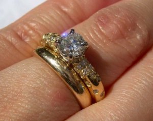
last photo. I hope they help for size of stones even though your gf's fingers are much smaller than mine!

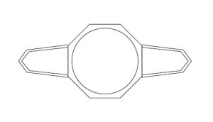
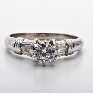
A-Ring tapered baguette.JPG
 
oh Addy! thanks for posting those pictures - my heart skipped a beat when i saw them! i think you ring is lovely beyond words... i understand about it being too high, but aside from that i think it is just perfection. do you have an information about the size/measurements of the baguettes?

there have been a lot of great suggestions and inspiration photos posted here, but i have to say that personally, Addy's ring hits exactly the right note in my eyes. it nails that understated, timeless elegance and beauty that i feel as though you're after, tristan! and i can imagine it better now with tapered bullets, too, as an alternative. JMHO of course. :))
 
quick gimp mockup...
tristanbaguette.jpg
 
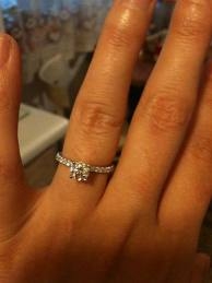
Ok, this style doesn't seem to be in the running, but I thought I'd post it because the center stone is .55 and the ring size is 4.5, so will give you an idea how it would look. I'm not necessarily endorsing any ring I'm posting, (although I think this looks pretty!) but I think it's important to find examples with a similar stone size so you can get the feel of the proportions.

images.jpeg
 
Tristan, This ring is going to be stunning I think and am interested to watch how it evolves. There have been so many great ideas but I think you are spot on with the 3 stone with bullets, something like Addys ring or the 2nd Leon that Pregcurious posted would really showcase that gorgeous stone and give a classic look. The only concern would be the stone itself, what is her skin tone? I had bought a lovely pale pink blush spinel from Dana and was going to put it in a solitaire but the stone without anything around it but 4 prongs just kind of fades into my pasty pale white girl hands so now I am thinking either 8 prongs or a bezel, something just to accentuate the color of the stone a little. Will this be a issue with your stone?
 
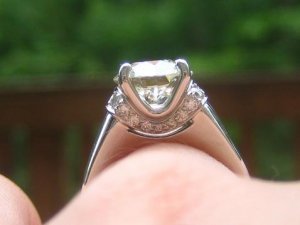
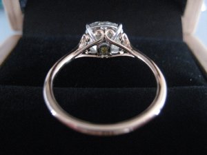
Measured the bags as best as possible using DH calipers. Not entirely sure I'm using them correctly. I must say, this is dangerous stuff, I knew my little vintage ring was uneven but I never realised how uneven until today! I feel so bad for this little ring.

Bag 1 - 3.3 mm long. 2.04 mm at top tapering to 1.53 mm at the bottom
Bag 2 - 3.53 mm long. 2.02 mm at top tapering to 1.45 mm at the bottom
Highest point on ring is 6.48 mm tall - way too high. Too much information, but I whack it on everything - including the toilet seat.

I think I vote for the pears. I agree that tapered baguettes and bullets are classic, but pears would sparkle more and I'm not overly fond of bullets myself.
 
First off, :appl: You people are fantastic! Thanks for the enthusiasm from all camps!
Had to take a break from this over the weekend, too close for comfort to be reading this thread at home.

Susimo: That three stone illusion head setting is lovely! Stored for a future project. :))

Gypsy: Thanks for your ideas, and the alternative options. I truly appreciate it. Got a very quick sketch from Victor too on the bevels. I'll upload it later. I made up my mind not to go out and out antique/art deco this time round. It clashes too much with the way she dresses and the style isn't flourishing locally so it is a bit too different.

Starzin: That ring is quite pretty! I'm surprised at how it looks, very nice. I think my center would be a bit too small to pull it off though, would have too much metal showing on my gf's small fingers.

Phoenix: Ah, great. Thanks. I'll be popping down this week then. You're a dear. :appl:

Stepcutnut: Oh hello! Nice to hear from you! Yes I'm liking the 3 stone as it has classic and elegant nailed down. Now I'm trying to lay my fears of washout and size to rest. Rose gold to my eye washes out colour More than plat. I would trade some loss of overall pinkness for the fact that the center stands on its own. The rose gold settings on Leibish convinced me of this.

Junebug: Thanks! The proportions are looking good. I'll have Victor mock up the gems next to the stone for a real life picture. He has already confirmed that the sides will be set with V shaped prongs at the end and resting against the center's prongs instead of 3 prongs individually. I think I would prefer that as it provides a seamless contrast between pink and D sides. Thanks for the solitaire style! I think 3 stones would help the pink though. If it was a solitaire it would be a solasfera! :))

Pixies: Thanks! I really wanted to go the full art deco route when I started this, but I had to rein myself in and think of my gf's style. She wouldn't be as much in love with that design language I think. So perhaps I'll try it with another ring down the road if she's open to the idea! No need for surprises then. :) This round is understated classic elegant all the way.

Addy: I'm sorry you don't love the ring. Its very pretty though! Nice proportions, thanks for the photos. They help me cement the mental image of the balance with a few examples (yours, acebruins...) I think face on, the ring is very lovely. I do agree the height is a bit too high, but I can work that with Victor. Hehehe, I loved the OCD toilet seat measuring. I understand though. You must get the most out of your toys! I would too.

LD: I'm amazed at the breadth of your collection! I know what you are saying, and I can See it from the pics. Hmm. I do like the blue a lot more in terms of how it doesn't lose as much size. Do you think the metal colour plays a big part?

slg47: thanks! I really need to get photoshop... I think between Acebruin's ring and Addy's ring, I can see the evolution of the eventual ring I will probably make. I think I'll bling it out just a little more with some Single cut pave, but not OTT.

Artdecogirl: Yay! If the art deco girl thinks 3 stone is appropriate I feel better letting go of the vintage angle. I don't know about the wash out. Hmm, might have to sneak the pink into the room while she is sleeping to see. Sigh. Can just imagine losing that in the folds of the bed. Ugh.
 
So victor showed how fine a bezel he could set, and these are the proportions. I'm a bit torn. I THINK i prefer a non bezelled appearance, but I THINK a bezel might be advantageous to the colour of the stone.

How would you all vote? Bezel? Or no Bezel?


Oh, and if anyone has ever done a colour enhancement cup with LM/SK/VC, could you please post a picture from the profile view and the top of it? He said he'll see my stone to check if a colour enhancement cup would work its magic. But I wanted the profile to show only platinum... VC says it should be possible.

Bezel.png

bullets.png
 
Her fingers should be around a size 3 3/4 for a snug fit need to confirm... time to break out the wine. So its a great assistance to the bank account if the lady has small fingers! Less ct for coverage... haha. :tongue:
 
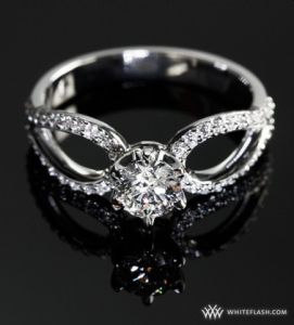
Well you had quite a bit to go through! :)) I was just getting ready to post some other ideas and even though you seem to have settled on a 3 stone I'll put these up just in case it triggers something. You appeared disappointed not to be able to have a pave shank because of the width but I think there's two things here - your GF doesn't have a lot of finger real estate so it's a matter of creating some shank real estate if you want to fit more bling :bigsmile:
Starzin: That ring is quite pretty! I'm surprised at how it looks, very nice. I think my center would be a bit too small to pull it off though, would have too much metal showing on my gf's small fingers.
For posterity I found a better photo in Facetfire's thread and as you can see, it's not a particularly wide setting so wouldn't show a lot of metal looking down at the diamond from the top. I think it's a lot more delicate than it looks with FF's 2.3ct.

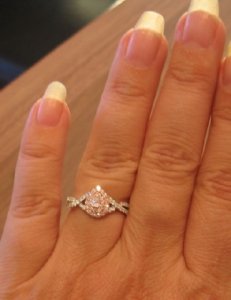
As for the amount of metal...not necessarily. Pregcurious has the lovely Whiteflash "Petite Champagne" with a .5 diamond (though I don't know what size her finger is) and you can see that this sort of shank can fit quite well with a different sort of pave, not the single line which is what I think you had in mind. More photos here https://www.pricescope.com/community/threads/thanks-to-quest-jewelers-for-my-reset.163316/


One more idea is to put pears in this sort of split shank (pointy ends to pink) - this style actually allows the shank to be a fraction wider than the centre but because the points narrow the setting towards the pink, that's where the focus would be.


As to bezel or no bezel...I think the bezel would give a little more presence and help define the pink yet it will be very fine - finer I think than the drawing indicates.
Her fingers should be around a size 3 3/4 for a snug fit..
Speaking as a 8.5 :shock: may I say that's positively intimidating :lol:

You do seem to have made progress anyway! Congratulations :bigsmile:

FF-dia-side.JPG

preg-champ-hand.jpg

pear-split.jpg

Screen shot 2012-01-30 at 11.38.06 AM.png
 
TristanC|1327890291|3114577 said:
So victor showed how fine a bezel he could set, and these are the proportions. I'm a bit torn. I THINK i prefer a non bezelled appearance, but I THINK a bezel might be advantageous to the colour of the stone.

How would you all vote? Bezel? Or no Bezel?


Oh, and if anyone has ever done a colour enhancement cup with LM/SK/VC, could you please post a picture from the profile view and the top of it? He said he'll see my stone to check if a colour enhancement cup would work its magic. But I wanted the profile to show only platinum... VC says it should be possible.

Absolutely with Bezel.
 
I am pro-bezel.

The WF/Quest ring is a size 4.25.
 
I prefer it without a bezel for the tapered bullet side stones. I think you're right though, a bezel will highlight the colour better. I can't even really picture in my head, but what would a 1/2 bezel, on where the bullets meet the centre look? Would that be best of both worlds?

This thread has been great for DH and I. He knew that I was unhappy with some aspects of my ring - height mainly - I really do think I chipped it on a toilet seat once! but just thought I was over thinking. I think he's realised how much I do like the style of my ring, it's classic and lovely and gives great finger coverage. However the wonkiness and height really bug me. It looks like we might be trying to get those fixed soon! So thank you :)
 
Tristan-
The use of a RG enhancement cup should do the trick to boost the color-just make sure there is enough of an opening for cleaning the stone, or else there can be areas that don't get clean very easily! FCD rounds need a little more help in the color boosting department :)
 
Does she like bezels? Personally I don't on a ring except for the ones like that gorgeous deco ring a few pages back. My set is very classic and modern so it just depends on her taste. If you go with a bezel personally miligrain makes it look nicer to me. Can't you get a sense of what she loves? I'd just hate you to end up with a pricey ring that is what the crowd here likes when she is the person who really matters. Ps I think the blue three stone ring looks bigger to you because it is shot closer. A better comparison would be to see that ring from a distance next to the halo pink.
 
BEZEL!!!!!

Also, glad to see you're leaning towards a 3-stone, and I personally love the tapered bullets.

Anne
 
My vote is for D pears, no bezel

I really like the idea of setting the pink in a very, very pink gold with the rest of the ring white. Y'know not all pink gold is the same and it doesn't have to look like it was cast from a penny. I've seen pink gold that almost looked like candy. I think it would be the best way to enhance the color and maintain a dainty classic look.

no cup!!!
 
tristan what's the color grade of your pink again?

in this photo you can see the cup underneath the basket...
cimg7452.jpg
 
TristanC|1327889981|3114576 said:
LD: I'm amazed at the breadth of your collection! I know what you are saying, and I can See it from the pics. Hmm. I do like the blue a lot more in terms of how it doesn't lose as much size. Do you think the metal colour plays a big part?
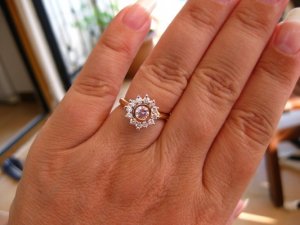
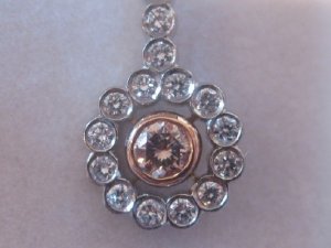
Tristan - Yes I think metal colour plays an enormous part when you're talking about pinks. You know because you're a regular on the CS forum that I really don't like rose gold? Well for pink diamonds, it's almost a "must" for me especially if they're on the smaller side. The rose gold will bring out the colour and make sure it stands out. HOWEVER there's rose gold and rose gold! It varies enormously and I prefer the pale subtle rose rather than the coppery orange type rose gold.

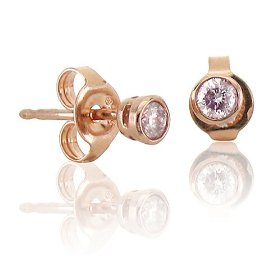
In terms of bezelling your stone I think it's a mistake (sorry). I would use rose gold (and claws) for the centre and w/gold or platinum for the sides. Here's an example of a pink diamond ring with a halo. It's on my "to do" list to reset. However, in earrings, I love the look (both are set in rose gold halos). Maybe somebody could photoshop the centre of the earrings onto a design you like?

I want to show you how a rose gold halo with white shank can really give a soft subtle look and makes the pink pop so that's my last photo!

Hope these help.

Diamond Pink Ring 4_1_1.JPG

Diamond Pink Earrings Closeup1_1_1.JPG

Diamond Pink .55ct on hand for ps.jpg
 
I agree that rose gold can be of such varying colour that it can be lovely - like LD's - or overpowering. I prefer the contrast of the white bezel against the pink and you can see a video here http://gilletts.com.au/product_info...te=GILLETTS_AJ&ezcamp=GILLETTS_0&currency=AUD of a pink in a white bezel which I think is not dissimilar to yours and so illustrates very well what it might look like.

However there are other ways of enhancing the pink one is, as Acebruin pointed out, having a rose gold cup and Victor explained for BrightIce at one stage:
Victor explains it like this:

It's literally a cup of metal wherein we would almost copy the pavillion facets of the stone in rose gold and sit the stone on top of the cup. It would cover the bottom of the stone except a small area around the culet. From the bottom of the ring you'd see a cup of metal covering the bottom of the stone.

Another way is to have the bezel in white gold and the basket underneath in rose gold.

Yet another is to set a pink melee under the stone. Can't find the thread but someone did this with a yellow and I think there was quite a good pic of it. Does anyone know what I'm referring to?

ETA: This Google images page might also help you see various colour ways
http://www.google.com.au/search?q=b...=mode_link&ct=mode&cd=2&sqi=2&ved=0CEEQ_AUoAQ
 
Starzin|1327974954|3115250 said:
I agree that rose gold can be of such varying colour that it can be lovely - like LD's - or overpowering. I prefer the contrast of the white bezel against the pink and you can see a video here http://gilletts.com.au/product_info...te=GILLETTS_AJ&ezcamp=GILLETTS_0&currency=AUD of a pink in a white bezel which I think is not dissimilar to yours and so illustrates very well what it might look like.

However there are other ways of enhancing the pink one is, as Acebruin pointed out, having a rose gold cup and Victor explained for BrightIce at one stage:
Victor explains it like this:

It's literally a cup of metal wherein we would almost copy the pavillion facets of the stone in rose gold and sit the stone on top of the cup. It would cover the bottom of the stone except a small area around the culet. From the bottom of the ring you'd see a cup of metal covering the bottom of the stone.

Don't like this idea at all, unless the metal conforms to the pavilion surface perfectly and makes complete contact in all areas dirt and grease *will* get trapped and it'll be impossible to clean thoroughly, and you're left with less light return face-up (grease alters critical angle) and without the benefits of foil-wrapping (plain ol' reflection, only if diamond and metal cup surfaces contact without breach, the shinier the metal cup surface the better)

Another way is to have the bezel in white gold and the basket underneath in rose gold.

Yet another is to set a pink melee under the stone. Can't find the thread but someone did this with a yellow and I think there was quite a good pic of it. Does anyone know what I'm referring to?

Haven's OMB w/ large open culet

ETA: This Google images page might also help you see various colour ways
http://www.google.com.au/search?q=b...=mode_link&ct=mode&cd=2&sqi=2&ved=0CEEQ_AUoAQ

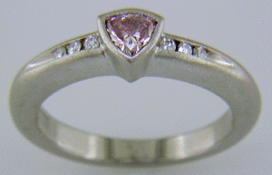
What does VC say? Your stone looks purplish to me, and I've never seen cool rose gold - all the stuff I've seen is at most peachy, still very warm, I'd think a bezel would clash (I don't like the look of the attached for example) but even peachy prongs as LD suggests, if delicate, wouldn't have nearly so strong an effect, maybe just play up the pink... A brushed-finish platinum bezel like the second might work too, if you prefer bezel, I'm thinking the matte finish will minimise the colour washing and let the sparkly centerstone shine... I would definitely do the pavilion-side struct(s) in as pink an alloy as VC can manage. Another thought - what about a black rhodium bezel, or some other naturally very dark metal - black tungsten/titanium? Nothing brings out pale colours like a black background, if VC will work in these metals, though of course it's a bolder and more unique look.

avoid.jpg
avv.gif

Got the black metal idea from e-wb http://www.e-weddingbands.com/index.html
 
Yssie thank you so much for remembering it was Haven's OMB - clever girl :appl:
Here's the link for those who are interested. It is an O/P and the jeweller set a 3pt yellow underneath. There's lots of photos and one very good underside one showing just the glint of the yellow from underneath. It definitely makes a difference and yet not distractingly so IMHO
https://www.pricescope.com/communit...y-2-30-ct-omb-antique-cushion-upgrade.158760/


Besides Justin then you can say you bought your GF not one but TWO pink diamonds (or use a pink sapphire melee if it's more cost effective) ;))

Personally I would plump for this and all white gold elsewhere, while I still favour the bezel, using the tiny pink would allow you to use prongs more effectively if that is your preference.

haven-yllw-under-OMB.JPG
 
Hi all, crazy busy days at work, so not enough time to digest the wealth of info on this thread.

Update is that I'm getting confused! But I'm trying to hold on to my core. Really need to get this right...

The other update is that I'll be sending off my pink to Victor soon via Malca Amit - I believe Phoenix had some good experience with them from Singapore as well.

Addy: my absolute pleasure. My hope is that this thread will help others when it comes to setting .5carat sized stones too, or FCDs if that is what they are looking to do. I'm glad this thread is an enabler for you! :appl:

Winternight: Yes, the issue I have is how to do a bezel and keep it modern/classic. Might be a challenge and it needs a smarter man than me to figure it out. Calling out to VC here.

Gypsy/Preg: Got your vote, thanks! And preg, that size ring and the stone proportions look really nice on your finger! It is helping me have hopes that hers will be similar due to the similarity of ring sizes.

AnneH: Gotcha. Thanks!

Anonymous: Yes, I saw only 1 example of a rose gold that was a beautiful pink - i'm not sure if it is real, or if it will retain that colour with wear. Worth a thought. VC loves rose gold with pink too. Maybe he will have real feedback when he gets hold of the diamond

Acebruin: It is Fancy Purplish Pink. That cup is the thick rose gold area going around the diamond? Sorry if I'm being obtuse.

LD: You have an example of every option I'm considering! =) Green with envy

Starzin: Its cool that some of the pics from here slg's photoshop for one appear on that search! Hopefully this helps future pink diamond setters too. Those photos are confusing me! But it is a good thing!

Yssie: Hello! Glad you're here too. Black would be a bit too bold. But I understand your point about the contrast. I think it would be plat though - big fan of the patina that forms.

Starzin: Yay! An excuse to get an argyle pink! Cool! haha. I'll read up on this thread once I get a chance!

To all of you - thanks for the ideas, and the efforts. If this is keeping you from spending money elsewhere (out of trouble) then please keep it up! :)) thanks again
 
Tristan, I think the bezel would be nice because it would protect the stone. Your stone even with insurance would not be easy to replace if it chipped. But as long as you have good insurance, you shouldn't let that be the deciding factor. After seeing Addy's ring, I have changed my mind about a three stone. I think hers has beautiful proportions. I am going to say that I think baguettes would be much better than shields, though. I don't like the fatness of shields next to a smaller stone. I think the baguettes are more complimentary to the center. I would be inclined to make it just like Addy's except to set the center stone a little lower.
 
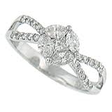
Was browsing around on the internet instead of getting something done and came across this on Dover jewelry. Center stone is .60. I throw it out there just for potential inspiration - and because I thought it was a pretty setting!

Hmm, on second thought, maybe a little too much of an 80's look? I guess the single side stones look a little more classic. Oh well, I'm trying!

dsc_0027141.jpg
 
TristanC|1328094686|3116255 said:
Acebruin: It is Fancy Purplish Pink. That cup is the thick rose gold area going around the diamond? Sorry if I'm being obtuse.

yes it's the yellow gold around the diamond... not rose... :P

your stone might have enough color to not warrant a cup... let VC decide... but i wouldn't do a bezel, i would definitely do the cup instead of the bezel... but that's just my preference...

as far as addy's ring look, remember hers is set high... so with the same tcw sides as her ring, the look won't be the same if you want to set low...

whatever you decide, i'm sure VC is going to knock it out of the ball park!
 
tristan have you thought of or explored the idea of half moons or traps next to the center, then the bullets or baguettes? i'm thinking that might help elongate the ring to help avoid the the sort of squat look of the no-example gypsy posted? assuming you don't care for that look, either, of course.
 
rainydaze|1328129173|3116661 said:
tristan have you thought of or explored the idea of half moons or traps next to the center, then the bullets or baguettes? i'm thinking that might help elongate the ring to help avoid the the sort of squat look of the no-example gypsy posted? assuming you don't care for that look, either, of course.

That look that Gypsy posted is my nightmare. But if VC churns out a ring like that... he wouldn't be the man we all think he is. Speaking of that ring, I wonder if the pink is a natural pink. Hmm...

DS: Thanks DS! I won't be getting insurance on the ring... it doesn't seem to be a possibility here to get ring insurance. So it will be a wear in good health and please don't bang it into a wall next to an open drain kind of ring... :sick:

Rainydaze: yup, VC suggested looking into proportions for a 5 stone too, but he said he would advise once he got the stone.

Junebug: Don't worry, more ideas are great. I prefer the proportions of Acebruin's and addy's to that find, but thanks and keep them coming!
 
Tristan, seriously? No ring insurance? Oh gosh. I probably wouldn't have anything worth over $3-5000 in that case. Yikes!
 
diamondseeker2006|1328147988|3116898 said:
Tristan, seriously? No ring insurance? Oh gosh. I probably wouldn't have anything worth over $3-5000 in that case. Yikes!

Tristan, did you see my post on the insurance thread? Basically, you don't need to have a min amount to insure with Chubb. But they do require you to have Contents with them which at 0.30/ 0.38% (I forget which and am too lazy to check my records) is not a lot (well, not for me cuz my sum assured for Contents is very low).

If you can contact me via DB (Preloved thread), I'll give you my insurance broker's details.
 
GET 3 FREE HCA RESULTS JOIN THE FORUM. ASK FOR HELP
Top