shape
carat
color
clarity

PLEASE cast your vote for favorite ring combo...

Gemstone pairing/design


  • Total voters
    104
Joined
Jan 20, 2012
Messages
4,252
Hello friends,

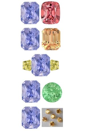
I know you must all be sick to death of seeing this rather unremarkable sapphire, but I've narrowed down my ring choices, and I'd truly appreciate a final opinion. I thought if I started a new thread, it would receive the most votes, so here we are. Specs: Periwinkle sapphire, which I already own, is 2.93ct. with a radiant cut, and measures 8.31 x 7.01mm. I normally don't need so much help, but I'm a little outside my comfort zone with all of these colors! I did decide against a monochromatic look with more blues and purples, as I'd really like to do something fun and a bit adventurous this time.
slider_grouphugg.gif


Choice #1

Type: Paired in a toi et moi bypass with a coral spinel
Pros: I already own the spinel, and neither stone is particularly exciting on its own
Cons: Not sure if the shapes work together, and the spinel is deeper in tone and more saturated in color

Choice #2

Type: Paired in a toi et moi bypass with a soft orange sapphire
Pros: I'm really loving this color combo, and the stones are almost exactly the same size/shape
Cons: I'd have to spend a decent chunk on the new sapphire, and the cuts are different (one radiant/one step)

Choice #3

Type: Three-stone with fancy yellow diamond traps (the yellow will appear softer in person)
Pros: I've been wanting to incorporate yellow diamonds into a design, and this was my original idea
Cons: Another expenditure, but almost half the price of the orange sapphire

Choice #4


Type: Paired in a toi et moi bypass with a mint garnet
Pros: Our lovely PSers specifically suggested this one, and I already own the garnet
Cons: I had something special in mind for the garnet, which I would have to give up

Choice #5

Type:
Halo (possibly double) with 2-2.8mm fancy yellowish-orange diamonds (VS)
Pros: I do love me a good halo :)
Cons: The color of the diamonds has the potential to veer brownish in person, and this would be the priciest option

Many thanks for all of your past and future assistance!!

Sincerely,
Autumn

Capturee4rbu6.JPG
 

Attachments

  • Capturee4rbu6.JPG
    Capturee4rbu6.JPG
    46.7 KB · Views: 28

KeepStepping

Shiny_Rock
Joined
Apr 16, 2010
Messages
143
#2

The color combination of soft orange and periwinkle bring out the best in each other, it is a really beautiful combination. The soft colors are really harmonious and make me appreciate that periwinkle stone.
 

Avondale

Brilliant_Rock
Joined
Oct 31, 2021
Messages
1,052
I am torn between soft yellow side stones or combining it with the mint garnet.
It's 50/50 in terms of colour, but design-wise I very much prefer 3-stones, so that's where my vote went.
 

Ionysis

Brilliant_Rock
Joined
Oct 1, 2015
Messages
1,925
Would soft green side stones be an option?

I think the periwinkle colour goes best with the soft green, but I like the aesthetics of the third stone (in terms of proportions etc) better!

Agree this would look lovely. I do like the yellow too as long as it’s a soft buttery yellow not mustardy or greenish.
 

chrono

Super_Ideal_Rock
Premium
Joined
Apr 22, 2004
Messages
38,364
Light but bright green (mint) or light orange (not coral) are my picks.
 
Joined
Jan 20, 2012
Messages
4,252
Thanks so much, everyone! I'm surprised the mint is getting so much love!! I could nix the garnet and do two tourmalines instead, if we like a three-stone better. So that's an idea. And that way I can use the round mint garnet as I'd planned to in another ring. I looked for a vanadium chryso pair, and, as expected, they're very scarce.

I'm still liking a buttery yellow diamond three-stone too, and the soft orange toi et moi. These 2 pairings are probably my favorites. I'll check back in a bit later and see how the poll progresses. This is very helpful!
 

Cerulean

Ideal_Rock
Joined
Sep 13, 2019
Messages
5,078
My eye goes straight to the orange because it’s a softer color and doesn’t do anything to undermine the pretty periwinkle - these colors enhance each other.

I think the green garnet is a bit too saturated and I worry competes with the blue. What a I think you’d be better off with is a paler stone, like below.

I think the yellow side stones are my least favorite, as in all honesty I think these particular stones clash. Looks like a cooler toned yellow which is going to bring out any whisper of grey in your stone. They are still quite saturated even if they aren’t as intense as the melee!

Obviously, just my opinion!

***edited - it’s also absolutely NOT an unremarkable sapphire! Outside of rich blues, I really love pastel stones the best. I think she’s a stunner so feel committed to helping her find the right partner!

1655732981094.jpeg
 
Last edited:

thirdrock

Shiny_Rock
Joined
Mar 16, 2019
Messages
287
Would soft green side stones be an option?

I think the periwinkle colour goes best with the soft green, but I like the aesthetics of the third stone (in terms of proportions etc) better!

I agree with this. Soft green side stones would look great! I also like the soft orange sapphire but I think the 3 stone design with green would stand the test of time.
 

Cerulean

Ideal_Rock
Joined
Sep 13, 2019
Messages
5,078
Ok I’m going to throw one more comment out there bc it’s driving me a little bonkers and I hope this doesn’t offend anyone. We’ve had incredible PSAs for other aspects of this forum, and so why not color pairing?

I studied color theory. Complementary and complimentary are NOT the same thing and I think they are being conflated. Complementary is a term used to describe a color relationship (I guess angles too, but that’s for another time), and complimentary is well…giving someone praise or getting free snacks on an airplane. =)

Complementary is a term for colors that are opposite on the color wheel. We’ve all figured that with googling! Okay but what does that mean?

When next to one another, they each look their BRIGHTEST and BOLDEST, which in actuality can often look quite garish if you’re not careful, because your eye can’t really rest on both at the same time without almost…vibrating. This relationship is leveraged for drama! So typically you need to pick which one you want to be dominant to avoid visual conflict. Whether that is choosing one to be much smaller (i.e. an interior designer may choose a yellow accent pillow for a purple room) or a related, tertiary color.

What the heck is my point? If you pick a complementary color that is stronger than its partner, like bright yellow side stones next to pale periwinkle, that yellow is going in for the kill! Your periwinkle will play second fiddle. :roll:

Again, what we all find visually pleasing is not set in stone of course (pun intended), but there is rhyme and reason to color pairings that’s been around for a long time! Some of us know it in our gut, some of are trained to understand it, and some of us are better relying on advice.

Anyways, that’s it. I think you’ve got some fun options on your hands, OP!
 

Avondale

Brilliant_Rock
Joined
Oct 31, 2021
Messages
1,052
If you pick a complementary color that is stronger than its partner, like bright yellow side stones next to pale periwinkle, that yellow is going in for the kill! Your periwinkle will play second fiddle. :roll:

Autumn may elaborate further, but I was left with the impression she just used her original image for demonstration purposes and was intending to acquire a softer, more gentle yellow coloured diamonds for side stones. So really, I don't see anyone suggesting she goes with the original bright yellow stones.
 
Joined
Jan 20, 2012
Messages
4,252
I think she’s a stunner so feel committed to helping her find the right partner!

lol I can relate! I become so invested when other PSers ask similiar design questions!! Thank you for all of your insight and advice. It's been most helpful, my friend.

Autumn may elaborate further, but I was left with the impression she just used her original image for demonstration purposes and was intending to acquire a softer, more gentle yellow coloured diamonds for side stones. So really, I don't see anyone suggesting she goes with the original bright yellow stones.

Yes indeed, the yellow diamond color would be softer in person. Thank you for clarifying! I don't think I'd go too pale though, as I don't want to have to strain to see the color. And you know how FCDs are...
pixelSHERLOCK_finished.gif
 
Joined
Jan 20, 2012
Messages
4,252
Love this colour ^^^^!!!

I agree with this. Soft green side stones would look great! I also like the soft orange sapphire but I think the 3 stone design with green would stand the test of time.

You have both been immensely helpful, thank you! I'm actually really surprised green is in the lead! I'll admit the orange is still my fave at the moment. But that could change... and then change again... and again. As I said, I'm a Gemini!!
nuts.gif
 
Joined
Jan 20, 2012
Messages
4,252
I voted for the green and periwinkle color combo. I think making a three stone ring with mint colored sides would be gorgeous. Or paraiba sides but I think we all know how expensive those are. :shock:

Pale yellow sides would be my second choice.

Thank you for your input, my friend!!
 
Be a part of the community Get 3 HCA Results
Top