shape
carat
color
clarity

House COLOR Help ... PLZZZ!

Which combo do you prefer?

  • Original Scheme (WHITE w/ GREEN)

    Votes: 1 100.0%
  • YELLOW w/WHITE shutters

    Votes: 1 100.0%
  • YELLOW w/ RED shutters

    Votes: 1 100.0%

  • Total voters
    1
  • Poll closed .
Status
Not open for further replies. Please create a new topic or request for this thread to be opened.
I really love the mythical but I wanted to share this because I love it and well, just cause lol Who else would I show it to? I think partly because this looks more like the color that was actually on her wall... the color in the sherwin williams thingy looks more thistley or lighter or something. The way it looked on the house though... flipping gorgeous.
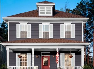
janesaysduck.jpg
 
hmmm no this is cooler... it''s that warmth - almost a golden in the purple... bah, I''m going to go make coffee lol

I don''t envy you the decision making deco!! Just remember - you can''t really go wrong :)
 
Date: 10/9/2009 1:25:55 PM
Author: Cehrabehra
because I am a supreme dork I mocked some stuff for ya lol

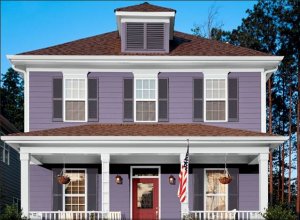
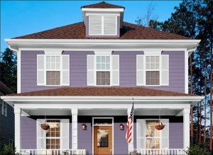
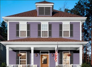
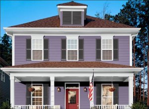
Honeycomb, Serape, Truepenny, Peppery
Red Bay, Fireweed, Kirsch Red, Burgundy
Oooohhhh.... Truepenny is one of my favorite, favorite, favoritest orangy color by SW. It looks so beautiful when it''s been painted. I still love the idea of an orange door and vote for this color if you do it.
 
NO ORANGE DOOR! It''s appealing because it is fall. Won''t be as pretty in the spring/summer. I vote the bottom red door! (not opinionated am I?)
25.gif
 
Date: 10/9/2009 3:01:22 PM
Author: AprilBaby
NO ORANGE DOOR! It''s appealing because it is fall. Won''t be as pretty in the spring/summer. I vote the bottom red door! (not opinionated am I?)
25.gif
I am also "not feelin" the orange door. At all.
 
I''m feeling the orange door, but it could be because I love orange!

I am loving the red door though- I think the color was luxurious red? I think it would be so cheery with the purple house.
 
we have a blue/grey house....trim is the same color. we just had a new door installed and used Vandyke Red from ICIPaints which is a standard color the door shop carried under the Glidden label. i think its named for the painter's beard! anyway, its a coppery orange and i absolutely am loving this door! i will admit that on a a bright summer day when the sun hits it directly it will appear more orangy but, hey, orange appears to be my color of choice for some years now.

good luck!

mz

eta: its really more copper looking but one can see the orange in that copper!
 
Date: 10/9/2009 3:26:42 PM
Author: April20
I''m feeling the orange door, but it could be because I love orange!


I am loving the red door though- I think the color was luxurious red? I think it would be so cheery with the purple house.

that color orange is a bit of a trend right now - it''s only now that you can not only get away with it but have it be a popular choice. But it''s also an attractive combination - especially this autumnal time of year. Going yellower will give you more pop and reflect springtime more (and perhaps not fit in the fall as well)... the green choice is neutral and will go with every season and be a backdrop for introducing other colors such as red. All that purple will help the red and green get along without looking like christmas.

Another thing I was fooling with earlier was dark charcoal/purple/blue (near black maybe) shutters. It looked pretty cool, let me see if I saved a pic. That site started pissing me off lol
 
oh I did - awesome... I think it looks great and leaves a lot of room for fluctuation on the shutters... it would be toning them down quite a bit (without the severe contrast that your present green/white has) and that could be nice. Best part - no hurry because it would look fantastic in the white in the meantime... anyway, here it is. I might go try to do one with that door again.

ETA - I couldn't get a good dark color out of that program but I bet there is one.

dkgreyshutters.jpg
 
Here is the house with Truepenny:

decotruepenny.jpg
 
I like this dark shutter combo better than the one above... I''d replace it if I could.

decodkshutter.jpg
 
MZ take a pic!
 
Oh deco - look at this one!!! :)

Mythical, Red Bay, and Caviar

decodkandred.jpg
 
not liking what looks to me to be a yellow toned door at all. like the last one posted with a more coppery red door.

too tired and too busy getting ready for ren faire tomorrow and then ready for a storm that''s supposed to hit us sunday night......but one day i will get that camera out and get a picture. its so rich and says "i''m the door you want to walk through".

mz
 
Date: 10/9/2009 6:03:21 PM
Author: Cehrabehra
Oh deco - look at this one!!! :)
Mythical, Red Bay, and Caviar
First of all ... thank you so much, Cehra! I really appreciate your interest & mocking stuff up like this is just above & beyond. So nice of you. Seriously.

2ndly -- I really like that Mythical, Red Bay, Caviar combo. Its a departure from "Cottage" ... more in the "Sophisticated Farmhouse" category -- but I like it a lot. Its less cutesy & tones down the purple a bit. I can't tell if that's how the Caviar color would look on our solid shutters -- or if their louvered shutters are making the color look darker? Would have to test it out to see but it might be worth a shot. The SW folks are so used to me now. I'm gonna start going in my pajamas I think.

The charcoal grey house was very pretty too. I think I'd like that color on another kind of house -- more of a farmhouse colonial or a craftsman or something. Grey looks awesome with Orange. And Purple. Next house!


ETA: I do have one concern about the Caviar shutters -- since the front of our house doesn't have a door -- there would only be Mythical, Caviar & White on the front -- no "pop" of color. The only "pops" would be on the *sides* of the house. Makes things trickier. My thought was that the contrast of white shutters might be a pop & lighten the front up a little w/o getting silly with a too sweet icy lavender or something on the shutters. Hmmmm. I love the look on THAT house. Maybe I can find similar colors on Ben Moore & use the other program to try to see what it would look like on *OUR* house. Oh Honey ... (no use, there's a Yankees playoff game on ...
3.gif
)
 
Don''t settle until you find the one that makes your heart sing! You still have all of your options open.

Another thing to consider (aside from roofing) is that your two stories have different patterns of wood - and not to make your decision more difficult, you can introduce another color on your dormers. have you thought of that?
 
I can''t get my print screen to work anymore booo! lol
 
btw - I don''t know that I really recommend the caviar... I like the red door and I suspect you really want a red door - am I right? You mentioned your fav before was red... and really you can have a red door, you just have to be careful what color of red you pick so that it doesn''t clash with the purple. I think it looks fantastic with that red bay... but you''d have to check it out in person. it will be easy to decorate for *any* holiday - all of them, all year which is nice. You can choose two other colors for your house... three if you include the trim but I think I''d go ahead and just commit to the white for trim, it brightens it up. That leaves you with shutters - I don''t know that I''d do caviar... but something not BLACK but something darker... something with a little purple or blue in it but mostly charcoaly. Something that would accentuate the shutters without making them scream for attention. Then you have the option of painting the top floor the same color or yet another color... maybe a darker purple to peek out from the top... maybe plummy? Maybe something even a little darker?
 
also - I think it would be easy to pull out a charcoal color that goes both with your stone and your brick. Have a knockout POP door that isn''t trendy, but totally fits the house... keep your white trim so that everything matches... and choose another darker shade of purple that goes with everything at the top. Also - you can eventually paint your trim two colors... you can keep white accents and add in bits of charcoal to manipulate the visuals... white will highlight and accentuate what you like, the charcoal black will recede and create definition.
 
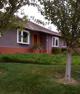
deco we were out walking this morning so i snapped an iphone photo of the purple house for you. i love it with the brick contrast. and this door is pretty much the same color as ours...i just love it with the brick (our house has brick too). so you could also do brick with your house somehow if you like it, aka maybe as a raised flower border along the front of your house.

i took a 'larger' scope picture to show all their landscaping and stuff too (trees add a lot, the green goes nicely) but then you couldn't see the color of the house as well.


purple house.jpg
 
Just wanted to say that I really like the charcoal shutters a LOT better than the white!
 
Date: 10/11/2009 1:32:12 PM
Author: Mara
deco we were out walking this morning so i snapped an iphone photo of the purple house for you. i love it with the brick contrast. and this door is pretty much the same color as ours...i just love it with the brick (our house has brick too). so you could also do brick with your house somehow if you like it, aka maybe as a raised flower border along the front of your house.
GREAT PIX!!! Thank you SO much, Mara! I''m having some frosty feet as the decision deadline ticks down but its nice to see another beloved purple house. And its good news that it works with the brick. Hopefully our similar shade will work ok with our brick chimney(s). Our garden beds are already built out with bluestone borders that match the pathways & tiny patio area so we''ll probably stick with those -- but the gray def. works well with the Mythical. Its the brick I wasn''t sure about.
 
Date: 10/11/2009 5:01:11 PM
Author: diamondseeker2006
Just wanted to say that I really like the charcoal shutters a LOT better than the white!
Thanks Diamondseeker2006! They are growing on me too. Really thinking about testing that color on a pair of shutters before painting them all white. Only worry that it''ll make the front of the house too dark -- but once the white trim is cut in ... maybe it won''t be too dark ... and a THIRD color on the front could be a nice accent. Light, medium, dark all in one facade. Lots to think about.
 
Date: 10/9/2009 3:26:42 PM
Author: April20
I am loving the red door though- I think the color was luxurious red? I think it would be so cheery with the purple house.
Thanks April20. I picked up cards for Luxurious Red and Red Bay & one other darker red & held them up to the Mythical painted on the house & to the entryway that''s red & up against the brick -- LEANING toward Luxurious Red at this point. Red Bay is a little more yellowy in person. Like a Chile Pepper red or something. Luxurious Red has a clear blue undertone - seems more harmonious with the Mythical.

The doors are BY FAR the easiest thing to change out after the painters are done. I''ve painted the doors myself before.

LEMMIE ASK YOU GUYS THIS -- what do you think about SCREEN DOORS. Should they always be white? Trim color if the trim isn''t white? Or DOOR COLOR. My DH thinks screen doors should always be white but I''m thinking if we go white you won''t even see the door color behind the screen. The door will look black no matter WHAT color we paint them.

Thoughts??
 
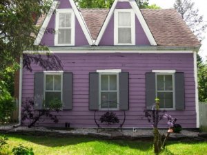
Here are *similar* colors mocked up on our house .... can only use Ben Moore colors w/the software - gah. But this is KINDA what medium purple would look like with slate gray shutters & white trim.

cupidsdartebonyslate.jpg
 
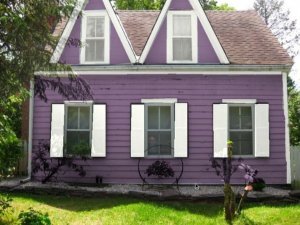
And here it is w/white shutters. Any preferences?

cupidsdartwhite.jpg
 
love the house color; don''t like the white shutters at all!

mz

ps i''m glad there is someone esle that obsesses about this type of thing like i do....accept for me its interior colors....
 
I don''t care for the white shutters either. I like the gray ones.
 
have you mocked up the side with the one door? See what a red door with the purple, charcoal, and white will be like?

I''m trying to feel the general idea because those colors look so funny on that program... I love the purple plants lol
 
Date: 10/11/2009 10:13:24 PM
Author: Cehrabehra
have you mocked up the side with the one door? See what a red door with the purple, charcoal, and white will be like? I''m trying to feel the general idea because those colors look so funny on that program... I love the purple plants lol
The colors are SOOOOO off. It''s hardly worth looking at that program. Unfortunately my DH has hit the wall on this decision. Mystical House + White Shutters + Luxurious Red Doors is looking like "it". The Ben Moore mock up program only works on Windows & my computer doesn''t have it so I can''t really play around on it for hours like I do on the SW''s program. And he absolutely won''t mock up the other side in the wonky color BM program at this point. Poor guy has been going through this for *years* now & its ramped up quite a bit in the last few weeks, with multiple trips to the story, endless agonizing etc. I don''t blame him for being annoyed & wanting to be "done" already. Going to gray shutters at this point is treading some dangerous emotional waters around here. Dunno if that''s the hill I want to die on, yanno?
3.gif
 
Status
Not open for further replies. Please create a new topic or request for this thread to be opened.
GET 3 FREE HCA RESULTS JOIN THE FORUM. ASK FOR HELP
Top