Taurus2313
Brilliant_Rock
- Joined
- Dec 28, 2017
- Messages
- 603
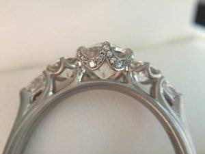
I like it! But agree that I don’t care for that swoopy line that @Taurus2313 wrote about above. I think every else looks more deliberate.
 I noticed it from the get go but wasn't sure that it was an element that she actually wanted on the design or not until she mentioned it so I never brought it up until she mentioned it. Glad that we all agree that it just looks out of place..
 I know, I know but that last thing that I wanted to do is point out something that might have never been an issue to begin with.

2") Sure if you would like to, that sounds okay by me..
Sure if you would like to, that sounds okay by me..


2")


300x240.png)