shape
carat
color
clarity

FCD Ring Design

clairejune

Rough_Rock
Joined
Oct 16, 2012
Messages
13
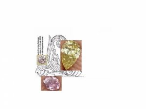
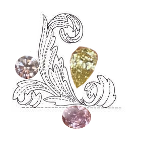
Chrono, I'm referring to the fanciful black and white drawing with the 3 diamonds shown in the design.
 

chrono

Super_Ideal_Rock
Premium
Joined
Apr 22, 2004
Messages
38,364
I tried incorporating the suggestions but my Paint skills are lacking. None of the leaves are removed. I could not paste the picture of the yellow pear without accidentally "erasing" the right-hand-side most leaf. The yellow pear also needs to be angled further.

Claire,
I think we cross-posted and what I mocked up is essentially what you suggested.

fcd_design_x1.jpg
 

clairejune

Rough_Rock
Joined
Oct 16, 2012
Messages
13
Yes, if the yellow pear were angled further in, like the hand of a clock extending out diagonally from a center point. I just thought that maybe it would look great if the yellow diamond were cradled by the leaf, like swirling around it a bit. Makes a great visual presentation. The accent diamond would serve as a counter balance. In this configuration, the pink diamond works as a solid base to the offshoot of the gold swirl.
 

Starzin

Brilliant_Rock
Joined
Sep 26, 2011
Messages
1,850
clairejune|1387204132|3575227 said:
What if you switched the yellow pear with the accent diamond, with the peat tilting out towards the 1:30 position? Looking much better IMO!
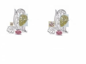
I really don't think that would work because the pear would end up on the next finger over to the left. We have to remember Chrono has fairly small fingers and the design should sit mostly on top.
 

Starzin

Brilliant_Rock
Joined
Sep 26, 2011
Messages
1,850
Actually that would work if you remove the leaf I want to pave a bit of :bigsmile: I'm not mocking it up now because I'm off to bed.

I expect to see this finished in the morning :lol:
 

chrono

Super_Ideal_Rock
Premium
Joined
Apr 22, 2004
Messages
38,364
Claire,
You should be in some sort of a design field; the ring looks visually balanced!

Starzin,
I am going to try to draw this design to scale to see if it ends up too large for my finger. Worst case scenario, it will be a middle finger ring. With it drawn as suggested by Claire, I think a pave leaf will be overkill and take away from the intricacy of the leaves and emphasis on the FCDs. Done by morning? You are a difficult taskmaster. :knockout: :bigsmile:
 

clairejune

Rough_Rock
Joined
Oct 16, 2012
Messages
13
Thanks Chrono,
I'm a trained painter, studied fashion design, and have a deep passion for jewelry. I love the challenges of designing something unique and having it made. This is an exciting project! Those FCDs deserve the best.
 

chrono

Super_Ideal_Rock
Premium
Joined
Apr 22, 2004
Messages
38,364
No wonder you are so good at this. Thanks for your help. I played around with these again using 2 different sized accent diamonds. I tried my best to draw to scale.

I moved the pink oval a bit higher in place of where a leaf used to reside.
I also tried to nestle the yellow pear closer to sit between the 2 leaves. Unfortunately, I could not prevent the accidental cover-up of the leaf structure to the right.

fcd_design_x2ab.jpg

fcd_design_x2ab_scale.jpg
 

T L

Super_Ideal_Rock
Premium
Joined
Sep 20, 2008
Messages
25,221
Hmmm, maybe I need to see the completed ring because it looks a bit too busy for me with those huge leaves.

I like this the best now (the one on the right) ------------->

like_these.jpg

Is this thread driving you bonkers yet Chrono? :lol:
 

clairejune

Rough_Rock
Joined
Oct 16, 2012
Messages
13
Yes, the leaves could be paired down a bit by slimming them, or having simpler lines. Or not. I think the stones are working nicely!
 

LD

Super_Ideal_Rock
Premium
Joined
Jun 29, 2008
Messages
10,261
Funnily enough the one that my eye was immediately drawn to was the same one TL has just pointed out.

With the mock up you've just done Chrono with the pear on the right, the leaves are not correct because you'd never see a flower in nature like this. Having said that, it looks like a Lily of the Valley. I also agree with TL that the overall design is too fussy and too focussed on the leaves.

If I were making it, I'd use the lovely floaty design of the leaves but not make them so big. I'd also put the pear back on the left. You have the makings of a pretty ring but the balance isn't right at the moment.
 

Starzin

Brilliant_Rock
Joined
Sep 26, 2011
Messages
1,850
Here's the rough idea of your pic - not to scale but the yellow and pink were taken from your hand shot so they are relative one to another. The little pink may be out a bit but not too much if you think about the sizes. I did this before I saw you'd moved the oval pink up and over.

I think I agree that the leaf could be slimmed down but it's really an exercise to try and coalesce your thoughts into something workable to show a designer. It does seem you like the sculptured look of a leaf or flower but this is getting away from the Romanov look. So tossing up between the Romanov "stalky" look and a simpler but sculptured leaf element... which wins?

c-acanthus-2.png
 

Starzin

Brilliant_Rock
Joined
Sep 26, 2011
Messages
1,850
Going in a completely different direction, does something like this have any appeal? Tiny white in the flower and a couple of leaves sacrificed elsewhere for the yellow and pink but essentially an open work filigree leaf circle.

filigree-bl-wh.jpg

filigree-leaf.jpg
 

chrono

Super_Ideal_Rock
Premium
Joined
Apr 22, 2004
Messages
38,364
I simplified and made the leaf smaller, and moved the pear back to the left. It might look more realistic but the ring does not look balanced.

smaller_leaf__right_pear.jpg
 

chrono

Super_Ideal_Rock
Premium
Joined
Apr 22, 2004
Messages
38,364
Starzin,
I love the romantic feel of the picture with the white background. I can see that as a brooch or pendant.

In the meantime, for those who are still reading this and haven't been driven crazy by my indecisiveness, I've found a few more designs that can be tweaked to suit.
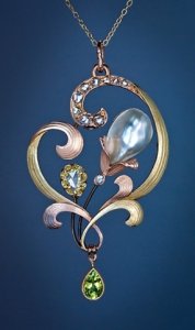
art_nouveau_pearl_jewelry.jpg
 

clairejune

Rough_Rock
Joined
Oct 16, 2012
Messages
13
I think Starzin's drawing of the ring with the yellow diamond on the right is lovely. There is a focus, balance and everything works towards a totality. Love it. My opinion is to move the yellow back over to the right.
 

chrono

Super_Ideal_Rock
Premium
Joined
Apr 22, 2004
Messages
38,364
I like the flow of the leaves in this one; not too ornate yet not plain and allows the use of multiple stones. I will be using fewer stones so the ring will not extend past the knuckle as shown.

art_nouveau_antique_rings.jpg

art_nouveau_ruby_diamond.jpg

ruby_diamond_rings.jpg
 

chrono

Super_Ideal_Rock
Premium
Joined
Apr 22, 2004
Messages
38,364
This also has potential but isn't as visually interesting.

flower_ring.jpg

nouveau_rings_2.jpg
 

chrono

Super_Ideal_Rock
Premium
Joined
Apr 22, 2004
Messages
38,364
Eureka?

more_fcds_y1.jpg
 

BWise

Brilliant_Rock
Joined
Jan 14, 2004
Messages
1,432
Chrono, I understand you had ruled out pendants because you want to be able to see those beautiful FCD when wearing them. However, I must honestly say that so far, this is the prettiest design on this topic. Any chance this can be converted into a ring (maybe remove the green stone)?


Chrono|1387294491|3576088 said:
Starzin,
I love the romantic feel of the picture with the white background. I can see that as a brooch or pendant.

In the meantime, for those who are still reading this and haven't been driven crazy by my indecisiveness, I've found a few more designs that can be tweaked to suit.

art_nouveau_pearl_0.jpg
 

chrono

Super_Ideal_Rock
Premium
Joined
Apr 22, 2004
Messages
38,364
Even the removal of the pear drop leaves the overall design much too large for my finger. I'll continue to play with the design to see if I can make it smaller.

an_fcd.jpg
 

chrono

Super_Ideal_Rock
Premium
Joined
Apr 22, 2004
Messages
38,364
When scaled to size, the pendant turned ring design does not look as elegant as it did when magnified.

actual_size.jpg
 

T L

Super_Ideal_Rock
Premium
Joined
Sep 20, 2008
Messages
25,221
Chrono|1387294700|3576093 said:
I like the flow of the leaves in this one; not too ornate yet not plain and allows the use of multiple stones. I will be using fewer stones so the ring will not extend past the knuckle as shown.

Are these rings for sale? I would think it's more cost effective to buy one and change out the heads for your stones.

That's a very nice ring btw.
 

JewelFreak

Ideal_Rock
Joined
Sep 3, 2009
Messages
7,768
I love the pendant design, but trying to figure how to concentrate it down & still keep the gracefulness, I come up with nada. The other one -- on the left in your tiny pics -- has good flow, but I think the pear needs to be on top for better balance. Also, it's the longest stone; would you have to wear the ring far down your finger for it not to hit the knuckle? What about making more of a curve on that top leaf so it comes around & the pear is "suspended" from it? I'll have to draw it to show you what I mean, uh oh...

--- Laurie
 

chrono

Super_Ideal_Rock
Premium
Joined
Apr 22, 2004
Messages
38,364
TL|1387303787|3576218 said:
Are these rings for sale? I would think it's more cost effective to buy one and change out the heads for your stones.

TL,
These rings are extremely expensive. This particular ring is already sold but based on prices of unsold similar pieces, this one might run around $10K and upwards. In addition, I have to do major rework to fit my FCDs in.
 

chrono

Super_Ideal_Rock
Premium
Joined
Apr 22, 2004
Messages
38,364
JF,
I put the yellow pear at the bottom because the shape is very different and is the only yellow stone. All the pinks and roundish shapes are at the top. I thought it might look odd to throw a yellow into a mix of pinks. If I wear this on my middle finger, I have just shy of 25 mm up to my knuckle. The total length of all 5 stones lined up back to back in a straight line is 20 mm but since the design calls for an S-like curvature, it should fit. Please do edit / draw. :cheeky:
 

chrono

Super_Ideal_Rock
Premium
Joined
Apr 22, 2004
Messages
38,364
Ummm....TL, that first ring is sorely lacking finesse and elegance. :o
The second is lovely but the ribbon seems a bit "young-ish" for an older person like myself.
The last one is more classy and well made though.
 

T L

Super_Ideal_Rock
Premium
Joined
Sep 20, 2008
Messages
25,221
Chrono|1387305287|3576240 said:
Ummm....TL, that first ring is sorely lacking finesse and elegance. :o The second is lovely not the ribbon seems a bit "young-ish" for an older person like myself.

Really? I love the first ring, especially the design. It is also a period piece.

You're not old!! LOL!
 

chrono

Super_Ideal_Rock
Premium
Joined
Apr 22, 2004
Messages
38,364
TL|1387305454|3576243 said:
Really? I love the first ring, especially the design. It is also a period piece.

So sorry. ;( The metalwork is lumpy and knobbly, and the design isn't feminine enough for me.
 
Be a part of the community Get 3 HCA Results
Top