- Joined
- May 20, 2016
- Messages
- 5,105
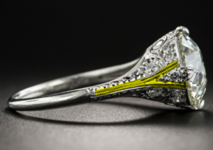
I hope I don't derail you...I love the shank. I love the head. I just don't love them together. The shank is all straight and sharp lines, while the head is all curves. I feel like the two parts need to flow better together and maybe that will resolve some of the comments above. For me, I would use double prongs and make the straight our of the shank. Then, I'd look to find a detail to add to the gallery that has less curvy swoopyness.
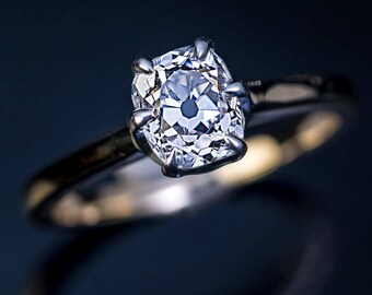
Prongs like this

Here are a few I thought of.
TGP


CVB


DK

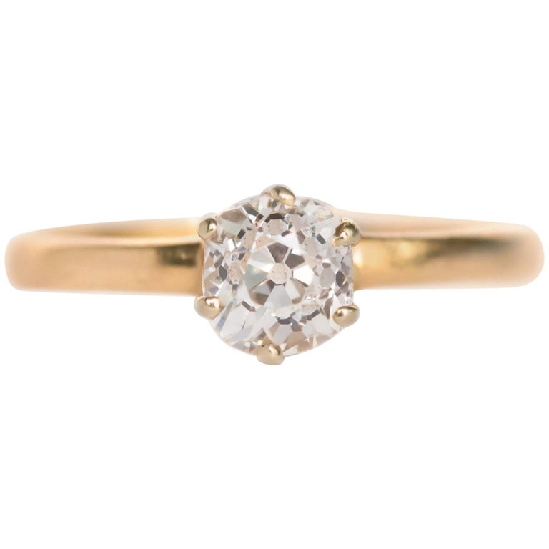
Prongs like this
Here are a few I thought of.
TGP
CVB
DK


300x240.png)