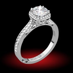
shape
carat
color
clarity

Updated Cadd, needs work or an I obsessing?

rockysalamander

Ideal_Rock
Premium
Joined
May 20, 2016
Messages
5,105
Hi all,

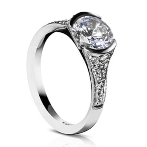
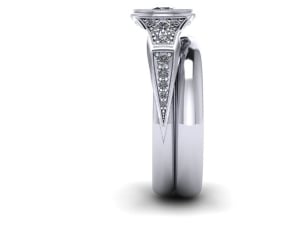
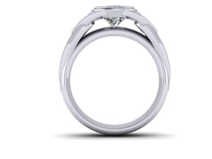
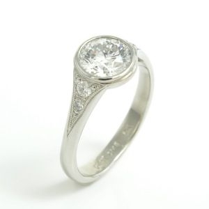
I received my updated Cadd and need some objective views. Please help my obsessive soul finish this project. I can't tell if I'm obsessing or it needs some tweaks. The wedding band shown is my actual one (4.4 mm, heavy comfort, etoile inspired). This is a 16-year anniversary ring that will use an Amora Gem to stand in for my lost family OEC :wall: . We will replace the Amora eventually. I'm looking for wearable and durable -- but still feminine and elegant.


INSPIRATIONS
calebmeyeritem3821modelc-291.jpg
sholdtvashon.jpg
adrian_view_3.jpg
{PS'r ring, but I can't remember whose, sorry}

CADDs
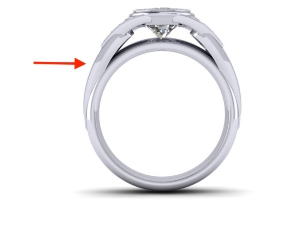
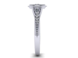
side_p.jpg
side_p2.jpg
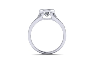
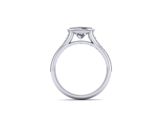
thru_p.jpg

Questions
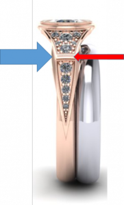
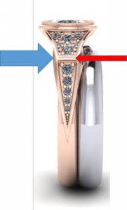
1) Does the gap in the design look odd (red arrow). I feel like it needs to be eliminated or more distinctive. Thoughts?
2) Does the side look a bit bubbled out(blue arrow)? This is also carrier through to the side view.
details_1.png
3) Can a cast ring like this be made in two metals? I'd love the bezel and shoulder pave/bead/bright areas (the V) to be rose gold the rest to be platinum. I've seen the inside of the V plated, but don't want the maintenance.

Anything else I'm missing? Thank you
 

pyramid

Ideal_Rock
Premium
Joined
Nov 10, 2002
Messages
4,607
You can't replace a stone in a bezel setting, as the bezel gets completely destroyed when removing
the old stone.
 

rockysalamander

Ideal_Rock
Premium
Joined
May 20, 2016
Messages
5,105
Thanks Pyramid. My jeweller is aware of my eventual plan to replace the stone. She's taking that into consideration for how the bezel is closed. Worst case...we can sacrifice the Amora gem to save the setting. Maybe it won't work, but sine the lost stone would be $16k + to replace (it was uninsured since I was an idiot)...I have to live with the options I have now. Any thoughts on the setting?
 

diamondseeker2006

Super_Ideal_Rock
Premium
Joined
Jan 11, 2006
Messages
58,547
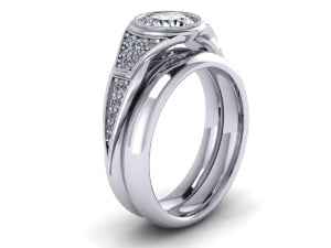
The CAD is very far from your inspiration pics. I love the first and third inspiration pics, and I would want it done exactly like one of those. I really dislike what your designer did. It looks closer to a man's ring to me. You need to be more specific, such as say... I want it to look exactly like the first ring. These shoulders (sides from the bezel) look nothing like the first ring. They protrude outward rather than being a solid one piece shank that goes in towards the bezel. I would not try to combine two metals on this ring because I don't think it will look right. That shank should be all one piece. I guess the bezel could be in another metal but I am not sure that would look good.
 

rockysalamander

Ideal_Rock
Premium
Joined
May 20, 2016
Messages
5,105
Thanks diamondseeker. Sigh. Her work IRL is lovely, creative and delicate...but I'm having such a hard time getting what I want from her. You confirmed my gut feeling. It looks like a man's ring. The shoulder is weird..it is chunky and unrefined...and the cadd is not the reason is looks that way. I had so hoped the cadd was just making the chunkiness look worse than it was. I would work with someone else, but she already has a $1000 deposit that would not be refunded at this stage. ;(

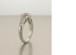
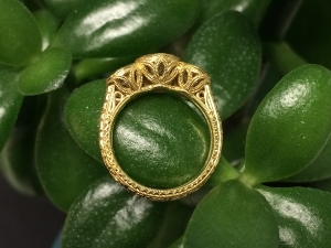
I would value if anyone else who can make suggestions on how to be specific with the design. The first and third are the right basic shape with the bezel and approach of the shoulder to the bezel, but I like when the top of the shoulder is more fluted than either the first or third. What I like of the first (James Meyer) was the "V" internal detail to the shoulder, but asked for an open gallery...not a closed bottom to the bezel. I also was open to the shoulder having slots/piercings to create the "V" shape. We talked about leaves, fleur de lis and three fingers of metal holding the bezel. I want a vintage vibe, but with a cleaner interpretation. Maybe I'm just not being clear.
 

simurgh

Rough_Rock
Joined
Nov 29, 2007
Messages
97
To try to get specific, one main issue is the cad shoulders are convex, and the inspiration rings' are concave, like a cathedral setting (I think you want the shoulders slopping up to the bezel, not arcing in at same height). Also, the part your blue arrow is pointing to needs to go - there's too much extra metal there that takes away from the overall look and make it look more masculine/less vintage. Maybe keep working w your designer as long as you don't pay more, and see if you get close enough?

Eta, do you have a top down cad? That may help people get more specific. One thing I'm thinking is reducing the amount of shiny metal for a more vintage feel. The bars on the side at your red arrows could be removed or milgrain rd which might help.
 

pyramid

Ideal_Rock
Premium
Joined
Nov 10, 2002
Messages
4,607
I think she is trying to design the ring like art deco but the original shape you want is more Edwardian.
 

Garnetgirl

Ideal_Rock
Joined
Dec 7, 2014
Messages
2,140
simurgh said:
To try to get specific, one main issue is the cad shoulders are convex, and the inspiration rings' are concave, like a cathedral setting (I think you want the shoulders slopping up to the bezel, not arcing in at same height).

I agree with this.

Also, in the inspiration rings, the bezel around the diamond is wider than the shank. In the CAD the shank is wider than the bezel and comes around to encircle the bezel. I think this is a factor that contributes to the masculine feel of the ring.
 

rockysalamander

Ideal_Rock
Premium
Joined
May 20, 2016
Messages
5,105
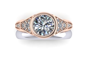
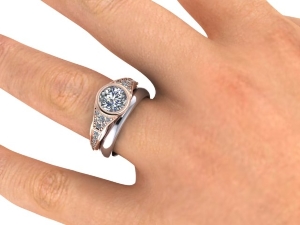
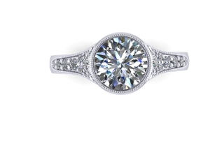
Thank you everyone!! I'm taking notes. Here is the top-down CADD and on a hand.

top_r.jpg

on_hand_22.jpg
 

rockysalamander

Ideal_Rock
Premium
Joined
May 20, 2016
Messages
5,105
In overall design, I like the vibe of Erika Winters (Jin, Helena, Grace) and LAD's Artemis. They are really well-proportioned and graceful. If that helps...
 

lovedogs

Super_Ideal_Rock
Premium
Joined
Jul 31, 2014
Messages
18,019
So I am not a CAD expert, but I agree that this is far from the gorgeous inspiration pics you posted. After looking for a bit I think my biggest issue with the current version is this extra piece of metal (arrow points to it). I am unclear why there isn't just a continuous piece from the bezel --> shank just like the Sholdt and James Meyer designs. As it is now it's 3-4 pieces (the shank itself, bezel, part that comes off bezel and has more stones, and the piece I pointed out below), which just doesn't "flow" as well as your inspiration rings.


thru_p.jpg


ETA: maybe you could point to sholdt and JM designs and literally say "these seems to have 1-2 pieces to them, and the CAD I have has 3-4)." That might be a more clear way to explain the lack of "flow".


I also agree that the part you pointed out (where there seems to be a "bubbling out", needs to be removed. I dont mind the gap part you pointed out per say, but think it would need to be mil grained in order to not stick out as odd.
 

diamondseeker2006

Super_Ideal_Rock
Premium
Joined
Jan 11, 2006
Messages
58,547
You've got to go back to your pictures. That first one has perfect shoulders and shank. One piece. I assume there is a bridge under the stone that connects the two sides of the shoulders. The only thing she is changing is the gallery. Bring her back to the picture and then reiterate the gallery under the stone. Do not settle until she gets it right!
 

Tourmaline

Ideal_Rock
Trade
Joined
Nov 17, 2013
Messages
2,560
I agree with others that a bezel ring not made for a specific stone that won't be taken out, is not a good idea. *Really* not a good idea. This CAD (there's one "D" in it) really looks nothing like your inspiration rings. I don't think you'll be happy with the result. Good luck.
 

Gypsy

Super_Ideal_Rock
Joined
Aug 8, 2005
Messages
40,225
Need head on view.
 

rockysalamander

Ideal_Rock
Premium
Joined
May 20, 2016
Messages
5,105
Thanks everyone. RE: spelling of Cad, the engineers in my office would get a chuckle out of that mistake! Its funny, I lost my family OEC quite a while ago, but not having a ring has bugged me of late. My family OEC will probably never be found, as it was lost in a hurricane swollen river. Believe me, I tried and tried.

Everyone - Thanks so much. I appreciate your willingness to give me some advise on communication with the designer. I thought CAD would make it easier, but oh my is it hard for me to think 3-D. I'm normally quite direct and clear, but this does not seem to be translating in this case.

Tourmaline - Thanks for underscoring the risk. Who knows if I'll find a stone the right size. Or if that new stone will be the right shape for this ring. But, that is a problem for after I get my 3 story Victorian house painted and leaky windows repaired before the snow flies. I do accept that it may never happen and I may need to have new ring made. I can live with that.

Gypsy - I'm not sure which view you mean by head-on. I've got top-down, shoulder view, and straight at the side showing the shape and gallery. Should I have another?
 

the_mother_thing

Ideal_Rock
Premium
Joined
Mar 2, 2013
Messages
6,306
The shoulders or sides of the CAD ring appear more convex (curve up/outward and parallel to the bezel), whereas your inspirations' shoulders appear more concave (curve in then up to the bezel). I think this may be adding to the more "masculine" vs. "feminine" look.
 

rockysalamander

Ideal_Rock
Premium
Joined
May 20, 2016
Messages
5,105
Hmmm...it seems I was much closer in the first set of Cad drawing she sent me (re-posted below). Maybe I need to point her back to these and then tweak things?

Keep the below overall proportion and shape (cathedral). Narrow the top of the shoulder in line with Chrono's Inspiration (last photo below) and Inspiration photo #1 (Closer to ~2/3 to 3/4 the width of the bezel for the shoulder, to my eye). Keep nice pointy "V" at the end of the design from new CAD. Point her back to the Chrono's Inspiration for the final look of the bezel that shows a bezel wrapped around the girdle visible with the shoulder coming from below that point. Would that be clear to ya'll?

FIRST CAD
thru_pt.jpg

side_pt.jpg

top_pt__1_.jpg

KEEP WITHIN THE MILGRAIN, get rid of blobby bit
details_1.png

FINAL BEZEL TO SHOULDER AREA CONNECTION
adrian_view_3.jpg
 

lovedogs

Super_Ideal_Rock
Premium
Joined
Jul 31, 2014
Messages
18,019
I do prefer the 1st CAD, although I would have the vendor make the part that connects to the bezel more narrow in order to avoid the extreme V shape. I really like the last photo you posted as an example of how the shank should connect to bezel :)
 

Gypsy

Super_Ideal_Rock
Joined
Aug 8, 2005
Messages
40,225
First round was comsiderably better.
 

Niel

Super_Ideal_Rock
Premium
Joined
Jul 23, 2012
Messages
20,044
Gypsy|1471215922|4066058 said:
First round was comsiderably better.
Sadly I'm inclined to agree. The bumps in the band seem superfluous and it made it down how a bit 90s which I don't think is the decade you're agter
 

rockysalamander

Ideal_Rock
Premium
Joined
May 20, 2016
Messages
5,105
Thanks everybody. I guess the good news is she is pretty close with her first CAD.so, a lot of the work is done....right? My fault for pushing her away from that shape.
 

rockysalamander

Ideal_Rock
Premium
Joined
May 20, 2016
Messages
5,105
Re: Updated Cad, needs work or an I obsessing?

I sent off an email to the jeweler with a list of very specific features I like and don't like. Thanks again for all the input. Finger's crossed.
 

Gypsy

Super_Ideal_Rock
Joined
Aug 8, 2005
Messages
40,225
Just tell her to scrap the last version and go back to the first and this time to only alter things from the first as a baseline.
 

rockysalamander

Ideal_Rock
Premium
Joined
May 20, 2016
Messages
5,105
Hi all,

I sat in the jeweler's studio for several hours yesterday while she did the design in CAD with me right there. We started from the first CAD and tossed the chunky monkey man's design (thanks Gypsy!). I would love for others to look objectively.For scale, the bottom of the band is 2.5 mm (the previous one was 3.4 mm!) and my wedding band is 4.4 heavy comfort fit.

The bezel looks wider (extra lippy) than it will be in reality. It will be just like Chrono's Tiffany inspiration (last photo in beginning). There will be milgrain around the side stones and bezel. I wonder if the shoulder curve should be more gentle, it kinds squeezes in the middle of the shoulder like a waistline, but we are trying to get my wband to be flush-ish.

Thoughts?

Round 3 CAD
side_9.jpg
top_8.jpg
thru.jpg

Should I add a curl in Gallery like yanaazul's (just the little curl, not the petals)?

yanaazuldavidklass14.jpg
 

Gypsy

Super_Ideal_Rock
Joined
Aug 8, 2005
Messages
40,225
Ohhh I really like that. I think the wasp waist is nice honestly and I'd keep it. No petal IMO it is such a clean design I'd keep it that way without adding anything to the gallery. I have to tell you, I just really love the aesthetic you are going for.
 

lovedogs

Super_Ideal_Rock
Premium
Joined
Jul 31, 2014
Messages
18,019
I love this version!!! Although I love the little curl, I think your ring is sleek and minimalist so I'd keep it as is. I'm excited to see it, I think it will be gorgeous!
 

rockysalamander

Ideal_Rock
Premium
Joined
May 20, 2016
Messages
5,105
Thank you Gypsy and LoveDogs. I needed that! I'm always looking for things with a clean feeling, but with (one or a few) great details done well. The more I look at it, the more I agree with you to keep the gallery totally open. The jeweler will 3-D print the ring today and I can try it on in-person tomorrow. That will allow me to be sure of the proportions (and ring size) on my hand and wedding band. :dance:

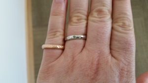
Now, I have to commit to platinum or rose gold. I keep waffling. My wband is platinum (recently polished), but it is really not the best color on my skin, but may be the most practical for my life/job. I wear this rose gold band on my right hand on days I don't wear my great grandma's ring or my great uncle's wedding band.

roseandplat.jpg
 

16ocean

Brilliant_Rock
Joined
May 3, 2009
Messages
702
rockysalamander|1471455344|4066947 said:
The more I look at it, the more I agree with you to keep the gallery totally open. ]


:clap:
-like- the final version & how you are keeping the gallery totally open.

platinum vs. rose gold

Just my opinion I like platinum . . . I think it looks good on your skin.
 

Gypsy

Super_Ideal_Rock
Joined
Aug 8, 2005
Messages
40,225
Platinum.
 

lovedogs

Super_Ideal_Rock
Premium
Joined
Jul 31, 2014
Messages
18,019
I think platinum looks good on your skin, and I'd definitely go with it for the ring. :wavey:
 
Be a part of the community Get 3 HCA Results
Top