shape
carat
color
clarity

Update on ring (to look or not)

Count me in as one who loves the contrast! Take some time to sit with it. Take it to different light sources... I know you wanted this to all be a big surprise, but just know that when this is all sorted for you and the ring is put away for a couple of months, it will be all so exciting to know that everything is official and the ring is just as you intended.
 
Another one that loves the contrast...the contrast sort of brings out the light buttery color of your marquise!

(you have to love it though)
 
I'm not going to be much help...but I just wanted to drop in and say you have very nice hands!
 
I really like the contrast between the center stone and halo. It’s gorgeous!
 
The ring is gorgeous. I, too, love the contrast.
 
I like the current rendering too. It is a big luscious look. If you are considering options: I think you will need fancy yellow melee to match the center stone. This is because melee will never look as saturated as a deeper larger stone. If you went that route I think the white metal head would make less sense than it does now with the white melee. I think now you have the warmer center, cooler melee and metal of the head, and the warm shank. It is balanced. To change the melee to warmer or fancy yellow it will be less balanced in my view.
 
Wow, I love it. Are you going to wear a band with it? Maybe a band with more of the champagne colored diamonds would bring it all together?
 
It's beautiful! I think the contrast works really nicely. I don't think I would find the ring as eye-catching if the melees blended in. Your centre stone looks warm, not yellow.
 
I also really like the contrast. I think it looks intentional and makes the center stone pop
 
Hi all, thanks for the advice on my previous post re whether to look at my engagement ring!

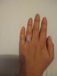
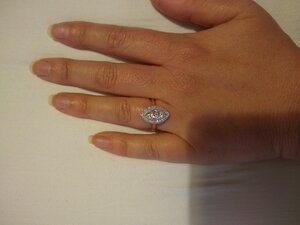
Update: it arrived yesterday. Looked at it in the evening and was absolutely thrilled; the centre stone is gorgeous (bought based on photo and video), and looks huge, and the colour (K) is perfect (white in most lights but shows a gorgeous buttery yellow undertone which is exactly what I hoped for). The setting is also amazing: milgrain bezel around the centre stone, then a halo with 26 single pointers diamonds, in platinum, on a YG band. Also fits perfectly. Yay!

You can sense the but right?! Sneaked a peak again today, in daylight. The halo melee are noticeably whiter than the centre stone, which is not the look I wanted; I want the stones to be roughly uniform in colour, and to all look 'buttery' against their platinum setting.

So I now have to call them tomorrow and ask them to change the melee I checked back through email correspondence and had initially said I wanted the melee in J-L colour to match a J-L centre stone, but didn't mention it after that.. kicking myself for not double checking before signing off.

Anyway, it is going to have to be changed, regardless of cost, just so gutted as it is perfect otherwise. But glad I did look! Lol

Can u post a picture of the ring?
 
I think it looks nice but due to the colour contrast it makes the centre stone look more like a coloured stone rather than a diamond. More of a right hand ring rather than an engagement ring. It’s gorgeous but if you’re worried about colour already then in my opinion the concern will just grow the longer you have the ring.
 
your ring is beautiful! like a shiny leaf on your finger. btw, the contrast is not noticeable to my layman eyes.
 
Thank you everyone for your comments and for the ring love!

I think my options are:

1) Keep as is
2) Switch melee for a fancy light yellow melee
3) Take out melee completely and switch to beading

Switching the centre stone for a higher colour is not an option as I want a lower colour centre stone; I don 't want it to look white. And switching the setting to all YG is also not an option as I want some contrast and like how the platinum brings out the colour of the centre stone (which I think I would lose to some extent if it were all YG)

Option 2 could work as it would give the whole ring a vintage/buttery vibe. But then I lose that contrast and the centre stone won't 'pop' as much

Option 3 again could work as though platinum is white, the fact it is metal would provide less contrast. But then I lose the added sparkle which I just adore (there is something I love so much about bigger flashes of a centre stone combined with those little tiny flashes from the melee; it is a look I have always liked)

So I think I will keep as-is, at least for now. I can always change in a year's time (OH would be fine with this) if after living with it I'm still not sure. However the more I look at it the more I like it; my reservations I think are largely to do with what other people think, which, frankly, is dumb. I just need to own my choice, and perhaps educate people that diamonds do come in different colours ;-)

Wedding-band wise I plan to go with probably a 3mm wide plain YG band; diamonds are a possibility, and haven't been ruled out, I just want the e-ring to take centre stage so would need to try options on and see.
 
Keep it as it OP! It looks intentional and it’s a really lovely combination between the white melee and the buttery center diamond. I would absolutely not do light fancy melee and it wouldn’t match anyway and it will just look off. But you need to be happy with your decision.
 
I think it looks perfect! Tiny melee like that even in K color will look whiter than your center stone. You cannot make a K look like anything but a K. So embrace the color of your stone and leave it like it is! I think it would ruin the ring to try to remove the melee in that halo. I have two light yellow diamonds and both have whiter halos on purpose! Definitely don't use yellow melee. I think any of the changes you are thinking of will make the ring less attractive, to be honest.
 
I need to stop lol
 
no shame at all!

keep them coming, especially in as many lighting scenarios as possible...
 
The only thing that other people are going to think is “wow, that is a stunning ring. I wish mine looked like hers”. It truly is beautiful!
 
It’s really beautiful! Congratulations!
 
no shame at all!

keep them coming, especially in as many lighting scenarios as possible...

I love how it looks so different in different lighting, it's crazy! So cool.

My favourite jewellery does this; I have a couple of I-J coloured diamonds that can look anything from warm and buttery to icy white; and also an awesome colour change stone (man made; cannot remember the name) that can be blue/green/purple depending on the light.

So excited to wear it all the time. Damn having to wait for my divorce!!
 
sure sounds like you are having lots of fun with your new ring!! Im happy for you!! thanks for sharing those images with us!! really helps to see what it was that concerned you, turns out your ring is FANTASTIC!!
 
Consider doing a yellow bezel around the center stone, but leaving the melee and outer metal as is. It would play up the contrast and connect the head with the band more, without compromising the contrast you like.
 
Another vote for leaving it as is! It’s perfect.
 
I think the ring as-is looks completely stunning. It has a classic look about it like some well-crafted antique rings from circa 1900. That is a nice halo. However, you should act according to your own aesthetic, always, and whatever will please you every time your eyes are on the jewel. I do agree that the beading in place of the melee wouldn't be nearly as pretty though.
 
Consider doing a yellow bezel around the center stone, but leaving the melee and outer metal as is. It would play up the contrast and connect the head with the band more, without compromising the contrast you like.

I did think about that briefly but I don't think it's for me. I think that the contrast between the centre stone and bezel would bug me.

Basically I am weirdly fussy, I think..
 
I think the ring as-is looks completely stunning. It has a classic look about it like some well-crafted antique rings from circa 1900. That is a nice halo. However, you should act according to your own aesthetic, always, and whatever will please you every time your eyes are on the jewel. I do agree that the beading in place of the melee wouldn't be nearly as pretty though.

This is great to hear, as I was going for an antique/vintage look, and wanted a centre stone with a distinct tint, that 'popped' against the halo.

I am actually now wondering if maybe I should have gone with really poorly cut melee? That give some sparkle but not much? Which is the look of a lot of antique rings

But once again, I do like that damn sparkle..!
 
I love it as it is and I love @mrs-b idea regarding a gold bezel! I hope you fall in love with it whatever you do =)2
 
GET 3 FREE HCA RESULTS JOIN THE FORUM. ASK FOR HELP
Top