shape
carat
color
clarity

The story of my ring's grading issue

ccuheartnurse

Brilliant_Rock
Premium
Joined
May 22, 2002
Messages
1,915
I can't tell any difference between the 2.14 & 2.28 re: colour. I do like the 2.28 (if that's the one on the right) because it looked like it had more fire which is what I'm drawn to 1st.

I like both styles of rings you are considering. I think 2.8mm is a bit wide personally. Remember, you will have a band which will add more mm width. If you are going the custom route, I'd stick with 2.2-2.4mm.
 

sledge

Ideal_Rock
Premium
Joined
Apr 23, 2018
Messages
5,791
@Julyisjuly maybe this will help you understand the differences in some of these rings. I've tried to keep it as simple as possible.

I didn't note it below but obviously you'd remove the pave -- that is easy peasy and will save you a few bucks to boot. Also, don't stress out too much if you decide to go custom. This isn't a super complex design. Plus WF has a great bench and will hold your hand throughout the process. Not to mention the folks here at PS will be happy to lend a hand. @rockysalamander is a jewel in these situations and helped me tremendously in my own journey to custom create a setting for my fiancee.

Anyhow, the good stuff...

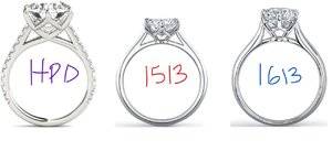
Original (unedited):
Inkedsymp-1513-1613_LI.jpg

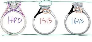
Markups & Comments:
Inked2symp-1513-1613_LI.jpg

1a. Main difference is the HPD design takes and criss crosses at a perfect intersection. You will see how the other Vatche bands do not do this. This creates a visual illusion of the right and left prongs that follow the shape of the diamond pavilion and is very flattering. I tried to show the criss cross in purple lines.

1b. A secondary effect is that it eliminates the small donut (circled in orange) that is present on the 1513 and 1613. If putting a wedding band next to the ring, it will help as the donut being gone will help the band sit flush.

2. The shoulders (pink/magenta) on the HPD ring is more straight up & down than the 1513 or 1613, although the 1613 has the most "swoop" of the three rings. If I were doing custom I think the HPD ring could be improved to use something more curvy like the 1613 shoulder.

3a. The shoulder thickness (black fill in) is thinner on the 1513 & HPD rings and not as full or flared out as the 1613. I actually prefer the thickness style of the HPD/1513 style ring and don't like the flare in the 1613, although I like the curvy flow. My thoughts are to keep the thickness but as noted in #2 use the curvy swoop.

3b. As a by product of the shoulder "swoop" and the thickness noted in 2 & 3a above, there is a triangle that is formed. This will change shapes ever so slightly when these characteristics are changed.

4. The HPD/1613 is noticeably taller than the 1513 ring as shown with the green lines. Many women prefer to set that stone as low as possible. If you look closely at the HPD ring, you will see the ring was custom designed so there is very little clearance between the pointed cutlet of the diamond pavilion and the metal portion of the ring where it criss crosses. On both the 1513 and 1613 there is a visible gap between the metal portion of the ring and the cutlet point. Again, if custom designing I think you'd appreciate the way the diamond is set in the HPD setting as it keeps the stone as low as reasonably possible.
 

LightBright

Brilliant_Rock
Premium
Joined
Mar 11, 2013
Messages
1,563
@Julyisjuly maybe this will help you understand the differences in some of these rings. I've tried to keep it as simple as possible.

I didn't note it below but obviously you'd remove the pave -- that is easy peasy and will save you a few bucks to boot. Also, don't stress out too much if you decide to go custom. This isn't a super complex design. Plus WF has a great bench and will hold your hand throughout the process. Not to mention the folks here at PS will be happy to lend a hand. @rockysalamander is a jewel in these situations and helped me tremendously in my own journey to custom create a setting for my fiancee.

Anyhow, the good stuff...

Original (unedited):
Inkedsymp-1513-1613_LI.jpg

Markups & Comments:
Inked2symp-1513-1613_LI.jpg

1a. Main difference is the HPD design takes and criss crosses at a perfect intersection. You will see how the other Vatche bands do not do this. This creates a visual illusion of the right and left prongs that follow the shape of the diamond pavilion and is very flattering. I tried to show the criss cross in purple lines.

1b. A secondary effect is that it eliminates the small donut (circled in orange) that is present on the 1513 and 1613. If putting a wedding band next to the ring, it will help as the donut being gone will help the band sit flush.

2. The shoulders (pink/magenta) on the HPD ring is more straight up & down than the 1513 or 1613, although the 1613 has the most "swoop" of the three rings. If I were doing custom I think the HPD ring could be improved to use something more curvy like the 1613 shoulder.

3a. The shoulder thickness (black fill in) is thinner on the 1513 & HPD rings and not as full or flared out as the 1613. I actually prefer the thickness style of the HPD/1513 style ring and don't like the flare in the 1613, although I like the curvy flow. My thoughts are to keep the thickness but as noted in #2 use the curvy swoop.

3b. As a by product of the shoulder "swoop" and the thickness noted in 2 & 3a above, there is a triangle that is formed. This will change shapes ever so slightly when these characteristics are changed.

4. The HPD/1613 is noticeably taller than the 1513 ring as shown with the green lines. Many women prefer to set that stone as low as possible. If you look closely at the HPD ring, you will see the ring was custom designed so there is very little clearance between the pointed cutlet of the diamond pavilion and the metal portion of the ring where it criss crosses. On both the 1513 and 1613 there is a visible gap between the metal portion of the ring and the cutlet point. Again, if custom designing I think you'd appreciate the way the diamond is set in the HPD setting as it keeps the stone as low as reasonably possible.

Sledge, you rock!
 

sp3

Rough_Rock
Joined
Sep 15, 2018
Messages
20
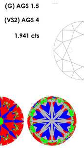
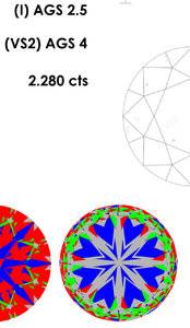
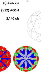
I agree with others here that the color of G 1.94 is very close to the others, so it not worth to spend more money on the G. I cannot tell difference in light performance though. I understand that each stone has its own characteristics based on proportions etc. in terms of optical symmetry, I’m wondering what the experts here think about the heart and V patterns on the three AGS certificates. The comparison seems to suggest that for H&A cut G1.94 has a better optical symmetry than the other two.
580E723E-5F79-41ED-9946-31156F319E9B.jpeg 59F9FA70-8845-4E72-B61C-92FA3B11ED1A.jpeg F01D8384-2986-4A95-B108-6F0C5FA77850.jpeg
 

blueMA

Brilliant_Rock
Joined
Aug 10, 2005
Messages
1,257
The comparison seems to suggest that for H&A cut G1.94 has a better optical symmetry than the other two.
You're correct. By the stats, images and numbers, the 1.94 wins, but that doesn't always equate to real life assessment, although generally a good approximation. Occasionally you'll see extremely lively beautiful expert selection stones or imperfect stones that beat out tight superideal stones. Again, whenever possible, you should always choose your stone in person.
 
Last edited:

sp3

Rough_Rock
Joined
Sep 15, 2018
Messages
20
Thanks blueMA.

@Julyisjuly — My conclusions are
(1) Select the stone that you think performs the best when you see it in person
and
(2) If (1) fails to give a decisive winner, pick the one that is better on paper (I2.28 in this case, no?) because stats and H&A images are generally a good approximation of real life performance. May the odds be ever in your favor.
 

blueMA

Brilliant_Rock
Joined
Aug 10, 2005
Messages
1,257
Thanks blueMA.

@Julyisjuly — My conclusions are
(1) Select the stone that you think performs the best when you see it in person
and
(2) If (1) fails to give a decisive winner, pick the one that is better on paper (I2.28 in this case, no?) because stats and H&A images are generally a good approximation of real life performance. May the odds be ever in your favor.

Well, as I've noted before, I prefer the ASET image of 2.14 over 2.28 in this case. :lol-2:

But generally, yes you're correct. As others have mentioned already, you won't make a "bad" choice amongst very well cut stones such as ACAs. The majority of the general population won't notice the subtle difference. However, if you're the type of person who tends to notice or obsess over detail & perfection or optimal performance, it may be worth taking a deeper look.
 
Last edited:

ccuheartnurse

Brilliant_Rock
Premium
Joined
May 22, 2002
Messages
1,915
Wow, this is like 2003 all over again. :lol-2: Sorry for the back handed remark. A well cut stone is a well cut stone. It's up to the individual to decide what their preference is ( fire over white brilliance over clarity over colour). You can hen peck the death out of a stone but in the end, it's the eyes that tell the tale. I personally love fire more than white light but I do love a balanced stone. It's a process that's taken 17 yrs + & ton of diamond buying to determine my preference. You won't know that after buying 1 stone but you will start to narrow down what you are drawn to & what you are not.
 

Siamese Kitty

Brilliant_Rock
Joined
Feb 3, 2006
Messages
909
@Julyisjuly, I think I like the 2.14 because to me it appears whiter.

But really, you have to pick whichever speaks to you. Like the others said, you cannot make a bad choice. In your gut, you probably know which one draws you in most (if any of these). I just went through this house hunting and I tried to imagine which one I'd be most upset about if it suddenly became unavailable for purchase. Not the same situation entirely, but it helped me realize my heart *was* actually set on one but I was doing my usual hemming and hawing. If the answer is "none," you may want to ask to look at more stones.;-)
 

Karl_K

Super_Ideal_Rock
Trade
Joined
Aug 4, 2008
Messages
14,632
I agree with others here that the color of G 1.94 is very close to the others, so it not worth to spend more money on the G. I cannot tell difference in light performance though. I understand that each stone has its own characteristics based on proportions etc. in terms of optical symmetry, I’m wondering what the experts here think about the heart and V patterns on the three AGS certificates. The comparison seems to suggest that for H&A cut G1.94 has a better optical symmetry than the other two.
The heart image on the report is computer generated from scan data and is not accurate enough for this comparison.
You would have to compare the actual heart images.
Once you get to the higher levels I have my doubts about actual heart images giving a meaningful comparison either.
 

Julyisjuly

Shiny_Rock
Joined
Jul 14, 2018
Messages
126
IMG_3334.PNG IMG_3335.PNG IMG_3336.PNG
@Julyisjuly maybe this will help you understand the differences in some of these rings. I've tried to keep it as simple as possible.

I didn't note it below but obviously you'd remove the pave -- that is easy peasy and will save you a few bucks to boot. Also, don't stress out too much if you decide to go custom. This isn't a super complex design. Plus WF has a great bench and will hold your hand throughout the process. Not to mention the folks here at PS will be happy to lend a hand. @rockysalamander is a jewel in these situations and helped me tremendously in my own journey to custom create a setting for my fiancee.

Anyhow, the good stuff...

Original (unedited):
Inkedsymp-1513-1613_LI.jpg

Markups & Comments:
Inked2symp-1513-1613_LI.jpg

1a. Main difference is the HPD design takes and criss crosses at a perfect intersection. You will see how the other Vatche bands do not do this. This creates a visual illusion of the right and left prongs that follow the shape of the diamond pavilion and is very flattering. I tried to show the criss cross in purple lines.

1b. A secondary effect is that it eliminates the small donut (circled in orange) that is present on the 1513 and 1613. If putting a wedding band next to the ring, it will help as the donut being gone will help the band sit flush.

2. The shoulders (pink/magenta) on the HPD ring is more straight up & down than the 1513 or 1613, although the 1613 has the most "swoop" of the three rings. If I were doing custom I think the HPD ring could be improved to use something more curvy like the 1613 shoulder.

3a. The shoulder thickness (black fill in) is thinner on the 1513 & HPD rings and not as full or flared out as the 1613. I actually prefer the thickness style of the HPD/1513 style ring and don't like the flare in the 1613, although I like the curvy flow. My thoughts are to keep the thickness but as noted in #2 use the curvy swoop.

3b. As a by product of the shoulder "swoop" and the thickness noted in 2 & 3a above, there is a triangle that is formed. This will change shapes ever so slightly when these characteristics are changed.

4. The HPD/1613 is noticeably taller than the 1513 ring as shown with the green lines. Many women prefer to set that stone as low as possible. If you look closely at the HPD ring, you will see the ring was custom designed so there is very little clearance between the pointed cutlet of the diamond pavilion and the metal portion of the ring where it criss crosses. On both the 1513 and 1613 there is a visible gap between the metal portion of the ring and the cutlet point. Again, if custom designing I think you'd appreciate the way the diamond is set in the HPD setting as it keeps the stone as low as reasonably possible.

@sledge
Can't appreciate the help enough. Everyone here is extremely helpful and providing valuable and independent opinions. How lucky am I to land my baby steps on this community!!!
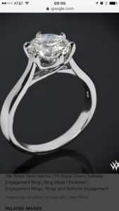
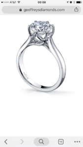
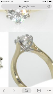
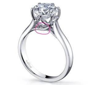
1513 I saw in person is too thin. I think the 119 Royal crown is also a good starting point. Through the crossing I circled in pink, may look uneven and messy? The flat Symphonie style on that part looks cleaner? Hmmmm
I don't know is the picture I saw, I feel the part in pink is also not very polished.
IMG_3337.JPG
 

Stephan

Ideal_Rock
Joined
Feb 13, 2003
Messages
2,917
I love the elegance of the 1513.
And I prefer the fire of the 2.28.
 

rockysalamander

Ideal_Rock
Premium
Joined
May 20, 2016
Messages
5,105
@sledge provided a great summary!

This is an IRL picture of the Legato Sleek, a WF house setting that has some of the elements you like in the others.
https://www.pricescope.com/community/threads/help-with-upgrade-please.245484/#post-4474069

WF did customize a version of the Legato Sleek with 6 prongs for a PS poster. You might ask them for photos of that setting. It was super pretty and had a head like the ones above.

They don't sell this setting alone, but this is a tapered trellis settings that would add to your inspiration if you go custom.
https://www.brilliantearth.com/Petite-Tapered-Trellis-Ring-Platinum-BE142-1151567/
 
Last edited:

kmarla

Brilliant_Rock
Premium
Joined
Feb 8, 2013
Messages
690
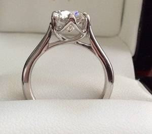
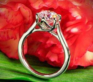
July is July, I actually had the 119 Royal Crown setting in platinum for my 1.98 carat I VS1 ACA and it was beautiful. I had Vatche, through Whiteflash, modify the shank width to 2.1mm. I remember there being a small fee to do this, around $150 or so. I didn’t see any issues with the area in red you circled where the crossover happens. It was elegant and highly polished. The only thing that bothered me about the setting was that the prongs at north and south were wider than the other four. It was more noticeable from the top down view. You can see in pics that they are actually two prongs that blend into one. I didn’t really notice this detail before I received it. If something like this might bother you at all, then I would recommend checking with Whiteflash to see if those prongs can be thinned to match the others. Hope this helps you and good luck in your choice :).


0A288AE1-EBF3-445D-B293-9F6221F96227.jpeg
292B2D63-7E50-4763-917C-29CBF638F7C1.jpeg
IMG_3334.PNG IMG_3335.PNG IMG_3336.PNG

@sledge
Can't appreciate the help enough. Everyone here is extremely helpful and providing valuable and independent opinions. How lucky am I to land my baby steps on this community!!!
1513 I saw in person is too thin. I think the 119 Royal crown is also a good starting point. Through the crossing I circled in pink, may look uneven and messy? The flat Symphonie style on that part looks cleaner? Hmmmm
I don't know is the picture I saw, I feel the part in pink is also not very polished.
IMG_3337.JPG
 

cflutist

Ideal_Rock
Premium
Joined
Jul 12, 2004
Messages
4,052
I have not read this entire thread, am on my way back from a cruise in Antarctica, (first day with decent Internet due to the curvature of the earth and satellite positioning).

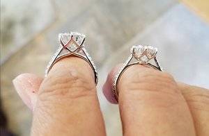
Here is a photo of my HPD Symphonie and Vatche 1514 (pave version of 1513).
Must remember that the CADs are much chunkier than the finished product.

20171014_193920.jpg
 

kal2021

Brilliant_Rock
Joined
Dec 21, 2010
Messages
585
I have not read this entire thread, am on my way back from a cruise in Antarctica, (first day with decent Internet due to the curvature of the earth and satellite positioning).

Here is a photo of my HPD Symphonie and Vatche 1514 (pave version of 1513).
Must remember that the CADs are much chunkier than the finished product.

20171014_193920.jpg

Love your Symphonie! Just went back and read your thread on how you designed it. Simply gorgeous!
 

Siamese Kitty

Brilliant_Rock
Joined
Feb 3, 2006
Messages
909
IMG_3334.PNG IMG_3335.PNG IMG_3336.PNG

@sledge
Can't appreciate the help enough. Everyone here is extremely helpful and providing valuable and independent opinions. How lucky am I to land my baby steps on this community!!!
1513 I saw in person is too thin. I think the 119 Royal crown is also a good starting point. Through the crossing I circled in pink, may look uneven and messy? The flat Symphonie style on that part looks cleaner? Hmmmm
I don't know is the picture I saw, I feel the part in pink is also not very polished.
IMG_3337.JPG

It's not because it was my suggestion, but good grief I LOVE this! If I ever do a solitaire again, this is it. I don't think the portions you highlighted would be noticeable to the naked eye, but I'd confirm your standards and expectations on the front end with whomever you choose to do the setting.
 

Julyisjuly

Shiny_Rock
Joined
Jul 14, 2018
Messages
126
July is July, I actually had the 119 Royal Crown setting in platinum for my 1.98 carat I VS1 ACA and it was beautiful. I had Vatche, through Whiteflash, modify the shank width to 2.1mm. I remember there being a small fee to do this, around $150 or so. I didn’t see any issues with the area in red you circled where the crossover happens. It was elegant and highly polished. The only thing that bothered me about the setting was that the prongs at north and south were wider than the other four. It was more noticeable from the top down view. You can see in pics that they are actually two prongs that blend into one. I didn’t really notice this detail before I received it. If something like this might bother you at all, then I would recommend checking with Whiteflash to see if those prongs can be thinned to match the others. Hope this helps you and good luck in your choice :).


0A288AE1-EBF3-445D-B293-9F6221F96227.jpeg
292B2D63-7E50-4763-917C-29CBF638F7C1.jpeg
Thank you! Very helpful tip! Noted down
 

Dmndsr4evr11

Brilliant_Rock
Joined
Dec 9, 2018
Messages
1,490
@sledge provided a great summary!

This is an IRL picture of the Legato Sleek, a WF house setting that has some of the elements you like in the others.
https://www.pricescope.com/community/threads/help-with-upgrade-please.245484/#post-4474069

WF did customize a version of the Legato Sleek with 6 prongs for a PS poster. You might ask them for photos of that setting. It was super pretty and had a head like the ones above.

They don't sell this setting alone, but this is a tapered trellis settings that would add to your inspiration if you go custom.
https://www.brilliantearth.com/Petite-Tapered-Trellis-Ring-Platinum-BE142-1151567/
@rockysalamander - I love my legato sleek! I actually just had them thin it out to 2mm thickest part from 2.5mm with my recent upgrade.

@Julyisjuly - I can post more pics with different angles if you’d like. As rockysalamander mentioned, you can ask them if they can make it into 6 prongs if that’s what you like.
 
Last edited:
Be a part of the community Get 3 HCA Results
Top