shape
carat
color
clarity

Setting renderings - anything I need to address/ask about?

pierrotlunette

Shiny_Rock
Joined
Jul 22, 2018
Messages
111
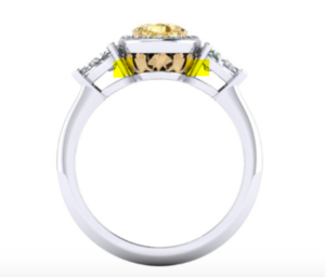
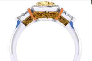
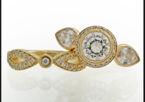
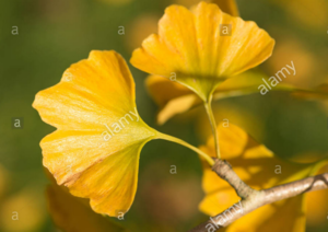
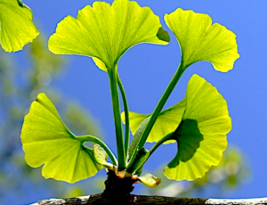
Good morning, all! I received my second set of renderings from Leibish this morning and am generally happy. We asked that they incorporate some small ginkgo leaves in the gallery (these have sentimental meaning for my fiance and me - I was worried they'd be tough to do, but they're nice!). They've kept the profile low and the cup under the stone open, which were also requests. Is there anything else I need to ask about before they proceed? I know some here weren't in love with the side pears, but I prefer those over pave (I'm a pianist and find small stones on the side irritating when I play). We have never designed a ring before, so I want to be certain I'm not missing anything. Many thanks in advance for your help!


Screen Shot 2018-08-28 at 10.27.07 AM.png Screen Shot 2018-08-28 at 10.27.01 AM.png Screen Shot 2018-08-28 at 10.26.50 AM.png
 
I am no help with CADs/renders because I'm not good at "reading" them for potential issues. I just wanted to say I think the ring looks amazing and is going to be gorgeous!!!
 
I like the overall idea. I have a couple of thoughts.

Pear V-prongs can be pokey. You can eliminate much of that by having them build up the shank thickness as it approaches the pear tip. This makes the pear tip integrated into the shank (the pear tip is held by the shank...not a separate V-prong) and you don't have that pokey prong. To do that, you make also need them to tip the pear a bit more downward.

The other benefit of this is that that dip in the shank is a place for your adjacent fingers to rest and the ring tends to be much more self-correcting for spinning.

upload_2018-8-28_10-52-15.png


upload_2018-8-28_10-51-40.png

upload_2018-8-28_11-0-7.png

The prongs they show are vertical and very straight. I think with the shapes of the shank and the design, you'd be good to ask them to make them more rounded and curved.

Also, make sure you have big/open cleaning holes like the ruby and diamond three stone above. Dirty diamonds lose 2 color grades!
 

Attachments

  • upload_2018-8-28_10-50-8.png
    upload_2018-8-28_10-50-8.png
    255.8 KB · Views: 11
  • upload_2018-8-28_10-50-34.png
    upload_2018-8-28_10-50-34.png
    259.8 KB · Views: 10
  • upload_2018-8-28_10-54-26.png
    upload_2018-8-28_10-54-26.png
    63.9 KB · Views: 10
One more thought. The ginkgo leaves don't really flow from the setting. What if they were flowing up from the shank under the finger? This is much more contemporary than your setting, but is showing the idea well.

upload_2018-8-28_11-1-48.png

upload_2018-8-28_11-3-41.png
 
This is very helpful - thank you! I hadn't thought about building up the sides of the shank to minimize finger poke from the pears. I also like the suggestion to round the prongs somewhat. One question: if I ask them to tilt the pear sides down a bit, will that mean they need to change the height of the gallery at all?

Also - I'm also wondering about the way the stones sit into the halo portion. It seems like there is more metal visible than I imagined, but like lovedogs mentioned above, I don't have any real experience translating what I see in a CAD to real life. My assumption is that setting them this way is more secure, but I don't want the overall effect to be heavy in any way. What's the best way to articulate this?


I like the overall idea. I have a couple of thoughts.

Pear V-prongs can be pokey. You can eliminate much of that by having them build up the shank thickness as it approaches the pear tip. This makes the pear tip integrated into the shank (the pear tip is held by the shank...not a separate V-prong) and you don't have that pokey prong. To do that, you make also need them to tip the pear a bit more downward.

The other benefit of this is that that dip in the shank is a place for your adjacent fingers to rest and the ring tends to be much more self-correcting for spinning.

upload_2018-8-28_10-52-15.png


upload_2018-8-28_10-51-40.png

upload_2018-8-28_11-0-7.png

The prongs they show are vertical and very straight. I think with the shapes of the shank and the design, you'd be good to ask them to make them more rounded and curved.

Also, make sure you have big/open cleaning holes like the ruby and diamond three stone above. Dirty diamonds lose 2 color grades!
 
Thank you! I'm really nervous about getting it "right" - I'm also having a hard time making the leap from what I see on the page to real life. :)

I am no help with CADs/renders because I'm not good at "reading" them for potential issues. I just wanted to say I think the ring looks amazing and is going to be gorgeous!!!
 
Everything @rockysalamander said. Right on the money, Rocky, as per usual! :appl:

That solitaire setting Rocky posted with the ginkgo leaves is unreal and the flow is perfect. I do like the one Leibish sent drawings for, but i think the one Rocky posted is far smoother and flows much better.

And I'd definitely smooth out the jump from the band to the tip of the pear; I've had 2 rings with pear sides - one with a sharp jump and one with an integrated slope. The one with the integrated slope was more comfortable, hands down, all day long.
 
I agree - that ring is gorgeous! If we tried to go in this direction, I'm having a hard time envisioning how the leaves built into the shank might work under the side stones. Would it be something like having the larger downward pointing leaf under the center pear, then the larger upward facing leaves flowing under the pear sides?


Everything @rockysalamander said. Right on the money, Rocky, as per usual! :appl:

That solitaire setting Rocky posted with the ginkgo leaves is unreal and the flow is perfect. I do like the one Leibish sent drawings for, but i think the one Rocky posted is far smoother and flows much better.

And I'd definitely smooth out the jump from the band to the tip of the pear; I've had 2 rings with pear sides - one with a sharp jump and one with an integrated slope. The one with the integrated slope was more comfortable, hands down, all day long.
 
One question: if I ask them to tilt the pear sides down a bit, will that mean they need to change the height of the gallery at all?

You don't have to change the height of the center. You are just asking them to tip the pear-tips downward as much as needed to meet the shank that is built up to capture the pear tips.

Also - I'm also wondering about the way the stones sit into the halo portion. It seems like there is more metal visible than I imagined, but like lovedogs mentioned above, I don't have any real experience translating what I see in a CAD to real life.

This is a good observation. They have the melee in the halo placed level with the ground. If you have them tilt the halo and melee 20 degrees downward from level (so they are tipping away from the center), you will have much less metal showing and a prettier side view. Can you see how this ring has the melee and halo tilted away from the center -- so its less metally.

upload_2018-8-28_17-22-42.png

For the ginko leaves. Right now, they have these framed by and separate from the surrounding metal. That is fine if you want that look. I think making them look like they are emerging from the metal makes more sense.

Here, I borrowed a few of those lovely organic looking leaves. The two on the right and left are mirror images. The upper point of the leaves flow into the prong. The center one is rotated upward. This is rough, but can you see how they can make the flow much better? I also tried to show how they could curve the prongs, like they are following the curve of the ginko leaves. The leaves under the pear sides (if there is room), should have a stem coming from behind that prong. The leaves here are also not flat, they are cupped in the middle to make them more realistic. Look at the band above to see that and send that as an example. Othersie, they might look more like shells.

upload_2018-8-28_17-41-30.png
 

Attachments

  • upload_2018-8-28_17-31-6.png
    upload_2018-8-28_17-31-6.png
    419.6 KB · Views: 10
You don't have to change the height of the center. You are just asking them to tip the pear-tips downward as much as needed to meet the shank that is built up to capture the pear tips.


This is a good observation. They have the melee in the halo placed level with the ground. If you have them tilt the halo and melee 20 degrees downward from level (so they are tipping away from the center), you will have much less metal showing and a prettier side view. Can you see how this ring has the melee and halo tilted away from the center -- so its less metally.

upload_2018-8-28_17-22-42.png

For the ginko leaves. Right now, they have these framed by and separate from the surrounding metal. That is fine if you want that look. I think making them look like they are emerging from the metal makes more sense.

Here, I borrowed a few of those lovely organic looking leaves. The two on the right and left are mirror images. The upper point of the leaves flow into the prong. The center one is rotated upward. This is rough, but can you see how they can make the flow much better? I also tried to show how they could curve the prongs, like they are following the curve of the ginko leaves. The leaves under the pear sides (if there is room), should have a stem coming from behind that prong. The leaves here are also not flat, they are cupped in the middle to make them more realistic. Look at the band above to see that and send that as an example. Othersie, they might look more like shells.

upload_2018-8-28_17-41-30.png

Huge improvement. Now swoop the arms up to the pear tips to get rid of the sharp step and you'll have yourself a far more organic looking ring! Gorgeous!
 

Attachments

  • upload_2018-8-28_18-5-29.png
    upload_2018-8-28_18-5-29.png
    347.4 KB · Views: 13
Rockysalamander - I can't thank you enough for taking the time to map out these improvements. I especially like the alternative way of incorporating the leaves into the design and connecting them throughout the gallery and the suggestion re: tilting the halo to reduce the amount of visible metal. I'm going to share with the designer and will keep sharing info. as I have it.

=)2
 
Good morning, all - I have an updated rendering! The jeweler was able to incorporate most of the suggested changes: he tilted the halo down 20 degrees, tilted the side stones down, and built up the sides of the shank. He reconfigured the gingko leaves in the center, but he said there was not enough room to add a leaf under the side stones. It also doesn't look like the center prongs were rounded, so I'll ask about that. I'm attaching the only photos they sent - what do you think?

I'm wondering about two things: it looks like he/she only changed the leaf configuration under the rounded part of the pear but left the remaining leaves under the gallery the same - would it look better to have them in the same alternating pattern? Also, I'm wondering about my initial request to have the pear sit flush with the halo - without seeing the stone, do you think it would perform better with a little more light coming in from the sides?

Screen Shot 2018-09-04 at 9.21.45 AM.png Screen Shot 2018-09-04 at 9.22.56 AM.png Screen Shot 2018-09-04 at 9.22.09 AM.png
 
I think its really close, but those prongs are really bugging me. Those prongs serve two purposes. They are to hold the "round" end of the side-pears and to support the center halo. I think those need to be seperate function. So, instead of a single piece of metal to do both, they make a strut to support the halos (blue). Then, the prong for the pear-sides emerge from the top of the cross-bars...not below them.

upload_2018-9-4_17-20-0.png

Strut under the halo seperate from the prongs. Tuck it under the halo. They will have to sort out the leaves, but I think that actually will help connect the parts.
upload_2018-9-4_17-21-3.png

Prong emerging from the cross-bar. See SK rings below.
upload_2018-9-4_17-22-24.png

They did not show the bottom view, so make sure it looks like this Seven Kirsch ring with big holes under the stones for cleaning access.
upload_2018-9-4_17-14-30.png
 

Attachments

  • upload_2018-9-4_17-14-3.png
    upload_2018-9-4_17-14-3.png
    266.5 KB · Views: 9
Rockysalamander - I was hoping you'd see this and comment! I agree about the prongs and appreciate the explanation about their function. The idea of separating the support jobs by creating a strut to support the halo and a prong to secure the side pears makes good sense to me. I'm sending these images to the jeweler - thank you!

I feel like I may be driving the Leibish bench crazy with my pickiness. :rolleyes2: 
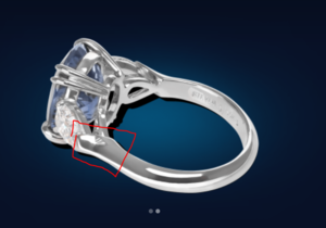
Please tell me that's normal. :)
 
Also - could you link me to that yellow gold ring (the second image in your last post)? I tried to use Google's reverse image search but couldn't find it. I'd like to see another image or side view of that setting, because it looks like a good one to demonstrate the supporting center strut idea to the jeweler in case he/she wants more clarification.

I think its really close, but those prongs are really bugging me. Those prongs serve two purposes. They are to hold the "round" end of the side-pears and to support the center halo. I think those need to be seperate function. So, instead of a single piece of metal to do both, they make a strut to support the halos (blue). Then, the prong for the pear-sides emerge from the top of the cross-bars...not below them.

upload_2018-9-4_17-20-0.png

Strut under the halo seperate from the prongs. Tuck it under the halo. They will have to sort out the leaves, but I think that actually will help connect the parts.
upload_2018-9-4_17-21-3.png

Prong emerging from the cross-bar. See SK rings below.
upload_2018-9-4_17-22-24.png

They did not show the bottom view, so make sure it looks like this Seven Kirsch ring with big holes under the stones for cleaning access.
upload_2018-9-4_17-14-30.png
 
You ring, you be a picky as you like!

The three stone bezel is a J. Briggs & Co setting. Its one of my favorites.
https://www.jbriggsandco.com/rings-...monds-Three-Stone-Halo-p/bezpear3steng-rg.htm

One other detail. You mentioned you wanted the pear flush. I'm not sure if I have this right, but I think you want the girdle of the pear to be just over the inner rim of the halo. Color of the inner rim aside, I think this is what you want (Mark Broumand,https://www.markbroumand.com/3.08ct...haped-diamond-engagement-ring-3646-1d9992485/) .

Based on the renderings, I can't tell if the girdle is sitting on the inner halo or below it. I would really recommend it sits on and slightly covers the inner rim of the halo. If you really want to play up the color of the yellow center, an inner yellow bezel and prongs like the MB setting would accomplish that. In this case, they also have a yellow gold cup under/cupping the stone -- just ignore that. If you look at the view from below, you can see another way to accomplish the struts. You really only need three. Your leaves would be between those pave struts. I would not recommend you pave the donut and struts, so not recommending that, just look at the flow and struts!

3.08ct-Fancy-Light-Yellow-Three-Stone-Pear-Shaped-Diamond-Engagement-Ring-Side-View-300x300.jpg


upload_2018-9-4_20-9-41.png
 

Attachments

  • upload_2018-9-4_20-4-28.png
    upload_2018-9-4_20-4-28.png
    249.7 KB · Views: 7
Sigh - that J.Briggs ring is so gorgeous.

And yes - I did ask them if they could lift the pear up a little bit over the top of the halo (I'd originally asked for them to make it more flush to keep the profile low, but I think I'll compromise the stone's performance if they do). I sent them the photo below as a reference, but I'll also send them the photos of the Mark Broumand ring. It looks like this emerald has more than the girdle up above the halo, while the Broumand is a little lower...but it's hard for me to tell.
Screen Shot 2018-09-04 at 10.00.11 AM.png

I do know there's a partial yellow gold "cup" around the center (although it's definitely not full) in the current design.

Is this at all similar to what you were thinking re: the support struts and the side pears coming out of the top of the ring? The sides are also included in the halo in this particular example, which I don't want, but I wondered if the basic structure was what you had in mind:Screen Shot 2018-08-20 at 10.07.32 AM.png

Again - I can't thank you enough for your help with this!
 
I'm probably being way too picky, but I feel like the pear is not centered. It needs to be centered more on the shank of the ring. And in the cads at least the halo is too "pointy" if there is a way to space the diamonds to reduce the metal at the pointed end of the stone. I also agree with suggestion of making the halo angled slightly away from the stone (more graceful), and and also angling the pear side stones so that V prong is integrated with the shank of the ring. The last thing I just think would look better. I have no idea whether it would be more comfortable, as the existing design has a "dip" that might prevent rubbing.

The ginko leaves are a really pretty design piece.
 
Partygypsy - thank you for weighing in and asking about the center stone's placement. I *think* I see what you're talking about and will call it to the jeweler's attention. I'm okay with the pointy look of the halo, although I agree with you about minimizing the look of all that metal. I'm going to ask if there's any way to further decrease that without compromising the security of the stones. Thanks for your help!


I'm probably being way too picky, but I feel like the pear is not centered. It needs to be centered more on the shank of the ring. And in the cads at least the halo is too "pointy" if there is a way to space the diamonds to reduce the metal at the pointed end of the stone. I also agree with suggestion of making the halo angled slightly away from the stone (more graceful), and and also angling the pear side stones so that V prong is integrated with the shank of the ring. The last thing I just think would look better. I have no idea whether it would be more comfortable, as the existing design has a "dip" that might prevent rubbing.

The ginko leaves are a really pretty design piece.
 
Okay folks - new rendering (#3) . They didn't really send any 3-D CAD images, but the jeweler did address a couple of things. First, he did take rockysalamander's directive and create a center support strut for the halo and then structure the top of the ring so that the side pears come out of the halo. This doesn't look exactly like what rockysalamander suggested, but the look of the prongs is minimized.
Screen Shot 2018-09-06 at 3.52.38 PM.png

He also addressed the ginkgo leaves in the gallery - but I'm not sure I like the solution. i really like the section under the round part of the pear,
Screen Shot 2018-09-06 at 4.02.58 PM.png

but I think the alternating ginkgo leaves around the remainder of the gallery look a little goofy:
Screen Shot 2018-09-06 at 4.03.03 PM.png


I think they look better in the second set of renderings: Screen Shot 2018-09-04 at 2.11.07 PM.png

They might also work if they went around the remainder of the gallery in pairs, with the stem connecting either at the bottom of the halo or the bottom of the gallery:
Screen Shot 2018-09-06 at 4.06.54 PM.png

I'd be so grateful if you guys would weigh in on this. I'm ready to get this thing into production and on my finger! :) :)
 

Attachments

  • Screen Shot 2018-09-06 at 4.06.54 PM.png
    Screen Shot 2018-09-06 at 4.06.54 PM.png
    781 KB · Views: 11
Gotta cook dinner, but throwing out a few images so consider for the gallery. Just translate to ginkos.

What if the leaves overlapped and were more east/west? You would have that lovely upper curve and V really emphasized.

upload_2018-9-6_17-57-53.png

What if you alternated a ginko leaf and a bezel set round? Add a round each under the pear like the Briggs setting.
http://blog.cheyenneweil.com/2012/04/ginkgo-eternity-rings/#more-1561

Instead of applique of the leaves in the gallery, maybe engrave on the shank? You'd have to flatten the shank for this.
84b29013e26b4f9d9bd905ea20250862.jpg


one or two large leaves that work in the gallery with a more integrated style?
https://www.greenlakejewelry.com/gallery/gallery_iframe.aspx?ImageID=52714

Large in the middle and then put some smaller ones? Maybe mixing up the size and orientation to make it more natural will make it flow better?
upload_2018-9-6_18-4-56.png

Ginko grow from a single point in a cluster if the real leaf representation is important.
upload_2018-9-6_18-7-35.png
 

Attachments

  • upload_2018-9-6_18-6-51.png
    upload_2018-9-6_18-6-51.png
    599.6 KB · Views: 6
Thanks for responding so quickly, RockySalamander - I almost feel like this ring is as much yours as mine. ;-) The more I look at the original east/west design the jeweler first suggested (in the pointed part of the gallery; I definitely prefer the current look of the rounded end), the more it's growing on me (and it echoes your east/west suggestion above). I'm challenged to envision the ginkgo overlap, but I think a little air between the leaves (especially since they'll be pretty tiny) is okay. With each side flowing toward the point, I think it works okay. (Can you tell I've reached the exhausted point with these decisions??):eek2:
Screen Shot 2018-09-04 at 2.11.07 PM.png
 

Attachments

  • Screen Shot 2018-09-06 at 4.03.03 PM.png
    Screen Shot 2018-09-06 at 4.03.03 PM.png
    130.1 KB · Views: 10
  • Screen Shot 2018-09-06 at 3.52.38 PM.png
    Screen Shot 2018-09-06 at 3.52.38 PM.png
    183.7 KB · Views: 8
GET 3 FREE HCA RESULTS JOIN THE FORUM. ASK FOR HELP
Top