shape
carat
color
clarity

Need help. Got my cushion three stone ring but it's set too low, and I have one other concern.

allaboutcushions

Rough_Rock
Joined
Apr 10, 2007
Messages
59
Hello PS,
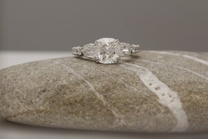
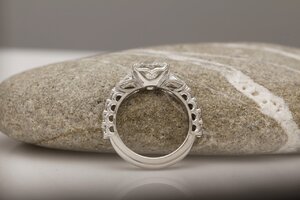
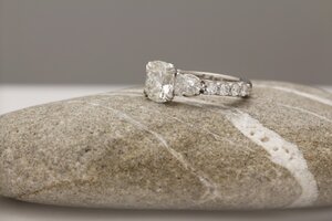
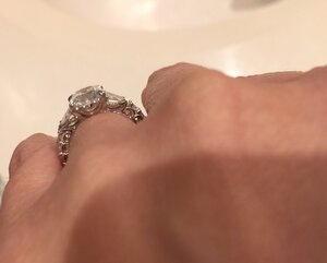
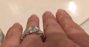
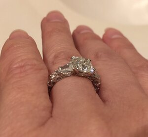
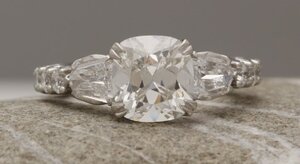
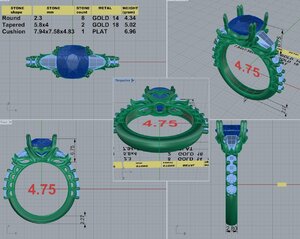
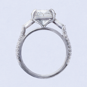
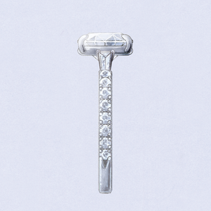
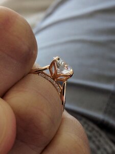
I finally got my three stone cushion ring from David Klass today and while much of it looks amazing in person, I have two concerns. First and most important, the main diamond is set too low. I measured it with my digital caliper and it is showing as 5.54 mm high. The original CAD had it at 5.7 mm and I had asked to change that to 6 mm. I went with 6 mm because I own a three stone aquamarine setting that is set at 6 mm high, so while low, it still appeared high enough to me and wears comfortably. Now seeing it in person, I'm pretty sure that a half mm increase might still be too low. My diamond is 4.83 mm deep and to me at 5.54 mm, it looks like my diamond is literally sitting on my finger. My old cathedral setting was way too high for sure, but this really low height makes my diamond look much smaller from all angles in my opinion (not just from the top/front). What would you all consider a medium height for my size diamond? The dimensions are 7.94 x 7.58 x 4.83. It is a 2.06 ct cushion. I asked if 6.75 mm might be possible, but I don't want to be Goldielocks and go from too low to too high. I also don't want to have any more changes after this.

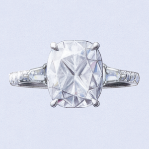
Second, what do you all think of the metal showing behind the shield sidestones. My original design and inspiration photos did not have metal baskets showing behind the sidestones but looking back at the CADs that were sent to me, those do. However, I didn't realize the metal would be showing. I thought it was just shown in the CAD so I could see where everything was. I figured that during the setting process, the basket would be fitted to the sidestones like I've always seen on the majority of rings. In fairness to David, the more I looked at the pics with the metal showing, it kind of grew on my and I started to think that I might really like it in person. I thought it might make my ring look unique and the edges of the shield would be softer and curved instead of straight like the rest of the aspects of my ring. It's also much more subtle in real life. However, looking at it in person, it may take away from the shields by making them appear more like pears, which aren't as rare. I'm also not sure if it makes the sidestones look too big and again make my center stone look smaller. I had emailed my concern about the metal right after I got the ring and David promised me if I wasn't happy with the look/effect that I could send it back and he would adjust it at no charge to me.

This has been a long process and David has provided me with wonderful customer service, but I really wish this was done and I was 100% happy with the final product.

Any help/advice would be much appreciated. I've attached pics/CADs as appropriate. Please help!
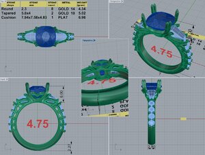
55970-QUAD.10.14.19.jpg thumbnail_55970-5.jpg thumbnail_55970-3.jpg thumbnail_55970-4.jpg

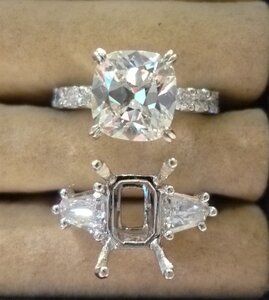
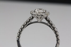
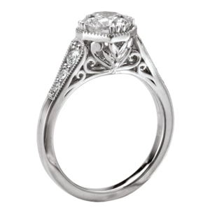
These are two of the inspiration pics from rings he previously made and neither of these had the metal showing behind the sidestones. Though those were rounds and trapezoids.

249F480F-35C1-4366-AF31-454504D26DE4.jpeg threesdiamond2 (2).jpg
 

elle_71125

Ideal_Rock
Premium
Joined
Jan 29, 2012
Messages
6,202
I don’t have any helpful input but I saw this on Instagram and I LOVE it! :kiss2:
You did a great job designing the ring. I love the profile view too.

Can you post a picture of it on your hand? One from the top and one from the side. That may help.
 

allaboutcushions

Rough_Rock
Joined
Apr 10, 2007
Messages
59
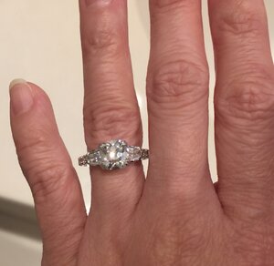
These are the best I could take w/ my iphone. Don't get me wrong, with the exception of those two issues I mentioned, the ring is gorgeous. I really wish I loved this ultra low setting but I'm shocked by how much smaller it makes my center look. While I wouldn't ever want to go back to the cathedral peg head setting I had, this makes my diamond look flat. I'm going to look for a pic of how my diamond looked on my hand in the old setting. Not sure if I still have any.


IMG_2192.jpg IMG_2193.jpg IMG_2196.jpg IMG_2197.jpg
 

allaboutcushions

Rough_Rock
Joined
Apr 10, 2007
Messages
59
BTW, David kindly sent me an email back letting me know he will recast in order to adjust the height and metal baskets so they don't show as much under the shields but I need to tell him what the new height should be. I also asked his opinion in my reply but haven't heard back.

Any thoughts on 6.75 mm high?
 

rockysalamander

Ideal_Rock
Premium
Joined
May 20, 2016
Messages
5,105
Ypu only posted 2.5 hours ago, and most US folks are still at work. Our UK friends are probably asleep at midnight and our aussie members are probably just ready for lunch. Give folks a chance to read and respond. People want to help, but it's not instantaneous.
 

elle_71125

Ideal_Rock
Premium
Joined
Jan 29, 2012
Messages
6,202
You’ll definitely get a lot more notice in the morning. PS is really quiet on the weekends.

Now that I’ve seen the hand shots, I can see why you feel the center is set too low. There are a lot of people that would set it low on purpose (less likely to get banged up, more comfortable, etc) but it’s definitely a big adjustment coming from a cathedral setting.
 

Slickk

Ideal_Rock
Premium
Joined
Jan 3, 2013
Messages
4,993
Beautiful stone and very pretty design. Love the bullets!
I like a low set stone for the reason that PP stated. But, I wonder if the center stone would look higher if the side melee were lower to the shank/finger. Your shank stones are higher than usual, imo, and I think maybe if they were lower the center three stones would stand out more. I also wonder what band you will pair with it.
I’m sure DK will tweak this and you’ll hopefully be very happy with it.
 

allaboutcushions

Rough_Rock
Joined
Apr 10, 2007
Messages
59
Beautiful stone and very pretty design. Love the bullets!
I like a low set stone for the reason that PP stated. But, I wonder if the center stone would look higher if the side melee were lower to the shank/finger. Your shank stones are higher than usual, imo, and I think maybe if they were lower the center three stones would stand out more. I also wonder what band you will pair with it.
I’m sure DK will tweak this and you’ll hopefully be very happy with it.

The round sidedtones are 4.5 or 5 points each and from my original ring, which my DH asked me to include in the new ring. I actually love the way they are set with the scalloped arches. I have a rose cut diamond eternity band that is just as thick/high and I do not mind the feel of the diamonds against the sides of my finger. Also the rounds look much bigger in the pic than in real life. The metal peeking out from behind the shield sidestones does make them look bigger/chubbier. I think those looking bigger actually affects the way my center stone looks more than the rounds due to proximity. But thanks for replying an offering a suggestion.

As for pairing a wedding band, I have accumulated a ridiculous number of stacking bands over the years and I bought a platinum spacer to protect both the ring and band(s). I’ll post some looks later. I also don’t mind wearing the ering alone on my left hand and my wedding bands stacked on my right hand.
 

diamondseeker2006

Super_Ideal_Rock
Premium
Joined
Jan 11, 2006
Messages
58,547
The ring is very pretty but I agree the center could be a tiny bit higher. Your ring designer is the one who should be recommending the height, so hopefully they will advise you. I do think the round stones could be set lower, and I'd want that changed.

I honestly don't understand the part about "metal baskets showing behind the sidestones".
 

allaboutcushions

Rough_Rock
Joined
Apr 10, 2007
Messages
59
The ring is very pretty but I agree the center could be a tiny bit higher. Your ring designer is the one who should be recommending the height, so hopefully they will advise you. I do think the round stones could be set lower, and I'd want that changed.

I honestly don't understand the part about "metal baskets showing behind the sidestones".

Hmmm. Not sure if it's because the pics aren't close up enough. Also, here is a comparison with the original rings. You can see the shields in the original setting without the metal showing behind the girdle--can you see the straight edges? The leaf baskets under the shield peek out the side and give a more rounded shape. At first I was intrigued by that effect but IRL it almost makes them look too chubby next to the cushion.

thumbnail_55970-5 (2).jpg P1040531 (3).JPG

Can you see the difference now?

I did send an email asking David his opinion but I also suspect he will simply want me to make a final decision about how much higher to go, and I understand that. I was curious if others could share their experience with ring heights. At this point, I know the current height of 5.54 mm is too low for my tastes. It just looks flat against my finger to me. I was hoping to get a little advice on how much higher to go or what would be considered medium height.
 

nala

Ideal_Rock
Premium
Joined
Oct 23, 2011
Messages
7,055
I see what you are saying about the metal that surrounds your side stones. It does mnahe them appear like pears and does not showcase them for their shape. Yes. Ring is set too low that is seems to blend in. Maybe raise to 6.25?
 

allaboutcushions

Rough_Rock
Joined
Apr 10, 2007
Messages
59
I see what you are saying about the metal that surrounds your side stones. It does mnahe them appear like pears and does not showcase them for their shape. Yes. Ring is set too low that is seems to blend in. Maybe raise to 6.25?

Thx, so I’m not crazy in that the shape looks different.

I’m leaning toward a height of either 6.5 or even 6.75 cuz I do not like how it looks flat on my finger right now. Also I don’t wear my ering 24/7. I take it off when I am doing stuff around the house like dishes, cleaning, gardening or playing with my kids and sleeping. I work in an office at a desk so low risk wearing it there.

I’m a little surprised how much everyone dislikes the arches with the round sidestones or rather the height of them. If I didn’t have that height, you wouldn’t be able to see the shape of the arches, which I actually love. Go figure everyone wants me to change one of my favorite aspects of the ring. Btw, the other thing I love are the claw prongs holding in the shields and cushion. Those look awesome. So tiny and pointy—just love them.
 

Bonfire

Ideal_Rock
Premium
Joined
Feb 22, 2014
Messages
4,238
Pretty ring, but I agree it sits a bit low. Are you thinking of deleting the leaf baskets under the shields altogether? The top down view shows a lot of metal which fattens the look of the shields and blends in too much with your cushion. I love the double prongs! I would defer to David’s suggestion as to height once you communicate to him your preferences. Keep us posted, it’s a beautiful ring!
 

GliderPoss

Ideal_Rock
Premium
Joined
Sep 25, 2008
Messages
2,936
Personally I love the low-set look for many reasons including the practicality of it, but I agree the shield shape of the side stones is lost due to the metal supporting it.
 

KKJohnson

Brilliant_Rock
Premium
Joined
Aug 15, 2017
Messages
1,834
mine is 8.2 so I say go high with the 6.75.
 

tyty333

Super_Ideal_Rock
Premium
Joined
Dec 17, 2008
Messages
27,234
The ring is very pretty but I agree the center could be a tiny bit higher. Your ring designer is the one who should be recommending the height, so hopefully they will advise you. I do think the round stones could be set lower, and I'd want that changed.

I honestly don't understand the part about "metal baskets showing behind the sidestones".

@diamondseeker2006
I think she is referring to seeing the metal along the sides of the shields from the top-down view. It sort of changes the shape of the shields and looks
somewhat bulky IMO. Correct me if I'm wrong @allaboutcushions . I think your side view example photos are confusing everyone.

I think your center does need to go higher but I cant advice to how high.
 

diamondseeker2006

Super_Ideal_Rock
Premium
Joined
Jan 11, 2006
Messages
58,547
@diamondseeker2006
I think she is referring to seeing the metal along the sides of the shields from the top-down view. It sort of changes the shape of the shields and looks
somewhat bulky IMO. Correct me if I'm wrong @allaboutcushions . I think your side view example photos are confusing everyone.

I think your center does need to go higher but I cant advice to how high.

Thank you, tyty!

If you don't want to see the metal on the sides of the shields from the top view, you will have to remove that top metal piece on both sides and just have the prongs hold the stones in at the ends. You'll lose the petal look from the side view, but that's the only way to solve the problem.

Regarding the rounds on the shank, when you look at the very first picture with the ring on your finger, the shank sticks out too far on your finger. That's why I was saying those stones need to be lowered. If you plan to wear a wedding band at all, the bottom of that e-ring shank really won't be visible to you most of the time anyway.
 

allaboutcushions

Rough_Rock
Joined
Apr 10, 2007
Messages
59
Thank you, tyty!

If you don't want to see the metal on the sides of the shields from the top view, you will have to remove that top metal piece on both sides and just have the prongs hold the stones in at the ends. You'll lose the petal look from the side view, but that's the only way to solve the problem.

Regarding the rounds on the shank, when you look at the very first picture with the ring on your finger, the shank sticks out too far on your finger. That's why I was saying those stones need to be lowered. If you plan to wear a wedding band at all, the bottom of that e-ring shank really won't be visible to you most of the time anyway.

Thank you Tyty and Diamondseeker. Tyty, yes, I was talking about the top view regarding the metal behind the shields. I got the revised CAD from David and per his notes, Diamonseeker you are correct that I would have to remove the top part of the leaf holding the shields. Considering I am pretty easy on my rings, I think relying on just the five prongs will be fine. It's not like the leaves were providing any protection with the girdle of the shields since they didn't line up like a straight basket would have. I suppose if I had any concerns I could have him change them to straight line baskets like the original setting they were in (no metal showed).

thumbnail_55970-QUAD.jpg

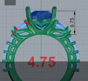
Here is the revised CAD (still shows the leaves that I need to have removed). I haven't yet asked about lowering the round stones. If I didn't go with the arches, I would consider a lower micro U-prong that I saw on this other DK ring. I think though with all of these changes, I'd probably need to pay some type of design change fee. It's like I'm recreating a new ring and that wouldn't be right unless I cover the expense.

klass u prong sidestones.jpg
 

Dreamer_D

Super_Ideal_Rock
Joined
Dec 16, 2007
Messages
25,415
Does it feel comfortable between your fingers when you wear it?

My diamond is set about 7mm high.

I like the petal detail on the shields, it matches the central basket.
 

allaboutcushions

Rough_Rock
Joined
Apr 10, 2007
Messages
59
Does it feel comfortable between your fingers when you wear it?

My diamond is set about 7mm high.

I like the petal detail on the shields, it matches the central basket.

Thanks. Honestly, in real life, it's really hard to even see the profile detail of the leaves. I think I'm beginning to understand why folks just go with the straight edge baskets. Do you feel like the 7 mm is too high? I tried on some of my friends/coworkers rings on at work today and measured their heights. One measured 6.84 high and I liked the way it looked much better than mine right now.

The round sidestones don't feel bad to me--I just don't really notice it. It's not like the resting state of my fingers are locked tight next to one another all day long. Usually they are slightly apart--isn't that how most people's hands/fingers sit naturally? I don't like to sleep with any jewelry or a watch. I have a fitbit but never sleep with it even though you're supposed to if you want the sleep analysis. Like I said, I have a couple of eternity bands, one of which is a pretty thick band with rose cut diamonds. I guess I'm kind of use to diamonds and prongs rubbing on the side of my fingers. Not to mention I've seen a ton of thick eternity bands on this site--even thicker than how my round sidestones look, so I'm not the only one.
 

Bonfire

Ideal_Rock
Premium
Joined
Feb 22, 2014
Messages
4,238
The height looks better and could even go a bit higher if you like. From the top view I still see metal that distorts the shape of the shields. What do you think?
 

allaboutcushions

Rough_Rock
Joined
Apr 10, 2007
Messages
59
Yes, David said that if I kept the leaves that due to the "wrapping" of those end prongs, a little metal will show. That's why I think I have to either get rid of the leaf all together or switch to a straight edge basket for the shields. I kind of feel like I need that straight edge basket to maintain the integrity/strength of the ring since that will hold those three stones together. Right?
 

headlight

Ideal_Rock
Joined
Nov 2, 2003
Messages
3,294
I think the ring is gorgeous and perfect as is. I think the way he did everything is based on executing that design perfectly. The elements you are comparing with won’t work with this ring and vice-versa. To be perfectly honest, I don’t think you like this design... I think you like the idea of this design but you don’t like what is involved in having this design. If you change the height of the center you lose the continuous flow. If you alter the metal you see from the side stones, you ruin the consistent flow of that element running throughout the design.
Personally, I think you will not like it when he redoes it to your changes. I think it will be a mix-match mess of elements that don’t work together.
This ring is a excellent example of what custom is... something completely integrated where there is no element whatsoever of findings (components) that were put together to create a mounting.
Are you willing to live with it for a while? I think you may come to love it. I think you are not used to it.
It’s gorgeous and such a standout in design, execution, and craftsmanship and I honestly hope you will throw out all your previous ideas and preconceptions of everything that’s come before it and look at it with fresh eyes for the incredible ring it is. Honestly, it’s absolutely stunning.
 

OoohShiny

Ideal_Rock
Premium
Joined
Apr 25, 2014
Messages
8,228
Personally speaking, I think a low setting is the best option - less chance of smacking it on something, catching in clothing, spinning on your finger when cold, etc. I just think these settings with a stone sticking out miles from the shank look like an accident waiting to happen!

Personal taste is just that, though - so you should get what you want :)
 

rockysalamander

Ideal_Rock
Premium
Joined
May 20, 2016
Messages
5,105
Here's how I would suggest a way to retain the leaf, but hopefully solve the visibility.

Change the two prongs indicated to come off the adjacent prong (red). This will eliminate the bottom part of the prong on the upper end of the shield and integration with the leaf on the lower end of the shield. The leaf is inserted under the shields like a applique. They attached to the remaining prongs, but are no longer structural. This will simplify the prongs and I think solve the issue because now DK can tuck the leaf fully under the shields. It may be two leaft (one on each side) or one wider leaf.

Unless DK says otherwise, you don't need the bars that run along the long-side of the shields. So, you don't have to add them. It might look odd to have a linear element in such a curvy design. I would just use the prongs to support the shields.

Alternatively, replace the leaf with more arcs. But, I'd still simplify the prongs. It will show the shapes more cleanly.

For height, based on what you've stated, I would likely raise the stone to 6.8 or so. It seems you want it to be raised up and distinct, rather than a continuous arc.

1574340884187.png


Not the best example, as I'm at work, but its like treating the leafs like the curls under gallery here. You can only see these from the side. From the top, they are below and inward of the edge of the shank/bezel.

1574340620295.png
 

allaboutcushions

Rough_Rock
Joined
Apr 10, 2007
Messages
59
I think the ring is gorgeous and perfect as is. I think the way he did everything is based on executing that design perfectly. The elements you are comparing with won’t work with this ring and vice-versa. To be perfectly honest, I don’t think you like this design... I think you like the idea of this design but you don’t like what is involved in having this design. If you change the height of the center you lose the continuous flow. If you alter the metal you see from the side stones, you ruin the consistent flow of that element running throughout the design.
Personally, I think you will not like it when he redoes it to your changes. I think it will be a mix-match mess of elements that don’t work together.
This ring is a excellent example of what custom is... something completely integrated where there is no element whatsoever of findings (components) that were put together to create a mounting.
Are you willing to live with it for a while? I think you may come to love it. I think you are not used to it.
It’s gorgeous and such a standout in design, execution, and craftsmanship and I honestly hope you will throw out all your previous ideas and preconceptions of everything that’s come before it and look at it with fresh eyes for the incredible ring it is. Honestly, it’s absolutely stunning.

Thanks for all your kind words about the design. i always wanted an integrated head design as I really disliked how my old ring had a peg head plopped down on it. I’ve also always wanted a three stone with unique sidestones. What I learned from this process is that I definitely do not like ultra low settings. I also don’t want the two sidestones to sit right next to my center. I still want my cushion to remain the star of the show and to just have a couple of supporting characters. I think there are aspects to my current ring design that may have been “over engineered” that are causing it to appear bulky and possibly detracting from my gorgeous cushion. That is why I’m reconsidering the design based on the feedback on here. Here are some pics of a ring drawing by Kwiat that would set my cushion fairly high but integrated with the ring and they use bullets that are set about halfway down as well as round pave on the side. Thoughts? 0729A1F7-96AE-4974-BAFD-BD52A823579A.png 76D9A6EA-540F-422D-A475-D1F69475EDBB.png D64D2D1F-FF42-43C9-9006-458C35769204.png
 

allaboutcushions

Rough_Rock
Joined
Apr 10, 2007
Messages
59
I would still want to keep my double claw prongs on the center cushion but since this has the baskets for the sidestones, I think my shields will be okay being held by three prongs like salamander suggested. Also that might help show off the shield shape. This design has all straight edge baskets, would it look weird if I had my “V” curve basket for the center? Also I only have four rounds for each side.
 

rockysalamander

Ideal_Rock
Premium
Joined
May 20, 2016
Messages
5,105
Thanks for all your kind words about the design. i always wanted an integrated head design as I really disliked how my old ring had a peg head plopped down on it. I’ve also always wanted a three stone with unique sidestones. What I learned from this process is that I definitely do not like ultra low settings. I also don’t want the two sidestones to sit right next to my center. I still want my cushion to remain the star of the show and to just have a couple of supporting characters. I think there are aspects to my current ring design that may have been “over engineered” that are causing it to appear bulky and possibly detracting from my gorgeous cushion. That is why I’m reconsidering the design based on the feedback on here. Here are some pics of a ring drawing by Kwiat that would set my cushion fairly high but integrated with the ring and they use bullets that are set about halfway down as well as round pave on the side. Thoughts? 0729A1F7-96AE-4974-BAFD-BD52A823579A.png 76D9A6EA-540F-422D-A475-D1F69475EDBB.png D64D2D1F-FF42-43C9-9006-458C35769204.png

The ring you designed is exuberant, detailed and intricate. This is a little black dress. What suits you better?
 

allaboutcushions

Rough_Rock
Joined
Apr 10, 2007
Messages
59
Thats a fair question and that’s probably part of the problem. I like both ball gowns n little black dresses. I see the beauty in both. While I designed all those elements for the ring, it’s like Headlight stated, I didn’t realize the effects of some of those elements. If simplifying and streamlining the design will ensure that my cushion pops and you can tell what the sidestone shape is then I’m willing to go less “fancy.” Also, as you can tell I really like floral elements. If my leaves don’t work then at least I get a tulip shaped head for my center!
 

allaboutcushions

Rough_Rock
Joined
Apr 10, 2007
Messages
59
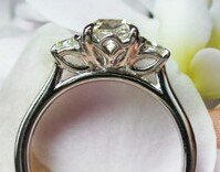
This was another tulip like leaf head I was considering but not sure if it would set the cushion too high.


17484FE5-444B-4574-B05B-3542393B92D7.jpeg
 
Be a part of the community Get 3 HCA Results
Top