shape
carat
color
clarity

"Jedi" red spinel, cobalt spinel, and diamond ring ideas

momofive

Brilliant_Rock
Joined
Mar 13, 2011
Messages
1,040
If you're going to use the 2 large cobalts, I would like it EW. I would also like to see it without the 2 large cobalts. Just for kicks.
 
Joined
Jan 20, 2012
Messages
4,144
Not suggesting that -- maybe a belt buckle then? The original is lovely! The bigger spinels at E/W creates a more snowflake-like appearance to my eye -- with less elongation. I am no help! Vs. your 9:09 post, I definitely like the inner diamond halo plus trilliants best.

I am not so good at this part -- don't listen to me too carefully! I agree with @icy_jade above!

Usually this part comes to me quite quickly, but sometimes it can be a struggle (especially when you're forcing shapes and sizes you didn't necessarily want). But I'm even worse when giving recommendations to others on designs... that's why I've been sort of mum on your pendant thread. I want so badly to participate, but I just don't have the chops!
chute.gif
 
Joined
Jan 20, 2012
Messages
4,144
"Entourage"? :think:


I think for a better star effect look, start with this design and tweak. I would keep the 2mm pair NS and the 3mm pair EW. Instead of having the 2.5mm at the corners, I'd make the 2.5mm flank the 3mm stones. Thus the EW sides would look more rounded and less distracting. Assuming the smallest stones are 1.5mm (my guesstimate), starting from the 12 o'clock position you'd have
2 1.5 1.5 2.5 3 2.5 1.5 1.5 2 1.5 1.5 2.5 3 2.5 1.5 1.5
Then readjust trillions. I'm going to be super busy the next few days, so that's all I can suggest now.

Honestly, even if you don't optimize the layout to minimize the distraction, it will be a beautiful ring that will drive many of us into an envious frenzy when it is revealed!

Personally, I've learned to be super sure what I want to do before turning it over to a CAD designer so that I have no regrets, but maybe I'm just way more picky than even the average PS'er when it comes to color and layouts.

This is an interesting tweak! I'm going to try it in a composite... thank you!!
 
Joined
Jan 20, 2012
Messages
4,144
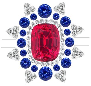
Have you thought about your shoulder/band design? I’m not great at design, but I’m thinking your first option would work well since the eye will still be drawn E/W by the shoulders of the band. That would create balance in my mind between the slight stone size difference of the N/S stones. You could even add some type of design element to the shoulders if you were looking for more balance. I love an elongated design, so I wouldn’t have noticed the slightly larger N/S stones myself .
Here are lines drawn for the band to give a better idea of what I’m trying to describe.
7497E26E-3BB0-450F-8AD9-4BDE347C2A20.jpeg

I too love an elongated design! And, yes, I figured the band would give the 3 o'clock and 9 o'clock positions some width to balance it out. I was planning on keeping the band plain (no stones). But do you think perhaps I should add some round diamonds? I do have some of the smaller cobalts left over to intersperse, but I was keeping them in case there were issues setting the others (I truly hope there won't be!).
 
Joined
Jan 20, 2012
Messages
4,144
Another fabulous ring. It's actually very close to my ruby setting only with different halo colors. My pears are at 12, 2, 4, 6, 8 and 10. Maybe it will help give you an idea of what the orientation would look like that way.

DSC_0276.JPG

I've seen this before! Whose is it? STUNNING. Hmm I wonder if I should try forgoing the trilliants and maybe alternating with the larger cobalts and pear diamonds? Thank you for the inspo!!
 

LilAlex

Ideal_Rock
Premium
Joined
Mar 3, 2018
Messages
3,636
"Entourage"? :think:

Not a slur. Maybe it's more of a Berganza word but here's a Lang definition:

Screen Shot 2023-03-25 at 10.46.17 PM.png

@Autumn in New England, you have great taste and design sensibility -- don't sell yourself short! I am much better at "A or B" (like at the optometrist) than I am at "Draw the prettiest thing you can think of!" I have gotten great feedback from you and others here. Doesn't necessarily keep me from going off the rails, though...

It would be hard to ruin that amazing layout. I think using the small diamond halo to create some separation between the bold hues is a great trick. Everything else is just gravy!
 

Catmom

Super_Ideal_Rock
Premium
Joined
Apr 6, 2005
Messages
12,427
I've seen this before! Whose is it? STUNNING. Hmm I wonder if I should try forgoing the trilliants and maybe alternating with the larger cobalts and pear diamonds? Thank you for the inspo!!

LOL, it's mine. I'm actually having a pendant made that is the inverse of this with a diamond center and ruby pears.
 

2Neezers

Brilliant_Rock
Premium
Joined
Jan 8, 2014
Messages
1,874
I too love an elongated design! And, yes, I figured the band would give the 3 o'clock and 9 o'clock positions some width to balance it out. I was planning on keeping the band plain (no stones). But do you think perhaps I should add some round diamonds? I do have some of the smaller cobalts left over to intersperse, but I was keeping them in case there were issues setting the others (I truly hope there won't be!).

I think it will fabulous either way! I honestly would be extraordinarily thrilled to have this ring in any of the layouts you are working through. I don’t think you can go wrong! :love:
 

smitcompton

Ideal_Rock
Premium
Joined
Feb 11, 2006
Messages
3,269
Hi,

Autumn, the colors are exquisite for this ring. My comment doesn't find the larger blue stones distracting. What I think doesn't "fit:, are the trilliant diamonds surrounding the ring. I find them too much. Perhaps another row of round diamonds to make it more cohesive.

I'm like so many here. Please take it with a grain of salt.
Annette
 

Eli22

Brilliant_Rock
Premium
Joined
Jan 2, 2018
Messages
989
Oh my goodness...another Autumn creation to look forward to! I'm no help with design, but love the color combo!!! :kiss2:
 
Joined
Jan 20, 2012
Messages
4,144
LOL, it's mine. I'm actually having a pendant made that is the inverse of this with a diamond center and ruby pears.

Yes! I think I asked previously if I could add it to my inspo file. lol
 
Joined
Jan 20, 2012
Messages
4,144
Not a slur. Maybe it's more of a Berganza word but here's a Lang definition:

Screen Shot 2023-03-25 at 10.46.17 PM.png

@Autumn in New England, you have great taste and design sensibility -- don't sell yourself short! I am much better at "A or B" (like at the optometrist) than I am at "Draw the prettiest thing you can think of!" I have gotten great feedback from you and others here. Doesn't necessarily keep me from going off the rails, though...

It would be hard to ruin that amazing layout. I think using the small diamond halo to create some separation between the bold hues is a great trick. Everything else is just gravy!

Thank you for the pep talk, my friend!!
cheerleader1.gif
This is probably the most excited I've been about a project. Just a bit nervous about setting the cobalts. Even though they're quite clean, it can be precarious. eek How is your pendant project coming along?
 
Joined
Jan 20, 2012
Messages
4,144
Hi,

Autumn, the colors are exquisite for this ring. My comment doesn't find the larger blue stones distracting. What I think doesn't "fit:, are the trilliant diamonds surrounding the ring. I find them too much. Perhaps another row of round diamonds to make it more cohesive.

I'm like so many here. Please take it with a grain of salt.
Annette
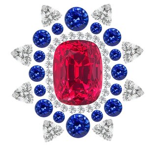
I appreciate the input! Yes, I have considered the design without the trilliants too, so I definitely see what you mean.
 

Timor

Shiny_Rock
Joined
Jul 30, 2022
Messages
316
Love the color combo! I think personally I like Rfisher's design the best as I prefer curves to pointy points. Though I wonder what would be used between the pears and the small cobalt - separate prongs to keep the most of the starburst effect or metal inbetween?
 
Joined
Jan 20, 2012
Messages
4,144
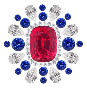
So I had to tweak @Rfisher's design a bit just to make everything to-scale with the actual stone sizes (I also wanted to avoid too much negative space, so I added the inner diamond halo back in). I did lose some of the starburst effect in the process though, and now it looks more rounded. The pears would be 4x2.5mm here, so I wouldn't want to go any smaller with them. Hmm... what do you guys think?

Capturejuij.JPG Capturejobs.JPG
 

voce

Ideal_Rock
Joined
May 13, 2018
Messages
5,161
Definitely prefer this latest version with the inner halo and pears. I think you should go for a split shank instead of a single thick band. Imo, a split shank would draw the eye more towards the symmetry of the layout and make the ring more balanced and easy to wear. A single thick band draws too much attention down the center line.
 

momofive

Brilliant_Rock
Joined
Mar 13, 2011
Messages
1,040
@Autumn in New England in your design, using the pears, you made them the fall into the same circumference as the sapphires. You also mentioned you missed the starburst effect. I think @Rfisher 's design has the pears slightly smaller so the sapphires can still give the "burst" effect. Maybe when you added in the halo, which I like, that moved the pears out a bit more.
 
Joined
Jan 20, 2012
Messages
4,144
@Autumn in New England in your design, using the pears, you made them the fall into the same circumference as the sapphires. You also mentioned you missed the starburst effect. I think @Rfisher 's design has the pears slightly smaller so the sapphires can still give the "burst" effect. Maybe when you added in the halo, which I like, that moved the pears out a bit more.

That's a great point, and I agree. But the problem is I have to use the actual sized gems in my composite (and make it to-scale). So if I remove the inner diamond halo, in order for everything to fit (without a huge gap between the red spinel and accent stones), the pears would have to be super tiny. :confused2: And 4x2.5mm is already smaller than I want to go. There's always a compromise, ugh! I'm interested to see if @Rfisher (or anyone else) may have a remedy for that. But this was the only way I could find to make it work.
 

stepcutnut

Ideal_Rock
Joined
Aug 11, 2008
Messages
2,839
What a fun project you have in the works! I love the color combination and can't wait to see which layout you decide on :)
 

Rfisher

Ideal_Rock
Premium
Joined
Oct 19, 2013
Messages
5,503
negative space wouldn’t bother me if the result is something like this :love:
6038A48E-000A-4953-9309-45D7F9A0B7BD.jpeg

I didn’t realize I changed any of your stone proportions - so I do apologize if that made your task more difficult. :)
 
Be a part of the community Get 3 HCA Results
Top