You are using an out of date browser. It may not display this or other websites correctly.
You should upgrade or use an alternative browser.
You should upgrade or use an alternative browser.
Help With Three Stone DK CADs PLEASE!
- Thread starter FutureChocolateMLK
- Start date
- Status
- Not open for further replies. Please create a new topic or request for this thread to be opened.
FutureChocolateMLK
Brilliant_Rock
- Joined
- Mar 11, 2018
- Messages
- 1,072
Personally, I would find rings that speak to me the same way- use adjectives like: floral, fluid, modern, minimalist to narrow it down.
Maybe limit yourself to just looking at 3-stone rings to gain inspiration from?
Yes, I definitely think my biggest struggle has been finding solitaires that I love and then hitting a wall when trying to translate it into a 3 stone design. I sent David another email to get the next CAD worked up. If I don’t like the changes, I’ll have to go back to the drawing board. Hoping he will provide some insight as well.
I keep going back to the modified Resilient you worked up for me. It’s most certainly a contender, especially if this third CAD goes pear shaped. Thank you for taking the time to do that, I really appreciate it. You and @Taurus2313 have both been amazing!
Taurus2313
Brilliant_Rock
- Joined
- Dec 28, 2017
- Messages
- 603
Yes, I definitely think my biggest struggle has been finding solitaires that I love and then hitting a wall when trying to translate it into a 3 stone design. I sent David another email to get the next CAD worked up. If I don’t like the changes, I’ll have to go back to the drawing board. Hoping he will provide some insight as well.
I keep going back to the modified Resilient you worked up for me. It’s most certainly a contender, especially if this third CAD goes pear shaped. Thank you for taking the time to do that, I really appreciate it. You and @Taurus2313 have both been amazing!
FutureChocolateMLK
Brilliant_Rock
- Joined
- Mar 11, 2018
- Messages
- 1,072
Looking forward to seeing that new CAD and what you guys come up with!

Thank you for being patient with me and talking me through my craziness.
I was looking at the floral basket last night (the one that doesn’t overlap) and where it’s just a peg head on a band, I’m not sure how I could rework it to look right as a 3 stone. The LAD basket is able to overlap and kind of sit around the edges of the band if that makes sense? I’m excited to see the next revision, but I have other ideas if this doesn’t look right. Stay tuned!
swaye2010
Brilliant_Rock
- Joined
- Nov 16, 2015
- Messages
- 1,194
I thought these were kind of interesting. You could put the floral/tulip basket in the middle on the first and that would still work with these designs. The 2nd one isn’t as ornate but would let in lots of light and it looks like it sits pretty low.....
https://www.victorbarbone.com/colle...ar-shaped-diamond-engagement-ring-side-stones
https://www.victorbarbone.com/colle...champagne-diamond-engagement-ring-side-stones
https://www.victorbarbone.com/colle...ar-shaped-diamond-engagement-ring-side-stones
https://www.victorbarbone.com/colle...champagne-diamond-engagement-ring-side-stones
FutureChocolateMLK
Brilliant_Rock
- Joined
- Mar 11, 2018
- Messages
- 1,072
I thought these were kind of interesting. You could put the floral/tulip basket in the middle on the first and that would still work with these designs. The 2nd one isn’t as ornate but would let in lots of light and it looks like it sits pretty low.....
https://www.victorbarbone.com/colle...ar-shaped-diamond-engagement-ring-side-stones
https://www.victorbarbone.com/colle...champagne-diamond-engagement-ring-side-stones
Thank you for this! Both are really beautiful, and I found a couple others I like too. Funny thing is, David sent me a pic of one back in the beginning before the first CAD and I had no idea where he got it, but it was the Monroe. Initially I didn’t care for how squatty it was, but the ones you linked have my wheels turning. I love the Resilient from The Gemstone Project with the modifications @molecule worked up, but I’m unsure about a trellis design. I was trying to find a work-around and maybe one of these will inspire me.
swaye2010
Brilliant_Rock
- Joined
- Nov 16, 2015
- Messages
- 1,194
I know the first one is a pear but I think you can modify it with your other inspirations. It is kind of a squatty cathedral setting and will be lower than the typical trellis designs which sit pretty high off the finger. The benefit is you never have to worry about the prongs but this might not matter if you go with the channel set bands. I like the prongs on the Monroe or the one I linked, but the baskets just need some design flair to make it a bit unique, which is what I think you are going for.Thank you for this! Both are really beautiful, and I found a couple others I like too. Funny thing is, David sent me a pic of one back in the beginning before the first CAD and I had no idea where he got it, but it was the Monroe. Initially I didn’t care for how squatty it was, but the ones you linked have my wheels turning. I love the Resilient from The Gemstone Project with the modifications @molecule worked up, but I’m unsure about a trellis design. I was trying to find a work-around and maybe one of these will inspire me.
FutureChocolateMLK
Brilliant_Rock
- Joined
- Mar 11, 2018
- Messages
- 1,072
I know the first one is a pear but I think you can modify it with your other inspirations. It is kind of a squatty cathedral setting and will be lower than the typical trellis designs which sit pretty high off the finger. The benefit is you never have to worry about the prongs but this might not matter if you go with the channel set bands. I like the prongs on the Monroe or the one I linked, but the baskets just need some design flair to make it a bit unique, which is what I think you are going for.
Yep! Exactly what I’m going for. I’ve been brainstorming and sketching again today. After going through all the VB rings, the Ari really stands out to me. It’s similar to the Monroe but all rounds and not quite as squatty. I’m not sure how I could change it to give it that extra touch I’m looking for, but I’m thinking. David emailed me this evening and said I can expect another set of CADs tomorrow. My first step is opening the basket back up in my first design inspo and putting it with the side baskets of the Resilient. If that doesn’t turn out right, I think I’m headed in the direction of either the Ari or the Resilient, with a few tweaks of course.
FutureChocolateMLK
Brilliant_Rock
- Joined
- Mar 11, 2018
- Messages
- 1,072
Round 3:
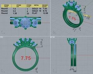
I like the skinnier wedding band. He took it down to 1.3mm stones so an overall width of 2.5. I think it looks a lot less bulky. As far as the baskets go, he didn’t get my new ideas until after he sent this so I’m expecting another CAD tomorrow. I told him to delete the side leaves and open the center basket up more like CAD 1. I’m liking the 4 prong sides though. It all feels a lot more light and airy. I still see that dang mask though, so I think they need to go. What’s everyone think?

I like the skinnier wedding band. He took it down to 1.3mm stones so an overall width of 2.5. I think it looks a lot less bulky. As far as the baskets go, he didn’t get my new ideas until after he sent this so I’m expecting another CAD tomorrow. I told him to delete the side leaves and open the center basket up more like CAD 1. I’m liking the 4 prong sides though. It all feels a lot more light and airy. I still see that dang mask though, so I think they need to go. What’s everyone think?
Taurus2313
Brilliant_Rock
- Joined
- Dec 28, 2017
- Messages
- 603
Round 3:
I like the skinnier wedding band. He took it down to 1.3mm stones so an overall width of 2.5. I think it looks a lot less bulky. As far as the baskets go, he didn’t get my new ideas until after he sent this so I’m expecting another CAD tomorrow. I told him to delete the side leaves and open the center basket up more like CAD 1. I’m liking the 4 prong sides though. It all feels a lot more light and airy. I still see that dang mask though, so I think they need to go. What’s everyone think?
Cant wait to see the new CAD tomorrow and what you guys came up with!
Love the new dimensions on the band though!
FutureChocolateMLK
Brilliant_Rock
- Joined
- Mar 11, 2018
- Messages
- 1,072
Sorry but honesty is the best policy..I still see the Mardi Gras mask too..So Sorry!
Cant wait to see the new CAD tomorrow and what you guys came up with!
Love the new dimensions on the band though!
No no no! Do not apologize! That’s what I need. Honesty. I don’t want someone to tell me it looks great but really they’re thinking it’s ridiculous. Lol! It takes much more than that to offend me.
And agreed. The mask has gotta go. I do love the thickness of the wedding band and the 4 prong configuration on the side stones. I was afraid that setup would require a tapered band but he pulled it off! I think it lightens up the whole feel. Once those leaves (eyes
- Joined
- Jun 3, 2017
- Messages
- 828
Round 3:
I like the skinnier wedding band. He took it down to 1.3mm stones so an overall width of 2.5. I think it looks a lot less bulky. As far as the baskets go, he didn’t get my new ideas until after he sent this so I’m expecting another CAD tomorrow. I told him to delete the side leaves and open the center basket up more like CAD 1. I’m liking the 4 prong sides though. It all feels a lot more light and airy. I still see that dang mask though, so I think they need to go. What’s everyone think?
I also think the leaves/mask should go. I think the simplicity of the setting without them would be beautiful OR redo and have the leaves be the actual support/prongs. As they are now, they look extra/tacked on.
Sorry for the honesty but you asked for it! and FWIW, I’m just a lover of pretty things and have no design skills at all!
FutureChocolateMLK
Brilliant_Rock
- Joined
- Mar 11, 2018
- Messages
- 1,072
I also think the leaves/mask should go. I think the simplicity of the setting without them would be beautiful OR redo and have the leaves be the actual support/prongs. As they are now, they look extra/tacked on.
Sorry for the honesty but you asked for it! and FWIW, I’m just a lover of pretty things and have no design skills at all!
Haha! I appreciate your honesty. And I obviously have a difficult time with design myself! Lol. I thought it would look fluid to have the side leaves be prongs on the smaller stones. Boy, was I wrong.
Taurus2313
Brilliant_Rock
- Joined
- Dec 28, 2017
- Messages
- 603
Thank you @eapj for saying that, whew I was feeling so bad to have to be honest about them. Glad that I am not the only one that sees them that way too. I totally agree with you that they look tacked/added on.
@michellelynn9175 Thanks hun you are so sweet! I do totally love the 4 prongs on the side stones rather than the 6. It does look so much better that way. I do have a question though, Did you change your mind about your FrankenRing? I thought that the way that you had designed the gallery of the side stones looked great. I think that would work with whatever basket design that you choose for the center stone.
@michellelynn9175
FutureChocolateMLK
Brilliant_Rock
- Joined
- Mar 11, 2018
- Messages
- 1,072
Thank you @eapj for saying that, whew I was feeling so bad to have to be honest about them. Glad that I am not the only one that sees them that way too. I totally agree with you that they look tacked/added on.
@michellelynn9175Thanks hun you are so sweet! I do totally love the 4 prongs on the side stones rather than the 6. It does look so much better that way. I do have a question though, Did you change your mind about your FrankenRing? I thought that the way that you had designed the gallery of the side stones looked great. I think that would work with whatever basket design that you choose for the center stone.

I know some people get offended and bent out of shape when you tell them your opinion, but I am NOT one of those people.
And as far as Frankie goes, David didn’t get my next set of changes until after he had modified it for the third CAD. I’m probably throwing too much at him at once and he can’t keep up.
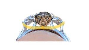
For the changes I specified:
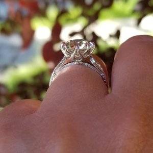
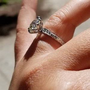
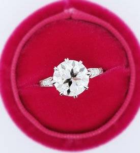
- Opening the basket back up like CAD 1, but still maintaining the “nothing but prong” look from a top view. I’ll post pics below of what I sent him.
- Lowering the side stones from how it appears on the “Frankie” diagram and tucking them under the center stone slightly so there is no gap in between them. This will make it look more modern as opposed to the Victorian look. Even though I chose larger side stones, I still don’t like how there are gaps in between them on some antique rings.
- Obviously deleting the leaves/mask on the sides.
I think up until now I haven’t been detailed enough in my correspondence, so this is a learning curve for me. Moving forward I’ll be sending lots of pics and being more specific. Here’s what I sent to explain the basket and not being able to see anything from the top. I also sent Frankie to him. Haha!
Taurus2313
Brilliant_Rock
- Joined
- Dec 28, 2017
- Messages
- 603
I know some people get offended and bent out of shape when you tell them your opinion, but I am NOT one of those people.So thanks to all of you for being real. Being on your end you never know how someone will respond, especially via an online forum, but I assure you I appreciate all the advice and opinions.
And as far as Frankie goes, David didn’t get my next set of changes until after he had modified it for the third CAD. I’m probably throwing too much at him at once and he can’t keep up.He told me he got my email, and would show me tomorrow (which is today) so I’m expecting to get them this evening. I think he takes the time at the end of the day to sit at his computer, follow up on emails, Work on CADs etc because that’s when he typically responds.
For the changes I specified:
- Opening the basket back up like CAD 1, but still maintaining the “nothing but prong” look from a top view. I’ll post pics below of what I sent him.
- Lowering the side stones from how it appears on the “Frankie” diagram and tucking them under the center stone slightly so there is no gap in between them. This will make it look more modern as opposed to the Victorian look. Even though I chose larger side stones, I still don’t like how there are gaps in between them on some antique rings.
- Obviously deleting the leaves/mask on the sides.
I think up until now I haven’t been detailed enough in my correspondence, so this is a learning curve for me. Moving forward I’ll be sending lots of pics and being more specific. Here’s what I sent to explain the basket and not being able to see anything from the top. I also sent Frankie to him. Haha!


YAY!!
Taurus2313
Brilliant_Rock
- Joined
- Dec 28, 2017
- Messages
- 603
FutureChocolateMLK
Brilliant_Rock
- Joined
- Mar 11, 2018
- Messages
- 1,072
FutureChocolateMLK
Brilliant_Rock
- Joined
- Mar 11, 2018
- Messages
- 1,072
Taurus2313
Brilliant_Rock
- Joined
- Dec 28, 2017
- Messages
- 603
Oh oh oh, Raises hand!
FutureChocolateMLK
Brilliant_Rock
- Joined
- Mar 11, 2018
- Messages
- 1,072
Oh oh oh, Raises hand!I will go first!
LOVE IT!! Frankie is gorgeous!!
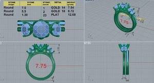
What the heck happened to the middle basket though? He took it back to 8 prongs and they’re not even the same shape?
Taurus2313
Brilliant_Rock
- Joined
- Dec 28, 2017
- Messages
- 603
What the heck happened to the middle basket though? He took it back to 8 prongs and they’re not even the same shape?
FutureChocolateMLK
Brilliant_Rock
- Joined
- Mar 11, 2018
- Messages
- 1,072
Yeah they are..You thought the same thing that I did.. Look again at the side shot..You can see that they are prongs and not like petals? like they appear in the top shot looking down.. You do get 8 prongs though on this one but wasn't that what your inspiration photo above had? Remember he is going by what you supply him visually and also tell him. In post number 75 above by you I see and count 8 prongs..

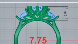
Yeah, I can see where he would think I wanted to go back to 8. I’ll have to clarify. But the basket isn’t even the same design. And I specifically told him I didn’t want to see anything but prongs from a top down view and its even worse than the first CAD
The tops aren’t pinched in like the inspiration pics. It looks more like the Dahlia by CVB.
This is what I want to go back to, but 6 prong. Am I missing something here? I feel like I am. Lol.
Taurus2313
Brilliant_Rock
- Joined
- Dec 28, 2017
- Messages
- 603
Yeah, I can see where he would think I wanted to go back to 8. I’ll have to clarify. But the basket isn’t even the same design. And I specifically told him I didn’t want to see anything but prongs from a top down view and its even worse than the first CAD
The tops aren’t pinched in like the inspiration pics. It looks more like the Dahlia by CVB.
This is what I want to go back to, but 6 prong. Am I missing something here? I feel like I am. Lol.

Good eye!
I am so sorry that this is taking so long to get right just like you want it but you will be glad in the end rather than have a ring that you are NOT 100% happy with.
FutureChocolateMLK
Brilliant_Rock
- Joined
- Mar 11, 2018
- Messages
- 1,072
Taurus2313
Brilliant_Rock
- Joined
- Dec 28, 2017
- Messages
- 603
FutureChocolateMLK
Brilliant_Rock
- Joined
- Mar 11, 2018
- Messages
- 1,072
Sorry about that.. My bad
didn't catch that earlier.. It's late and guess I am getting tired, haha. Honestly I do like the trellis design on the side stones and it does blend well with the main center basket that you love so much from the 1st CAD. If you didn't use that there, what else would you do in that area? Sending you get well vibes for Migraine Relief!

I think the triple wire shank is what’s throwing me off. It doesn’t look as clean and simple as before. He took that from the Resilient, and I think I prefer it to go back to the way it was. It looked less cluttered before.
Taurus2313
Brilliant_Rock
- Joined
- Dec 28, 2017
- Messages
- 603
I think the triple wire shank is what’s throwing me off. It doesn’t look as clean and simple as before. He took that from the Resilient, and I think I prefer it to go back to the way it was. It looked less cluttered before.
I noticed that too and I am going to tell you what I think happened.. I think that in your photo that you made in Paint where you are trying to show that you want the side stones to be lowered underneath the Center Basket, the line is there to represent that you wanted them to be moved lower and I think that he mistook that for an actual part of the design.
I do still love the design overall and think that with a few minor tweeks it will be looking more like what you are going for..
Last edited:
- Joined
- Jun 3, 2017
- Messages
- 828
I like it! But agree that I don’t care for that swoopy line that @Taurus2313 wrote about above. I think every else looks more deliberate.
FutureChocolateMLK
Brilliant_Rock
- Joined
- Mar 11, 2018
- Messages
- 1,072
I like it! But agree that I don’t care for that swoopy line that @Taurus2313 wrote about above. I think every else looks more deliberate.
I agree, the line needs broken up. It looks out of place. I like the side stone design too, so I’ll have to sit down today and try to convey exactly what I want. My last email had bullet points and pictures for each point, so I don’t know how I can be any more clear? I do like the basket from CAD 1 but you can still see it poking out from the top view, so that needs changed. I’ve told him this like 4x but it still doesn’t look right. Could it just be the CAD throwing me off where everything is blown up and it won’t look like that once it’s cast? I guess I need to ask.
- Status
- Not open for further replies. Please create a new topic or request for this thread to be opened.
Share:
How Are Diamonds Made? Natural vs Lab-Created Explained How Are Diamonds Made? Natural vs Lab-Created Explained - 08/05

Top Wedding Ring Brands for Every Style and Budget
Top Wedding Ring Brands for Every Style and Budget - 08/05
Where to Buy Lab Grown Diamonds: Best Places Compared
Where to Buy Lab Grown Diamonds: Best Places Compared - 08/05


300x240.png)