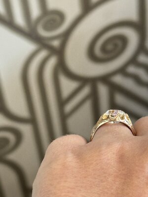
- Joined
- Jan 3, 2013
- Messages
- 5,299
I love, love #3. But I think it's a secondary or tertiary ring.
Now that I know that there is no color zoning, I vote for #2 wholeheartedly. The cut looks fab. My only concern is if it will be too warm for you. I have a HRD M so probably a GIA OP. I love it most of the time.
I’m torn between 2 and 3, but leaning towards 2 because it’s just such a beautiful stone.
1 would drive me batty because it sits so low. I suppose I could, maybe, get used to that but… why? It seems less elegant and interesting than a setting that has some elevation.
One thing I like about 2 is that it’s open to so many setting options. Because the stone is so beautiful (and large!) on its own, it it doesn’t need to be dressed up and could be set in anything.
I’ve also drooled over 3, but seeing it next to 2, it seems kind of fussy.
Part of why I enjoy old cut diamonds is the rarity and the fact that they will become more rare over time. and I like for the value of my rings to be mostly, or almost entirely, held in the central diamond. For these reasons I would personally choose the second option. It is the most valuable and rare option! Like others have said, I would lean into the color and encourage its warmth. I love the warmth of very tinted diamonds. And old ones just melt me.
@springsparkle has a gorgeous OP colored OEC in a yellow gold bezel that leans into the color. She posted this video a while ago showing her OP next to an H color MRB. My eye is absolutely drawn to the rich buttery color of the OP! I would like to own a diamond in this color range some day and I would set it to play up and enhance the color as much as possible.
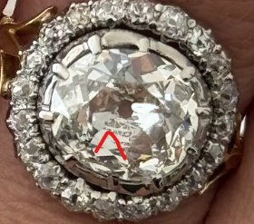
#2. You type-sound excited about it.
An O is never going to look white, but you are going for an antique look so a warm color will be beautiful. Agree you should not bother with rhodium.
You might want to see the stone in person against different karats/alloys. A light colored yellow gold could give you a really pretty monochromatic effect. Dark gold could either provide contrast or lend more yellow to the stone, depending on the cut.
You might like this look more than your earlier low-color stone set in white metal. Sometimes that low color diamond+white metal combo comes across as “tinted diamond” (no offense to people who like that look). Whereas a low color set in yellow gold looks intentional.
Ha, I was trying my best to remain neutral! I think you are completely right about the effects of the yellow gold. Why do you think rhodium plating the inside is a bad idea? Could that have a negative impact on the appearance of the stone from the inside?
You’ve got the stone in hand, right? Put some foil under it and see how it looks!
You’ve got the stone in hand, right? Put some foil under it and see how it looks!
@twosanguinehearts any updates? #livingvicariouslythroughyou
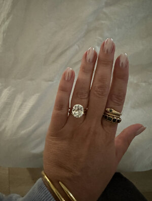
You’re all the best for following up! I will say that I am still shocked by the poll results. I thought it would be more split! That said, it was beyond helpful. I’m excited to share that I received a very generous offer to have Option 2 set into a custom yellow gold ring so I can be 100% certain that it’s the one before I commit to it forever. Very, very appreciative that this is an option, as I know it will help so much! The shape and cut on this stone are just beyond. I’m keeping fingers and toes crossed that I’m blown away by the result of this exploration!! Adding one more pic of it loose.

Drooling over here…
Sorry for the silly qu but I’ve been wondering how your stone is being held up like that, as I can’t see the prongs of a stone holder? It looks like it’s floating!
You’re all the best for following up! I will say that I am still shocked by the poll results. I thought it would be more split! That said, it was beyond helpful. I’m excited to share that I received a very generous offer to have Option 2 set into a custom yellow gold ring so I can be 100% certain that it’s the one before I commit to it forever. Very, very appreciative that this is an option, as I know it will help so much! The shape and cut on this stone are just beyond. I’m keeping fingers and toes crossed that I’m blown away by the result of this exploration!! Adding one more pic of it loose.
It's not set yet, but will definitely report back!!
I hate to disappoint, but I decided not to pursue the big omc. I really do want something a bit more white-facing and preferably in an antique setting. I tried on an incredible belcher with a large stone at Platt that I'm still thinking about. The Victorian three stone is also still on my mind, I'm just hesitant to drop $500 on shipping just to see it in person. I also found another interesting antique option that I'm hoping to see this week. I'll report back soon with more updates and some pics!
I’m glad you stuck to your preferred specs! These are expensive decisions and you should get what you want.
Was it the K at Platt’s? I tried that on last year and the chunk had me drooling!
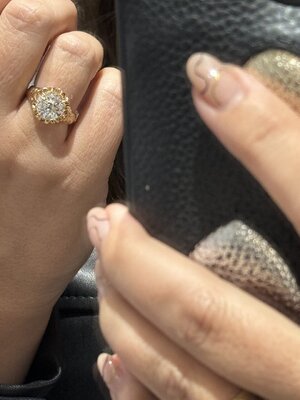

I looked at the K last year as well, and it’s beautiful, but it didn’t sing to me like I thought it would. This one is a super white facing L in a belcher setting. Smaller, but looks significant still in the belcher setting. I’m still noodling on the faceting pattern and gold tone of the setting. It’s so beautiful though!!!
