shape
carat
color
clarity

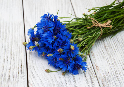
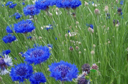
Does cornflower blue actually have faint violet undertones?

chaitea

Rough_Rock
Joined
Nov 16, 2022
Messages
13
As my title says, does cornflower blue have purple or violet undertones? I ask because I keep reading that pure blue without ANY violet is desirable for sapphires or that cornflowers are the only flowers that are pure blue without undertones. But quite honestly, in my garden, all my cornflowers are a rather deep blue with an unmistakable violet undertone.

I've also just read that for antique Kashmir sapphires, that a tiny tinge of violet is actually common in Kashmir sapphires. It's by Enhoerning, who specialise in coloured stones (see here https://www.enhoerning-jewelry.com/blog/kashmir-sapphire-faq

Not that I'll purchase a Kashmir sapphire, but I think the colours are lovely in their own way. Is this some sort of attempt to standardise sapphires for pricing differences?
 
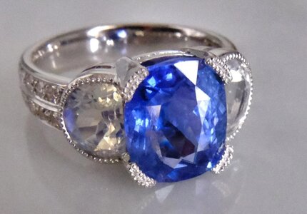
Here are some photo examples of the Kashmir sapphires with violet undertones that I've found.

Photo evidence seems to at least confirm that people don't care about the purplishness as much as they do with other sapphires.
I've seen also on Lang Antiques that their Kashmir sapphire also has this tinge of violet. https://www.langantiques.com/exceptional-2-62-carat-kashmir-sapphire-and-diamond-ring-agl.html
On this news article, the Kashmir sapphire is very purple https://www.pbs.org/wgbh/roadshow/s.../kashmir-sapphire-diamond-pendant--200906A33/
And here the sapphire is described by Christie's rep as "This superb gemstone combines an exceptional size with a richly saturated and homogenous cornflower blue colour that is highly desired in Kashmir gems.": https://www.vogue.in/content/star-kashmir-sells-20-crore

Here on Hancock's of London, theirs has it too, although more subtle or harder to see than on the Lang's photo https://www.hancocks-london.com/pro...pphire-and-old-mine-diamond-three-stone-ring/
And here too, even more subtly. https://vintagediamondring.com/prod...heat-kashmir-sapphire-diamond-engagement-ring


And on a 2019 thread here in this forum, there was a thread about someone's great grandmother's Kashmir sapphire coming back slightly violet and she was terribly upset. Perhaps like me, she believed that violet is not a desirable undertone in sapphires. But a photographer on the forum was able to show how the sapphire truly has a violet blue.
 
I've always seen cornflower with a touch of violet. This is why I dislike colour descriptors based on flowers, blood, etc since they vary IRL too.
 
I've always seen cornflower with a touch of violet. This is why I dislike colour descriptors based on flowers, blood, etc since they vary IRL too.

Same ^... I definitely see violet. These trade names are very alluring, so I get it, but they're not great qualifiers.
 
Well, this is a fun question! Ahhh, ideal blues. In short, I think the answer is no - i do not think trade ideal colors always have violet modifiers, but i think it depends. ive seen many trade ideal colors that look like pure blue to me, whatever that means as its subjective

artists have been debating color theory for centuries...

Pure blue is an extremely rare color in nature. Many things we think are blue are in fact deep violets (like blueberries) - because no compound exists that colors things blue (like chlorophyll = green coloring)

Corundum itself is actually clear!

So, the blues you see in sapphires is based on what is called "structural color", not a pigment in itself. Basically, the structure of the traces of titanium and iron in sapphires is scattering light in a way that your eye reads as blue on the color spectrum. If the corundum has chromium, it reads red (rubies)

Interestingly iron and titanium = yellow/green and pink. They basically work together in a process called "charge transfer" which transfers electrons, the yellow and red wavelengths disappear, and all you get leftover is PURE BLUE!!!

Weirdly, the same minerals present in tourmaline create brown.

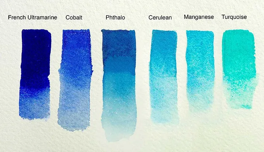
Before they could test, people thought blue sapphires were colored by cobalt. And if you look at what is considered primary blue (the purest of pure blue, with no red or yellow present, the other 2 primary colors) - cobalt is pretty close to neutral, primary blue.

Warm tones (+ red) <-------------------------> Cool tones (+ yellow)
1669162772161.png

My guess is, regions like Kashmir produce rich blue sapphires with just a whisper of chromium. I know there are Kashmiri rubies, for example. It's a miracle they aren't the color of mud! In general, I wonder if greyish undertones are due to too much chromium, or vanadium (like the Montana sapphires, which are characteristically greysish or color shifting to violet).

For me, it is more helpful to think of a blue as warm vs. cool, vs getting into modifiers unless you have an incredible eye for it. which some people on the forum do.

this is all above my pay grade, but i do think it's cool to mull over :bigsmile:

Thank you for the excellent, thoughtful and illustrated answer! Cobalt is my ideal blue, so that was interesting to learn.
 
Thank you for the excellent, thoughtful and illustrated answer! Cobalt is my ideal blue, so that was interesting to learn.

I like nerding out about color! I always thought cobalt was my ideal, but after living with it, now I think I'd fall head over heels for "ultramarine" or a really light blue...*sigh*
 
Well, this is a fun question! Ahhh, ideal blues. In short, I think the answer is no - i do not think trade ideal colors always have violet modifiers, but i think it depends. ive seen many trade ideal colors that look like pure blue to me, whatever that means as its subjective

artists have been debating color theory for centuries...

Pure blue is an extremely rare color in nature. Many things we think are blue are in fact deep violets (like blueberries) - because no compound exists that colors things blue (like chlorophyll = green coloring)

Corundum itself is actually clear!

So, the blues you see in sapphires is based on what is called "structural color", not a pigment in itself. Basically, the structure of the traces of titanium and iron in sapphires is scattering light in a way that your eye reads as blue on the color spectrum. If the corundum has chromium, it reads red (rubies)

Interestingly iron and titanium = yellow/green and pink. They basically work together in a process called "charge transfer" which transfers electrons, the yellow and red wavelengths disappear, and all you get leftover is PURE BLUE!!!

Weirdly, the same minerals present in tourmaline create brown.

Before they could test, people thought blue sapphires were colored by cobalt. And if you look at what is considered primary blue (the purest of pure blue, with no red or yellow present, the other 2 primary colors) - cobalt is pretty close to neutral, primary blue.

Warm tones (+ red) <-------------------------> Cool tones (+ yellow)
1669162772161.png

My guess is, regions like Kashmir produce rich blue sapphires with just a whisper of chromium. I know there are Kashmiri rubies, for example. It's a miracle they aren't the color of mud! In general, I wonder if greyish undertones are due to too much chromium, or vanadium (like the Montana sapphires, which are characteristically greysish or color shifting to violet).

For me, it is more helpful to think of a blue as warm vs. cool, vs getting into modifiers unless you have an incredible eye for it. which some people on the forum do.

this is all above my pay grade, but i do think it's cool to mull over :bigsmile:
That's a wonderful visual demo, nicely photographed.

I like nerding out about color! I always thought cobalt was my ideal, but after living with it, now I think I'd fall head over heels for "ultramarine" or a really light blue...*sigh*
When I made some very amateur attempts at watercolour, I was instantly drawn to ultramarine. It's magic! It glows! Nothing in real life can match it - except for top quality lapis, of course.

I've often wondered whether there really is a unique 'pure' blue (or red, green or yellow, for that matter). Or is it partly a convention? From what I've read, I gather that most people will agree that orange and purple, for example, are not pure colours, while red, green, yellow and blue are. But there's not so much agreement about precisely which red etc., is the 'pure' one.

Some technical points:

Strictly, 'structural colour' refers to the colours of things like opal, blue moonstone and labradorite. These have 'structures' with dimensions comparable to the wavelengths of visible light (packed spheres in opal, layering in moonstone and labradorite). This produces colour by interference. Structural colours typically show iridescence - they depend critically on the angles of lighting and viewing. The colours of ordinary rubies and sapphires are not structural in this sense.

Accurate, comprehensible and non hand-waving explanations of the colours of gemstones are not so easy to come by. This site makes an attempt: https://www.webexhibits.org/causesofcolor/6.html
The whole site is worth looking at. But you will have to err... 'recall' your chemistry and quantum mechanics to make much sense of it.
This GIA article is specific to corundum. Again, you will need a bit of background to understand it. https://www.gia.edu/doc/sp20-corundum-chromophores.pdf
 
That's a wonderful visual demo, nicely photographed.


When I made some very amateur attempts at watercolour, I was instantly drawn to ultramarine. It's magic! It glows! Nothing in real life can match it - except for top quality lapis, of course.

I've often wondered whether there really is a unique 'pure' blue (or red, green or yellow, for that matter). Or is it partly a convention? From what I've read, I gather that most people will agree that orange and purple, for example, are not pure colours, while red, green, yellow and blue are. But there's not so much agreement about precisely which red etc., is the 'pure' one.

Some technical points:

Strictly, 'structural colour' refers to the colours of things like opal, blue moonstone and labradorite. These have 'structures' with dimensions comparable to the wavelengths of visible light (packed spheres in opal, layering in moonstone and labradorite). This produces colour by interference. Structural colours typically show iridescence - they depend critically on the angles of lighting and viewing. The colours of ordinary rubies and sapphires are not structural in this sense.

Accurate, comprehensible and non hand-waving explanations of the colours of gemstones are not so easy to come by. This site makes an attempt: https://www.webexhibits.org/causesofcolor/6.html
The whole site is worth looking at. But you will have to err... 'recall' your chemistry and quantum mechanics to make much sense of it.
This GIA article is specific to corundum. Again, you will need a bit of background to understand it. https://www.gia.edu/doc/sp20-corundum-chromophores.pdf

Ultramarine was always one of my favorite colors to paint with...it's just so rich and full of depth. the kind of color that leaves me breathless!

Thanks for correcting me on the structural color. I wasn't really familiar with the term in reference to gemstones, but rather objects in the world that don't have a color in themselves, but were colored due to refraction of light (like butterfly wings) - I learned about it studying art (objects are pigmented or have structural color..etc)

I extrapolated my really shallow knowledge of the subject and assumed that because corundum was colorless itself, that the structural impurities of the iron/titanium created the "blue color" versus them being pigmented in themselves...

anyways...interesting that it specifically applies to moonstones, opals and the like. ive always been drawn to them. i wonder if it applies to fancy white diamonds as well? or really anything with opalescence?

As per your question about "pure colors" - there is widespread consensus that there are 3 "primary" colors, which are unable to be reproduced by mixing other colors...they are red, blue and yellow. (green, purple and orange being "secondary" colors)...this dates back to some of the earliest diagrams of color relationships by isaac newton in the 1600s, he was keen enough to document all of the colors that are on the visible spectrum, what we now know as ROYGBIV in a classic rainbow!

...however, the exact colors for these "primaries" are up for debate. you can buy a tube of "primary blue" paint, for example, but you may find 5 minutely different hues in a single store, and each artist I know selects a specific "primary" for their own palette. like cobalt blue, pthalo blue, ultramarine...

i always used 2 versions of each primary...because similar to gemstones, each color has a "masstone" and an "undertone" - Ultramarine would have a masstone of dark blue, and an undertone that I'd call a "violet bias" - so if you mix it with white, it turns to violet. I'd have a second blue in my palette called Pthalo, because even though it has a masstone of dark blue, the undertone is a green bias and produces totally different results.

most of the gem hounds on this forum are color theory experts without really realizing it. it's quite impressive...most artists develop that keen sense for color after lots of training!
 
Well, this is a fun question! Ahhh, ideal blues. In short, I think the answer is no - i do not think trade ideal colors always have violet modifiers, but i think it depends. ive seen many trade ideal colors that look like pure blue to me, whatever that means as its subjective

artists have been debating color theory for centuries...

Pure blue is an extremely rare color in nature. Many things we think are blue are in fact deep violets (like blueberries) - because no compound exists that colors things blue (like chlorophyll = green coloring)

Corundum itself is actually clear!

So, the blues you see in sapphires is based on what is called "structural color", not a pigment in itself. Basically, the structure of the traces of titanium and iron in sapphires is scattering light in a way that your eye reads as blue on the color spectrum. If the corundum has chromium, it reads red (rubies)

Interestingly iron and titanium = yellow/green and pink. They basically work together in a process called "charge transfer" which transfers electrons, the yellow and red wavelengths disappear, and all you get leftover is PURE BLUE!!!

Weirdly, the same minerals present in tourmaline create brown.

Before they could test, people thought blue sapphires were colored by cobalt. And if you look at what is considered primary blue (the purest of pure blue, with no red or yellow present, the other 2 primary colors) - cobalt is pretty close to neutral, primary blue.

Warm tones (+ red) <-------------------------> Cool tones (+ yellow)
1669162772161.png

My guess is, regions like Kashmir produce rich blue sapphires with just a whisper of chromium. I know there are Kashmiri rubies, for example. It's a miracle they aren't the color of mud! In general, I wonder if greyish undertones are due to too much chromium, or vanadium (like the Montana sapphires, which are characteristically greysish or color shifting to violet).

For me, it is more helpful to think of a blue as warm vs. cool, vs getting into modifiers unless you have an incredible eye for it. which some people on the forum do.

this is all above my pay grade, but i do think it's cool to mull over :bigsmile:

You are the color GURU!! I agree... maybe what we're talking about is not so much a violet modifier, but a total lack of green. Even the smallest drop of green into the mix reduces a blue sapphire's value exponentially. Then again, I love teal (and green) sapphires too! :mrgreen:
 
Once again, I'm just over here in the corner, quietly content, but furiously learning.
Thank you.
870383
 
anyways...interesting that it specifically applies to moonstones, opals and the like. ive always been drawn to them. i wonder if it applies to fancy white diamonds as well? or really anything with opalescence?
The opalescence of fancy white diamonds is caused by scattering from small inclusions. This does not create colour, it just spreads the light around. Most other opalescent or sleepy gemstones are similar - the inclusions just scatter whatever coloured light the stone produces.

The colour of blue Lalique-style opalescent glass is more interesting. There, the 'inclusions' are very small, of the order of the wavelength of visible light or less. Such inclusions scatter shorter wavelengths more strongly than longer ones, so the glass looks yellow in transmitted light (the part that isn't scattered) and blue in reflected light (the part that is scattered). This is structural colour. [A similar story explains why the sky is blue and sunsets are red - there the scattering comes from air molecules. (See Rayleigh scattering, Tyndall effect)] I'm not sure whether any natural gemstones show this effect.

As per your question about "pure colors" - there is widespread consensus that there are 3 "primary" colors, which are unable to be reproduced by mixing other colors...they are red, blue and yellow
Painters take red, blue and yellow as primary, because these are good pigments to use to mix a wide range of colours. (But note that no finite set of 'primary' pigments can mix all highly saturated colours.) Printers learn about CMYK, and think for example, that red is produced by mixing magenta and yellow and a bit of black. Digital photographers and computer graphics artists use RGB, and think that yellow is produced by mixing red and green. There's no mystery here - different mixing technologies require different primaries. But I doubt that any of these 'technological' primaries (including the painters' primaries) are truly primary in a perceptual sense.

Which colours are 'pure' is a slightly different question. Most people can 'see' orange as a mixture of red and yellow. But they would think it weird to regard red as a mixture of purple and orange. This is the sense in which red is perceptually pure and orange is not. But precisely which red is the pure red? Is that even a sensible question? Or do the people who devise colour grading systems just pick something reasonable but arbitrary?
 
When I made some very amateur attempts at watercolour, I was instantly drawn to ultramarine. It's magic! It glows!

Ultramarine was always one of my favorite colors to paint with...it's just so rich and full of depth. the kind of color that leaves me breathless!

I'm joining the ultramarine lovers club. It's what I instantly think of when people say "royal blue", not just in terms of stones, but in general. Makes you feel you can fall and sink in it whole.

My understanding is that trade ideal sapphire blue has a violet modifier.

Same.

Besides, as with any other colour, it would be damn near impossible to find a pure blue that everyone agrees is actually pure blue. If you compare two blues next to each other, one will have a bit more violet or a bit more green comparatively to the other. In the end most people would prefer a bit of violet.

If you think about it, it's much the same with other colours, as well. We judge emerald green based on whether it leans blue or yellow, we describe ruby red as having either pink or orange in it. Every time someone shows something that they consider to be "pure red" someone else will say they see pink or orange in it. It's a lost cause. :knockout:
 
I'm joining the ultramarine lovers club. It's what I instantly think of when people say "royal blue", not just in terms of stones, but in general. Makes you feel you can fall and sink in it whole.


Same.

Besides, as with any other colour, it would be damn near impossible to find a pure blue that everyone agrees is actually pure blue. If you compare two blues next to each other, one will have a bit more violet or a bit more green comparatively to the other. In the end most people would prefer a bit of violet.

If you think about it, it's much the same with other colours, as well. We judge emerald green based on whether it leans blue or yellow, we describe ruby red as having either pink or orange in it. Every time someone shows something that they consider to be "pure red" someone else will say they see pink or orange in it. It's a lost cause. :knockout:
You'd be surprised how many people can't perceive colours properly, it's genetic and there's nothing one can do about it.
 
You'd be surprised how many people can't perceive colours properly, it's genetic and there's nothing one can do about it.

Yeeees, I remember something about the types of cones and how most people have 3 types but some people have 4 and are able to perceive more colour tones and nuances... My memories might not be entirely accurate, so feel free to correct me.
 
Yeeees, I remember something about the types of cones and how most people have 3 types but some people have 4 and are able to perceive more colour tones and nuances... My memories might not be entirely accurate, so feel free to correct me.
Yes, there are those lucky special people who can see more colour, tetrachromats, how amazing is that.

I'm talking about colour blindness, it is prevalent (in men especially), more than people think. It doesn't have to be obvious but enough to skew the perception of colour in certain colour bands.


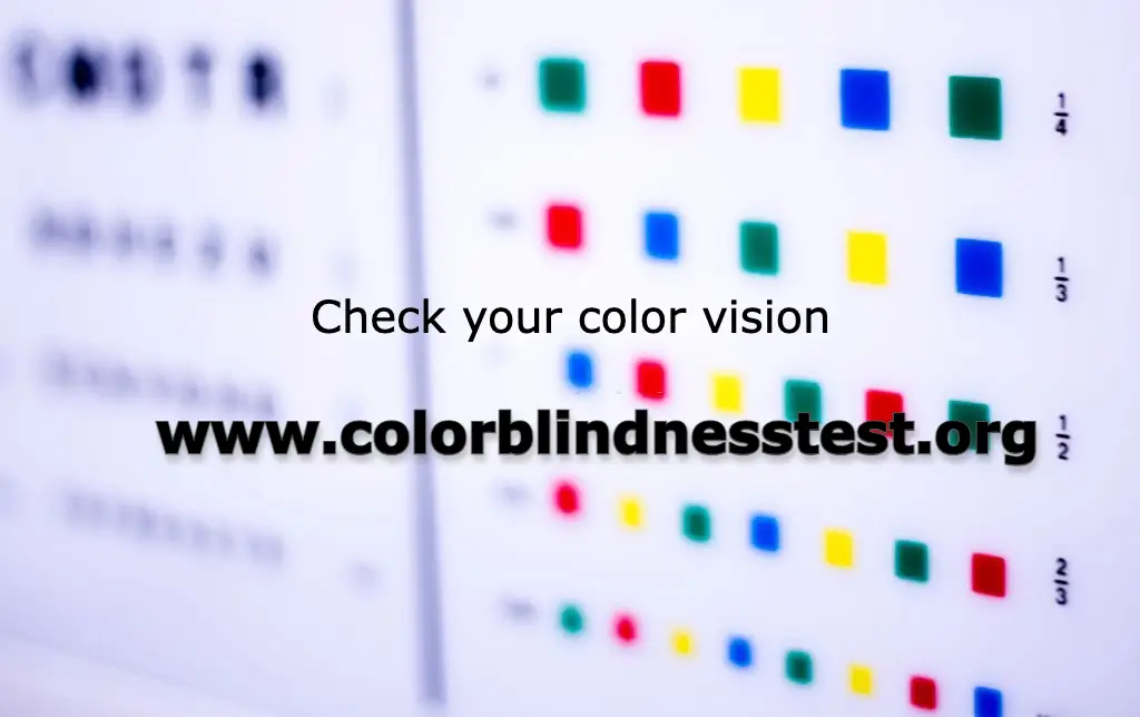
I've taken the Farnsworth Munsell 100 Hue Test when it was still available online. The one above is the short version.
 
I've taken the Farnsworth Munsell 100 Hue Test when it was still available online. The one above is the short version.

Ooooh, I'm off to do it.

...

0 on the short version. I found a download for the long one.

---

8 on the full version. That was fun! The husband is doing it now. :D
 
Ooooh, I'm off to do it.

...

0 on the short version. I found a download for the long one.

---

8 on the full version. That was fun! The husband is doing it now. :D

Can you please share a link for the full version one? I can't find it anymore, it used to be here: https://www.xrite.com/hue-test
I never downloaded anything, just did it online.

I also scored 0, did it multiple times. Btw, your monitor can be off so don't fret if you don't score 0. Calibrate the monitor and try again.
 
The opalescence of fancy white diamonds is caused by scattering from small inclusions. This does not create colour, it just spreads the light around. Most other opalescent or sleepy gemstones are similar - the inclusions just scatter whatever coloured light the stone produces.

The colour of blue Lalique-style opalescent glass is more interesting. There, the 'inclusions' are very small, of the order of the wavelength of visible light or less. Such inclusions scatter shorter wavelengths more strongly than longer ones, so the glass looks yellow in transmitted light (the part that isn't scattered) and blue in reflected light (the part that is scattered). This is structural colour. [A similar story explains why the sky is blue and sunsets are red - there the scattering comes from air molecules. (See Rayleigh scattering, Tyndall effect)] I'm not sure whether any natural gemstones show this effect.


Painters take red, blue and yellow as primary, because these are good pigments to use to mix a wide range of colours. (But note that no finite set of 'primary' pigments can mix all highly saturated colours.) Printers learn about CMYK, and think for example, that red is produced by mixing magenta and yellow and a bit of black. Digital photographers and computer graphics artists use RGB, and think that yellow is produced by mixing red and green. There's no mystery here - different mixing technologies require different primaries. But I doubt that any of these 'technological' primaries (including the painters' primaries) are truly primary in a perceptual sense.

Which colours are 'pure' is a slightly different question. Most people can 'see' orange as a mixture of red and yellow. But they would think it weird to regard red as a mixture of purple and orange. This is the sense in which red is perceptually pure and orange is not. But precisely which red is the pure red? Is that even a sensible question? Or do the people who devise colour grading systems just pick something reasonable but arbitrary?

I meant to reply and didn’t…the long story short is, I think the primaries across these different paradigms are remarkably similar, the exception being green vs. yellow, so it does sound like we are in agreement. I do think it’s impressive that painters and philosophers were able to roughly pinpoint the basic colors that exist due to the physiology of our eyes and how they perceive color.

As for your question as to “pure” red - I think there is a reason to believe there is a pure red, but it would be hard to measure as color is subjective. (As we’ve even seen in this thread)

There’s a fun Reddit thread about it that I lurked on a while back:
The TL;dr is that there probably isn’t an objective true red, but there is a subjective one.
 
Yes, there are those lucky special people who can see more colour, tetrachromats, how amazing is that.

I'm talking about colour blindness, it is prevalent (in men especially), more than people think. It doesn't have to be obvious but enough to skew the perception of colour in certain colour bands.


I've taken the Farnsworth Munsell 100 Hue Test when it was still available online. The one above is the short version.

I’ve always found these kind of fun, I wonder how accurate they are. It seems like tetrachromacy is more common in women, too - but that it’s quite rare overall.
 
Can you please share a link for the full version one? I can't find it anymore, it used to be here: https://www.xrite.com/hue-test
I never downloaded anything, just did it online.

I also scored 0, did it multiple times. Btw, your monitor can be off so don't fret if you don't score 0. Calibrate the monitor and try again.

I found it here: https://www.color-blindness.com/farnsworth-munsell-100-hue-color-vision-test/

The test can be downloaded as a .swf file, which is a flash file. Browsers nowadays no longer support flash, so I use the flash player debugger which allows me to run them easily. The exe file can be downloaded here: https://archive.org/details/flashplayer_32_sa_debug_2.

Funny thing is, the husband scored 20, and he's a designer and actually professionally trained in art. :D We figured we could try it again later on his PC, he has an actually nice monitor, I just use my laptop screen.

There are some fun theories around this. A few studies have shown that women are better at perceiving color and describing color vs men on average - one theory is that it was adaptive, because women were “gatherers” not hunters, and needed to be more sensitive to slight differences in color to determine which berries and nuts were edible and which were poisonous.

Men were hunters, and are better at tracking moving objects. It’s pretty wild to think about how these roles in societies may have been more than just social constructs, but actual ways to adapt to different physiological skills.

That’s not to say that there aren’t men who are amazing at perceiving color and women who are amazing at tracking fast objects. But I’d guess they are outliers?

Also- I know green and red cones lie in the X chromosome and women have 2 X chromosomes where men have one. Color blindness is definitely more common in men, especially red and green. I’m not sure if blue color blindness is even possible…The 2 X chromosomes in women may also be what causes tetrachomacy but honestly I have no idea!
 
Last edited:
I've always seen cornflower with a touch of violet. This is why I dislike colour descriptors based on flowers, blood, etc since they vary IRL too.

+1000000000
 
The TL;dr is that there probably isn’t an objective true red, but there is a subjective one.
All perception is subjective. The interesting question is whether people with normal colour vision agree closely on the 'true' colours, or whether they have differing 'true' colours. FWIW, I tend to agree with this (though I have no evidence either way):
If you think about it, it's much the same with other colours, as well. We judge emerald green based on whether it leans blue or yellow, we describe ruby red as having either pink or orange in it. Every time someone shows something that they consider to be "pure red" someone else will say they see pink or orange in it. It's a lost cause. :knockout:
This is why people came up with colour grading systems.


Also- I know green and red cones lie in the X chromosome and women have 2 X chromosomes where men have one. Color blindness is definitely more common in men, especially red and green. I’m not sure if blue color blindness is even possible…The 2 X chromosomes in women may also be what causes tetrachomacy but honestly I have no idea!
Yes, this is the reason colourblindness and defective colour vision are more common in men. And why tetrachromacy is found (as far as I know), exclusively in women. (With 2 X chromosomes, you can have different versions of the relevant pigment gene on each chromosome.) There are forms of colourblindness ('tritan') caused by defective 'blue' cone pigments, but they are very rare.

There are some fun theories around this. A few studies have shown that women are better at perceiving color and describing color vs men on average - one theory is that it was adaptive, because women were “gatherers” not hunters, and needed to be more sensitive to slight differences in color to determine which berries and nuts were edible and which were poisonous.
I'm skeptical about evolutionary just-so stories. It's easy to come up with plausible stories but hard to get evidence either way. An interesting question: are men with normal colour vision (i.e. the vast majority) more sensitive to subtle differences than women? Or is it just that they don't like to identify as 'interior decorators'? :)

I can't not link to the results of Randall Monroe's (XKCD's) online survey of colour names. Not very scientific, and a bit tongue-in-cheek, but maybe not far off the mark: https://blog.xkcd.com/2010/05/03/color-survey-results/
 
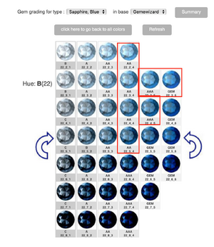
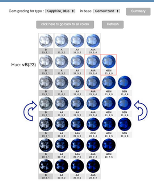
GemEwizard considers all these colors to be "blue sapphire"

With in each color there are various tones and saturations. The ones I put a red box around GemEwizard considers to be cornflower blue.

BlueSapphrieGemE.pngScreen Shot 2022-11-28 at 7.12.39 PM.png
 

Attachments

  • Screen Shot 2022-11-28 at 7.10.03 PM.png
    Screen Shot 2022-11-28 at 7.10.03 PM.png
    830.4 KB · Views: 9
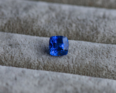
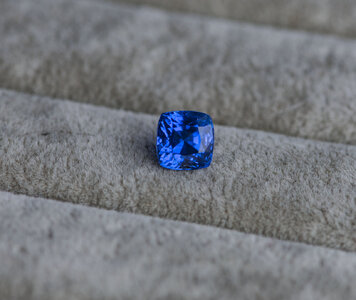
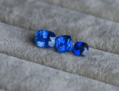
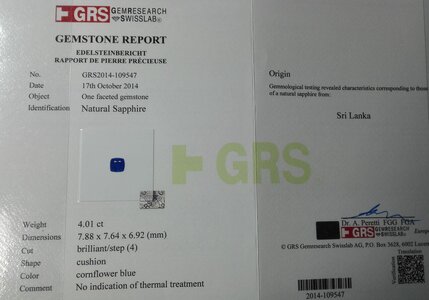
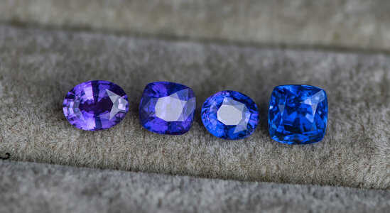
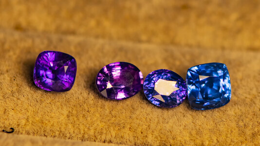
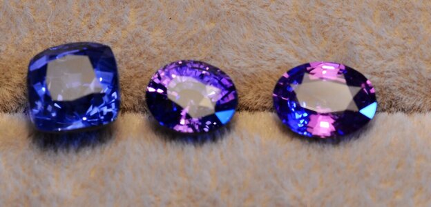
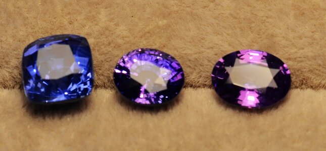
The blue color of sapphire comes from titanium, and the purple hue of sapphire is due to the content of chromium, and sapphires containing chromium will have a color shift in warm lighting environments. So a perfect cornflower sapphire should have no purple tinge. Perfect cornflower sapphire should be titanium-induced color, low iron content and low chromium content, low chromium content cornflower sapphire can maintain pure blue in various light environments, low iron content can make sapphire not dark And without the green tinge.
Comparing the picture samples, it can be seen that the sapphire without purple tone can maintain a bright blue color in any light environment, while the color of sapphire with purple tone will have a large deviation in warm light environment

DSC_8210.jpgDSC_8216.jpgDSC_8229.jpg证3.jpgDSC_8229.jpgDSC_9075.jpgDSC_9086.jpg白炽灯+白光手电.jpg白炽灯下1.jpg

southeast.jpeg
DSC_8216.jpg
12-15-29-akqj2oux4d0.png
 
Last edited:
The blue color of sapphire comes from titanium, and the purple hue of sapphire is due to the content of chromium, and sapphires containing chromium will have a color shift in warm lighting environments. So a perfect cornflower sapphire should have no purple tinge. Perfect cornflower sapphire should be titanium-induced color, low iron content and low chromium content, low chromium content cornflower sapphire can maintain pure blue in various light environments, low iron content can make sapphire not dark And without the green tinge.
Comparing the picture samples, it can be seen that the sapphire without purple tone can maintain a bright blue color in any light environment, while the color of sapphire with purple tone will have a large deviation in warm light environment

DSC_8210.jpgDSC_8216.jpgDSC_8229.jpg证3.jpgDSC_8229.jpgDSC_9075.jpgDSC_9086.jpg白炽灯+白光手电.jpg白炽灯下1.jpg

southeast.jpeg
DSC_8216.jpg
12-15-29-akqj2oux4d0.png

You never fail to impress with your incredible collection!
 
GET 3 FREE HCA RESULTS JOIN THE FORUM. ASK FOR HELP

Featured Topics

Top