shape
carat
color
clarity

DK CAD Assistance - Antique Repro

Maeve

Rough_Rock
Joined
Nov 15, 2018
Messages
7
Greetings Pricescope!

I am a long-time lurker and have learned so much from PS over the years. I’ve been too shy to post anything previously, but am now working on a project with David Klass and could use some feedback from the resident CAD experts. I would greatly appreciate any suggestions you can provide.

I used to own the below gorgeous antique ring and and am having it replicated for a new stone. It will be 14k antique gold (rosy YG) with an antique finish.

2BA6D31B-E42F-42FA-9831-B284371928A6.jpeg 3F1A0582-1C8E-4C8F-BA2F-68DE48DF607F.jpeg 994541BA-20E8-4AFE-8384-0231BD8BE124.jpeg 21A165AF-4235-4F38-A8E9-1DCC2B8EF256.jpeg

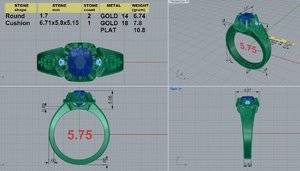
The old setting was very worn down, especially the prongs, so I know the replica will look a bit different. The old stone was 1.14ct., 6.4 x 5.8 x 4.2mm. The new stone is 1.54ct, 6.71 x 5.82 x 5.15mm (GIA M VS2) and has a super tall crown. David is sourcing tiny matching stones for the two side stones. This is my stone:

9CC03D95-2C41-4DD4-8B72-88ED95E334E5.jpeg 0CDF5B51-44CE-4EBF-A5B1-E28A0B093BBA.jpeg

With the below CAD and wax for the repro, I’m worried the head is too thick/large and I’m concerned the prongs will overwhelm the stone. I love the look of the original head, but it’s hard to visualize how it would look with all prongs intact.

Should we shrink the head and reduce the number of prongs?

F2502AB1-C89A-4D25-8352-43F700701FA3.jpeg
EF93739A-5749-4B0F-9F12-1B7F70E43B3D.jpeg F18C7429-67D8-4404-9AAE-85BEE24DD8FF.jpeg 74A103DD-073D-498A-8AF8-8805720B2F5F.jpeg

I also think the W cut outs/shapes on the shank might not be large enough. I love the proportions of the W shape of the shank as it meets the stones on the original. It’s hard to tell, but they look proportionally smaller on the CAD. It might just be the CAD bulkiness though. I will ask DK about this.

I’m also going to ask DK about the shank thickness right next to the stone. With the original ring, I love how the shank is the same height as the stone at the apex of the taper (right next to the stone). In the CAD it looks wider/taller than the stone.

Lastly, the proportion of the engraved/chased elements is slightly off—the dotted element should be smaller.

Thanks a million in advance for any help you can provide!
 
Gorgeous antique stone! !!
I'm not an expert, so I don't know if the larger head is partly due to the CAD being generally bulkier in order to be shaved down a bit during polishing. But it looks larger than the original.

A crafty PSer recently sprayed her wax with metallic paint and it made a huge difference. Looked so much more realistic. I wish I could find that thread... Give it a try. It was really helpful.
 
What a beautiful antique setting you found! So unique and perfect to show off the full glory of your chunky old cushion :)

I think you are spot on with most of your concerns and comments. I haven't personally had a CAD ring made, so I am not sure if the bulkiness of the head is just from the CAD. If you would like something a bit smaller, it probably wouldn't hurt to ask to shave it down a bit --- It doesn't have to be exactly the same as the original in the end! It's YOUR repro. You will have to be diligent about making sure that all of the rest of the proportions are adjusted accordingly, which can be a bit of a pain. But worth it.

I think you are right about the dot details being too big. In the original ring, the top two dots are only as wide as the diameter of the circle above. This ensures a consistent triangle flow that matches the taper of the band. In the CAD the two dots are slightly wider than the diameter of the circle above, disrupting that flow.

As for the W detail... I think the "smaller" look is actually a result of the shape of the shank. The shank of the original ring seems two swoop/curve out more as it meets the head. The CAD is more of a straight diagonal line for the taper. Does that make sense? If the shank swoops out more, the W shape will get a little wider and more prominent.
 
Last edited:
Gorgeous antique stone! !!
I'm not an expert, so I don't know if the larger head is partly due to the CAD being generally bulkier in order to be shaved down a bit during polishing. But it looks larger than the original.

A crafty PSer recently sprayed her wax with metallic paint and it made a huge difference. Looked so much more realistic. I wish I could find that thread... Give it a try. It was really helpful.

That was me! :wavey: My thread is over on FFJ since it’s moissy. If you’ve got fingernail polish in a similar color, that works too ;)2
 
Drawing on a laptop is hard, but hopefully this makes sense haha. A little more exaggerated than what you would want in real life, but I hope you get the point ;P

upload_2018-11-15_11-29-54.png
 
I love this project.

Since you say you used to own the original- that means DK didn't get a chance to see the original, correct? That would be too easy.
Do you have an additional photo of the original ring looking straight head on? If so- that'd be an easy way to get the proportions right- I think you are correct in this ring looks beefier more so than just accomidating for shrinkage.
 
Thank you all for the comments! They are very helpful and give me great food for thought.

@kipari and @michellelynn9175 The gold spray paint idea is brilliant! I will give it a try and report back.

@elliefire99 thank you for the drawing, I see what you mean about the shank shape. I’ll ask DK about this.

@Rfisher Here are a few more pics of the inspiration ring. I have many more if different angles would help. Correct, DK did not get to see the inspiration ring in person unfortunately.

90EED8DF-5176-4E4F-8C0C-3701694A6339.jpeg A46239F0-4AC4-4ED8-AEA7-BFF599D68175.jpeg 3112B8E3-23F1-4291-A2C8-29E5F5360E76.jpeg 16E76755-632D-4A2A-9222-5969016904BF.jpeg BD616888-C269-4582-85AE-5997D04C35DE.jpeg DFC0C638-9C1F-470B-91F4-D415371E7020.jpeg E18B5EC6-B3F9-48E4-9508-260110A44952.jpeg
 
Last edited:
The wax also appears to have too many prongs, the original doesnt look like it has the 4 side prongs.
 
I see the same number of prongs, just the two on either side of the accent diamond are smaller on the original.
If the beefier look is not what you want - I would confirm with DK that the proportions of the metal to stone of the original will come close to what the cad ultimately produces after finishing. Repeat show them the head on shot if needed.
It's one thing to say that the original had worn down prongs vs seeing new prongs - it's another to have a scaled up carriage.
 
@KKJohnson and @Rfisher I think the number of prongs is correct. On the original, two side prongs on each side were super worn down, barely touching the stone. I asked DK to make the prongs like the ring would originally have looked, before being worn down from 100 years of wear.

Having the prongs intact on the repro really changes the look of the head. Maybe it would look better to minimize or remove the side prongs to recreate the minimal prongs look? I like the idea of lots of prongs to protect the stone but don’t want it to look cluttered. I also want to make sure the stone gets enough light.

Thanks for the feedback re: head bulkiness. I’ll talk to DK about it
 
Hi all, mini-update: I emailed David this morning and had a nice phone call with Amy shortly after. She is doing to address my concerns and send a new CAD soon. She was great to talk to and seemed to really get the look I’m going for.

David and Amy have been wonderful. I should mention I worked with them for months designing a completely different ring design from scratch. There were an embarassing amount of CAD revisions and emails, and two waxes. After all that, I changed to this design. :shock: They couldn’t have been kinder or more understanding about it. A+ customer service.

I found some gold nail polish and painted the wax. I was really surprised by how good it looks! It was very helpful envisioning how the ring will look on my finger. Thanks again for the suggestion, @kipari and @michellelynn9175

74B9DD1B-BBC0-403E-B407-372D18F8C338.jpeg 4C081ED4-7649-4776-8933-BE776EA7C839.jpeg D7D54461-0713-4C46-A99B-FC22296BD586.jpeg
 
Hi all, thanks again for your feedback on my project with DKJ. Here is the hopefully final CAD:

9519A931-1EB0-4C62-87DA-627E66B0E404.jpeg

Amy said to disregard the red, the ring will be one color. I noticed the shank appears to have a engraved/milgrain border; Amy confirmed it is just lines in the CAD.

I think I’m happy with the basket after discussing the challenge of adapting the design to my stone’s high crown and depth with Amy. She thinks it will look very similar to the original when finished.

I decided to go for 10 prongs rather than 12. I’m hoping this is a good compromise to maintain the look of the original ring and protect the diamond while letting enough light in. I like the 10-prong look on the 1.4-ish ct. stone below, so I figure it will look ok on my 1.54 ct. cushion.

E0853CDB-EE28-4281-8E55-7AEB4072BF77.jpeg

After wearing the wax for a few days, I decided to keep the shank taper shape the same. Amy confirmed the apex of the shank taper is the same width as the north-south dimension of my stone. The proportion of the engraved/chased elements has been adjusted.

Any suggestions for improvement before I approve the CAD? Thanks again, PSers!
 
How do you feel about this part of the ring?

778576A2-AB6B-4A89-8A1A-784EF0CEDFF4.jpeg

The original appears to be a bit more rounded but with the age it’s hard to tell if that is intentional

263B206C-213B-4C08-A12A-2EC00170F8F6.png

I also like the 10 prong over the 12
 
Yay! I agree that the 10 prong helps lighten things up a bit (I also love the 10 prong inspo you attached =)2)

It seems that the dot pattern on the shank has changed since the last CAD, and is different from the original ring. Is that intentional?
 
@KKJohnson I see what you mean. I tried on the wax again and I’m not bothered by it. Thanks for pointing that out.

@elliefire99 Hmm, the proportions of dotted element do seem a bit off but I’m struggling to articulate how. Are they too small and not long enough? Do the proportions look better in the below CAD? This was the second to last CAD, and I asked Amy to scale the engraving up a bit. It looks like only the larger rounded element was increased, not the dotted one.

117E267C-3806-48CF-AF26-B881B82742DA.jpeg
 

Attachments

  • 8B9FA8B0-3609-4DB0-88A8-0C2331DA6F7C.jpeg
    8B9FA8B0-3609-4DB0-88A8-0C2331DA6F7C.jpeg
    221.9 KB · Views: 57
Ah! I didn't even realize that the proportions had changed. I was referring to the way that the length and relative position of the line between the three dots has changed. I think the large dots of the current CAD look good though :)

In the original, the line extends just a bit above the two top dots, but not all the way to the fleur de lis detail.

In the wax, the dots and the line are all smaller than the original, so the line is shorter and falls in the middle of all three dots, with lots of empty space.

In the final two CADs it looks like maybe Amy and David comornsared for the larger/longer line by bumping it upwards. So now it touches the fleur de lis detail at the top, and there is little empty space between the dots and the line.

No one is correct, per se. Whichever you like best! But I think if you are trying to stay closest to the original, I would cut off a little bit of the top of the line so it doesn't touch the base of the fleur de lis. :)Screenshot_20181126-231649_Samsung Internet.jpg Screenshot_20181126-231520_Samsung Internet.jpg Screenshot_20181126-231012_Samsung Internet.jpg
 
I guess the detail at the top isn't really a fleur de lis, but you get the idea :lol:
 
What are the dots suppose to symbolize under the fleur de lis? I have tried googling it and cant seem to find this type of design.
 
Sorry for the delayed response! @elliefire99 thank you for the explanation- I hadn’t noticed that and prefer the shorter line on the original. I will ask Amy to shorten the line and tweak the proportion of the dots slightly to be closer to the original.

@KKJohnson I’m not sure exactly what the engraving design is supposed to be, but I know I like it. :rodent: I think the round “fleur de lis” element plus the dots was a sort of floral design, with the round part as the flower and the dots as the stem and leaves.

I think aside from the engraving tweak the CAD looks perfect. Any other suggestions?
 
GET 3 FREE HCA RESULTS JOIN THE FORUM. ASK FOR HELP
Top