shape
carat
color
clarity

Custom Setting for AVC e-ring: Thoughts and Recommendations

elliefire99

Brilliant_Rock
Joined
Oct 12, 2018
Messages
584
Hard to tell because of the grid lines, but the shank is currently drawn as a double wire, like the winged inspiration ring.

Sally suggests a single shank for a more smooth transition from the side stones into the main shank. Also so allow for a delicate 2mm shank. Considering this.

But does anyone have any examples of good transitions between three stone suports and the shank? Potentially ones that make the transition between a tri/double wire less awkward/more organic. I know that is a teeny tiny specific detail, but it makes a difference!
 

elliefire99

Brilliant_Rock
Joined
Oct 12, 2018
Messages
584
I like the orientation of the AVC!

Thanks! The kite-set was a plan from the beginning. One of the few thinks I am 100% sure about haha. I hope it doesn't result in me constantly turning my head to see the maltese cross, but I love the look!
 

elliefire99

Brilliant_Rock
Joined
Oct 12, 2018
Messages
584
A bit overwhelmed by all the factors and details, tbh. Wondering if I should just paste the whole email? Is that a weird violation of privacy?
 

elliefire99

Brilliant_Rock
Joined
Oct 12, 2018
Messages
584
What the heck. Just pasting the (slightly abridged) email content here. It's a lot to summarize:

So as I said, and as you can see, it's really impossible to show milgrain detail clearly at this scale, but those details will be discussed with words and your sample images between myself and Pomme.

What you do see here is the diamond showing 4 prongs as you've indicated, and how that will look with the drawing reflecting actual sizes; the three 2.3mm wide side stones, and how those will sit and look. I've shown the double shank so you can see and judge for yourself if this is the look you like.

I haven't completed the 3rd view (side view) because I want to hear what you decide about the shank, and also the height of the kornerupine settings. I show them a the height that is not too high, and not too low ... this is normally where I would suggest they sit, as they will look really nice and balanced in this position when you see the ring from the view. Laying them closer to the shank will be too low ... and higher creates a lofty setting, maybe too "madame." Also, they will be less stable on their support it they're too high.

Note that if we create a double shank, the support at the end of the triple gem setting area will connect in the middle of the two shanks. A single shank will be more fluid in this regard.


I've shown here just a simple straight support at the mid point of the 3 stone setting area, but we can get creative in this area. Normally I like to set a single scroll in an area like this ... it's so graceful; lyrical. It works with the curves and lines of the basket as well. But I wanted to check with you ... what do you think? Or would you like these gems a bit lower, and with an empty gallery area? Or this height, but with an empty gallery area?

The main basket ... from this side view, you don't see the prongs head on; you see them from a side angle, so they look quite slim. But these would be our original Lotus prongs (which, btw, are a copyrighted jewelry design element ... widely copied unfortunately, but they're ours! :). So it would be an open Lotus petal prong ... not a solid, filled in prong ... which would be too heavy with your diamond, and also cut the play of light for the stone. The prongs would have milgrain detail, as would all the gold details around the outer edges, which we would create to extend around the setting just under 1mm beyond the girdle of your diamond, so they're visible. I've shown scallops between the prongs ... which join at each corner and connect to the base of the setting in a straight line. How do you like this?

One of the aspects you noted in your email, which was very specific, was how you like a softer looking aspect to the prong and how it meets with the crown, like a piece of cloth. I liked that. That's what our Lotus prongs do, as they're rounded, their shape is entirely curved, not angular. If you look at the 8 pronged crossover setting that you referenced at the beginning of your recent email, those prongs are the tulip style prongs that were made famous by Tiffany's many decades ago ... they have a more angular appearance. Do you see what I mean? It's in how they meet the base of the setting. So that's where you see the sharper flavor ... it's a function of the entire shape of the prongs. Anyways, either is beautiful, and if you want me to show you how it would look to have those corners (which will have no prongs) meet at a sharp angle, I can do that. It will be a step away from the curves of the prongs ... but it can be done and maybe for you it will be closer to what you'd like to see, if you don't like the curved angles/scallops shown here.

....

Finally, if you want the sides to sit closer to the center stone, we could also set them as a curve, instead of as a triangle. So that the closest two would be separated by the prong (one on each outer edge of the prong), and the outer stone would sit in the middle. But in fact, I like how they look here ... I think they will look even better with a slim shank, around 2mm maximum ... it would run nicely underneath the gems. :) I've sketched them to show the most minimal bezel settings ... if we create slightly wider bezel settings, the entire area will gain about 1.5mm.
 

elliefire99

Brilliant_Rock
Joined
Oct 12, 2018
Messages
584
I feel like I've jumped into the deep end here. Haha. This is not only the first custom project I have ever done, but also the ONLY ring I will/currently own. (Unless you count a DCI Championship ring, but that's not meant to be worn really)

I know I have dumped so much stuff onto this thread, but any thoughts and pointers are appreciated!! Tyty!

A summary of my thoughts and concerns!

Things I am certain about:
I want the side stones clustered as triangles (as pictured), not curved.
I want thin, delicate bezels, not thicker.
The top view of the prongs and the kite set orientation of the AVC are perfect.

Things I want to change:
1) I almost certainly want a donut. Not a large one, but I want more space available in the gallery. Also cleaning.
2) I want the top of said donut to come to a point. A la Mike Robinson's beautiful setting for @Treenbean (hopefully they are okay with my using their photo. If not, holler and I will remove it.)
3) I want the four main prongs (whatever their final shape may be) to continue OVER the donut, to go all the way to the base of the ring.

Areas in which I am looking for inspiration:
1) Transitions between main shank and three stone supports (mentioned earlier). Things that look interesting and natural!
2) Three stone gallery designs. What does the space below the side stones look like? Preferably not a design with three distinct baskets. (I feel like I want to wait until the basket design is decided to decide on this, but I would still love to see some examples)
3) Great basket designs in which the prongs go over the bottom donut.

Opinions?:
1) Double or single wire shank?
2) Floating bezels (just the the bezels by themselves) or bezels set into some kind of yellow gold platform (bezels on top of something)?
3) Milgrain the baby bezels or leave them smooth?
4) Raised three stone profile or angled down to meet the shank (more like a cathedral)?

@Treenbean 's ring with a pointed bottom donut and prongs that continue over donut.
23-jpg.320208
 

elliefire99

Brilliant_Rock
Joined
Oct 12, 2018
Messages
584
Anyone? Sally want to get the final design pinned down within the next 3 days to try to get the ring to me before I fly to Ecuador to visit my fiancee :)

(If not, the extra time will be worth the wait to get everything right, but it would also be great to have it done!)
 

twang07

Shiny_Rock
Joined
Jul 2, 2017
Messages
159

elliefire99

Brilliant_Rock
Joined
Oct 12, 2018
Messages
584
Thanks @twang07! I actually really like that shank! It may solve some of my double/single wire problems :)

And, I loove me some milgrain hehe. Bit I'm never sure how much is too much.
 

elliefire99

Brilliant_Rock
Joined
Oct 12, 2018
Messages
584
Alright, fam. Inching closer to a final design.

Poll: Three donut base (as pictured below) or just continue the standard shank under the side stones to meet the bottom of the main basket?

Pros and cons?
20181110_003811.jpg
 

Starfacet

Ideal_Rock
Premium
Joined
Nov 25, 2017
Messages
2,015
Continue standard shank IMO
 

elliefire99

Brilliant_Rock
Joined
Oct 12, 2018
Messages
584
That's the direction I'm headed. Only doubting because I have never seen a 3 stone without triple donuts, and bc the donuts seem like a good way to make the traction from the double wire shank to the head of the ring more smooth/natural.
 

elliefire99

Brilliant_Rock
Joined
Oct 12, 2018
Messages
584
Looks like structurally we need those bottom donuts, so donuts it is!! Sally says she will try to make them as light-looking as possible though.

beginning to think that maybe a CAD-based approach would have been better for me, but onwards! Refining bit by bit....
 

elliefire99

Brilliant_Rock
Joined
Oct 12, 2018
Messages
584
The current proposed design. The basket is not quite what I want, which is closer to my own concept sketches below. Working through it.

For sure going with a single shank, and for now just working out the specifics of how to make an indented detail like twang07's suggestion work!

upload_2018-11-14_14-2-42.png

upload_2018-11-14_14-4-8.png
 

Lykame

Brilliant_Rock
Joined
Jun 1, 2018
Messages
1,433
Wow I'm late to this party. What a great process! Might be too late to make any comments but thought I would try...

I was going to suggest that if you wanted a double shank, maybe the way to integrate that third bottom stone would be to use some sort of shield or kite shape. But I can see you have chosen to go for a single shank, which likely will flow more easily.

Do you have any examples of real rings with the lotus prongs Sally is talking about? Some of her email I didn't follow at all to do with prongs and cloths and crowns... :confused:

Things you asked for inspiration on...

1) transitions? Maybe the shield or kite shape, that's quite a nice look. I'm thinking anything beyond that might look a bit busy because of the detail elsewhere.
2) have you decided what the space below the gallery will look like? You have white prongs in your colourful picture? I personally actually quite like quite a lot of negative space... Empty space... I.e, not a busy undergallery, either fully empty or a couple of prongs. One of your inspiration pictures was the opposite, with lots of filigree, and that was beautiful, but it worked because there were no doughnuts.
3) Love your basket design!

Opinions:
1) I know you've decided on single shanks, the only way I think you could have a double shank would be if you had a cuff shoulder and then double wire for the majority of the band and then another cuff, single shank and then your stones. If that makes sense.
2) Bezels on a platform? Hmm... Prefer them by themselves?
3) Milgrain everything or nothing! :lol:
4) It would be nice if there was a bit of angling? Not all straight in one line... Basically like your picture

Essentially think you've nailed it! :mrgreen2: Hopefully I haven't made you question anything especially if everything is finalised! :???:
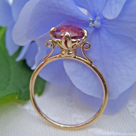
Looking forward to update reports!
 

elliefire99

Brilliant_Rock
Joined
Oct 12, 2018
Messages
584
Aw, thanks for chiming in @Lykame! And it's not too late at all; Sally should be working on the final layouts in the next day or so based on my comments this afternoon. I can still send something off if I change my mind :)

As for Sally's email and the prongs... you are only getting half the conversation here. Haha. She is responding to my attempt to describe my desired prongs with a metaphor. Soft and pinched as if you dropped the stone into a tiny handkerchief and pulled the corners up over the girdle of the stone :lol:. The lotus prongs are like the ones in her popular lotus setting below. I love them, but ended up vetoing them bc they didn't work with where the rest of the design was going. The "geometric" prong are what she drew in the last set of layout from her --very triangular. We are now aiming for something between the 2 of them.
il_570xN.83263786.jpg

(sorry, I don't know how to make the pictures smaller)

Would you mind actually clarifying what you mean by using a shield shape for the double shank? Now that we realize that we have to do triple donuts, the double shank may be back on the table. It just looked really awkward when we didn't have pear shaped donuts under the side stones. Do you mean that the support should be shield-shaped (I kind of tried to draw this on the diagram with the donut/no donut poll) or are you saying that the bezel thing around the third stone should be shield shaped to flow seamlessly into the gap between the two shank wires? DEFINITELY open to ideas on this point, as it is something not set on. :)
 

elliefire99

Brilliant_Rock
Joined
Oct 12, 2018
Messages
584
And no decision yet on the gallery space below the side stones! The little v shapes on my diagram are white bc they are stand ins. Whatever it is, it will be small, as there is not a lot of space there with the steeper slope.

Actually, opinions here also welcome! We need to decide if we want to keep the bezels slightly elevated, but still sloped down (as they are now), or angle them completely down like cathedral shoulders so the last bezel is flush with the band. This second option is more conducive to a shank like the one twang07 shared. And with this second option, there would likely be no extra gallery detail.

Cuffs. I actually included them in my earliest sketches I sent for quotes. Got rid of them bc the stones already take up so much horizontal space on my finger. I guess I just have to make a different ring with cuffs :razz:

Going platform-free on the bezels :) Sally said a yg platform would look "harlequin" haha

and ALLL the milgrain ALWAYS :) :) :)
 

Lykame

Brilliant_Rock
Joined
Jun 1, 2018
Messages
1,433
Aw, thanks for chiming in @Lykame! And it's not too late at all; Sally should be working on the final layouts in the next day or so based on my comments this afternoon. I can still send something off if I change my mind :)

As for Sally's email and the prongs... you are only getting half the conversation here. Haha. She is responding to my attempt to describe my desired prongs with a metaphor. Soft and pinched as if you dropped the stone into a tiny handkerchief and pulled the corners up over the girdle of the stone :lol:. The lotus prongs are like the ones in her popular lotus setting below. I love them, but ended up vetoing them bc they didn't work with where the rest of the design was going. The "geometric" prong are what she drew in the last set of layout from her --very triangular. We are now aiming for something between the 2 of them.
il_570xN.83263786.jpg

(sorry, I don't know how to make the pictures smaller)

Would you mind actually clarifying what you mean by using a shield shape for the double shank? Now that we realize that we have to do triple donuts, the double shank may be back on the table. It just looked really awkward when we didn't have pear shaped donuts under the side stones. Do you mean that the support should be shield-shaped (I kind of tried to draw this on the diagram with the donut/no donut poll) or are you saying that the bezel thing around the third stone should be shield shaped to flow seamlessly into the gap between the two shank wires? DEFINITELY open to ideas on this point, as it is something not set on. :)

Totally understand about the handkerchief, that made me laugh visualising that, it makes total sense now. Those prongs remind me of flames, interestingly, even though they are petals.

The shield... I meant the way the shank met the round bezel, I'll see if I can find an example in a moment, but having the bezel of the bottom side stone 'become' shank is an interesting idea... Although not what I meant. Equally you're right, the real estate of this means that the stones take up the width of your finger, which is awesome, but perhaps it doesn't leave much room for shank details. I just wondered if a sheild shape might be slightly less... Awkward looking a way to get the shank integrated. I'll find a picture if I can but doing this on my phone so will be a separate post.

When you say triple doughtnuts do you mean each side stone will have its own doughnut?

Your galleries... What about just one swirl? Like a ~ but swirlier. It would act like a strut support but not be too busy and could be mirrored on the other side.

Regarding the side stones tilted... I think if it's tilted down so extremely it's really going to affect your top view.... You could tilt it a bit more than it is perhaps? But that would still leave that gallery space. You're doing a lot with the central basket, is there a way to do a really simplified version of that or one component of that as your gallery detail?

And yay for millgrain!
 

Lykame

Brilliant_Rock
Joined
Jun 1, 2018
Messages
1,433
So in hunting for the picture I was thinking of I found this:

https://www.etsy.com/uk/listing/625529044/the-cora-victorian-style-yellow-gold

So obviously this is a completely different style but what about having a double shank come under the side stones to connect in some way to the basket and having the side stones sit on top of the shank a bit like that? That's not actually doing that really but it made me think of it as an option.

For a shield shape... I kind of mean a shape like this... https://www.etsy.com/uk/listing/262961974/the-cvb-six-prong-victorian-elsa-style. Sorry I am definitely not trying to plagiarise CvB she was just the first person when I thought to try and find you a picture that I thought of as an easy find, hence how I found the other picture. :)

Your double wire could come around that shape and below the bezels and the shield could come up to meet the bottom stone.

Does that make sense?
 

elliefire99

Brilliant_Rock
Joined
Oct 12, 2018
Messages
584
So in hunting for the picture I was thinking of I found this:

https://www.etsy.com/uk/listing/625529044/the-cora-victorian-style-yellow-gold

So obviously this is a completely different style but what about having a double shank come under the side stones to connect in some way to the basket and having the side stones sit on top of the shank a bit like that? That's not actually doing that really but it made me think of it as an option.

For a shield shape... I kind of mean a shape like this... https://www.etsy.com/uk/listing/262961974/the-cvb-six-prong-victorian-elsa-style. Sorry I am definitely not trying to plagiarise CvB she was just the first person when I thought to try and find you a picture that I thought of as an easy find, hence how I found the other picture. :)

Your double wire could come around that shape and below the bezels and the shield could come up to meet the bottom stone.

Does that make sense?


Thank you!!!

The idea of setting the bezels on top of the split shank a la Cora is intriguing. I wonder if there would be too many conflicting shapes involved at a larger scale (little bezel circles stacked on top of linear solid shanks). But I DID actually include little dots on the shank like the Cora in an earlier sketch... Poor Sally. Just when she thinks we are close, I always send a flurry of more stuff her way.
upload_2018-11-14_22-47-10.png
(dots)

And I think I am TOTALLY on the same page with you on the shield support with the split shank continuing under the stones. This is what I was trying to demonstrate in my little diagram, but maybe that was not clear at all to both Sally and the people here haha. I didn't pursue it bc we decided to go donut-less, but maybe Sally will look at it again now that we will need to have a split shank under the side stones for sure. I conceptualized it with the pointy part of the shield pointing toward where the two shank wires split and the flat end of the shield facing toward the bezel. Is that what you were imagining?
upload_2018-11-14_22-52-12.png
 

elliefire99

Brilliant_Rock
Joined
Oct 12, 2018
Messages
584
Re: your previous comment

"Triple donuts" are this. Really a split shank under the side stones rather than a real "donut" per se...
upload_2018-11-14_22-58-36.png

Gallery... Sally says she is going to draft a simple scroll. We'll see what she comes up with there. I also definitely like galleries that mirror the basket design, but the only element I could think of pulling out was the little peaks that mirror the pointed basket (the white prongs in the colored diagram). They're fine, but don't knock my socks off. Hopefully Sally has something up her sleeve!

Thanks for being a sounding board! Fresh eyes are great!:kiss2:
 

Lykame

Brilliant_Rock
Joined
Jun 1, 2018
Messages
1,433
Basically this just agrees with what you've said above:

IMG_20181115_074705__01.jpg

Or what about?

IMG_20181115_074714__01.jpg

Other things I'll respond to in a bit! :geek2:
 

Lykame

Brilliant_Rock
Joined
Jun 1, 2018
Messages
1,433
Re: your previous comment

"Triple donuts" are this. Really a split shank under the side stones rather than a real "donut" per se...
upload_2018-11-14_22-58-36.png

Gallery... Sally says she is going to draft a simple scroll. We'll see what she comes up with there. I also definitely like galleries that mirror the basket design, but the only element I could think of pulling out was the little peaks that mirror the pointed basket (the white prongs in the colored diagram). They're fine, but don't knock my socks off. Hopefully Sally has something up her sleeve!

Thanks for being a sounding board! Fresh eyes are great!:kiss2:

Ok understanding the doughtnut thing now. Will be nice to see Sally's scroll. When you say the peaks, do you mean the red bit on your colourful drawing? An upside down version of that? Or... You have some shapes in there that look slightly diamond/kite like - perhaps a very gentle repeating version of that? Might be a bit busy though...
 

elliefire99

Brilliant_Rock
Joined
Oct 12, 2018
Messages
584
Thank you so much @Lykame for drawing those out for me! Really going the extra mile. It seems that looking through thousands of settings for your rings has really paid off ;P

The "peaks" were referring to the orange parts on the diagram. Literally just points haha. But the red sections (which have a little more flavor) are also a great idea. I also didn't think about using some of the shapes created by the negative space in the basket. How creative and astute!
 

elliefire99

Brilliant_Rock
Joined
Oct 12, 2018
Messages
584
Aaaand shank and gallery updates from Sally!

(Basket will be re-drawn later. She has OTHER clients too... haha)

I LOVE the final shank design! Great team effort on this :) :) :) It is a single, not double, with the divot that disappears partway down the shank as the shank narrows down to 2mm (for ease of resizing). The tip curves up to form the support of the last bezel. Also love how the shield/pinched shape echos the points elsewhere in the ring. Yay! :love:

Thoughts on the scrolls in the gallery? I like them, but I don't really have any scroll type things anywhere else in the ring. Is that a problem? I can also wait until final basket design to approve the gallery design. I am going to push for it to look more like my colored diagram,... though Sally's sharp points are growing on me...

upload_2018-11-15_10-9-50.png
 

Lykame

Brilliant_Rock
Joined
Jun 1, 2018
Messages
1,433
Aaaand shank and gallery updates from Sally!

(Basket will be re-drawn later. She has OTHER clients too... haha)

I LOVE the final shank design! Great team effort on this :) :) :) It is a single, not double, with the divot that disappears partway down the shank as the shank narrows down to 2mm (for ease of resizing). The tip curves up to form the support of the last bezel. Also love how the shield/pinched shape echos the points elsewhere in the ring. Yay! :love:

Thoughts on the scrolls in the gallery? I like them, but I don't really have any scroll type things anywhere else in the ring. Is that a problem? I can also wait until final basket design to approve the gallery design. I am going to push for it to look more like my colored diagram,... though Sally's sharp points are growing on me...

upload_2018-11-15_10-9-50.png

Oooh I like those sharp points, they're very fluid looking! I think they look really beautiful. Is there a way perhaps if you want to change it more to your design to do some sort of pointed half way house?

That shank looks beautiful! Really pretty! Love the shield shape. What is thr black centre to it? Some sort of split? You could even millgrain a line down the middle of the shank if you wanted, basically like her drawing reference lines have done. That would illusion a double shank but would be more secure. I think that is all really pretty. :kiss2:

Not sure what I think of that scroll. It does look pointey like everything else so I can see the theme. What do you think? What about two scrolls per gallery rather than one long one? One going up like / and the other mirrored downwards \.

Glad you understood what I meant about the negative space!

Would you consider doing some sort of scroll work that contains a surprise stone? So you would have four of them? Tucked into some sort of swirl or bezel. Might not be your cup of tea, and I don't know what I think of that either. Just throwing suggestions. :geek2:

This must be very exciting to you!
 
Be a part of the community Get 3 HCA Results
Top