ItsMainelyYou
Ideal_Rock
- Joined
- Jun 27, 2014
- Messages
- 5,473
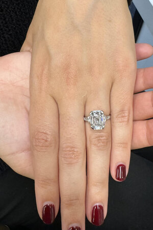
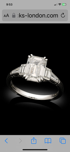
Ah, needed clarity!The width appears to be about 2.5 by the stone and taper to 1.8 at the palm size. Are you suggesting widening the palm side?
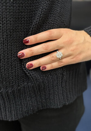
I agree with making the shank a little wider so the diamonds are larger fwiw
Yes, taper to 2mm on the palm.


300x240.png)