shape
carat
color
clarity

CADs are here for my 1.55 OEC - thoughts?!

OECtime

Rough_Rock
Joined
Aug 8, 2013
Messages
83
The ring will be 18k rose gold with a 1.55 OEC center stone and pave in the basket and on the shanks.

Here are my thoughts: I would prefer bead set pave on the shank and in the basket. I also think I don't like the donut - I want my ering to sit close to my wedding ring and don't want that donut pushing it out. Are there reasons why it would be better to keep it? Also, I want my ering to sit low - does this look low to people? Finally, I think I'd like the prongs to swoop together and connect under the basket - right now the ring looks a bit like a table to me (?)

Thanks for your thoughts and help!
 
Lovely!

When I look at it my eyes wish that either the pave went further down the shank, or there was something stopping the diamond there. Like an outline or something, so that it makes sense that the pave stops there. I think that could be done and then you could have it need set like you want.
 
This is what I mean

uploadfromtaptalk1380663101262.jpg
 
That's a great idea, Niel, and something I'm definitely considering. I agree it looks "unfinished" right now.
 
The donut may be an important part of the structural integrity of the ring - many vendors advise not eliminating it, as it gives strength. But perhaps it could be made smaller, keeping in mind that a variation like that will then cause the angles of the struts to change, etc.

And I agree - the side stones either need to go farther down or have a definitive stopping point.
 
The donut probably wont cause your band to jut out, because the prongs are angled out. The top of the band will only sit as close as the point it touches the prongs.
 
Also, depending on what colors you're trying to bring out in your diamond, I would do the basket ring (not the prong or donut just the part holding the pave) in white gold instead of rose. So the white metal reflects in the diamond and doesn't lower the color.
 
The stone is a (very white) GIA J. That said, I think I'm ok with having all rose gold.

I'm having the CADs revised and will post them here. I at least want to see what it looks like without the donut and with more of a "swoop" connecting the prongs (if that makes any sense)!
 
Niel|1380664552|3530368 said:
Also, depending on what colors you're trying to bring out in your diamond, I would do the basket ring (not the prong or donut just the part holding the pave) in white gold instead of rose. So the white metal reflects in the diamond and doesn't lower the color.
I have a 18k rose gold bezel. My OEC is L/M and it looks quite white to be honest. Most colour I ever see is a steely/grey/silvery type colour. I think it all has to do with the tint of the diamond. Not everything you set in a warm gold will pull warm colours, IMO.

Kind of a roll-of-the-dice, but the contrast of the rose gold can really enhance the white-ness of it all! I think the ring will be stunning - best of luck, OP!
 
I agree with the idea that there should be a stopping point for the pave. A little engraving on the shank at the end of the pave would be gorgeous. I don't think the donut is going to interfere with your band sitting flush. Overall, it's really pretty. Can't wait to see the new CADs.
 
Hi all - revised CADs!

I've got the pave beadset now, with milgrain. I am also deciding between two little indents to add visual interest after the milgrain versus one indent. (Of course, I could go with no indents, also!) Thoughts?!

Two indents:


One indent:
 
No indents:
 
Love it!!
I like the two slash marks best, then one, then none last.
 
I like the slashes also. I think 2 works best but 1 is also ok. Without them it makes the pave look like it stops early. With them
gives a little more interest and makes the end of the pave seem more like thats where its suppose to end.
 
Oh yes, the slash marks make a difference! I think I like one slash best, but 2 looks nice also. Good call Niel!

Also really like the change to the basket and how the prongs swoop more. Geez, this is pretty!
 
This is going to be such a pretty ring! Your revised CADs have made a nice difference and I like the indent(s). The swoop of your prongs are pleasing as well. It looks like depending on the "height/thickness/rise from finger to the top of your finger" of your wedding ring, will determine how closely your wedding ring will sit next to your e-ring. The higher the wedding ring, the further it looks like it will sit next to your e-ring. But I personally like a small gap between my rings. :)
 
Love the revision! Can't wait to see it.
 
:lickout: :lickout:
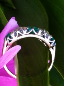
Two for sure. Or one. But, I have an antique emerald/OEC diamond 5-stone with the double.

See the faint double in this photo?

_10749.jpg
 
The milgrain in the image is just for your reference right? They aren't casting the milgrain? They are hand applying it after casting right? Because that's what they should do.
 
Gypsy|1381454598|3535611 said:
The milgrain in the image is just for your reference right? They aren't casting the milgrain? They are hand applying it after casting right? Because that's what they should do.

I'm double checking on this. Do you happen to know what JBEG's general policy is? I definitely want the milgrain to be really delicate an light.

Thanks, all, for your thoughts on the insets. I'm going with two, to match the double prongs and in keeping with the vintage design.
 
The answer is: yes! Milgrain applied by hand.
 
The milgrain and slashes make all the difference. (I prefer the double slash) I like what they did with the head too. It's going to be gorgeous.
 
Beautiful! I can't wait to see pictures of the real thing!! :)
 
GET 3 FREE HCA RESULTS JOIN THE FORUM. ASK FOR HELP
Top