shape
carat
color
clarity

Bought a BIG blue nuance for planned recut to OEC/transitional...!

evergreen

Brilliant_Rock
Joined
Jan 18, 2012
Messages
828
It's done it's done it's done!!! :dance: Ashley and SWDC were terrific to work with.

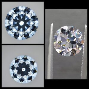
Then: 4.01ct J VVS2 (light blue), 10.09-10.12mm, 55% table, 62.7% depth, crown 16.5%, pav 42.5%
Now: 3.73 I VVS2 (faint blue, heh), 9.90-9.93mm, 52% table, 61.2% depth, crown 16.5%, pav 41.5%

(New cert doesn't give CA or PA; old CA and PA were 36 and 40.5.)
Lost its cool Ukrainian origin, but that's OK. I still know. :)

...so it only lost 0.2mm diameter! My goal was something >9mm so thrilled being on the upper end of that range. I asked for big fat arrows, and mentioned that I like checkerboard (but to be honest I'm not sure if those are somewhat mutually exclusive - priority was big fat blob sparkles, not splinters!.

From SWDC:
ADCreHcFrgFVCvUgouJzhmEUwZG7l3RGhzpGPuoF3L1IdjNcgDolWBzJgXjCMQwjnUMdBbb33AWaaFcPKq-woYnAtOAs3xdS1nffS7BkNgQg1aFQe0oUHIrZpX4YgPTuHh31CTnVUjgpCP3AiyeNhhQUyQp1hBOW6tJ7GembnI6bheVUKx5gL5IMEawcgacR3r-7AXkuj2XcB2vwTpYBMUUzn_vYhVXimDISZ3d-3iGBeEg0_oxX8eohT-2FvuqLww-X9Bx_frbJirK_E4M0ZNX4-0Yj3CcPgIFprj45nnsdt3TXl6p3Ip4HQEuYb7a9FemFfnNdoWScsYlSpuEa-d4lqzInPCrhwfW7GKwK4NVhM0bqhc6v0yuaaWu8RolsvQQHxMWI4m0qbPQvSItZpTZj52MlxuzqyS6f0CyrWXTk3lX8UmhFMoQewR6KWPixW7g3XOJzWYiC0MEJrm6qVLddprVsUwd8dyFMCiBrECEgsf9hpE9PyaeMguQkDXy66GSNSKTUEU59TICxXVu4wiIE89xQnxvevlkgrDGsAachDhmL2B_1y_Bfr4FWIWeLdaGjRYLnTU_gZ7_DF9yXiM93nf1tXDw3rf0hbP8117im_yxp1TGFBGm4h9f28vzSSykZru-G9GAPWr5OuZNmud9huhWfEYDasdKbWkEMicNqrtbwTQXIWrU5zzhEh8ep1UrZSHkNWD9IOhlbppWt-crsL7TUwlDvPMUyX-eZsbMOchJ6mJrqMQvn-2n4k0_U5UjIP6M0fbGq8DLq3WBtVgG_Vcub8ysG3TzKdL6LfSqJo1HtwCUzSHRgzB_rgmXinqZvLHQLhtDS8AMVttmI4JwBOCzi29i52ORffuKE3qYSmqWDQbPg9T8tMB6XDO7Yx53_QQvs6Qpb8BKOO52WuAyiVw2RPSCDpfE-iFu4CoKvp-ns1dkKnFT1HXM1vYu-CCE=w1080-h1080-s-no


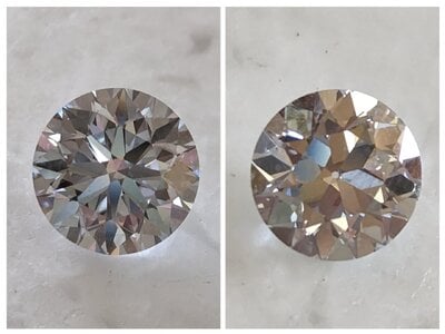
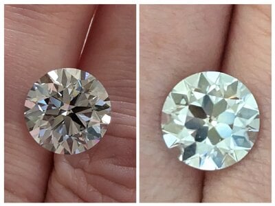
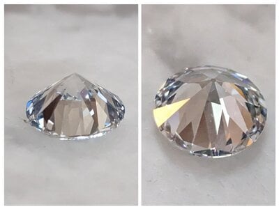
My photos, before & after:
ADCreHcS7ZnZC925ftW9s28Oj8dTTq6MwI2BLsBT4E0baFMeaZpKiMIHdttfla4j_IeceiM4i4I-ngubiTPjwP2Wh49GPAx_LFXjfhnWFsuP5B6rYK6Jhty4tVxwfnl3sATrxHALBx6tpp6LpVTLMfceV8y6t1bcNL0hEtE_Fwpiu68wIYRWzPc-qh_6c9dZi2yn49AoImBvmUCFkNZabXMg5UOciK7k60SuZQm0uskiqG7-gITkZ0-IXv8r5_RXFxOZW1xc-GI6A-iIFBqaSSQm1V5flVVEjic5iYurLKBljYrX0R0oI931C7Tpd02WxXeyViTpB5BAbw5Z2vZ6TKKhTA40AHaF4XzRsAajNSeOUHx_d9Jig8jH_MsEewevkRcaj5iqMW0SNAQUrh_rW6gR0N2vCCTPf-Xvu53_ZRWmc0SQpQnFoYpkXZ5SXVS-WERIayXQzvBa7q3CCRuN7Z3AJoZhlQ0ttztEguapat_7T9FEvDdA2H9LS1DmlZW-6SMAomf2VvqGWhzPd-ubYN17Ov_PChW9Ptz6KWSxIWCVc1fUKlET0NkxA0gWkSjY6nDfERAGRz2SuI3fzivJ_43syqBrYEhYvj1bmcd_NR0oVSlR-8lSzWQ_l99oIDhO77desP3BPYqduEv7AE-1lEzvPpFkGzX_CJY0ie-zQrKUxWYjYtFLroUj0sNUJVYXpiMZWFlFlabiHFy1e-LcQXd-GOZMAPaY1J9qJR9V0I51bS6Ce-0sW78NIFzwyQL3uBG_aLHlnszaSd9CRKwJOlUXt9cNBDXPpIrMTXiWgHf962Q76B5Pv8pKnskt02b1NYjC3tuhLWiVsG_lWsjnVOeCGBmMlyJcmT1LkKAud3XV1AjX3lQy3M3wn0khcdOCsq5HuLO8jYf5lLO7JfznYwEqDnuPXfJusE6Shqf2fut2HVi8niSivoRaMMhx7n_UtCg=w1480-h1112-s-no


ADCreHe4PYDd8JeVYWFR7184rKOFzb5F8BH16S-SZhOec9moC_WrDcb1I1GVgXwIoyBqZQDSLls57L5Gvb1xHutKPQyA_hivktlzVEhoZtvPFYJTr961MUxG-afsxyYGuoMsrkYPHW5VNnY5sTJrt7w4QXLHlOfj9YBjPKhr8Ysf0tIRgI37ZulImI2aTyl2TPHbYG6AixbeSQsj6VplzYd-Hw82pZDg5RyLJQ8XtOvs074VL2I6aad0zK1rOhlls0VS8Eni6NiQWxiryS87PdCj-WFB8V2OeJIQLhWCL9YzwevF95QwcMDIAlQsjrqL1kl3VCpY3wIqwCo6OxkDNVpRoUkjMOjN7T3MGlZ1waZg9s5yF8qBARCMabsqrTBTKFyAEqDKlSWVfi1TZpju6Eg3sHITl7LKYaL3C6Gxlo02DRmLGeqB77mJ5RoxJaoLiKum2F5sGQhJjJQf1-2SgCB0McXK4ba7j8T3p6dDBeYNCzVGgFv0dhKCO0GKdDtkW3T2meQUz6H96xsP5sCtvQW-boVd4GXroOO06iAKJoN-cAW9wUhnMeMOUzKjEAz_FyXMRS-_daKo5zcoYi9iV0VW2ZlQkST8rjHort3N1F3M0FKaK5p9mjUwOcUYjjFzmKC75Knm_-Yb5WxLdMJ7msm5LKx24MK-7_VX8AfPMdsCgsMVDynb5ibkyh7XEknHRKk7QyreBqXmRxPHicjNyR4_HCBDzSahxyfMpBjbKh8e0Ka0D_NeQVYfDaxXV-J6qbhXcuOPZ8S6k-t0SPZ7L4fBW_KInTd79MBeg18RWBMv1HA6OvAlZVSj6rs_8JHCOxhK7Ihts8_kwoXKAZ_u-usRR1p72KLLCZl_fNK460HoG7dsElE9vwcpmshhzivno9ld7Z9Xe0S1Hhb-zPrwb1N5E3GW4bFz_MD7CfePK74UxjkktASTIe70NqDHt9kBQQs=w1480-h1112-s-no


The cut is stunning. Snowflake shimmers in the middle, edge-to-edge bright. Got rid of all those splintery RB virtual facets, for sure!!

Ashley warned me, and he was definitely right, that it would look less blue afterwards. Hundred percent correct. (Even graded I instead of J. Shrug!) If I could have found a lower-alphabet blue, it would have met my goals a little better, but ultimately I am still happy with this one. I just... need to plan the setting carefully. Here are some before/afters relevant to body color:

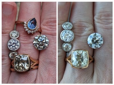
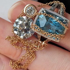
With platinum-bezeled GIA I transitional (ungraded ~K sides) and RG-bezeled GIA O/P cushion.
ADCreHdbui5OKudHgiIUDW7HGq12zBrK4zOtzOJfvsLgGRZhvH28ULrFazfS5aBXwzD_RQpUdBQ1TCM1Gc9OmpVzS86Mq4wh1AwSSD1JApKj_47qtM4nxaeZkRiYuHTKwP2QVINL6YUo-P7G8rjgwHjTEc5vVdE4GscJPdmpz-s2tVQE5lcOcvg2i29amUd4KYBR_jWpTpzcHEgCPKq8KmTsG5_vR9QMZanh1mCjI29D2Ga1jBiOp2Y1zB1_LKv3C22w0D1KCOQKuR3eEHaQAbzyQyUn6KWamrTBVLn5iwLSGEpicEd44tJUJhFdXC1y4822dHwS_UABeQL8dagl9ePTs8BLw2XZz7PYAsAHcBwN5XtILKunfKOVDF0v5cwhDfIVU5HSMUU2ibGi6o4YvlgAFa4zLsEbIha_OxWaCSsYQqIPcsBnfI7mVJqhqgUslCQElsUruruiRa5isLRDl48kUug4SMlEqCZBa5J310iAsnRB4VFxiHIO0FA18a1yBwVbkjKuZbH08jgLMD8HSGlEI9qfAjGciScqlZHGBpthbZdKiXnuCc5SL44EQ54wwFOE95DK_D8q7sZFKokj9hMBnGKmg3-l-0uToPyGsV3aIWzHWwG0L3sJSEDL2d3-i2QPzuPc1Sic4wWzECkE5355DnJG9JwiMjx2mB9-Eu84bMgxEhCVaxj0uNyGidwLnuU2ilmZPnH_SlVWBgpkbuDirAecPCfcd4s6BoL73vBRN_KlO_iHw759g27OQcozIOoevoFnWykBCMN_pDyhY57C_hug17EwqObEyK2rmUyO98BpeITUO1coh-JwruCyza94tZQZp7cb2KuXu-bNSXYcWTlwRW_g83YZmzt0droJ-etGnoxoh6J0BCIMjZDuspgMR-d_NM-U3VAKuY0KofEi03hcNzygZ4NQtQ3Gbx6-vaRMxqCuOKMvnQEEwtiGTT4=w1480-h1112-s-no


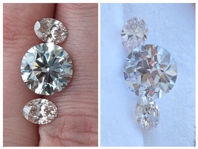
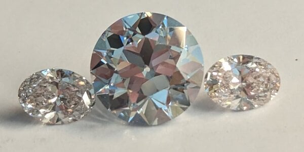
With J CVD "pink" ovals.
ADCreHfTqFB9daw9Yj7HdFDr2n7LX2jVa1F9cYQEjqNsb1LlE65zMBcX0nTosg6RT3Cm0Abc1-R8URF46HLtXoD1I2t-wSNkRtuhGGMtSF_XXYzbmu2BILvrDgP9dAqZ3bJIUpL8N-KjDMUFfW76czPLe6XLlAEaquEetU2kcqQPfoS71d6Wb9h2xBL35uCc-1xv75NnvXdqDetqqNuvSXVPGva_PJwS2C1nOZq7PDEtcZTN8xfKVM0MXaL9NTcgndQ_kOTLYEbwdVheJAAO3YsOyhq3dfZRtB-CtdDgQ_BKLE0AhlF6EhmWt3kTV5pC5I-azKvwmQP1RFtqjCqhyOLa-nMox0AsQoFEUWQbXj5LfoNrUjrJFOuR5rn4pLhpi8hvJqFnlJQ3pc6SeztpEWn34qD6Gm7g19K1ZH1iEQiEERl55eXPaQHHjKeau0jz4KmAl7vlYJkSm3ww4R866kC3w8vncdsNIAOVaPRY73O0wZeye2yCOUctLl-PgtK3pVfDsHOYTSyLv8-yvl5L1YtjWkmr3HthZwMdgwwGTJPllazaNiGofdSnAlORZZydlwbhBvwI1zEkNhYtdYsvCnyUQvfcR0PFmZ_NoZcd7z77iMU0Mo4x37enH301t-wJ8GmAyAsTog0HinkhnB4SUhuKu4yZX24EMomgETLHZS5Xrm-jKs4GBVE5h9JpwOBSovLZgxEo9uykdHPXrvd6N8io52a7DrI9CkOkUVj1J9y6KPDT-hcVjwdLI8-Fu6fR0XnQw5PBQqla0TW9pFcb0RlE-dA8XjAdC1tFJUjIu5ygzVEoRP9MIQ5JxOBuhQTRglcQ356YoSFx1RMN8QIWfb-LCuejZwFzEH4LKBuuq1w7RK2gH0rghSoDwR-ALICKnnoKaZKhzgTUGfoklnM-0A5T2qca3LNZ5-TaEhtGl47xZoNjPSPHT-DQABn1TJSi04c=w1480-h1112-s-no


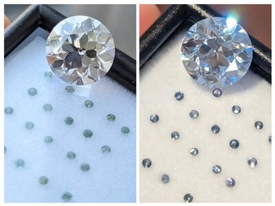
I had been thinking maybe I'd go with a platinum or RG CVB Astrid setting, with these little color-change garnet melee, but I'm not so sure the color works.
ADCreHdhdacsmjYpg40KLrT0Ta-hhuPEoMxi_7AdD__IiXZytoI4-m3R4pJBCIE52XkgwBBDRSDtOocd8-BXbhjBTg5OAc7j_DjYxbucUyQ2Dj-NsFf8KKQ3ZA78ItbWBl7ne6vV6IqUMhctSlSngVbITRo81lUHYuUsZAbdyjgSnYCWHh99g6mhMJu4hg4rWjVzt8WusneAT3K0HaOvwrajnTw_-nRoLaDDUpqDaJ7A2-9w0DF6uj2FX0n9eQZrmSoZ7rtzPsa7ozhaBr-DHLRTypkKCRlm072XnCkE4QElsWSrUW7lU159PeAx4x_GRz4BBVXwxcNhEL_O94DZgztt27oHLgQPzwN4NTdQwETLyY6N2da6akvenVoXalpkd2m3jtVErYTY8h_ktMp2eGcwgva86eUIS3m6EjEV4RrIf7BdpEm3mGfVOhcr4Z-hIsdLuOHBJVeb9vhFaIoqu6jaN1Fqpe7_2zwj6if3rWMRfxxXrYjk2mx8fx4_priXJu4imeFCMfMjMZXlrDNM2a00kDvOIqH4tczVdqypT_NV4vMulRD16g52Ln6E6L3hjK00ZfuoAWeSNadf7MJZb8RAoDg48kWfR4Xvvdzpzlfby4PPohsiffshfKWgG-hjqMdGj9w-BF5nM5pzmp2-EwAg6FIRD7GUvmNPZwepT_CybvZMD7yT4qYBq5RYtm2AFoKIzcryEkdpcF9fYnGvKGKPqm7Rkp8Hvsh8gY-GGO9ZErOtt5K5YO63ltA9Lss-1GOS702nf5gYylUrY7gaWlfzd941U6UYOkZgprlmZFC4tJEYFgLanQrVcDsaZNyYwYdCTnlptZRF-THsMdwlpMAGiYEAwRr6KNmouQx9L-ahxkWqL4LNO0Bjx9ZXkadYpxyCcAD6_R8mouXKFxInM3kBwdRIgNLs_3oiWEU7WoLcOnNbqJTewZ7z2UHp3AYkkuY=w1480-h1112-s-no


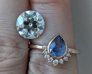
Maybe sapphire after all? I think it's just not going to really LOOK blue, except in occasional lighting environments, no matter what I do.
ADCreHfB9l0MBTPaRmU5vSNQnQujJTNPcBShBBaIFPTZyH7kNnnv-cYDScbcJhI9P3mCZfp-mCeyoYcRqqp7m_gM7XMxlzVPsNSvljjnrq6qoL-FubNF6husIkQmdXa--YQrDuiJSsejZ7BIBPCrWYzqjfgPAXnj4b4KEqPHhP6xLGH5xHRR0sK7YrSGW7gtxxou2vloj2xhi6EHiI-TjbP0PQlQYAkkuDo5ZREr8JC-cIWyRr-SXRmKmtwfnk0T-1lHOsY76wq18NnQS9M_zbii7AdPeChzBfJIfycu2BwG7gWGrByKR_BX6z7UWUTHtq23JD1qyoPmgDJZnEf4k8wCVUisJKIQEgQ77U7rtIcPvHvME4kQwdu_oMoYDnoXr18Pkl3PDUcZhG316CISSA69VjViY5TavGeWsP-AqaLUjtwz4jE3mUxIu0spmDl4gC19_L0rRcJ_hmNcaniYv6UfaUqGgDB3uUr9tUowq_GoIpTEZzcWeopGUDBmLGnMy-8MOz5aae2cL9tqHMvh_otud_0d-b7G_95woQqAiNIlkqQmZkuO7wFPsDl1qVcJxzKmWD8akUU8R3vd4gvtLd1H_kxzc7SGOz5-dH9TsqzP4ZDtPmmwtXtvI5ijphMnTvVGkr22mcVzXP3pTIfPJdMjXtVNQWa5m0p1gFP6gLisnRa3SREWDLZMq_7UJ0ADRtGfqukw6JAqaphw7RRUC_XdSaz5gg4gMUbPa7c7UZNNKglpROIYg7CMv6vluB1CFquM5-Gfvfa1e76ED8ejyBHbiDxsmvvgB3faMNLCrkODbbPa3Sb483JIfyaIT3egcfCZcc75yFfS7-rvIMm1T5hU6bKlQ2FUGh6LjiX63sFhq0cfOihj5he3jx8nXP9_2cayzKNUOdEC_NKbN5V8n3VgfUfvDpxfp_8Md6HODjkY1WWayInrLKq5JGkcZmUeQGc=w1480-h1186-s-no

ADCreHdcie3KyPAI7-BkT46umRrkm7vMni3c5Escbnji9r-oxdGt7VYc2xmXLSvA5MXLTfurBoWXn-QI_TDm4NU_rRSPSBQInYmt789T6A8JESIyFzT6GslNiEXrKojAEKUlMHJSTrp4xAlNOOJRSw29EVkvlp9dQdTZs76NHEnHY2C4T9fyWeUZ-8lVaRTR41DtpQXoRMDzONrwmDTSdFierQarDdDtnLsptKwANUTxMmK-GYhe-t8k4B6Hu1j_Z4555BKeDRpPBdeiUB8OZEo9QAwRy4l_sokExsQB0BqYU8Wf1Lvny8dR9Iq9LJhaGgw6UHBNgqujtlkLbe4Ww4F6kBSO1KbJPQ0CZDZ_QRJJp7Zluk36Tlmd7LfMz1J6pt6qb8fsNTQLCxRuzVI1DbZ1kIA2jdAiunDTbNqvcK6WSjtQMcqaz79otvq2DmApy4pM6xBepEuwT_6RYPV0sy0bXZ9lfWtOakncQRH-zYOl_u5Ndb7DH0I0Y93iVoRymuRIPuhJdfmKO6KecdJOsc24Oyk3zhpV-eCC__fDWD8yG9m0I4dLVNQ1mowjVT2eZjpJwvQFawoRmshpmLmq7-fVHKptV4rNEUDQMP9qXprKpbil_APbgM58LizoeI3cFaqMmYx3ueblpN99wceHieSW3NBLHA9tW-mda081Np3tRyuFgXfZRMiEldVQlVW19b9IlM51h2T8SamL_0q6I-i4Qs94_cYVozRZzlNeeupY829Ne6lA_LDiOOk706p8aaB8Yxi5zywQbKSRSlgBp4rYY7fCsdFHWY6Lph0eN48hlw9vsuW3GTJ9_ieeXDKeWYR42QwM3GFWsEl7bnjlENLxeL6mwLcBYRckZtng6lelHSfbprEI8WwtDfiQdjXu1s2BLebpm-2u1mOdbDOCs-ATwdRS9BJUcVkaIRDRAQMcRQanKnDNTFLPt2S4IixrrCA=w1400-h1197-s-no


Probably time to redo the PowerPoint. ;-) It's how I cope when I don't know my next move!! I missed the window to ask for a bigger culet, and it is tiny (which I prefer at baseline), and the stone is overall so well-cut I'm not seeing a lot of opportunity for color to come through the pavilion if I wanted to try to introduce some blue to bounce around in there.
 
Last edited by a moderator:

Tiff1886

Rough_Rock
Joined
Jun 2, 2023
Messages
35
I missed the window to ask for a bigger culet, and it is tiny (which I prefer at baseline)

It looks gorgeous. I like the small culet :) Thank you for sharing all the details!
 

0515vision

Brilliant_Rock
Joined
Jan 16, 2023
Messages
853
I can’t see any of the photos either! Sadness!!! :wall:
 

Lcorb

Rough_Rock
Joined
Dec 14, 2021
Messages
56
I can’t see photos either…thought it was just me
 

Tiff1886

Rough_Rock
Joined
Jun 2, 2023
Messages
35
I can’t see any of the photos either! Sadness!!! :wall:


I can’t see photos either…thought it was just me

Well you all are missing out then.... hahaha.

I see most of the photos, but there are a couple links to a photos.google.com/album/... that are not loading.

Once evergreen gets all the links updated you are in for a treat :)
 

evergreen

Brilliant_Rock
Joined
Jan 18, 2012
Messages
828
Ah drat!!! I thought maybe a click-and-drag (which works on my computer, ha) would save me the trouble of downloading and uploading everything, but I was clearly mistaken. Bummer. I'll ask Ella to help get rid of the post with the links, whoops, & repost. :)
 

evergreen

Brilliant_Rock
Joined
Jan 18, 2012
Messages
828
COPY PASTED POST FROM ABOVE BUT HOPEFULLY FIXED THE IMAGE ISSUE:

It's done it's done it's done!!! :dance: Ashley and SWDC were terrific to work with.

Then: 4.01ct J VVS2 (light blue), 10.09-10.12mm, 55% table, 62.7% depth, crown 16.5%, pav 42.5%
Now: 3.73 I VVS2 (faint blue, heh), 9.90-9.93mm, 52% table, 61.2% depth, crown 16.5%, pav 41.5%

(New cert doesn't give CA or PA; old CA and PA were 36 and 40.5.)
Lost its cool Ukrainian origin, but that's OK. I still know. :)

...so it only lost 0.2mm diameter! My goal was something >9mm so thrilled being on the upper end of that range. I asked for big fat arrows, and mentioned that I like checkerboard (but to be honest I'm not sure if those are somewhat mutually exclusive - priority was big fat blob sparkles, not splinters!.

From SWDC:
IMG-20230915-WA0000.jpg

My photos, before & after:
20230927_104734-COLLAGE.jpg
20230927_104704-COLLAGE.jpg
20230927_104611-COLLAGE.jpg The cut is stunning. Snowflake shimmers in the middle, edge-to-edge bright. Got rid of all those splintery RB virtual facets, for sure!!

Ashley warned me, and he was definitely right, that it would look less blue afterwards. Hundred percent correct. (Even graded I instead of J. Shrug!) If I could have found a lower-alphabet blue, it would have met my goals a little better, but ultimately I am still happy with this one. I just... need to plan the setting carefully. Here are some before/afters relevant to body color:

With platinum-bezeled GIA I transitional (ungraded ~K sides) and RG-bezeled GIA O/P cushion.
20230927_105938-COLLAGE.jpg


With J CVD "pink" ovals.

20230927_110031-COLLAGE.jpg

I had been thinking maybe I'd go with a platinum or RG CVB Astrid setting, with these little color-change garnet melee, but I'm not so sure the color works.

20230927_110109-COLLAGE.jpg

Maybe sapphire after all? I think it's just not going to really LOOK blue, except in occasional lighting environments, no matter what I do.


PXL_20230927_175300127.jpg
PXL_20230927_175113053.jpg

Probably time to redo the PowerPoint. ;-) It's how I cope when I don't know my next move!! I missed the window to ask for a bigger culet, and it is tiny (which I prefer at baseline), and the stone is overall so well-cut I'm not seeing a lot of opportunity for color to come through the pavilion if I wanted to try to introduce some blue to bounce around in there.

@Tiff1886 @Cerulean @0515vision @Lcorb -- fixed??
 

Lisa Loves Shiny

Ideal_Rock
Premium
Joined
Nov 1, 2007
Messages
4,730
So happy with the outcome- gorgeous! The culet is small but you can recognize your diamond as a beautiful OEC and I see Kozibe in one of your pics. :)
 

Lcorb

Rough_Rock
Joined
Dec 14, 2021
Messages
56
Wow!! :love: And this is why doing a recut is on my bucket list!! So excited to see how you end up setting her!
 

Jax172

Brilliant_Rock
Joined
Mar 11, 2002
Messages
1,663
Wow. Gorgeous outcome!
 

tyty333

Super_Ideal_Rock
Premium
Joined
Dec 17, 2008
Messages
27,262
Beautiful recut!
 

Rockdiamond

Ideal_Rock
Trade
Joined
Jan 7, 2009
Messages
9,730
How cool!!!!
Nice result.
It’s important to remember that the color blue in diamonds behaves differently than yellow, for example. Yellow is a brighter color by nature.
For this reason, a Fancy Light Yellow has more saturation than a diamond graded Fancy Light Blue by GIA.
To add to the confusion IGI insists on using a different standard than GIA.
I have submitted such stones graded H-I -J by IGI to GIA to test this.
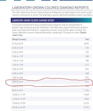
Unfortunately GIA charges almost $900 to grade a 5ct light blue lab diamond. So basically no one is using them.
 

0-0-0

Brilliant_Rock
Joined
Jul 30, 2010
Messages
1,312
Does GIA recalibrate their equipment at 5 carat intervals?
 

Mooshi

Shiny_Rock
Joined
Feb 23, 2014
Messages
297
Could we see it newly cut next to the pink ovals? It showed most blue next to the pink ovals to me. Can you check it next to some rose gold? Maybe a penny? Recut looks fantastic :)
 

oncrutchesrightnow

Ideal_Rock
Joined
Apr 17, 2006
Messages
2,731
Stone looks absolutely gorgeous.

I agree to try rose gold and pink stone surroundings.

Having a stone that looks nice and blue in certain lighting is cool in and of itself, even if it is not as blue as you wanted. Congratulations.
 

evergreen

Brilliant_Rock
Joined
Jan 18, 2012
Messages
828
For this reason, a Fancy Light Yellow has more saturation than a diamond graded Fancy Light Blue by GIA.

Ahhh, very interesting!! To be honest, though, I barely see color in my I transitional (though that's GIA) so I shouldn't be surprised I don't much see it in a blue I.

@Mooshi @oncrutchesrightnow @Cerulean -- I peeked around online and it looks like setting faint blue natural diamonds in a pink diamond halo is The Thing To Do. Definitely will be playing with it more in rose gold! It will be bezeled, and I'm wearing a lot of RG nowadays, white metal doesn't get as much love, so it would align well with my inclinations to put it in pink...!
 

Rockdiamond

Ideal_Rock
Trade
Joined
Jan 7, 2009
Messages
9,730
l (though that's GIA) so I shouldn't be surprised I don't much see it in a blue I.
I guess it’s because I’ve grown up with GIA color grading as the “Bible”…. So I have trouble seeing a faint blue stone as “I color”
Same for pink.
These colors are so rare and expensive in earth diamonds they get their own grading system.
Personally I’ll probably never get used to IGIs methods on faint blue
 

evergreen

Brilliant_Rock
Joined
Jan 18, 2012
Messages
828
Color comparisons!! Photos taken near a window and it's cloudy today.

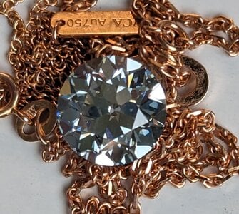
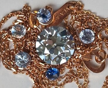
By itself with 18k RG: OH MY GOSH SO BLUE so I stuck with RG for the rest of the photoshoot.
PXL_20231003_171239845.jpg

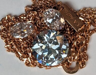
Next to those pink ovals (J/CVD "pink"), with and without gold nearby:
PXL_20231003_171334393.jpg
PXL_20231003_171408591.jpg


I'm not sure the pink is coming through, especially when backed with RG. It's not orangey-pink enough.

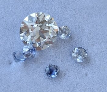
Here it is with those blue-zoned sapphires - I think this is the combo I'm most excited about (though it wouldn't be exactly these sapphires, they are too bizarre and too small anyway :) )
PXL_20231003_171536312.jpg


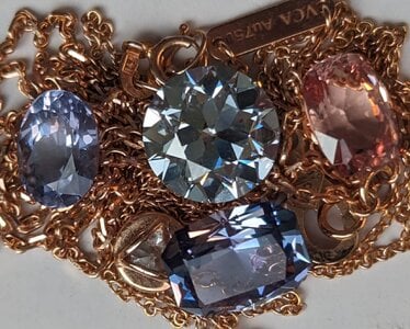
With a bunch of other colored stones: violet spinel round, unheated tanzanite rectangleish, peach mahenge spinel cushion. The diamond definitely has a slight greenish undertone to the blue, not purpleish. Also apparent in the comparison with sapphires above.
PXL_20231003_171717613.jpg

Finally, I put it next to a fairly well-saturated/deep aquamarine:
PXL_20231003_172133193.jpg

It wasn't a totally fair comparison since the aqua is already set, and not in RG; I think the undertones match a little better, but the diamond washes out. (Maybe situational, and not simply due to the color comparison, though.)

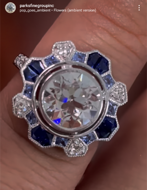
So, the Alex Parks ring with the different colors and shapes would be great, except I need to keep the sapphires from being too purple. Not sure how closely I can specify that, though, with his bench.
Screenshot_20230713-130449.png

I am still considering the CvB Astrid, too, though would be in RG; maybe I could find tiny Montanas to get the green tint? The color-change garnets upthread were too green IMO.

@Cerulean @oncrutchesrightnow @Mooshi thoughts on the color comparisons?

I don't know why last time I photographed her, i was basically sure she was a white diamond, and today she's faint blue. It was sunnier, I guess, so with warmer light, she showed less blue? EYES AND BRAINS ARE WEIRD.
 

LightBright

Brilliant_Rock
Premium
Joined
Mar 11, 2013
Messages
1,630
Congratulations on the fantastic recut. I can’t wait to see how you decide to set your amazing diamond!
 

oncrutchesrightnow

Ideal_Rock
Joined
Apr 17, 2006
Messages
2,731
Color comparisons!! Photos taken near a window and it's cloudy today.

By itself with 18k RG: OH MY GOSH SO BLUE so I stuck with RG for the rest of the photoshoot.
PXL_20231003_171239845.jpg

Next to those pink ovals (J/CVD "pink"), with and without gold nearby:
PXL_20231003_171334393.jpg
PXL_20231003_171408591.jpg


I'm not sure the pink is coming through, especially when backed with RG. It's not orangey-pink enough.

Here it is with those blue-zoned sapphires - I think this is the combo I'm most excited about (though it wouldn't be exactly these sapphires, they are too bizarre and too small anyway :) )
PXL_20231003_171536312.jpg


With a bunch of other colored stones: violet spinel round, unheated tanzanite rectangleish, peach mahenge spinel cushion. The diamond definitely has a slight greenish undertone to the blue, not purpleish. Also apparent in the comparison with sapphires above.
PXL_20231003_171717613.jpg

Finally, I put it next to a fairly well-saturated/deep aquamarine:
PXL_20231003_172133193.jpg

It wasn't a totally fair comparison since the aqua is already set, and not in RG; I think the undertones match a little better, but the diamond washes out. (Maybe situational, and not simply due to the color comparison, though.)

So, the Alex Parks ring with the different colors and shapes would be great, except I need to keep the sapphires from being too purple. Not sure how closely I can specify that, though, with his bench.
Screenshot_20230713-130449.png

I am still considering the CvB Astrid, too, though would be in RG; maybe I could find tiny Montanas to get the green tint? The color-change garnets upthread were too green IMO.

@Cerulean @oncrutchesrightnow @Mooshi thoughts on the color comparisons?

I don't know why last time I photographed her, i was basically sure she was a white diamond, and today she's faint blue. It was sunnier, I guess, so with warmer light, she showed less blue? EYES AND BRAINS ARE WEIRD.

Of these IMHO the best options are dark blue and solo.
Right now based on current pics IMHO an orangy rose gold bezel is a winner.

The AP setting is pretty but IMHO washes out the blue.

Have you tried white, pink, or perhaps orange? Or orangy pink? I am imagining some vivid orangy pink round brilliants next to your stone. Should be plenty of those available in LGD.
 

Mooshi

Shiny_Rock
Joined
Feb 23, 2014
Messages
297
I definitely agree about going with the most copper like of the rose golds possible, it looks great! I personally like the little varied blue sapphire rounds you have it paired with, seeing all the difference in blues is really nice. Although I agree with @oncrutchesrightnow about trying it with pink or orange lab diamonds, but the intense ones might be too much next to the delicate blue of your diamond. Perhaps the rose gold alone will be enough of the warm tone to turn your stone bluer, I'd probably stick with the varied blue sapphires for accents.
 
Be a part of the community Get 3 HCA Results
Top