shape
carat
color
clarity

AGS 0 asschers?

Status
Not open for further replies. Please create a new topic or request for this thread to be opened.

flopkins

Ideal_Rock
Joined
Nov 15, 2004
Messages
2,026
John - THANK YOU!!!!

It is so much clearer now~! I was trying to squint and see what the x/y axis were supposed to represent and now it makes so much sense.

Two more questions -

it seems that they use a triptych w.the firemap, ASET30 and ASET40 - any particular reason why these three?

and -

I assume that the ideal ''sweet spots'' would show up red (or whatever is desirable) in all three maps? I bet there must be some way to superimpose all three matrices and show the composite colors?
 

belle

Super_Ideal_Rock
Joined
Nov 19, 2004
Messages
10,285
34.gif
thank you sir john, for taking the time to post all of this info!
36.gif
 

whatmeworry

Brilliant_Rock
Joined
May 23, 2006
Messages
1,095
really interesting. But what else is missing? Can DNA determine a pretty stone? Just glancing looks like there are possible bands of possibility at the top right and bottom left (of Round Brilliants). But what happens when you really go steep deep or super shallow? Nail heads? Fish eyes? No contrast? Too much contrast? No scintillation? Ugly scintillation patterns? Durability issues? Must be other reasons why AGS, GIA primo cuts are in the middle band.
 

JohnQuixote

Ideal_Rock
Joined
Sep 9, 2004
Messages
5,212
Date: 8/16/2006 10:22:50 AM
Author: whatmeworry
really interesting. But what else is missing? Can DNA determine a pretty stone? Just glancing looks like there are possible bands of possibility at the top right and bottom left (of Round Brilliants). But what happens when you really go steep deep or super shallow? Nail heads? Fish eyes? No contrast? Too much contrast? No scintillation? Ugly scintillation patterns? Durability issues? Must be other reasons why AGS, GIA primo cuts are in the middle band.

You're right. Theoretical aesthetics aside, yield and practicality will always be considerations.

Yield is a driving force. Acquiring nominal yield from typical rough octahedron produces rounds in ranges of configuration we’re accustomed to. Even if the cost of diamond rough plummeted to $1/ct and yield were no longer a consideration we'd still be limited in the configurations our tools can shape: A 'cool' combination theoretically designed in software may not be practical in the real world.

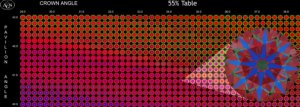
Back to aesthetics for a minute: Another thing to keep in mind is that these VLVF matrices are each made up of 62,500 images, so those 'bands of possibility' require closer inspection to assess how individual candidates would appear... It's like looking at a lake from an airplane: It might look pretty from 30,000 feet but if you went there on foot you might find it to be weedy and mucky.

Those bands of red look good, but when you zoom into them they may not feature well balanced - in our conventional thinking - images. For instance, here's that Tolkowsky ASET30, zoomed from out of 768 individual images (it's even hard to see individual characteristics at this resolution).


02_PSMosaicExample2b.jpg
 

JohnQuixote

Ideal_Rock
Joined
Sep 9, 2004
Messages
5,212
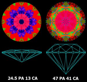
Now - here are images from extremes of the RB ASET30 VLVF.

As you can see, they are predominantly red, but not a conventional balance. The shallow would be impractical to shape (and would have a 'ring of death' appearance even if you could) and the steeeep/deeeep
2.gif
is 1.00 carats with only a 6mm spread and lacks contrast characteristics - one of the considerations you mentioned.

VLVFExtremes.jpg
 

JohnQuixote

Ideal_Rock
Joined
Sep 9, 2004
Messages
5,212
Date: 8/15/2006 11:00:38 PM
Author: flopkins

John - THANK YOU!!!!

It is so much clearer now~! I was trying to squint and see what the x/y axis were supposed to represent and now it makes so much sense.

Two more questions -

it seems that they use a triptych w.the firemap, ASET30 and ASET40 - any particular reason why these three?

and -

I assume that the ideal 'sweet spots' would show up red (or whatever is desirable) in all three maps? I bet there must be some way to superimpose all three matrices and show the composite colors?
Flopkins, you're quite welcome. It's fun material.
1.gif


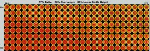
The reason AGS chose those 3 views is because they form the foundation of their light performance studies. The fire research is most recent. Here is a compilation of fire images for rounds near and around-near Tolkowsky.

FireMapExample1.jpg
 

JohnQuixote

Ideal_Rock
Joined
Sep 9, 2004
Messages
5,212
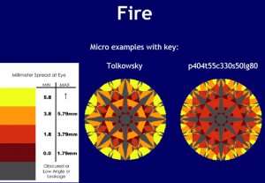
Just like contrast, AGS looks at fire in two ways: Static and dynamic. As for the fire maps which have been posted, yellow represents the greatest areas of dispersion.

Wink phoned me back in February, driving home from AGS class, extremely excited about the fire metric. It was too funny - he would drive in and out of cell areas so we probably had 3 drops...but he was so jazzed that he'd call back immediately and just pick up where he left off.
1.gif


I dropped a note to him requesting his input here.

FireMapExample2.jpg
 

WinkHPD

Ideal_Rock
Trade
Joined
May 3, 2001
Messages
7,516
Date: 8/16/2006 12:10:56 PM
Author: JohnQuixote
Just like contrast, AGS looks at fire in two ways: Static and dynamic. As for the fire maps which have been posted, yellow represents the greatest areas of dispersion.

Wink phoned me back in February, driving home from AGS class, extremely excited about the fire metric. It was too funny - he would drive in and out of cell areas so we probably had 3 drops...but he was so jazzed that he''d call back immediately and just pick up where he left off.
1.gif


I dropped a note to him requesting his input here.
AGS did their light research based on 30 and 40 blue since that is the most common range of obscuration from the head of the viewer. Peter could elaborate more fully but I recall that they initially looked at stones with as low as 27 degrees of obscuration to a high of as high as 45, but the universe of stones that performed well over both extremes was too low to be practical for the cutters.

As a jeweler I used to wonder why sometimes I and the guy would LOVE a stone, and the lady would choose something that did not look nearly as well to us. Now I know that it had more to do with her hairstyle than with me being blind. Many stones that perform well at 30 degrees of obscuration look fairly lifeless at 40 degrees. Back when I got into the business in the early 70''s there were a LOT of boufant hair styles that obscured 40 or more degrees, and the closer they looked at the stone, the worse it looked.

Now on to the fire metric. If you look at the chart that John so kindly provided you will see that the metric says millimeter spread at eye and lists the lengths.

Then it shows the Tolkowsky model with lots of orange and yellow next to a pretty but less worthy model with little yellow, only a little orange and mostly dark orange and reddish brown. Why this is important is that THE EYE CAN PERCEIVE THE COLORS ONLY IF THE LENGTH OF THE DISPERSION IS GREATER THAN THE WIDTH OF THE PUPIL OF THE EYE! If it is smaller then the eye perceives this as white light.

Remember back to the days our our youths when we were shown a prisim in science class. The light went into the triangle of glass and came out separated into its spectral colors by the angle of entry and exit. This is exactly what is happening in your diamond. However, these are very tiny prismatic releases and if they are too short, or if your eye is too close, then the eye perceives the result as white light, just another sparkle amonst many. White light, to our eyes, is the mixture of all of the colors together, thus small spectral releases that are still observed totally within the pupil of our eyes revert to that white light. I suspect that if you were able to cover half of your pupil and still observe a diamond with no other changes it would appear to have more fire than when you view it normally, as the light entering the eye would now not contain all of the light in some of the shorter lengths produced by the dark orange and dark brownish red areas.

Wink
 

flopkins

Ideal_Rock
Joined
Nov 15, 2004
Messages
2,026
John and Wink - thank you very much for you insights on the triptychs and firemaps- it is very interesting stuff!! It is nice when very useful information also looks so beautiful - I can imagine the three panels in huge print on a wall as a kind of modern art with a function!!!

I will be very excited to see AGS release the asscher info... !!!!
 

strmrdr

Super_Ideal_Rock
Joined
Nov 1, 2003
Messages
23,295
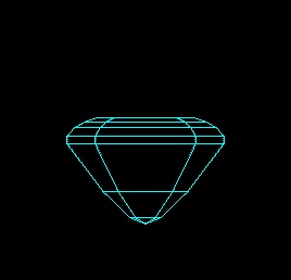
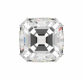
3 even pavilion steps eliminates ones like this the worst of the woofers.
They are the worst because they are cut totally for weight and with some back lighting are totally deceptive and they are impossible to eliminate by looking at certs.

Iv seen 2 like this in person graded by EGL, Jon got one in out of a batch he called in (rejected it of course), and not long ago one vendor had a fit on here when I said no way to an asscher cut this way. (and so I dont get yelled at im making it clear it wasnt the PS darling WF)

hmmmm3.jpg
 

strmrdr

Super_Ideal_Rock
Joined
Nov 1, 2003
Messages
23,295
Looks pretty good dont it?

hmmmm1.jpg
 

strmrdr

Super_Ideal_Rock
Joined
Nov 1, 2003
Messages
23,295
or not....

hmmmm2.jpg
 
Status
Not open for further replies. Please create a new topic or request for this thread to be opened.
Be a part of the community Get 3 HCA Results
Top