shape
carat
color
clarity

3 stone CAD help

I’m not sure what you are suggesting but this is what I am talking about:

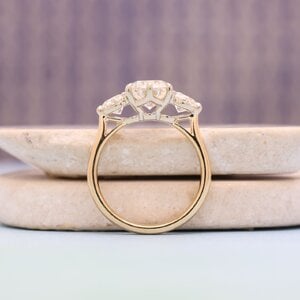
The options are to cast the shank and bridge in yg and the prongs/baskets in white, like your three stone and mine. Like this example but add a yg donut.

1745544889843.png

Or cast the shank in yg and cast the bridge and donut and baskets all in wg. Like my five stone. It is safe to do that, the bridge and baskets are a single piece of metal and attach to the shank where it meets the bridge.

Tyty is taking about the latter. I asked if she had considered the former as I think it could look good.
Yes, that would be fine as long as it is secure and stable. Guess we will see what she decides to do - can’t wait to see!!
 
So, I did some drawing last night...
IMG_20250425_083110874.jpg

I'm pretty sure I prefer the left side. The right side is too leggy/prongy. There is one donut for the center stone (same size as
the current CAD), then 2 smaller donuts on either side of that for the side stone prongs. So, yeah, a dangling prong and some
empty-ish space!:lol: I'm thinking I prefer that look over the leggy/prongy look.

I can have

A. Bridge/donuts/prongs all cast in white gold. (rest of shank in yellow gold)
B. Donuts/prongs cast in white gold. The part of the bridge that is not donut would be in yellow gold. (rest of shank in yellow gold)
C. Have the bridge/donuts cast in yellow gold and just the prongs done in white gold. (rest of shank in yellow gold)

I think I would be fine with options A or B. My issue with C is that it's really up to the bench how good it's going to look with
respect to connecting the prongs to the donut. I've always sort of thought as the prongs/donut as a unit, but now I see that
they are done separately in a lot of two tone rings.

Comments?
 
You did that sketch very well! Impressive!
I definitely like the left side better. Not sure about donuts on the side stones. In real life, the donut is very small. My purpose for the donut was to keep the wedding band from sliding all the way up and under the ering. I also didn’t want the center stone to overlap the wedding band - or be wider than the wedding band. If the bridge and donut are in white gold, you might have to replate from time to time. My channel set wedding band was in yellow gold so I was fine with the bridge/donut being in yellow. Makes a seamless transition from the ering to the wedding band. Do you know what type or color of wedding band you will wear with it?
 
Good morning @MissGotRocks ...I wear various wedding bands with my ering. 2 are white gold and one is yellow gold. I dont mind
the mixed metal look. I'm really not a very picky person, although you might not know it from this thread :lol:.

I'm going to ask DK about unplated white gold. I need to go goggle PS to see where people have used unplated white gold to see
if its a color I like. I think Yssie has used it, and I'm not sure who else. That way I wouldn't have to worry about replating as long
as I like the color of that metal. My main stone is an "I" so I dont feel like I need shiny bright white rodium, but I do need to go look.
 
I need to ask DK what their white gold is made out of...this is the best example I found.

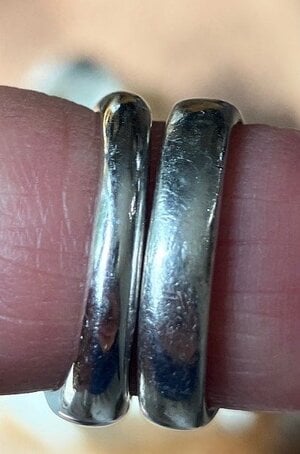
Only the first 3 rings matter. In order, they are:

Unplated white gold
Unplated white gold
Plated white gold

359A79B5-FB07-4104-8350-EF0D22AA0F24.jpeg

Not sure how I feel about the unplated White gold. It could work, or do I want brighter...not sure! It actually reminds me of platinum.
 
I like your drawing and I think the donuts on the side stones make it look finished and symmetric which I like a lot. I like both sides re stems of the prongs but if you like the dangling prong go for it! I really like the angle of the outer prong on the side stones and I like the swoop of the shank up to the basket. Very nice details.

I think for this design I would do option B, so only the donuts and baskets are WG. Or C. I think B is a little more modern and C a little more classic so I’d let that make the difference.
As to the finish, DK has some truly phenomenal benches who can easily execute C. Let them know you want a level of finish like my ring and Mrs Bs rings. I sent pictures so they knew what I was talking about when I made the same request. It was worth it as the finish on my ring is truly perfection. In my case my setting was quite pricey to begin (lots of detail work and many stones to set) so I’m not sure if such a request would affect cost.

Also might I encourage platinum for the baskets? The price difference is small from wg but the shine and tone and heft of platinum is very luxurious. This is a special piece and deserves it if you can swing it. My two tone rings both use platinum and 18k gold and I love it. If you go unplayed WG he has a very very white version that looks like rhodium in color. I’d ask for that for this ring.
 
Thanks for posting @Lookinagain... that is very white. I like it!

Thanks for your feedback @Dreamer_D . I will get a quote on platinum prongs/basket. My old setting for my pear stone was platinum. I did enjoy the weight on it.

I think I will be happy with option B. I also like the 3-donut design.

Going to get these changes off to DK so I can relax this weekend!
 
Maybe ask DK if B or C will be more durable. Always good to ask that when making these kinds of decisions.
 
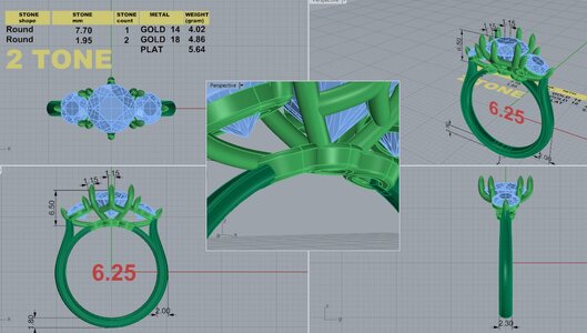
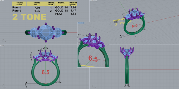
Got the new CADs back from DK. I'm pretty happy with them, I think*.

So, I'll probably go with this design if there are no major structural issues/minor changes.

DK 111401-QUAD-4.jpg

In other news, I was informed by Ritani that the side stone I bought was not going to be sent from the company in India. Of course,
they did not notify me until after they said they "secured it" and after the delivery date passed. I finally called and asked where
it was...they then had to go figure it out. Not very happy with Ritani. That was a wasted 2 1/2 weeks.:x2

So, what does everyone think?
 
I think it looks good. I am assuming he didn’t see the need to put the side stone prongs on the inside of the center stone prongs? I think they are fine as they are small prongs and are not on the same level as the center stone. I don’t know if he addressed shaving the shoulders a bit of the 12 and 6 o’clock prongs so that you don’t see much metal when looking at the ring straight on.
Sorry about the side stone - now what?
 
I decided not to ask about moving the side prongs because there are only 3, and I figured I should keep them evenly spaced for
maximum security. I did ask to have the 12 and 6 shaved down, and checking between both the CADs...it looks like that was
done. Its a very small change on the CADs, though.

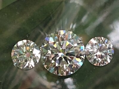
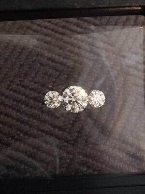
Now I have to find another side stone before I can move on (and wait to see if it makes it here). There is 1 super ideal stone available
that is, of course, in-house. It's more expensive, so I have to decide if I'd rather just go that route. :twirl:

Is the other side stone you have a super ideal? If so, I would probably get the one that is available so I could move forward. Unless, of course, if you are talking substantial money - then you might have to rethink it.
 
I really like it and I think it fits your design goals really well and I love the flow. The two tone is going to look great with this design as well.

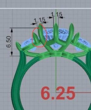
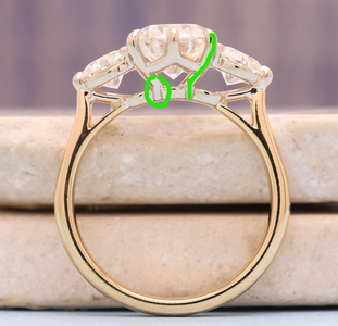
The only very small thing I might personally ask about is whether the side stone prongs can be moved ever so slightly closer to the center to eliminate the tiny gap I circled…. Though in real life it probably wouldn’t be noticeable.

1746044912272.jpeg
 
GET 3 FREE HCA RESULTS JOIN THE FORUM. ASK FOR HELP
Top