shape
carat
color
clarity

Which metal compliments a warm stone best?

yennyfire

Ideal_Rock
Trade
Joined
Jun 6, 2010
Messages
6,874
I have never seen a warmer stone in person before, nor have I ever seen rose gold (I know, what kind of PSer am I????)....only platinum, yellow and white gold.

In your opinion, which metal plays up a stones warmer color (i.e. highlights the creamier tones)? Which metal plays down a stones warmer color (i.e. makes the stone look whiter)? Photos would be a lovely bonus! ;))
 
I think yellow gold settings (but platinum prongs) make the lower color stones look whiter because of the contrast. I also have never seen a diamond set in rose gold, but I am definitely interested in rose gold. Haven's new ring is a great example of that. Yellow metals do not look good with my coloring, but there is a richness to yellow gold that is beautiful with diamonds. I think I'd prefer 18k in any color gold. But the next thing I'd want to try is rose gold with a platinum head with an old stone.
 
I'm curious about this as well. I have two warmer stones- in the M-N-O range, and I am torn about how to mount them to bring out the warm color. :bigsmile:
 
did I ever show this picture? I think here and there. The full white gold bezel is on a S-T color with excellent light return and the semi was on my K ACA. After having the S-T modern brilliant, I regret putting it in white gold as I think it washed the color out and i felt the diamond looked a little confused like it wanted to be colorless during some lighting condition and then it turned lemony sort of and I was a little bugged that it didn't "stay on" the lemony color... just my thoughts though, What I should have done was put it all in Yellow gold bezel I think it would have helped it a bit and put stark white sidestones in contrast? I'm not sure though as I sold the ring, turns out that I'm not a fan of this color shade in modern brilliant ;( anyways

I think it also depends on if the stone "stays warm" in almost all lighting condition (if it did stay warm all the timie and a noticeable color, my thoughts are to bezel it in a certain color that would help the color - not sure if that made sense?) with my S-T example like I said it didn't, it would turn on the near colorless look due to the cutting then the hint of warmth then I felt like I was trying to hide the color by putting it in wg even though I really thought I was trying to play up the color. I should have just received the diamond loose first then go into different jewelers to see different semi mounts and how it would play up the color is what I should have done.

I do feel that in order to bring out the warmth and make it noticeable, that a solitaire is not the way to go, but to put it in say a three stone with drastic contrast to make the warm stone obvious would work really well or a bezel halo maybe?. Just my thoughts though.

dtstdiamondbezel%20018.jpg
 
My M colored OEC looks it's absolute whitest in a platinum bezel with no contrasting melee. Perfectly matched larger sidestones are fine, they don't contrast. But even melee that's within a few colors is too white and makes the center stone look WAY more tinted.

Personally I think yellow gold and unplated white gold play UP the color best. If I wanted to make a center stone look more colored, I would bezel it in the color I wanted to play up and then add some super-white melee or sidestones, and have some white gold or platinum *somewhere* on the piece for contrast. I did discover when I wanted to play up the pinkish-brown tones in my U/V colored light brown August Vintage Cushion, that setting it in rose gold with nothing else actually washed the color out. (Which is kind of not what you'd expect- it just all kind of blends together and the color doesn't pop at all). It really needs the rose gold PLUS some white stones for contrast. I think the same phenomenon would happen with a yellow tint/yellow gold combo, too.

Old cuts can face up ridiculously white for their color grades. Unbelievably so. After resettign my M OEC in the Victor Canera french cut setting, I rarely see a tint to it face up, mostly it's just plain ol' white. It is only in overcast daylight, where the clouds are very thick, that you see much body color at all. And even then it's hardly more than a hint of cream tone.
 
Thanks D&T and LGK. You both make interesting points. I'll be really curious to see some of these "warmer" stones in different types of metal.
 
I think it depends how you define "compliments".

You could mean, makes the diamond seem more colorless.
You could mean, make the diamond seem more colored.

Sticking with the dictionary definition ignores the enormously relevant price-related aspect of diamond color and how settings influence diamond color perception.
We often get threads on which settings help a warm diamond look less colored, or how fluorescence can make it look less colored.

On the other hand you might be the rare person who does not care about value-baggage of white diamond color, and are truly free to just go with what looks better together.
Even then that is pure aesthetics and since people vary only your opinion counts.
 
I have an L/M in platinum and it looks really at home and white in there. If you wanted to play up the color I think maybe rose gold (but you really have to go see it against your skin). I only have diamond side stones in rose gold (avatar left) and I do think they show more warmth than before they were set.
 
Hi Kenny,

I realize that the definition of "compliments" is in the eye of the beholder. That's why I asked which metals make a stone look whiter and which metals emphazise the color. I was hoping for photos to illustrate each example. :)
 
Thanks Yenny; now I read your post close.
My apologies. :oops:
 
This is such an interesting topic!


My personal opinion: the "further away" the apparent colour of the metal and face-up colour (if bezel) or face-up+pavilion colour (if minimal prong setting) of the stone are, the more contrast there is between the stone and the metal, which results in a more tinted or washed out (white) stone - kinda like when you up the contrast in a photo editing programme, and darks all go to black and lights all go to white. I say apparent metal colour b/c a polished finish that returns more light to your eyes will hide the actual metal colour more than say a brushed finish (bright white/silvery polished plat vs grey patina'd plat, say)

Certainly face-up my J looked more tinted in a sterling holder than it does now in unplated white, because the gold colour is closer to the colour of the stone. The (slightly tinted) diamonds in my earring drops, on the other hand, look *white* against the 22k background.

Then I think you have room to fine-tune with setting type - an open three-prong setting will show a stone closer to its natural state, I guess, for lack of better wording - A) more of the stone - including the pavilion - is visible, and B) there is less metal surrounding the stone to blur the demarcation between stone and setting and lend the entire piece a "hue" at first glance. My I OEC stud stones were actually very close in colour to my J ring sidestones when loose - almost exactly the same size, too. Set, though, they look - very different: I wouldn't say the Js look a lot more tinted in the yellower setting, because if you take the time to inspect closely they really don't, but rather that in casual looks, or when admiring, most people (including me) aren't inspecting the stone colour - they're looking at the overall aesthetic, and the combination of creamy metal + slightly creamy stone makes the entire piece look "creamy" whereas bright white metal nearly enclosing the stone + slightly creamy stone makes for a very "icy" look.

I have asked BGD to set my N/O/P antique cushions in unplated 14k white gold bezels - I am hoping the tint of the metal is just ever so slightly lighter than the stones face-up, so that the overall "look" is creamy, but a lighter creamy than if I'd used 18k unplated wg bezels. Obviously on close inspection the stone colour is the same, but I do think the colour of the metal surroundings, the style of the metal surroundings, whether there are other stones nearby as LGK says - make a big difference!

And then there's rose gold, green gold... which can play up or bury both strength of tint and colour of tint! Honestly, I'd go to the coloured stoners for advice here ::)


Okay, since you asked for pics - I sadly don't have all that many diamonds to model so I present yet more mugshots of my ring. All taken w/ a P&S on auto wbal - yeah yeah I know Kenny! :cheeky:


From a distance the pieces "look" different - the ring is creamy, the stud is icy
B.png

But if you inspect the stones, they look very similar, like they "naturally" are
A.png

Against 22k yg even slightly tinted stones look very white
C.png

This one is a 4mm estimated S/T, set in silver. I'm thinking the effect is kinda similar to w/ LGK's gigantic bezel'd M - even though the stone is pretty tinted, it's "close enough" face-up in colour to a grey metal that the bezel kinda blurs the colour difference and makes the whole thing look "whiter" from afar, but this little guy is tinted enough that from close-up if you inspect you can see the tint, and even from afar if you care to look
DA.pngDB.pngDC.pngDD.png
 
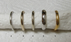
Past my edit time, but I just posted this pic in another thread and thought it might have some use here too -

A - plat (950/ru)
B - unplated 18k nickel wg from e-wb, custom piece (different manufacturer, matches my WF custom Ering metal perfectly)
C - unplated 18k nickel wg from e-wb, stock piece
D - plated 18k wg from WF
E - 22k
Metals1.png

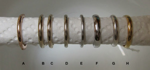
And another
A - 14k rose gold
B - unplated 18k nickel wg from WF, custom Ering
C - unplated 18k nickel wg from e-wb, custom band (matches Ering perfectly IRL in all lights)
D - unplated 18k nickel wg from e-wb, stock piece (a bit lighter/whiter than B/C, difference visible in most lights on closer look)
E - plat (950/ru)
F - plated 18k wg from WF
G - sterling
H - 22k
Metals3.png
 
Sooooo cool! Thanks for your post and examples Yssie!

Very interesting topic.

Cachette :))
 
Kenny, no apologies necessary. ;)) I realized when I asked the question that everyone has their own idea of what makes a stone beautiful, depending on whether you want to emphasize or hide the color in a given stone. That's why I asked the question both ways. :) Personally, I'd love to have two stones of warmer color and play one up (i.e. highlight the warmth) and play one down (i.e. make it look as white as possible)....probably not going to happen, but a girl can dream!


Yssie, thanks for taking the time to post your opinion and photos! You have such lovely pieces! I don't believe I've ever seen the pin before, it is gorgeous! I actually have the photo of the different metals that you took saved on my computer. It's great for reference!
 
:bigsmile: I'm really looking forward to seeing how the 14k works with the lower colours! I just wish I had more stones to play with.. 8)
 
great pics Yssie!
 
I think if you have a tinted diamond that you want to see more of the color in the stone, put it in a white metal. There will be a contrast between the stone and setting, making the stone seem more tinted. If you want to downplay the color, use a yellow or pink gold setting as the color is much stronger on the setting than on the stone. Once you hit the yellow range on the stone, such as fancy light yellow, using a yellow head and white shank can make the color seem stronger.

Personally, I like the look of a warm stone such as a P/Q/R in pink gold. The tones seem to compliment each other, but that's just my opinion. ;)
 
Winks_Elf|1305502478|2922616 said:
Personally, I like the look of a warm stone such as a P/Q/R in pink gold. The tones seem to compliment each other, but that's just my opinion. ;)
I agree, but of course I'm biased.

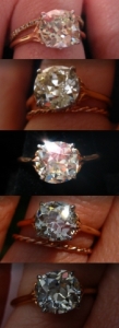
I haven't seen enough warm stones in various metals in person to make a comparison, but I can tell you that I love the way my O/P stone looks in its 18K rose gold setting with platinum prongs and basket details. I feel like the platinum around the stone brings out its warmth, but the rose gold really compliments its various tones. My jeweler also set a fancy yellow RB beneath its flat culet, and that REALLY helps bring out the color, I'd say.

The other thing about warm stones is that they really do look different in different environments. Sometimes I look down at my stone and it looks very white, other times it has a warm buttery color, and other times it flashes so many different colors it looks like there are small fireworks shooting off from my finger. This is another reason I really love the rose gold shank on my ring--it doesn't compete with my stone. It's almost invisible, as if the shank doesn't even exist and the stone really is the star. I love that.

I put together a bunch of different pictures of my stone in different environments so you can see how the rose gold looks with her different personalities:
oneringmanycolors.jpg
 
Haven|1305509272|2922702 said:
Winks_Elf|1305502478|2922616 said:
Personally, I like the look of a warm stone such as a P/Q/R in pink gold. The tones seem to compliment each other, but that's just my opinion. ;)
I agree, but of course I'm biased.

I haven't seen enough warm stones in various metals in person to make a comparison, but I can tell you that I love the way my O/P stone looks in its 18K rose gold setting with platinum prongs and basket details. I feel like the platinum around the stone brings out its warmth, but the rose gold really compliments its various tones. My jeweler also set a fancy yellow RB beneath its flat culet, and that REALLY helps bring out the color, I'd say.

The other thing about warm stones is that they really do look different in different environments. Sometimes I look down at my stone and it looks very white, other times it has a warm buttery color, and other times it flashes so many different colors it looks like there are small fireworks shooting off from my finger. This is another reason I really love the rose gold shank on my ring--it doesn't compete with my stone. It's almost invisible, as if the shank doesn't even exist and the stone really is the star. I love that.

I put together a bunch of different pictures of my stone in different environments so you can see how the rose gold looks with her different personalities:
oneringmanycolors.jpg


It really is amazing how different your stone looks so different depending on the lighting. I have a stone that I am guessing is somewhere in the L-M-N-O area and I am trying to figure out how to set it myself!
 
Oooh, I can't wait to hear more about this stone, Amy!
 
JbEG has a new setting (Bella) which has a warm old cut diamond in a rose gold head. It looks amazing!
 
Wow Haven, it's amazing how different your stone looks in different settings! I wonder if a modern RB of the same color would do the same thing??

Winks Elf, your explanation makes perfect sense, thank you! :))
 
ZahraLeyla|1305510733|2922719 said:
JbEG has a new setting (Bella) which has a warm old cut diamond in a rose gold head. It looks amazing!


now I have to search for this ring to see for myself!
 
Be a part of the community Get 3 HCA Results
Top