shape
carat
color
clarity

Which Cushion Would You Choose

dmndnwb

Rough_Rock
Joined
May 8, 2011
Messages
17
Ok, so I talked to Sarah over at GOG and she recommended these two. The first one is .80 k SI2 and the second is .88 L VS. The .80 has and inclusion that you can see with a 10x loupe and if you bring it right up to your face. She also said it was camouflaged in the facets. I personally am leaning toward the .80 because the color is slightly better. My thought is I can find a setting that will hide the inclusion even better. Which one would you choose? Will you see a major difference between k and l?

.80 K SI2
http://www.goodoldgold.com/diamond/8048/

.88 L VS1
http://www.goodoldgold.com/diamond/8206/

.80 k left .88 l right
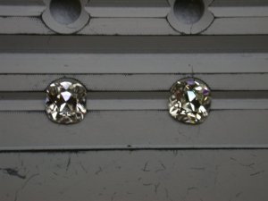
DSCN2355.JPG
 

megumic

Brilliant_Rock
Joined
Mar 8, 2009
Messages
1,647
Torn. Not sure which I'd choose. The imperfection on the K in the upper right corner is pretty clear...might be a deal breaker for me (and I LIKE inclusions and have one on my cushion!)
 

chamois

Brilliant_Rock
Joined
Jul 15, 2008
Messages
586
I would choose the .88 L VS1. The L colour wouldn't bother me, but the inclusion would, I also like a smaller table. For some reason which I can't put my finger on I like the shape of the .88 better, although both are very alike in overall shape. I've owned an L AVC so perhaps I'm bias. Tough call, good luck.
 

yssie

Super_Ideal_Rock
Premium
Joined
Aug 14, 2009
Messages
27,262
I would also pick the L.

My reasoning:

1. I like the increase in size - in these size ranges that difference would be very visible IRL.
2. I prefer the shape, and also that more elongated shape will exaggerate size on your finger, esp if you set it N/S, vs. the more square shape.
3. I think when you get to K, L cushions.. you're already dealing with a visibly tinted stone - it's not like the K will be white and the L will be obviously creamy in comparison. So any accommodations you're planning to minimize or bring out the colour of the L, you'd have to copy for the K.. so colour doesn't really play a part for me.
 

kal2021

Brilliant_Rock
Joined
Dec 21, 2010
Messages
585
Definitely the L. It's bigger, it's clearer, and like Yssie said the color difference will be minimal at that point. I'd rather have a larger, cleaner stone. :)
 

rubybeth

Ideal_Rock
Joined
Nov 12, 2007
Messages
2,568
I'd also go with the L. I think that inclusion in the K would bother me, plus like others have said, the L is a bit larger.
 

dmndnwb

Rough_Rock
Joined
May 8, 2011
Messages
17
Wow!!! Thanks for all of your input the more and more I look at the two stones I cannot see a color difference between the two. In the picture at GOG the L stone looks really clear. If I were to set this in a pave type setting with stones in the g/h range will I see a major color difference between the center and sides? Does anyone know where I can find some real life pictures of L color stones? I have looked through the forum and haven't found many.
 

rubybeth

Ideal_Rock
Joined
Nov 12, 2007
Messages
2,568
There are some L-M colors in this thread: [URL='https://www.pricescope.com/community/threads/show-me-your-k-colored-diamonds.112476/']https://www.pricescope.com/community/threads/show-me-your-k-colored-diamonds.112476/[/URL]

I think you will notice a difference in color if the melee diamonds are G-H. I would ask Good Old Gold what type of setting they can do so that the color difference isn't as noticeable. What metal are you thinking of using? Some people like putting these in yellow gold to play up the color even more, and some like the contrast with white metals (plat. or white gold). I think LGK's M-colored stone looks great in her setting from Victor Canera (https://www.pricescope.com/blog/jewel-week-new-ring-old-cut-diamond) but the french cuts are also Ms to match, and I love Haven's rose gold setting for her O-P color cushion (https://www.pricescope.com/blog/jewel-week-antique-cushion-cut-diamond-ring) but she doesn't have pave or anything to take away from her beautiful design.
 

tyty333

Super_Ideal_Rock
Premium
Joined
Dec 17, 2008
Messages
27,253
I would take the L. Melee always look whiter so you probaby will see a difference. If thats important than you might just
want to go with a solitare setting else you can play up the color difference. Love it for being an L and looking antique-ish.
 

chamois

Brilliant_Rock
Joined
Jul 15, 2008
Messages
586
If you do go with the 'L' and choose to have melees in the G/H range, it will depend on how large the melees are regarding whether the melees will show a big colour difference in comparison to the 'L'.
 
Be a part of the community Get 3 HCA Results
Top