shape
carat
color
clarity

Want Honest Opinion

Status
Not open for further replies. Please create a new topic or request for this thread to be opened.

chrono

Super_Ideal_Rock
Premium
Joined
Apr 22, 2004
Messages
38,364
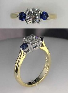
Here''s the before picture. Please compare it to the after picture that will be coming up shortly.

1. Other than the obvious different sapphire shape, do you all see any difference?
2. Am I too picky that I wanted little details that no one else sees but me?
3. Which do you prefer? The before or the after?
4. If you can improve on this, what would you do? Or NOT do? Or do nothing?

I''d like to note that the picture is not the true representation of the colour of the sapphires. The sapphire are a vB6/5, if my memory serves me right so they are a very saturated blue but not inky dark.

Please be honest in your comments. I can take it. If you don''t like it or think it is ugly or not your taste, just say so and explain why. I promise not to get mad. ^_^

Thanks.
Jubilee-with-trillion-sapphire.jpg
 

chrono

Super_Ideal_Rock
Premium
Joined
Apr 22, 2004
Messages
38,364
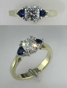
Here is the newly redone ring in size 4.25

jubilee-with-round-sapphire.jpg
 

cflutist

Ideal_Rock
Premium
Joined
Jul 12, 2004
Messages
4,055
I like the color of the new sapphires better but I like the design of the "before" ring better. This is because the trillions blended better with the center stone. Straight edge against straight edge, then flowing outward from that. My feeling is that there is a disconnect when you have circle next to straight edge. Just my opinion.
 

bstraszheim

Brilliant_Rock
Joined
Jun 21, 2004
Messages
533
Hi Chrono,

I agree with cflutist, I think the colour of the round sapphires is better, but prefer the design and flow of the trillions. Simply Sapphires usually has a bunch of trillions on their website, of course, when looking for some today, there are none, but that doesn't mean that John does not have a stash in his safe that is not listed on his website. They also offer a 10 day return policy, for any reason, you just have to pay the shipping to return the stones to them. Their website is http://www.simplysapphires.com. Other than the colour/ shape of the stones, I do not see any difference.

I hope that this helps, I wish you well,

Bridget
 

Matata

Ideal_Rock
Premium
Joined
Sep 10, 2003
Messages
9,084
I like the flow of the sapphires & center stone in the "before" but I like the look of the minimal sapphire prongs in the "after." My personal preference with square centers is to have trapezoid or other straight edged side stones because of the flow thing.
 

jenwill

Brilliant_Rock
Joined
Jun 7, 2004
Messages
735
I agree with Matata- i like the shape and flow of the trillions- but prefer the minimized prongs on the sapphires of the second one.
 

Kaili

Brilliant_Rock
Joined
Sep 13, 2004
Messages
753
I feel the same way as the above posts.

Will you tell us what you don't like?
 

fancyrock

Brilliant_Rock
Joined
Aug 27, 2004
Messages
549
ok, here is the honest truth....


I like the "before" better. The trillions accent the center stone beautifully.


and now... why I don't like the "after"... because it reminded me of a pretty center stone wearing a head-phone set. It just didn't look right to me. (sorry....
8.gif
)


"you asked for honesty, you got it!!"
9.gif
 

moremoremore

Ideal_Rock
Joined
Mar 15, 2004
Messages
6,825
Oh nuts, I have to agree. I prefer the trillions. The small rounds next to the jubilee just don't look right. I'm REALLY sorry.
sad.gif
I know this has been rough for you, but we want you to be happy...and it still doesn't sound like you're happy. I would go back to the trillions. Were they a different blue, or is that just a function of them being trils and rounds being rounds? I would prefer square sides stones best of all, but I would go for the trillions over the rounds.
sad.gif
The color of the rounds is beautiful tho.
 

ame

Super_Ideal_Rock
Joined
Jul 7, 2004
Messages
10,873
I like the before as well, sorry.
 

cflutist

Ideal_Rock
Premium
Joined
Jul 12, 2004
Messages
4,055
Here's another idea. Don't know if the shank will support this (judging from the picture it probably doesn't), but what if you mounted the rounds using 4 prongs instead of 3. Then you would have a more squarish look to match the center stone. The same principle applies to 4 prong tennis bracelets versus 3 prong bracelets ... the 4 prong ones look more square while the 3 prong accent the roundness of the stone more.

I still agree with mmm, trillions are my first choice followed by squares, and finally rounds last.

Are you getting confused yet?
1.gif
 

Patty

Ideal_Rock
Joined
Dec 7, 2003
Messages
4,456
Well, it looks like I'm the first one to say that I LOVE the round sapphires next to the regent. The color is gorgeous on the stones and they "pop" much more than the trilliants did. I think it's gorgeous!
 

hoorray

Ideal_Rock
Joined
May 16, 2003
Messages
2,798
Hi Chrono,

I'm with the majority:

I like the shape of the sapphires in the first ring better. I think the tapered look is more complimentary. I like the way they point down the ring/finger.
I like the color of the sapphires in the second ring better, but it may just be the lighting or photography.
I like the prongs in the second ring better, but didn't notice that until someone brought it up.

All in all, I prefer the first ring. I think your original problem is that the sapphires looked too small to you, but the second ring really has more of the "dot" look to me than the first.
 

headlight

Ideal_Rock
Joined
Nov 2, 2003
Messages
3,321
There was obviously something about the trills that made you change it. Personally, I love trills, but that is just me. But, with that said, Cflutist hit it right on -- the rounds should be set in four prongs to creat a "squared" look, thus blending better with the center stone.


It is really difficult for me to ascertain the color of the sapphires based on a computer monitor, so I don't feel like I can comment on that.


I'm sorry you are struggling with this -- I've "been there" with custom work in the past and my heart goes out to you.
 

aljdewey

Ideal_Rock
Joined
Nov 25, 2002
Messages
9,170
Of the two, I prefer the trillions look. The ring flows that way.....the other looks like something is in conflict....out of place.


Perhaps the 4-prong approach would fix this with the rounds.


Have you considered putting small square sapphires next to it?
 

Patty

Ideal_Rock
Joined
Dec 7, 2003
Messages
4,456
I'm posting Diane's gorgeous ring here. I chose my 3 stone after falling in love with Diane's. I just LOVE the round side stones with the Regent center (although my center stone is round). I think the 3 prongs look fine on the side stones but I do prefer 4 prongs on the side stones. Other than that, I would not change a thing, Chrono! But of course, you are the one who must love it, not me.
2.gif
 

noobie

Brilliant_Rock
Joined
Mar 3, 2004
Messages
1,318
Me too (first one), sorry. I agree with Matata on the prongs as well. However, these are pictures and the ring could look different on your finger.
 

strmrdr

Super_Ideal_Rock
Joined
Nov 1, 2003
Messages
23,295
imho the first one is 150 times better looking than the second.
 

chrono

Super_Ideal_Rock
Premium
Joined
Apr 22, 2004
Messages
38,364
Thanks for the very honest opinions. I'm not mad or anything.
9.gif
12.gif
In fact, I am very pleased that everyone was so honest and straightfoward. I'm going to pick up my ring now. Will be back later to add more comments.

I also would like everyone else to do another thing, if I may. These pictures are 4 times larger than the real thing. In reality, the old trillions looked like tiny round dots. That's how miniscule they were; I couldn't tell they were trillions unless I brought my hand up close to my face. Hence, I didn't want trillions again because no one can tell the shape. If it's going to look round, I might as well get rounds since they have better brilliance (plus I can go a little larger in round cuts vs trillion cuts).

So, if my Jubilee is a 2 or 3 carat stone, then yes, I'll go for trillions any day.
10.gif
The flow of the design is obviously more beautiful. However, with a center stone of 5.4mm and a side stone of 3.3mm, it is very difficult to see the shape. Seriously.

Take a step back and miniaturize the picture, then comment again. Thanks.
 

chrono

Super_Ideal_Rock
Premium
Joined
Apr 22, 2004
Messages
38,364
Okay. I've the ring in hand. Let's see now...

Thank you Patty for being the only one to stand by me.
3.gif
It's true that this re-design was inspired by Diane's ring. It is everything that I want and expected except for one thing: I should have gone with 4 prongs instead of 3 prongs on the side sapphires. A 4 prong will make the sapphires look more squarish and complimentary to the square Jubilee. Other than that, I love all the other changes that Wink did (but no one else noticed).

The round sapphires really pop and the blue colour and brilliance is top notch. No regrets on going with rounds instead of trillions. I had the same colour sapphires in trillions and somehow they still did not "pop" anywhere close to the rounds. I think that is the nature of the cut shape.

In short, I love the ring. I'm going to see if I get 4 prongs instead on the 3 prongs. You all are right about that; that is my design mistake, I guess. Other than the visual "flow" problem, it is perfect. It's too bad I have to give it up to get it fixed.
 

reena

Ideal_Rock
Joined
Jul 13, 2004
Messages
2,531
chrono, i think that your ring is just beautiful, and you're right--on your hand, people (especially non-pricescope people!) would probably never notice the difference between the trillions and the rounds. plus i love the color of the new sapphires. congrats!


will you post hand pics?
 

moremoremore

Ideal_Rock
Joined
Mar 15, 2004
Messages
6,825
Oh no! Why didn't my post from last night post! I think that the 'problem' is easily corrected. The problem is the prongs! I think this was mentioned above? You see how you have that one prong off to the side on the round? Diana has the 'traditional' placement on the round, making it appear much more square, so the flow is better. I'm telling ya, change the prongs on the round, and it's a beauty!!!!!!

Edited: duh! That's exactly what is said above!
 

chrono

Super_Ideal_Rock
Premium
Joined
Apr 22, 2004
Messages
38,364
Yup! MMM, I think you and the majority of those here who suggested 4 prongs instead of 3 prongs are right. However, cflutist is correct in that the head has to be remade. I can't just tack on another prong. Oh, the shank has to be remade again too! Oh no! What is Wink going to say this time? He's probably going to be so mad at me that he won't do it again.
cry.gif
This will be the 4th fix.
 

moremoremore

Ideal_Rock
Joined
Mar 15, 2004
Messages
6,825
I know you probably feel bad, but you need to be happy...I"m assuming he's charging you? So don't feel bad! He wants you to be happy to...

Can someone photoshop or something chrono's ring? I tried but I'm an idiot!!! I was playing around with the image as a bitmap and it looked great...
 

aljdewey

Ideal_Rock
Joined
Nov 25, 2002
Messages
9,170
----------------
On 10/15/2004 10:38:34 AM chrono wrote:

Okay.
Thank you Patty for being the only one to stand by me.
3.gif
----------------


Maybe I'm just taking this the wrong way, but that's an awful comment.

You ask everyone to give you their honest opinions....and then you say "Thanks for so and so for being the "only one to stand by me"? You make it sound like everyone let you down.

Maybe next time, you should tell us what the preferred response should be up front.
 

hoorray

Ideal_Rock
Joined
May 16, 2003
Messages
2,798
Chrono --

Both rings are beautiful, and we don't have the benefit of seeing them on your hand and in all the different light and hand positions that you do. You know the look you were going for and what looks best to you.

My last 2cents is that 4 prongs would probably square-up the side stones, but the prongs as they are are very nice and minimal, so it's a trade off. Maybe you should wear it for a while and see if it grows on you or it still bothers you.
 

chrono

Super_Ideal_Rock
Premium
Joined
Apr 22, 2004
Messages
38,364
Yes, aljdewey, you are taking that statement at face value. I was just teasing, which I tried to convey with the funny face but I guess it didn't come across that way.

Nobody let me down. I wanted true opinions and I still stand by it: if you think it is ugly, please say so. I am not a fan of people who say they think it is gorgeous but at the same time are making disparaging remarks in their minds. I prefer blunt honesty over sugar coated lies.
 

aljdewey

Ideal_Rock
Joined
Nov 25, 2002
Messages
9,170
Ah.....good to know.

Actually, I think your examples are a bit drastic. I don't dislike either setting.....I simply find the first one more visually pleasing (in the pictures).

Preferring the first one doesn't mean I find the second one ugly. It just means I find the flow of the first design more pleasing.
 

Patty

Ideal_Rock
Joined
Dec 7, 2003
Messages
4,456
Chrono, I'm glad you like it in person! As for the prongs, while I prefer 4 prongs over 3, you need to decide if it's worth having the ring head redone completely to change that one thing. I agree with lop that you should wear it a bit and then decide if you want to change to 4 prongs.
 

chrono

Super_Ideal_Rock
Premium
Joined
Apr 22, 2004
Messages
38,364
You all are quite right again about the look. It is different in person because the ring is much smaller. Wishy washy me is thinking about keeping the 3 prong look now. I do like the minimal prong work and it tapers nicely at the shank. With a 4 prong, it will end up with more metal and look "blockier" (if there is such a term).

I've had some office colleagues and my local jeweler who does lots of work for me comment on this new design versus the old one and all prefered this new one for the same reasons:
1. The blue sapphires really popped big time (almost stealing the centerstage from the Jubilee)
2. It doesn't look odd at all. They laughed at my "Princess Leia" comment though...
sad.gif

3. Minimal prong and nice flow to the stones.

I'm sorry to say I'm starting to like this "Princess Leia" ring. It sure looks funny in the picture but I am starting to be partial to it in real life. I'm going to wear it for a bit before making a final decision.

I'm going to have to prove most of you wrong with hand pictures now... First, I'll need to dig out my camera, develop it into a CD then paste it here so it may take a while. No scanner or digicam...
14.gif
 
Status
Not open for further replies. Please create a new topic or request for this thread to be opened.
Be a part of the community Get 3 HCA Results
Top