shape
carat
color
clarity

The "Perfect" Padparadscha

Joined
Jan 20, 2012
Messages
4,252
Hello all,

Several of us were discussing pads in another post, and I thought it may be interesting to start a photo thread and sort of poll the PS community on your idea of the perfect pad. I wonder if they'll be similar or, more likely, they'll all be very different! If you choose to comment, would you mind also mentioning from which country you hail?

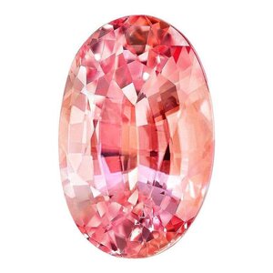
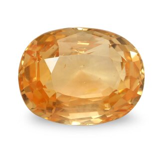
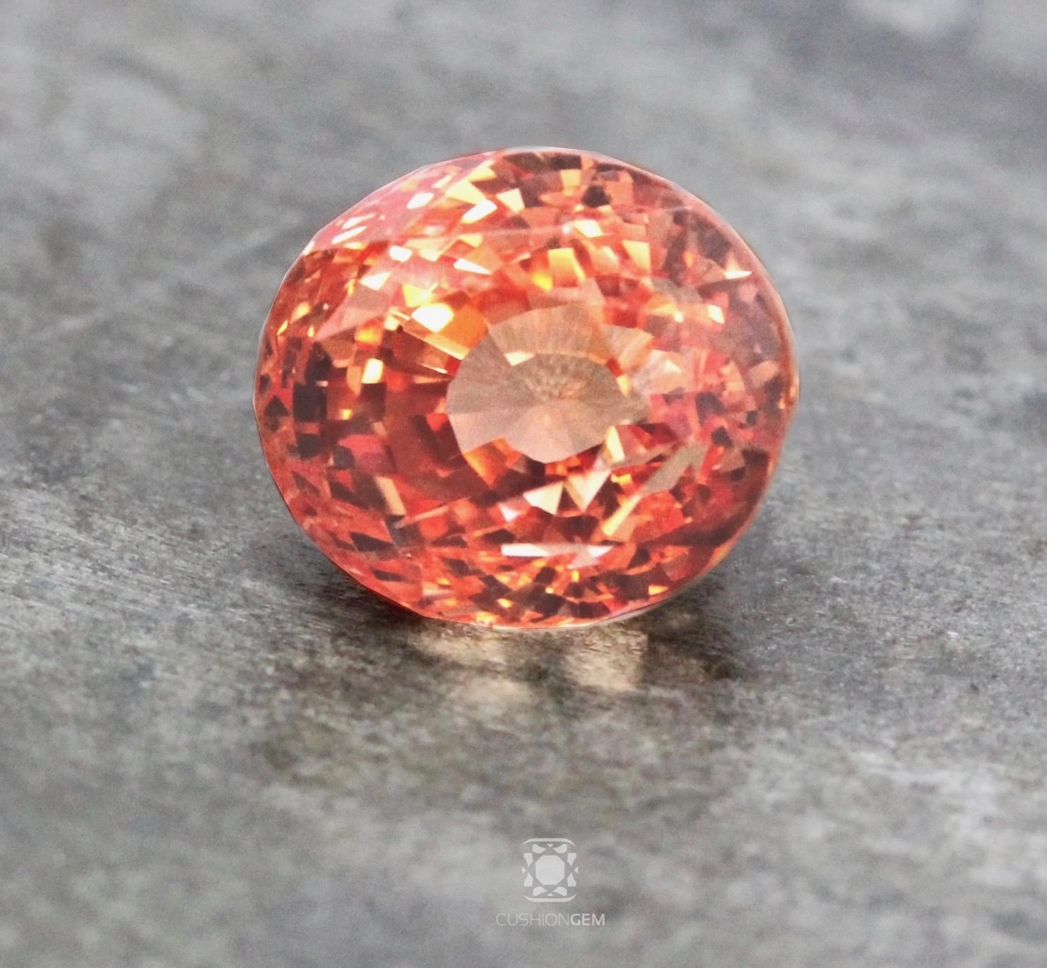
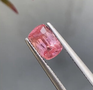
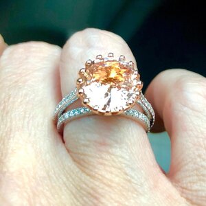
This is what I would consider to be the perfect pad hue, tone, and saturation. I'm from the USA, and, in general, I think we tend to favor a 50/50 split in hue or lean a bit towards orange-dominant.
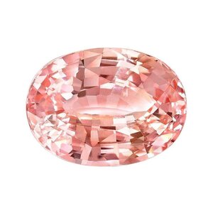
8856251_master.jpg
 

LilAlex

Ideal_Rock
Premium
Joined
Mar 3, 2018
Messages
3,658
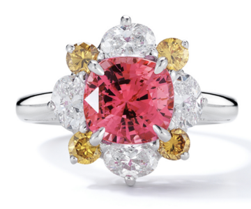
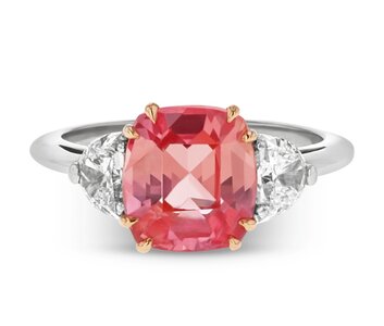
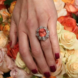
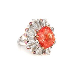
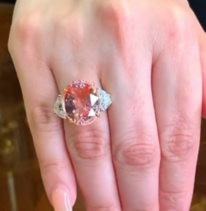
I like a much bolder saturation like this one from Oscar Heyman (I can not find their one I really love). Lost something in translation here but was super-vivid in the paper catalog back then :mrgreen2:.

Screen Shot 2022-02-23 at 7.06.26 PM.png

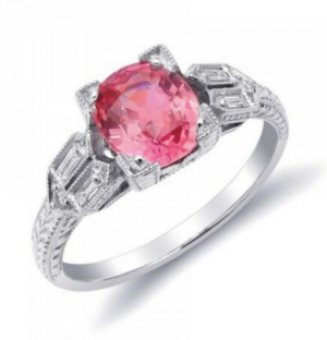
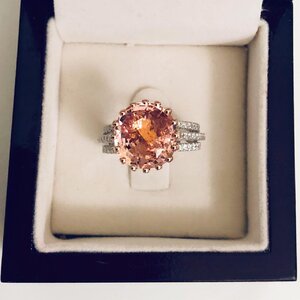
And this one from JupiterGems on eBay (never bought from them; have no idea if it looks like this but I liked the picture years ago and it is still in my watch list)

Screen Shot 2022-02-23 at 7.12.10 PM.png
 
Joined
Jan 20, 2012
Messages
4,252
I am also blown away by how differently labs view pad designations... here are some really cool variations.

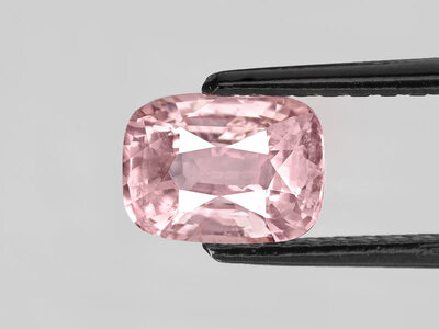
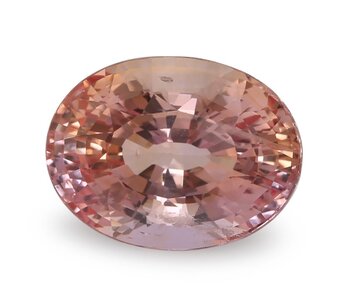
GRS certified this stone a pad, which some might find too pink.
R14557M-Padparadscha-1.55ct-Madagascar-R14557M-Padparadscha-1.55ct-Madagascar-4_800x.jpg

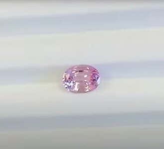
AGL certified this stone a pad. I see a purple modifier.
Untitled (2).jpg

This stone is so gorgeous... but some might find it too saturated to be a true pad. GIA certified it a pad.
j_10017062_master.jpg

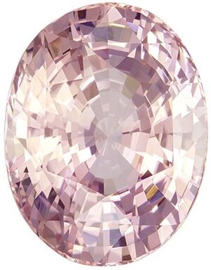
On the flip side of that coin! GIA certified this a pad, but some might find the saturation to be too low, which can cause gray/brown.

gia-certified-no-treatment-12-2-x-9-5-mm-padparadscha-sapphire-genuine-gemstone-in-oval-cut-so...jpg

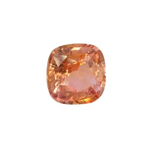
GRS certified this a pad. I see a yellow modifier.
13542-PAD-4.09-1024x1024.jpg

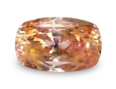
Lastly, here is a suite from The Natural Sapphire Company's blog. I don't think any of these guys qualify as pads using the LMHC's definition. But clearly others disagree!
padparadscha-1-new-e1534546817587.jpg
Padparadscha-2-new-e1534546683500.jpg
Padparadscha-3-new-e1534546883563.jpg
 
Joined
Jan 20, 2012
Messages
4,252
I like a much bolder saturation like this one from Oscar Heyman (I can not find their one I really love). Lost something in translation here but was super-vivid in the paper catalog back then :mrgreen2:.

Screen Shot 2022-02-23 at 7.06.26 PM.png

And this one from JupiterGems on eBay (never bought from them; have no idea if it looks like this but I liked the picture years ago and it is still in my watch list)

Screen Shot 2022-02-23 at 7.12.10 PM.png

You seem to prefer a pink-dominant stone with a more vivid saturation! Beautiful rings... thanks for sharing! P.S. Are you in the US?
 
Joined
Jan 20, 2012
Messages
4,252
@LilAlex I thought I should also mention... I LOVE Krishna from Jupiter Gem!! Honest as the day is long. He's also very professional and extraordinarily knowledgeable. I bought my most recent pad from him! George from JTV also buys from him. 8-)
 

LilAlex

Ideal_Rock
Premium
Joined
Mar 3, 2018
Messages
3,658
You seem to prefer a pink-dominant stone with a more vivid saturation! Beautiful rings... thanks for sharing! P.S. Are you in the US?

Yes, I guess I do -- but these are a little pink-er than I recall. I think the bottom one was GRS pad (you can probably still check on eBay) and the top was OH pad which, I assume, is above reproach. Spouse and I are pale so a super-subtle pad would be invisible on either one of us :cool2:. Maybe on one of those clear nylon bands from the other thread so we can fly right under the radar...

Good to know about JupiterGem (assuming it's the same place/guy). Why has this not sold in 5+ years? The price has inched up.

I am in the US for now -- but I don't know if that has informed my pink/orange color preference =)2. I certainly am pretty far from the origin of these designations. IRL, I do not know anyone outside of the trade who would even recognize the word.
 

CBianco

Brilliant_Rock
Joined
Nov 25, 2021
Messages
589
I personally prefer much more saturated pads, and pink leaning too but only because its my favorite color lol. The pale ones always remind me of morganite. I'm originally from Asia but in the US now, although I don't think it's too relevant as I only recently got into colored stones so no Asian influences :)
 
Joined
Jan 20, 2012
Messages
4,252
I personally prefer much more saturated pads, and pink leaning too but only because its my favorite color lol. The pale ones always remind me of morganite. I'm originally from Asia but in the US now, although I don't think it's too relevant as I only recently got into colored stones so no Asian influences :)

I, too, dislike pale or desaturated "pads" that resemble morganite! :snooty:
 

pokerface

Brilliant_Rock
Joined
Sep 12, 2011
Messages
892
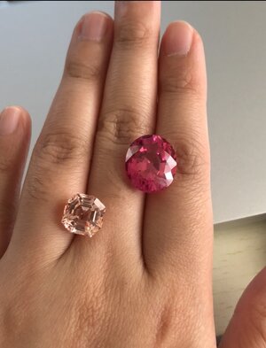
My ideal (and according to Richard Hughes, also Robert Crowningshield's) next to my stone! I think I did pretty good! I'm from the US.

5E9926FE-C26A-457E-ABC3-75A87DEF591A.jpeg
 

demantoidz

Brilliant_Rock
Joined
Jun 25, 2019
Messages
511
Here's a gorgeous one imo, very similar amount of pink and orange (GIA 'pinkish orange'), saturated, and not light enough to be pastel (I think)
Screenshot_20220224-133345.jpg
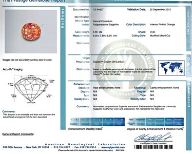
Saturated and orange leaning which I love (designated 'Classic Ceylon' by AGL which is interesting considering in the other discussion it was mentioned that they prefer pastel ones). If theres a touch more pink and no brown IRL, this would be my ideal color:

pad (1).jpg pad (2).jpg

Here's a lovely lighter one which many would probably prefer (I prefer the two above) :
https://www.instagram.com/p/CP1OWyhB9-5/?utm_medium=copy_link
OnPaste.20220224-135556.png
 
Last edited:

Rfisher

Ideal_Rock
Premium
Joined
Oct 19, 2013
Messages
5,509
@LilAlex I thought I should also mention... I LOVE Krishna from Jupiter Gem!! Honest as the day is long. He's also very professional and extraordinarily knowledgeable. I bought my most recent pad from him! George from JTV also buys from him. 8-)

Have you shown your Padparadscha on PS? Can you link to or show us please? :love:

I also enjoy working with Jupiter Gem. They are incredibly nice and helpful and honest with their opinions, imo.
 
Joined
Jan 20, 2012
Messages
4,252
Here's a gorgeous one imo, very similar amount of pink and orange (GIA 'pinkish orange'), saturated, and not light enough to be pastel (I think)
Screenshot_20220224-133345.jpg
Saturated and orange leaning which I love (designated 'Classic Ceylon' by AGL which is interesting considering in the other discussion it was mentioned that they prefer pastel ones). If theres a touch more pink and no brown IRL, this would be my ideal color:

pad (1).jpg pad (2).jpg

Here's a lovely lighter one which many would probably prefer (I prefer the two above) :
https://www.instagram.com/p/CP1OWyhB9-5/?utm_medium=copy_link
OnPaste.20220224-135556.png

I'm sort of loving that it seems most PSers prefer the more saturated stones. I was sure there would be some purists who favor the really pale pink leaning ones!

I do prefer the Ceylon material, and while I tend to steer clear of the super vivid stones, I definitely need a little oomph in the saturation department, as opposed to anything too delicate. I think of it like a "bright pastel." I also prefer orange-dominant. And since I see brown modifiers in almost everything, lol, you can imagine how difficult it is for me to find the right pad.
I, too, am surprised AGL certified that sapphire as a pad. Perhaps it was from before Monruedee Chaipaksa became senior gemologist. Or perhaps they accept more variations than I thought. :think: Pretty stone in any case!
 
Joined
Jan 20, 2012
Messages
4,252
Have you shown your Padparadscha on PS? Can you link to or show us please? :love:

I also enjoy working with Jupiter Gem. They are incredibly nice and helpful and honest with their opinions, imo.

Hi! I have not shown it before, simply because I take awful photos that border on offensive. It seems every time I upgrade my phone, the camera gets worse. Is it me? I have a Samsung Z Flip 3. If anyone has any idea how to put it on some type of macros lens, please, do tell. I cannot find any comparable setting. :wall:

Anyway... please forgive the lousy photo. It is unedited, and shot through the plastic gem box cover. My phone is also black, so it reflects in everything. grrr Photo is taken in diffused, natural light. It is my dream color and has a phenomenal cut (which I'm a stickler about). However, I did have to sacrifice on the clarity just a bit. Not sure if you can make it out in the photo, but the stone does have a small crystal right beside the girdle at the 4 o'clock mark. It is not surface-reaching though. Other than that, the stone is nearly loupe clean. Thanks for asking! =)2

download (1)zz.jpg
 

demantoidz

Brilliant_Rock
Joined
Jun 25, 2019
Messages
511
I'm sort of loving that it seems most PSers prefer the more saturated stones. I was sure there would be some purists who favor the really pale pink leaning ones!

I do prefer the Ceylon material, and while I tend to steer clear of the super vivid stones, I definitely need a little oomph in the saturation department, as opposed to anything too delicate. I think of it like a "bright pastel." I also prefer orange-dominant. And since I see brown modifiers in almost everything, lol, you can imagine how difficult it is for me to find the right pad.

I, too, am surprised AGL certified that sapphire as a pad. Perhaps it was from before Monruedee Chaipaksa became senior gemologist. Or perhaps they accept more variations than I thought. :think: Pretty stone in any case!
Not only did they designate it as a padparadscha, but Classic Ceylon, which means according to their site that:
1. The stone possesses a number of gemological characteristics that allow for a very high confidence level in the country-of-origin determination.
2. The stone also possesses a top-quality -- the quality which helped to earn these sources their name and status.
The report is from 2015, not sure when the senior gemologist changed.
I see some brown in the photo of it but I would hope it really is an intense pinkish orange IRL, as they described it as such.
 
Last edited:

Rfisher

Ideal_Rock
Premium
Joined
Oct 19, 2013
Messages
5,509
I’ve always wondered how different labs that designate ‘Padparadscha’ take into consideration color shift in different lightings and even color bleeding out in certain lights.

Of course the less color shift - the more expensive the stone….but I mean strictly whether it receives the designation for that particular lab or not.
Some labs stricter on color shift than others?
 
Joined
Jan 20, 2012
Messages
4,252
I’ve always wondered how different labs that designate ‘Padparadscha’ take into consideration color shift in different lightings and even color bleeding out in certain lights.

Of course the less color shift - the more expensive the stone….but I mean strictly whether it receives the designation for that particular lab or not.
Some labs stricter on color shift than others?

It probably does depend on the lab, but I think it is agreed amongst most that the proper examination lighting temp for CS is one that mimics daylight (which would be approximately 5000-6500K). AGL uses a solid 5500K and the GIA uses the higher end of the spectrum at 6500K (likely because they're more diamond-intensive). I prefer 5500K, which would be the equivalent to just around noon with the sun overheard on a clear day. I'm not sure labs care much about the color shift of CS amongst other lighting temps that may be found in the home, like incandescent or fluorescent, unless we're talking an actual color change CS, such as alexandrite or garnet, etc. The exception to this would be material with a color center prone to charging/fading under certain lighting/temps, like padparadscha, yellow, or orange sapphire (due to active or inactive iron content). During a color stability test, a pad's color may not change at all (stable), may change but still fall within the acceptable pink-orange hue range (still a pad), or it may change and fall outside of the acceptable pink-orange hue range (unstable - not a pad). GRS, for instance, has 4 main types of stability testing results. It's all so interesting.
 

Sprinkles&Stones

Brilliant_Rock
Joined
May 19, 2020
Messages
1,992
I was so preoccupied with my terrible photography skills, that I forgot to mention the specs on my pad. It is certified untreated with Sri Lankan origin from Gubelin and GIA. It weighs 5.5ct. and measures approximately 11x9mm. :shifty:

I would LOVE a separate thread on your pad! That’s huge, and so beautiful!
 
Joined
Jan 20, 2012
Messages
4,252
I would LOVE a separate thread on your pad! That’s huge, and so beautiful!

Oh thank you! Maybe I should do just that and ask opinions on mounting ideas, as PSers always have the most creative design inspiration. I seem to do the same thing every time... a halo or 3-stone design, etc. :roll:

Honestly, I was looking for a pad around 3ct., and after going through dozens of stones, I just couldn't ever find the right combination of perfect (for me) color, cut, clarity, and size. So this was larger and, of course, more expensive, but it ticked all the boxes. Krishna (love him) told me I'd cry when I saw it in person. While I didn't exactly shed a tear, it was certainly love at first sight! Thanks again for the comment!!
 

CaseyLouLou

Brilliant_Rock
Joined
Dec 22, 2019
Messages
1,257
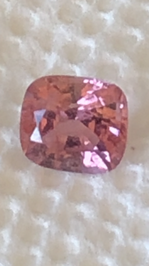
Can my ‘pad’ spinel play? I purchased it because it looked like a pad color to me. I took a photo of it next to my reddish-hot pink spinel for comparison. Taken in natural light.

What do you think?


399B7DC2-9208-4F1C-839F-88E852DAD06D.jpeg
3BC3EF5B-1D8B-44EB-907A-4FE6892E6245.png
 
Last edited:
Joined
Jan 20, 2012
Messages
4,252
Can my ‘pad’ spinel play? I purchased it because it looked like a pad color to me. I took a photo of it next to my reddish-hot pink spinel for comparison. Taken in natural light.

What do you think?


399B7DC2-9208-4F1C-839F-88E852DAD06D.jpeg
3BC3EF5B-1D8B-44EB-907A-4FE6892E6245.png

Of course he (or she?) can play! Spinel of any variety is always welcome, as far as I'm concerned. That is a really lovely stone, Casey! I tried a couple of times to source this color in a spinel, but they both came with brown tones. :confused2:
 

CaseyLouLou

Brilliant_Rock
Joined
Dec 22, 2019
Messages
1,257
Of course he (or she?) can play! Spinel of any variety is always welcome, as far as I'm concerned. That is a really lovely stone, Casey! I tried a couple of times to source this color in a spinel, but they both came with brown tones. :confused2:

Thanks! It has a lot of inclusions but I kind of like them. It still sparkles and has nice luster. I’m thinking of setting her in a 3-stone ring since it’s a large stone (to me anyway) of 1.5ct.
 

demantoidz

Brilliant_Rock
Joined
Jun 25, 2019
Messages
511
Images of this one have been on the internet for some yrs and its very much that saturated, orange-leaning color I (currently) prefer. It has changed settings, but it must be the same stone since its the same 12.30ct weight, shape.

And its available here.

It is less perfect color-wise in this video: https://www.facebook.com/Jewellerym...y-david-morris-the-london-j/1563331857062409/

2017-01-24-2234.jpg__1536x0_q75_crop-scale_subsampling-2_upscale-false.jpg 11-03-1059-12_30ct-Padparadscha-Diam-Ring-frnt-e1578484791134.png


ring-11041042-white-background.jpg__1536x0_q75_crop-scale_subsampling-2_upscale-false.jpg
 
Last edited:

Ionysis

Brilliant_Rock
Joined
Oct 1, 2015
Messages
1,925
Oooh a thread on my favourite colour / stone - yay!

Have to say I’m one of those “purists” referred to above. I do love the more saturated colours but to me one of the defining terms for a padparadscha is the word “delicate”. A vibrant stone is a joy in itself but to me it’s a different (not lesser) category.

I used to favour the orangey tone but over time I’ve been converted to the pinker.

To me the more important aspect in terms of colour is that there isn’t any other modifier aside from pink / orange - no brown, purple, greyish overtone.

I’ve bought quite a few “pads” and some have been dismal (and extremely expensive) mistakes. I have many which carry the right certificate. But I only have one which is really superb in colour. Oddly it’s the one i wear least because the paler pinkish ones go with my wardrobe better :doh::doh:
 

Lilith112

Brilliant_Rock
Joined
Jun 27, 2019
Messages
1,019
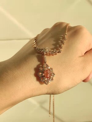
For me, my perfect pad is:

-No grey/brown/violet modifiers.
-Vivid but delicate coloring
-eye-clean and no extinction
-50-50 pink-orange mix with a bit more orange base

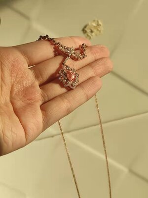
Pictures of my pad necklace:

WeChat Image_20220305020620.jpg
 

Attachments

  • WeChat Image_20220305020616.jpg
    WeChat Image_20220305020616.jpg
    272.6 KB · Views: 36
Be a part of the community Get 3 HCA Results
Top