shape
carat
color
clarity

Split-Shank Ring Design

Do you prefer the top ring or bottom ring?

  • Top Ring

    Votes: 46 92.0%
  • Bottom Ring

    Votes: 4 8.0%

  • Total voters
    50

srqledmeup

Rough_Rock
Joined
Jun 20, 2021
Messages
27
3041E53E-8ADC-489E-BD30-5F95ED7086D5.jpeg

Hi all,

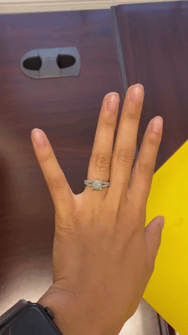
I’m back with more exciting updates! David Klass has our 1.288 carat WF ACA round diamond (see previous posts) and now we’re in the design phase of the ring.

I am interested in a Stephanie Gottlieb inspired split-shank ring in platinum. I LOVE her work and style, but unfortunately getting a ring directly from her was probably out of budget when it came down to it. I do want to give her full credit for the inspiration though.

The first is a more faithful interpretation while the second has a more gentle and delicate split. I’ve received a plastic model of the second one and he’s currently producing a plastic model of the first one.

I’ve asked some people in my real life for their opinions and everyone’s reaction is, “they’re not the same?!” so I am here to be among people who understand me.
 

Cerulean

Ideal_Rock
Joined
Sep 13, 2019
Messages
5,077
The bottom one looks more like a band - the tapered (top) looks more like an ering
 

Lookinagain

Ideal_Rock
Premium
Joined
May 15, 2014
Messages
4,460
I like the curve in the band on the top one best. And I think the top has a more graceful split. I'd love to see a CAD with 6 prongs instead of 4. Not sure if that would look better or not but I would love it if someone could do a mock up.
 

yssie

Super_Ideal_Rock
Premium
Joined
Aug 14, 2009
Messages
27,259
The first. But I want the concave inflection even more exaggerated, and I want the split to join into a single shank face-up.
 

Starstruck8

Brilliant_Rock
Joined
May 13, 2021
Messages
597
Top. The curve is more elegant, and the flaring ends frame the stone better. Agree with yssie - I'd give it more flare.

Here is a comparison (with cabs, not faceted stones). If I did these again, I'd make the split for the top one start a bit lower down, and give the 'arms' of the bottom one a stronger concave curve.

SplitShankComp.jpg .
 

oncrutchesrightnow

Ideal_Rock
Joined
Apr 17, 2006
Messages
2,688
Another vote for top!
 

nala

Ideal_Rock
Premium
Joined
Oct 23, 2011
Messages
7,054
Top
 

tyty333

Super_Ideal_Rock
Premium
Joined
Dec 17, 2008
Messages
27,227
the second has a more gentle and delicate split.

I would actually say that about the first one. It, the first one, is more delicate and has a more gentle curve. Definitely more pleasing to my eyes. Agree with @yssie on more of a curve into a single shank.

The second one is more architectural... Less pleasing in my eye. YMMV
 

ringo865

Ideal_Rock
Premium
Joined
Feb 14, 2014
Messages
2,897
Top. I might even have it curve ever so slightly more. Let us know when you get both plastic molds :)
 

srqledmeup

Rough_Rock
Joined
Jun 20, 2021
Messages
27
I'm back with the plastic model of the top design! :D

My thoughts: I think it looks much better than the first iteration and he really nailed the angle of the shanks as far as the inspiration ring.

I have one question/concern that I've already wrote to DK about this morningl. It may be due to the limitations of the plastic material.

I want to make sure that there is open space in the corner of the split shank. In the plastic model, it appears that the shanks are connected in the far corners by plastic. Please see attached images to see what I am trying to describe.

Thoughts?

IMG_1774.jpg IMG_0618 copy.jpg
 

srqledmeup

Rough_Rock
Joined
Jun 20, 2021
Messages
27
Here are not marked up photos of the model:

giphy.gif IMG_1775.jpg
 

Attachments

  • giphy.gif
    giphy.gif
    13.8 MB · Views: 19
Be a part of the community Get 3 HCA Results
Top