- Joined
- Jun 23, 2005
- Messages
- 18,121
What you are asking for reminded me of two settings by CVB (Caysie Van Bebber). For some reason my browser is showing me her prices in pounds and my settings are US, but if I recall these are typically under $2k. Maybe one of these would be a better fit? She sets outside stones, and her quality is highly regarded here.
Her 'Jovyn'
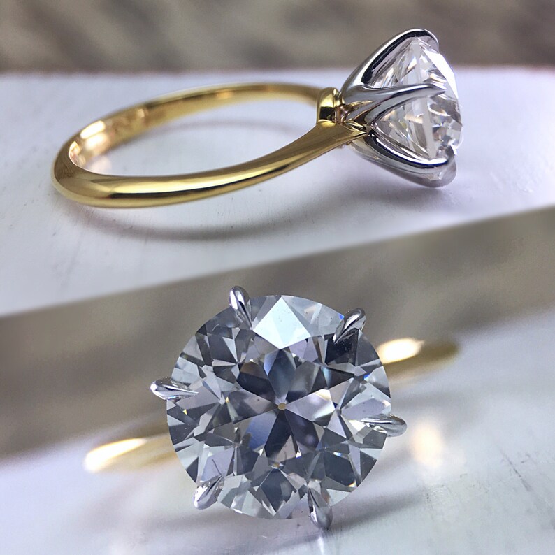
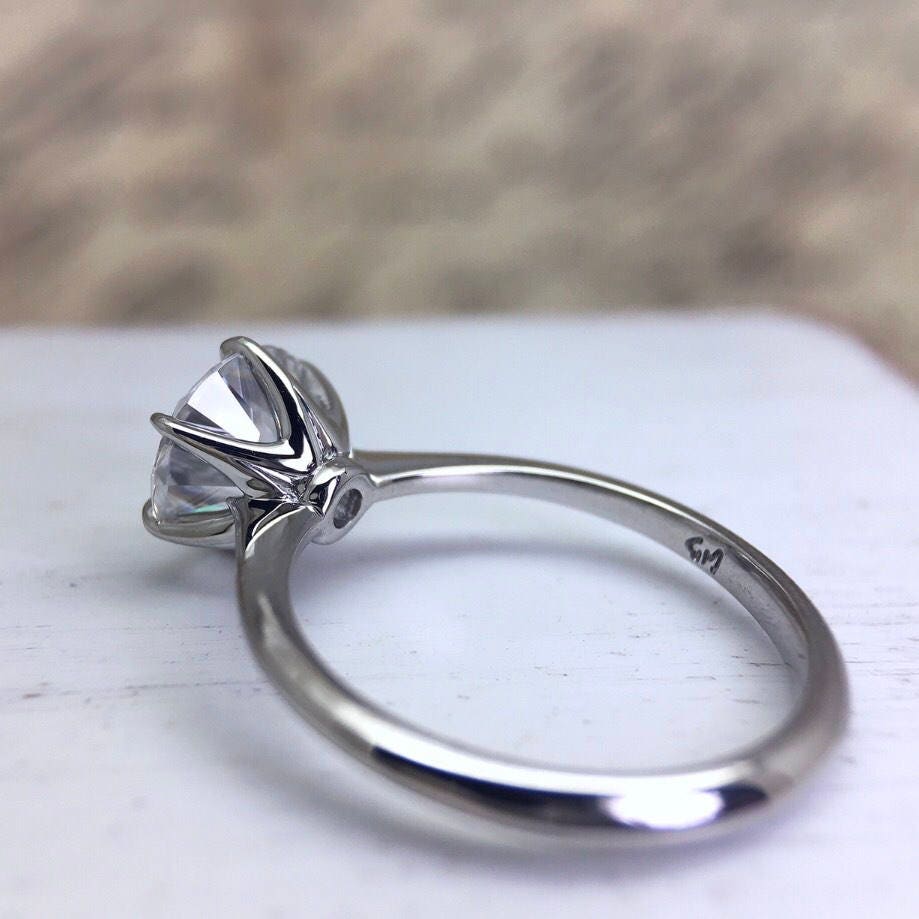
And her 'Abby'
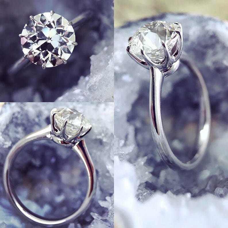
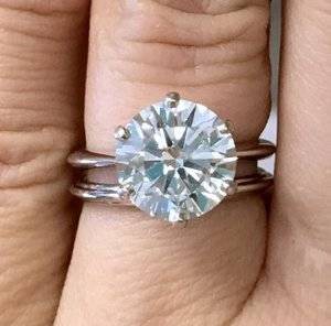
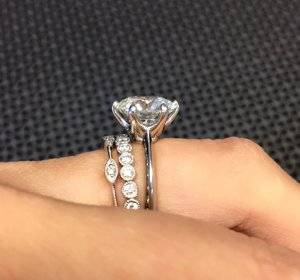
Oops... I should've read the entire thread. I see WF is helping you - good deal!
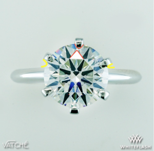
@Niel Ha, you are so right.
I'm glad that WF helped "reverse" my Frankenstein of a setting. I love the curves of the Vatche U113 basket, and should have never tried to customize it in the first place. WF was able to send it back to Vatche and change out the basket. This speaks volumes about WF's customer service!
I'm really happy with how the ring looks overall (esp the side profile!). Vera's sent me some images to approve of before it's shipped out. My only concerns are highlighted in red and yellow. Is such asymmetry between prongs and facets (in red) or spacing between the prongs and outline of the band (in yellow) normal? Is this an artifact of camera angle?
I'm sure once I have my sparkly precious back, I won't even notice the asymmetry. But once you see it in a still photo, it's hard to unsee it or stop thinking about it. And wow, my stone looks warm even though it's an AGS H. It looks white in real life though!
Someone please stop me and tell me I'm being crazy.

I strongly suspect this is just the photo ... just the smallest tilt in the camera angle will make the alignment look off like that .... BUT, if I were you, I would ask WF to look at it for the same issue before sending it to you. They can check to make sure and fix it before shipping, if necessary.
First of all, you're not crazy. I don't know if it is camera angle or not, but the prong at 12:00 is not in symmetry with the prong at 6:00. It should be a straight line down to connect them. It looks more like 12:30 and 6:00. That would really bother me, personally. That is the kind of thing I couldn't "unsee". I ordered a new diamond from WF in this same vatche u-113 setting 2 weeks ago. I'm still waiting to receive mine, I wouldn't want it to come in looking like this.
@Niel Ha, you are so right.
I'm glad that WF helped "reverse" my Frankenstein of a setting. I love the curves of the Vatche U113 basket, and should have never tried to customize it in the first place. WF was able to send it back to Vatche and change out the basket. This speaks volumes about WF's customer service!
I'm really happy with how the ring looks overall (esp the side profile!). Vera's sent me some images to approve of before it's shipped out. My only concerns are highlighted in red and yellow. Is such asymmetry between prongs and facets (in red) or spacing between the prongs and outline of the band (in yellow) normal? Is this an artifact of camera angle?
I'm sure once I have my sparkly precious back, I won't even notice the asymmetry. But once you see it in a still photo, it's hard to unsee it or stop thinking about it. And wow, my stone looks warm even though it's an AGS H. It looks white in real life though!
Someone please stop me and tell me I'm being crazy.

Thanks @Iwanttosparkle. I'm glad that I wasn't the only one who thought the prongs looked off. Did you wind up customizing your U113?
WF was very responsive, and they're looking into it. Hopefully this is just a small stumble.
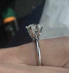
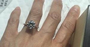
What a journey--for those of you following this thread, Whiteflash fixed the prongs even though it wasn't their fault. The final product looks AMAZING. I'm so pleased. They made the prongs smaller, more symmetrical, and aligned appropriately. The diamond's girdle also sits appropriately in all of the prongs' slots.
Now I'm off to figure out how to post a video on SMTB!
Thank you all so much for your help!


I love it but I’m sorry for your issues
I wish the title of this thread was “ set it and regret it. “
That’s all I came to say.
