shape
carat
color
clarity

Setting is done & images are IN -- feeling lukewarm.

lemonlimekisses

Rough_Rock
Joined
Mar 19, 2014
Messages
33
To start off, I feel incredibly guilty that I've found this process to be more stressful than fun. I haven't been very positive about it, and I've turned to the PS community for feedback and it's been very helpful.

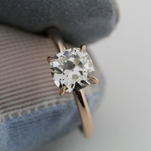
The setting has been made and here are the images -- I have mixed feelings about it. I don't know what to do, to be honest. My boyfriend thinks we should get it and see how I feel in person and if unhappy, get it remade. I know that these images are so upclose and in person, I may actually love it.

My biggest regret is going with the bright cut pave and not v-cut pave.. and I also wonder if I should've gone with a flush setting instead of the donut. I went back and looked at the ring that I fell in love with and.. well, it sucks. I wish I would've gone with that one but during the process, I fell in love with the idea of a donut and also thought bright cut would be more sensible. Additionally, the person I was working with recommended bright cut for the design, saying it would flow better.

Here is the ring I fell in love with --

https://fbcdn-sphotos-g-a.akamaihd.net/hphotos-ak-xpa1/t1.0-9/1381718_588367857890036_735441421_n.jpg

I'd love your thoughts on the ring.. any kind of feedback would be helpful. I don't feel comfortable sharing about this with friends or family and quite frankly, they wouldn't even tell the difference between the VC ring and this ring. Thanks so much.
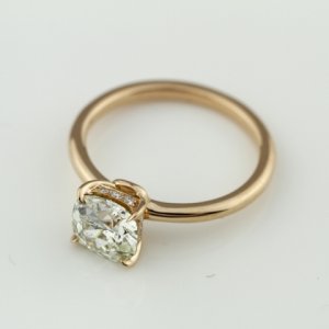
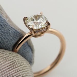
kkr1.jpg

kkr2.jpg

kkr3.jpg
 
I think that setting is quite lovely and the macro pics make everything stand out more. The donut looks quite small to me but the pics do not show the pave well enough to see them. The prongs are very nice.
 
redwood66|1403925665|3702564 said:
I think that setting is quite lovely and the macro pics make everything stand out more. The donut looks quite small to me but the pics do not show the pave well enough to see them. The prongs are very nice.
Hi Redwood66,

Thanks for your kind words. Do you think the bright cut looks okay? The more I look at v-cut, I like it.. which might mean I should just stop looking.

And I want to be clear to everyone who reads this that I am well aware that I am being difficult.. and I feel terrible for it! I wasn't forced into choosing bright cut or the donut, I did with some feedback and after googling images. I just feel a little regret not going with my initial "dream ring"..
 
Re: Setting is done & images are IN -- feeling lukewarm.

Personally I LOVE it - and the tiny differences from your inspiration piece I think only add to the beauty! I love the small donut. And the pave looks perfect to my eye - and a great fit to your center stone. I say see it in person and try to fall in love. I'd be surprised if you didn't - it's a stunner!!
 
Rosebloom|1403927303|3702576 said:
Personally I LOVE it - and the tiny differences from your inspiration piece I think only add to the beauty! I love the small donut. And the pave looks perfect to my eye - and a great fit to your center stone. I say see it in person and try to fall in love. I'd be surprised if you didn't - it's a stunner!!

+1 - I think I love your version more than the inspiration ring!
 
Your ring turned out beautifully!! I like it much better than the inspiration ring. The small donut enhances the design, bravo! :appl:
Gorgeous, please come back with hand shots.
 
I'm sorry you're not loving it, but FWIW I think it's gorgeous! Those prongs are dreamy and the pave looks great - tbh I like it better than your inspiration pic!
 
I am coming back in to agree with Rosebloom and marymm. The link did not work for me to the inspiration ring the first time but did just now. I love yours much better. I am not a fan of that style and much prefer the donut.
 
I don't like the VC version at all. It looks like someone just plopped the basket onto the shank. I much prefer the donut. The VC version also looks like something can pop off the head easily...I feel more secure with the donut. As for the pave, I can't tell the difference. I dont know IRL it may not be noticible as the photos are so magnified.
 
I think it's lovely too. Everything looks to be in good proportion, and the prongs are beautiful. I happen to like the donut - and as I recall, it's a feature that adds strength to the setting, which is a good thing.
 
I think your ring turned out gorgeous and I too like this ring better.
 
Incidentally, I prefer the doughnut because it makes the basket look more integrated as opposed to glued on. And I also prefer the bright cut pave because I don't like the texture of all the little slits along the metal.
 
jerichosmom|1403928563|3702597 said:
I don't like the VC version at all. It looks like someone just plopped the basket onto the shank. I much prefer the donut.

Popping back in to say ITA with jerichosmom!
 
marymm|1403927504|3702580 said:
+1 - I think I love your version more than the inspiration ring!

Ditto! I like the small donut also because I feel it gives a wee bit more strength/substantial feel to the overall ring. I am personally not a fan of heads that look like they are teetering on a band. I think you should see it in person before deciding for sure, as it really is quite a stunner!
 
I like yours better than the inspiration.
 
It has a very romantic feel to it. I love it but ultimately, you're the one wearing it. I agree with your boyfriend to get it in for a look before you proceed any further.
 
First off don't feel bad about not loving it... you're not being difficult, it's just how you feel.

Sometimes I think that we obsess so much over tiny differences in these super magnified photos, that once you see it in real life you really can't see the differences we see in the pics.

I think it is absolutely gorgeous. I don't know your full story, but I think the donut makes it look more elegant and classic. Classically beautiful. Wait and see it in real life. Then make a decision. I wish you the best of luck for a great resolution that makes your heart sing..
 
ABSOLUTELY see it in person. Magnified images are so misleading sometimes.

It is different than the inspiration picture but I actually like yours more.

I say give it a week or two. You might be surprised. :wavey:
 
I honestly and legitimately like yours better. It looks more classic and fits in with the appeal of the chunky cushion cut. I think the other setting would work better for something more modern.

Also, the donut will still allow bands to sit mostly flush. Seriously, once you get that thing on your finger with a band, you'll barely notice a gap. I personally don't like that style of ring without a donut - I just feel like it looks really awkward and like the head of the ring will flop off.

And I do actually think the bright cut looks better than v-cut... but I just like bright cut more in general. I would wait to see it in person.
 
I really like yours. The nice thing about a donut is that your wedding band will not sit flush with your ring and I like a little gap between the two, I think it keeps the center stone from getting lost between the two. I hope I am making sense?
 
This is simplicity at it best! Just perfectly done. I know you're in doubt but I wouldn't change a thing. I hope you love it and wear it in good health!
 
I far prefer the details on your ring to the VC inspirational ring. Your claws are totally TDF, and the donut, while very small, seems far more secure. I have a ring w a small donut like that and wearing a band beside it is no problem. It's not flush but there is no big gap. The pave is hard to tell for sure, but I feel it suits your OEC more appropriately.

I agree w others above, see it, wear it, get to know it ... Before you decide to change anything. Sometimes IRL things look BETTER than you imagine!! It us beautiful and I hope you can see the beauty in it that we do! :))
 
A puzzle piece [for falling in love] that's missing in the photos is the animation of the diamond, which you will have in real life.

It looks beautiful :love: beautiful :love: beautiful :love: to me and I hope it knocks your socks off!

edited to add 2 more beautifuls!
 
I think this ring is beautiful and prettier than the inspiration.
 
I think it's lovely. Of course, lots of people loved my first setting (with V-pave in the gallery and on the ring shank), but I never did. And I wasn't happy until I had it reset in a solitaire without melee. So I understand that a million compliments, while nice to hear, might not matter one bit in terms of how you feel about it. The pave is really small in reality, and the way yours are set won't be scratchy, as mine was. Anyway, I think you might love it in person.
 
I think it is beautiful. But I agree with Gypsy. Wait to see it in person to see how you feel about it IRL. And give it a week or 2 to be able to really know what you think. Good luck and please don't let this get to you. Everything will work out and you will get a ring you love after all of this. The question is if this is the one and you need to see it IRL and live with it for a bit.
 
I really like it too and I love the donut! My own rings are flush fit but I think I am really beginning to appreciate a bit of space between an ering and wedding band. I think you'll find you really love it when you get it and as Jimmianne pointed out - the diamond will become animated on your finger adding so much more to the look!
 
I agree with all the previous sentiments re: the donut. I think it helps give the basket a more stabilized and secure look. The pavé to me doesn't seem to be much different from the V cut and I think once you see it in person, you may find that the bright cut compliments your antique cushion cut (gorgeous by the way) well.
 
I love it! Obviously wait until you see IRL but from the photos it looks amazing to me!
 
I think it is really beautiful, and like many others I prefer yours to the original. Without the donut the VC version looks a bit odd to me.
 
GET 3 FREE HCA RESULTS JOIN THE FORUM. ASK FOR HELP
Top