shape
carat
color
clarity

Rectangular cushion pendant? (sapphire)

Status
Not open for further replies. Please create a new topic or request for this thread to be opened.

stermag

Shiny_Rock
Joined
Nov 26, 2005
Messages
433
I''ve found a sapphire that is both within my budget and has the color I''ve been after. Unfortunately, I''m not sure the shape will work for my pendant project. What do you all think? I''ve been searching through all the pendant threads in hopes of some inspiration but haven''t come up with much. Thoughts?

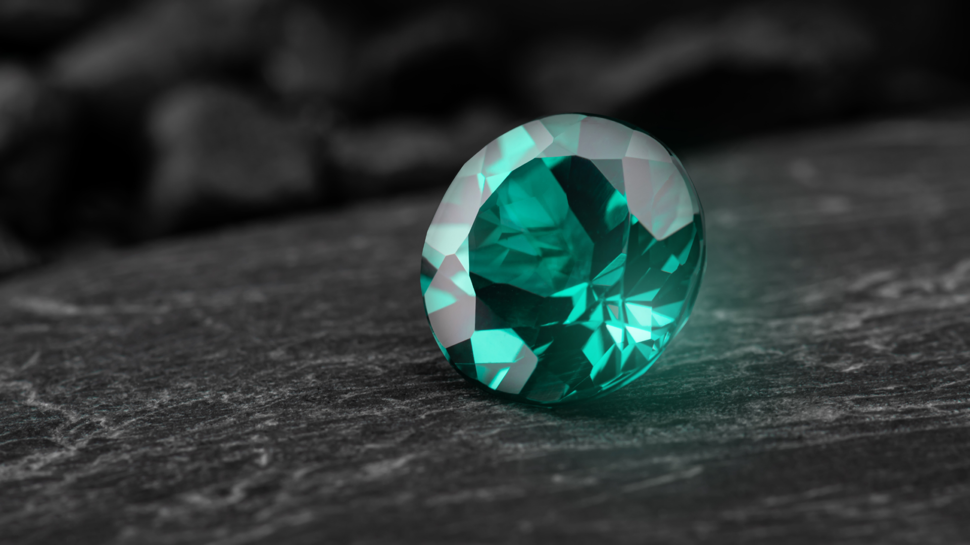
Also, here''s a pic of the sapphire in question. It''s a 1.29ct, with a ratio close to 1.5. Provided I am able to come up with a pleasing pendant design, any other reasons to pass this one up?

B774_1_0307200645354PM

B774_2_0307200645354PM


Danke!
 

SoonIHope

Ideal_Rock
Joined
Oct 11, 2005
Messages
2,152
I don''t actually have a pendant like this, but I must say this was my EXACT VISION for the pendant I may or may not get around to designing for my maid of honor! I wanted a rectangular cushion sapphire to set east-west on a really simple chain; I''m not sure what exactly you''re envisioning, but an east-west rectangle pendant just sounds so gorgeous to me!!!
 

valeria101

Super_Ideal_Rock
Premium
Joined
Aug 29, 2003
Messages
15,808
The picture looks gorgeous... so much so, I'd start wondering how close to nature it is. The show has a great return policy, and it may just be worth using it this time.
11.gif


Also, their jewelry section contains some cute pendants (at least used to - the listings chnage fast, and I have not looked recently). I wonder if it isn't a good idea to ask them for some setting options too.


Edited to add:

Speaking of design... there is allot of pave around, but that would definiyly not make a strong case against something like THIS as far as I am concerned
38.gif


collage_sapphire.pendant.jpg


Considering the quote for that larger piece, yours might just work out too. No intention to bring up something over the top.
 

stermag

Shiny_Rock
Joined
Nov 26, 2005
Messages
433
Well, I've spoken to NSC - the sapphire is still available (I've put it on hold), and the reason it is even remotely within my budget are its two inclusions (which you can see in the picture).

One is a feather, another is a small bubble. The website lists clarity as VS. The woman I spoke to examined the stone personally and said that the photos are representative of its color in real life, which is great (although I did confirm their return policy, and it's good). Also, this stone has not been treated.

I guess I'm wondering whether the inclusions should be a concern. I'm positive that a loupe clean sapphire similar to this one would be twice as much, and well out of my budget. Still, my initial thoughts regarding this project were somewhat different, as I had not considered this shape (I was all about finding a pear, if you recall).

Should I compromise on the shape given that I am taken with the color of this baby, and work with it? Or do I keep looking in hopes of finding something else? It is also considerably smaller than what I previously envisioned at 6.89x4.71mm (is this too small for a pendant?) but it does speak to me.

Help.
39.gif
 

valeria101

Super_Ideal_Rock
Premium
Joined
Aug 29, 2003
Messages
15,808
Nothing to loose seeing it, right?
2.gif
... and as long as those inclusions do not show, I wouldn't worry about them. Even less than those SI diamonds so much more talked about on the other side of this forum
5.gif


Changing the choice of shape for the sake of color makes all the sense in the world to me. If he pictures are not 'wishful thinking' that bit of sapphire should be quite a charmer.


Btw.
4.gif


a-lg_d70.jpg


Widget went for Van Craeynest with her star ruby ring... this is from them.
 

colormyworld

Brilliant_Rock
Joined
Aug 30, 2005
Messages
1,172
Hi stermag.
The color of that stone is very very nice. The only draw back I can see is the make seems a little off. This can be expected with native cut stones. You may or may not notice it in person. When set it should be even less noticable.
 

stermag

Shiny_Rock
Joined
Nov 26, 2005
Messages
433
Ana, you may be on to something. I saw a similar pendant at a local jeweler''s several weeks ago and it caught my eye. Being that the stone is a bit smaller, it naturally makes sense to "enlarge the effect", if you will, with the metal....

I would like to balance decorative and modern, hopefully in a graceful sort of way. :)
 

stermag

Shiny_Rock
Joined
Nov 26, 2005
Messages
433
Colormyworld, thank you. My eye isn't trained to notice/understand what makes a fancy cut excellent. I've learned to look for obvious windows and poor proportions/shapes, but that's where it ends.

I do like the look of concave cutting, but haven't found anything in the color/size/price I've been hoping for (I have no more than a grand for the stone). I wonder how much it would cost to recut this puppy - assuming this could be done without much loss to its face-up dimensions. Being that I'm in no big hurry, I could have it done at a later date, I suppose, which would break down the cost a tad.

Hmmm.

ETA: I may have spoken too soon. Found this on ConcaveGems.com - it's only 1ct, but evidently not as deep because the dimensions are a touch bigger. It's roughly $100 more.. which do I choose? Argh.

5060bsapph.jpg
 

colormyworld

Brilliant_Rock
Joined
Aug 30, 2005
Messages
1,172
If the color is true to life that concave cut gem would be my choice.
 

valeria101

Super_Ideal_Rock
Premium
Joined
Aug 29, 2003
Messages
15,808
No help here... but the cushion looks pretty darn perfect cut-wise. To me that is.

Concave cut? Oh well... it is you who needs to like it, not me. I doubt there is much left to improve about that stone, and if you were to have it ''concaved'', it may not end up over a carat anyway and definitely none larger.

Matter of taste 2c
38.gif
 

colormyworld

Brilliant_Rock
Joined
Aug 30, 2005
Messages
1,172
The outline of the stone in the top picture does not look even to me. The right side of the stone is a little fatter than the left side. The girdle looks a little wavey on top going to the left side. The bottom pic looks like the culet is off center also.
 

valeria101

Super_Ideal_Rock
Premium
Joined
Aug 29, 2003
Messages
15,808
Date: 3/28/2006 7:40:33 PM
Author: colormyworld
The outline of the stone in the top picture does not look even to me. The right side of the stone is a little fatter than the left side. The girdle looks a little wavey on top going to the left side. The bottom pic looks like the culet is off center also.

Well, but this isn''t a H&A diamond cut under microscope, is it ?
28.gif


Anyway, ''guess we are looking for different things: even color and brighteness are enough for me. As long as the shape is settable, that works too. This one is way better than my cut threshold for fine color - way better. Which doesn''t mean much, of course.
 

stermag

Shiny_Rock
Joined
Nov 26, 2005
Messages
433
Color, I do see what you mean now. It is highly unlikely that it would bother me, particularly once set. Thank you for pointing it out, however.

I keep staring at them both side by side. I think I will have the cushion sent in. Unless I don''t absolutely love it, I think I will leave the concave oval be. It doesn''t speak to me the same way, even though the color in the picture is somewhat similar.
 

colormyworld

Brilliant_Rock
Joined
Aug 30, 2005
Messages
1,172
I have a pink sapphire that was cut very much like the top picture. After looking at it for a few months I sent it to Wink who sent it to Richard Homer. He concave cut it. I am much more pleased with it now. I lost almost a half a ct. From 1.83 ct to 1.49 ct. IMO if colors are nearly the same the concave cut is a better deal.
 

colormyworld

Brilliant_Rock
Joined
Aug 30, 2005
Messages
1,172
Val you arer correct it is not an ideal cut diamond. I have no horse in this race stermag asked a question I just offered an opinion as I see it.
 

valeria101

Super_Ideal_Rock
Premium
Joined
Aug 29, 2003
Messages
15,808
Date: 3/28/2006 8:22:54 PM
Author: colormyworld
Val you arer correct it is not an ideal cut diamond. I have no horse in this race stermag asked a question I just offered an opinion as I see it.

Same here, sure that.

Honestly, I am quite enchanted with these hyper precise, fancy cuts too. There is something... ''artificial'' about them, but can''t deny the striking beauty of these gems either. And this is much said for me after being a consequent worshiper of cabochons and beads since as long as I can remember; an extreme view that awaits moderation perhaps
5.gif
 

colormyworld

Brilliant_Rock
Joined
Aug 30, 2005
Messages
1,172
I just think that if I am spending the kind of $$$$ for these things. I want to get the most bang for my $$$. I want it to look as close as to good to be true as I can get.
 

pricescope

Ideal_Rock
Joined
Dec 31, 1999
Messages
8,266
Stermag, i like Val, prefer this one and make something like that - you can wear it this way or 90 degree turned.

WESapphirePend.jpg
 

elmo

Brilliant_Rock
Joined
Jun 18, 2003
Messages
1,160
Date: 3/28/2006 7:25:20 PM
Author: colormyworld
If the color is true to life that concave cut gem would be my choice.
The unheated/untreated one would be my choice, also assuming the photo is accurate.
 

stermag

Shiny_Rock
Joined
Nov 26, 2005
Messages
433
Pricescope, Elmo - thank you for your votes and suggestions. I''m scouring the web and this forum for cushion pendants. I might request your opinions once or twice before I settle on the design.
 

stermag

Shiny_Rock
Joined
Nov 26, 2005
Messages
433
So I wanted to post a quick update. The sapphire I ordered from Natural Sapphire (top of the page) arrived today. While the color is represented fairly well by the photographs, the stone is significantly darker in all of the light sources I''ve seen it in thus far (no direct sunlight here today). In fact, at most angles, only a small portion of the stone is visibly blue. Of the two inclusions, the feather is virtually invisible, but the "bubble" the vendor described over the phone is quite noticeable, and I''m not sure what I think of it.

Now, on the whole, this is a really beautiful stone, and I''m fairly confident that it would make for a beautiful pendant... however...

I guess I''m wondering whether the light performance I would get out of the concave cut stone (also above) would be better. In other words, will that cut showcase the stone''s color better? The $100 price difference seems more and more insignificant to me.

As always, your thoughts are appreciated.
 

PrecisionGem

Ideal_Rock
Trade
Joined
Jul 27, 2004
Messages
2,030
Date: 3/28/2006 7:40:33 PM
Author: colormyworld
The outline of the stone in the top picture does not look even to me. The right side of the stone is a little fatter than the left side. The girdle looks a little wavey on top going to the left side. The bottom pic looks like the culet is off center also.
Colormyworld, I didn''t want to say anything until you brought this up, but I thought the cut looked pretty bad. I wouldn''t have thought that with such cutting the stone would have been very bright. Wonder if the photos have had some photoshop work done to them.
Good cutting in colored stones is more important than many people may think. Most colored stones are poorly cut, and many people have never had a well cut stone to compare them too. However, once they see them side by side, the develop a new taste for good cutting.
 

colormyworld

Brilliant_Rock
Joined
Aug 30, 2005
Messages
1,172
Sorry to hear the sapphire did not meet your expections stemag.
From my experince a well cut stone will stand head and shoulders above a so so cut stone in light performance. Richard Homers concave cuts are amazing. Very near to 100% brillance.
Gene I don't think the pics are photoshopped .I think it is flooded with intense diffused light. A brightness that will never be encountered in a normal situation.
I can not agree more with the second part of your statement though.
 

stermag

Shiny_Rock
Joined
Nov 26, 2005
Messages
433
To be honest, I am a little conflicted. One thing I do like about the sapphire currently in my posession is the fact that it is untreated. It is going to be a gift and I like its inherent rarity.

On the other hand, the cut, as some have noted, leaves much to be desired, and subsequently ... quite a bit of its beauty is simply lost. Richard Homer''s stone is cut to maximize its beauty, but it is heated.

I''m afraid the two (lack of treatment and beautiful cut) are mutually exclusive as far as my pocketbook is concerned. So, what to do?
 

colormyworld

Brilliant_Rock
Joined
Aug 30, 2005
Messages
1,172
stemag does the sapphire look black where there is no brillance?
 

valeria101

Super_Ideal_Rock
Premium
Joined
Aug 29, 2003
Messages
15,808
From your description, it sounds like a dark stone - probably no amount of fancy faceting would have brought it to life.

And while lack of treatment and cute cut may not be so hard to locate (recut something?), lack of treatment + beautiful color is difficult and the most expensive option. IMO, good color (no-excuse blue set and in most lights) is rare enough even with heating, so you would not loose the element of rarity with such a stone... if one des turn up in time. As long as it is heat only and not something more exotic.

This isn''t the first time those pictures from TSC disappoint!
11.gif


Looking at pictures on the Net one might think that vivid blue is the most common sapphire color - Hell, never thought about that one before. No website seems immune, and a ''random sample'' (Google Images) looks positively scary. Well, I''d wish. perhaps. Maybe this gives a reasonable excuse to any company to doctor their images, but...
7.gif


Anyway, bright blue & heated & well cut is not as common as Google would have it. If the concave cut one mentioned qualifies, it would be an uncommon opportunity.

And there should be others, if needed.

Wondering about a couple of Wild Fish stones labeled ''medium tone'' (hopefully):

b119-1.8c.jpg
f7-1.12.jpg


They seem well cut alright.


I am sorry to hear about that sapphire. I am disappointed too...
7.gif
That darn picture looks like the finest blues I have ever had the pleasure to meet, and I was hoping it would look that way and give you the same memorable experience. Sapphire is great!

Turning to the princess cut above, it sounded ''small'' for a bit (especially compared to the 10mm benchmark for the pear you were initially considering). However, I did like THESE allot and the pendant are an order of magnitude smaller - just a matter of clever design , I suppose. That could be repeated with a comparably larger and finer sapphire
12.gif


Hope something turns out right soon enough
1.gif
 

stermag

Shiny_Rock
Joined
Nov 26, 2005
Messages
433
I haven''t really organized my thoughts on this well enough to respond yet, Ana, but I will say...

I have certainly become quite suspicious of any pictures in which some facets of any given stone appear completely white. This seems to suggest that intense, diffused light Colormyworld mentions, and is almost certainly misleading when one tries to gauge realistic appearance of a given gem. Perhaps I''m totally wrong.

You are also positively right about one thing (although not only this one thing, of course) - color is king, and I find this to be true for me. In other words, if the color (all aspects of it) of that sapphire closely resembled the one pictured on the website, I would have gladly closed one eye to its imperfect cut, and probably would have also accepted some treatment (heat, particularly). Alas, the stone is much darker and the color only comes through on occasion, which doesn''t satisfy me.
 

stermag

Shiny_Rock
Joined
Nov 26, 2005
Messages
433
Colormyworld, and to answer your question - to be fair, the stone never appears black... a dark navy, perhaps, but not black. I will try to take some photos

Is it possible that this is a fine specimen but my untrained, inexperienced eye simply doesn''t recognize it as one? Can you offer an example of what a great color sapphire should look like in typical and most common lighting conditions? My apologies if this is too tall an order :)
 

bar01

Brilliant_Rock
Joined
Jul 13, 2004
Messages
622
My gals sapphire changes rather dramatically depending on light sources. It can go from glowing/electrical blue - to crisp royal blue - to darker blue. In natural sunlight, it is at its most stunning. Honestly, this is why I like having the ACA super ideal diamonds with it - they seem to work oppositely in many cases under different lights -with the result that one is always keeping the ring looking stunning

While everyone here knows I love untreated sapphires - the appearance must come first - and if your pocket book is limited then go with the best looking.

Do take some time to make sure you see it under strong natural light. Also, do not miss the opportunity to perhaps take it on a trip to tiffany''s or somewhere upscale to compare to their best sapphires while you have it on pre-sale evaluation.
 

PrecisionGem

Ideal_Rock
Trade
Joined
Jul 27, 2004
Messages
2,030
Photographing gems is tough. I think to get around this, there is a lot of photoshoping done to make them look better. I always shoot the stone straight down, I think this gives the best view and allows you to see that there are no windows. If you read in Richard Wises book, he comments that a good photo will show more brillance than the stone in real life will. I know that Scoville takes wonderful pictures of gems, and I doubt they really look that good in person.
The picture is only a picture, you really need to see the gem in person, that's why a good return policy is required. But you shouldn't dissmiss the cut. Two identical stones, one poorly cut, one well cut... the well cut stone will command a higher price and is much more rare. Just walk around Tucson, you will see trucks full of poorly cut stones all over, and only a hand ful of really fine cut GEMS, and these are the stones that the expersts only look at.
 
Status
Not open for further replies. Please create a new topic or request for this thread to be opened.
Be a part of the community Get 3 HCA Results
Top