Hey there! I''ve been lurking for a few months now, and as I''m going to be pulling the trigger soon I thought now would be a great time to finally create an account. I''m a recently graduated electrical engineer and have been searching for a beautiful stone for my fiancé-to-be (also an engineer). While I''m still exploring options, I thought that perhaps some of the tools I''ve been using might be useful/interesting/mildly entertaining to others.
The first of which is a simple data parser/presenter which can parse copy/pastes of diamond search listings from sources like Pricescope''s search, James Allen, Good Old Gold and Whiteflash. Because it isn''t really feasible for a person to look at the many thousands of diamonds one by one and retain memory of each, I built this tool to do two things:
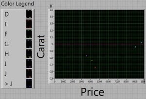
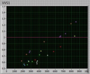
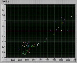
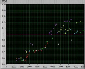
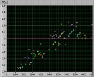
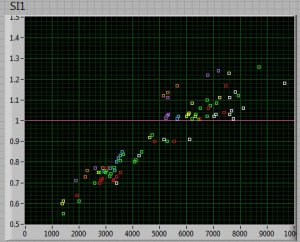
1) Show general trends of price with regards to carat, color and clarity (cut is a no brainer). This is to give me an idea of what combinations I can afford and where to make trade offs for maximum effect.
2) Highlight outliers to this trend (IE diamonds that might be priced lower than their neighbors).
I had it doing a bunch of complex statistics on this huge amount of data, but it ended up not being all that useful so I haven''t included it here. Why wouldn''t more detailed computations on each stone be useful? For the same reason you wouldn''t simply buy the best dot on the below graph you could afford. There are too many unquantifiable (and infuriating) characteristics of diamonds that have to be evaluated on a case by case basis. This is just a half decent tool to direct your attention to the right stones.
I hope someone finds these useful or at least interesting and worth the read

Data Collected from a Pricescope search with parameters:
Carat: 0.55 - 2.00
Color: D - J
Clarity: IF - SI2
Cut: AGS0/H&A
In House Only




300x240.png)