shape
carat
color
clarity

Post your invitation design:)!

Status
Not open for further replies. Please create a new topic or request for this thread to be opened.

Carats

Shiny_Rock
Joined
Feb 2, 2007
Messages
169
I thought I''d start a thread where we all posted our invitation designs:)!

I''m in the process of buying mine so I can''t post yet but for those that have already done it, feel free. It is such a confusing process and I''m sure you are so relieved to have gotten it out of the way. There are too many options!!

Post away:).......
 

purselover

Ideal_Rock
Joined
Sep 20, 2008
Messages
2,066
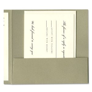
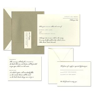
Here are the ones we used from Crane, I loved them so much! They were a simple gold invite with a pocket for the reply card and reception card. The best part was the outer envelope which had the Wedding Of Purselover and Mr Purselover December 26, 2009 on the back, it was a very nice touch for when people went to open them.

pl12.26weddinginvites2.jpg
 

purselover

Ideal_Rock
Joined
Sep 20, 2008
Messages
2,066
that was the closeup of the pocket - here''s the whole invite

pl12.26weddinginvites from crane.jpg
 

PumpkinPie

Ideal_Rock
Joined
Jan 17, 2010
Messages
2,841
Claritek - I had never seen your invites before - they''re lovely - you did a fabulous job :)
 

Prana

Brilliant_Rock
Joined
Mar 30, 2009
Messages
1,321
Here''s the best picture I can find... I got my invites from a local invitation store. They are quite pretty in real life, the have a pearly celtic knot border all around the invitation. They are very simple and elegant, I love them!

my invitations
 

Prana

Brilliant_Rock
Joined
Mar 30, 2009
Messages
1,321
Oops nevermind, for some reason the link won''t show the picture. But they are Carlson invites, style # VR3840-87
 

princessplease

Ideal_Rock
Joined
Feb 20, 2009
Messages
5,496
Made by Taylor's Paperie on esty...very non traditional, lol!
I mounted them on aqua pocketfolds from paperandmore.com, and inserted accomidation information, RSVP postcard and a hand drawn map (which I did in Word) to the ceremony/reception site.

vervevrev.JPG
 

ilovesparkles

Ideal_Rock
Joined
Feb 13, 2006
Messages
2,389
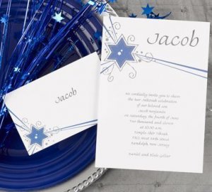
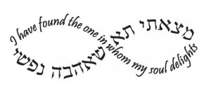
It is hard to imagine, but this is the invite design we got, but we added personal artwork to it. The infinity design will replace the name "Jacob" at the top. Our names, Hebrew and English, will be used in the text of the invite. I will post when we finally have them in our hands!

wedding invite picture 61310.jpg
 

ilovesparkles

Ideal_Rock
Joined
Feb 13, 2006
Messages
2,389
Infinity design with English and Hebrew.

infinity design 61310.jpg
 

Amzizzle

Shiny_Rock
Joined
Jul 17, 2008
Messages
476
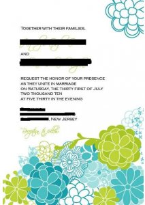
Here our mine,we had them custom made by Stelie Designs on etsy. Oh and those are not our real names or date.

Our Invitations
1.gif
 

ts44

Brilliant_Rock
Joined
May 31, 2009
Messages
612
Ilovesparkles - I love that infinity design! That''s so creative of you.

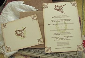
Here''s mine, from Stephanie of SunshineandRavioli on Etsy. She''s a doll! I blurred out most of the names but left my first name on there so you can see the font we used for mine and FI''s names.

Invitations blurred205406.jpg
 

PumpkinPie

Ideal_Rock
Joined
Jan 17, 2010
Messages
2,841
those are so adorable ts44! I love the vintage feel of the birds :)
 

ilovesparkles

Ideal_Rock
Joined
Feb 13, 2006
Messages
2,389
Date: 4/9/2010 1:18:26 PM
Author: ts44
Ilovesparkles - I love that infinity design! That''s so creative of you.


Here''s mine, from Stephanie of SunshineandRavioli on Etsy. She''s a doll! I blurred out most of the names but left my first name on there so you can see the font we used for mine and FI''s names.

Thank you ts44! I love the unique vintage feel of your invites! I can''t find the right word, but I just love them!
 

blueroses

Ideal_Rock
Joined
Nov 15, 2004
Messages
3,282
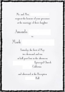
Ok, here are ours. I don't think we saved the proofs for the reply cards or insert cards--which were just for our website and not that exciting anyway--but they just looked similar to the invitation anyway.

We really love them. Nice combination of classic and contemporary, which is kind of us. The font is just a basic serif, traditional...and the border is a little punk rock. Elegant with an edge. (Literally!)

Very us.
10.gif


People have LOVED them. So many comments about the little black deckle edge/border. Like, across the board, everyone loves them. EXCEPT my mother. She thinks the black is "funereal."

20.gif


(ETA: the kind of ripped/burned looking edge is the way the edge of the paper looks...not the boxy border around it, that's just the way I had to crop the proof)

proofps1.JPG
 
Status
Not open for further replies. Please create a new topic or request for this thread to be opened.
Be a part of the community Get 3 HCA Results
Top