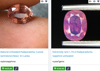
shape
carat
color
clarity

Padparadscha

GemJen

Rough_Rock
Joined
Jan 15, 2024
Messages
5
Hi all,
I was hoping for a little help navigating the padparadscha world. I recently discovered these sapphires and am so excited about them. I'm also in the market for an engagement ring, so my partner and I have been looking for an oval or pear stone: ideally more on the orangey - peachy side (with just a hint of pink) and a more pale/ less intense color. He just found one (link below) that looks pretty close to what I'm aiming for, but we're both pretty novice when it comes to judging cut and overall quality. I was hoping y'all might be able to educate me a little bit on what you see in these pictures. Any thoughts on the quality of the cut, appropriateness of the price, or whether we should even consider it with the report posted there and not a GIA or AGL report? Has anyone ever heard of or worked with this seller? I'd appreciate any and all input!

https://www.gemrockauctions.com/pro...adparadscha-sapphire-204-cts-oval-cut-2206325
 

MeatloafAirstrike

Rough_Rock
Joined
Feb 9, 2023
Messages
5
I can't comment on the color or the lab but that sapphire looks like it's pretty windowed, you can see the foliage behind it through the center of the gem in the video.
 

LilAlex

Ideal_Rock
Premium
Joined
Mar 3, 2018
Messages
3,658
You should have your pick; pale and peachy pushes you into the territory that some would say is less desirable. In fact you may do better just looking for a pale peach sapphire without the padparadscha designation.

Helps to know in advance if this works with your skin tone -- I know you know that. That hue/tone on me would just look like rock crystal :cool2:
 

Avondale

Brilliant_Rock
Joined
Oct 31, 2021
Messages
1,056
If this is the colour that you like, I agree with @LilAlex - drop the pad designation, or at least be very very mindful when assessing stones claimed to be pads by the seller.

A pad should be a blend between pink and orange only - no other hues, no other undertones. No brown, no purple, no yellow. As any other trade name, though, it attracts buyers and is thus used very frivolously.

The stone you're eyeing right now looks to me to have a brownish undertone. And while that may be due to the way my screen displays the colour, these two examples at the bottom of the page are... well...

1705393079914.png

You see it, don't you?

So, be very skeptic of people selling sapphires as pads. Sometimes it's an actual pad. And sometimes it's a seller trying to boost the profile of an otherwise ordinary sapphire in their inventory.

Regarding cut, it's most important to learn what windowing and extinction are - head over to the newbies thread here. It doesn't take much to start recognising them. This stone is definitely windowed and while you may not be noticing it much now because you don't yet know what you're looking at, there will come a point when that will bother you.
 

GemJen

Rough_Rock
Joined
Jan 15, 2024
Messages
5
I can't comment on the color or the lab but that sapphire looks like it's pretty windowed, you can see the foliage behind it through the center of the gem in the video.


Ah I think I see what you're talking about. Just to clarify: is it the same poor cut that causes the ability to see through a gem which also causes the dullness in the center below of this one ⬇ ?

https://www.thenaturalsapphirecompany.com/2.05ct-ceylon-sri-lanka-oval-padparadscha-sapphire-s6606-/
 
Last edited:

GemJen

Rough_Rock
Joined
Jan 15, 2024
Messages
5
You should have your pick; pale and peachy pushes you into the territory that some would say is less desirable. In fact you may do better just looking for a pale peach sapphire without the padparadscha designation.

Helps to know in advance if this works with your skin tone -- I know you know that. That hue/tone on me would just look like rock crystal :cool2:

Agreed! I'm a little worried I won't be as excited about it after holding it against my skin. I'm on the paler side, but warm-toned. I'm going to have to find some in-person to look at. Does anyone know of a pad seller who generally has well-cut stones and will be at the Tucson gem show this year?
 

GemJen

Rough_Rock
Joined
Jan 15, 2024
Messages
5
If this is the colour that you like, I agree with @LilAlex - drop the pad designation, or at least be very very mindful when assessing stones claimed to be pads by the seller.

A pad should be a blend between pink and orange only - no other hues, no other undertones. No brown, no purple, no yellow. As any other trade name, though, it attracts buyers and is thus used very frivolously.

The stone you're eyeing right now looks to me to have a brownish undertone. And while that may be due to the way my screen displays the colour, these two examples at the bottom of the page are... well...

1705393079914.png

You see it, don't you?

So, be very skeptic of people selling sapphires as pads. Sometimes it's an actual pad. And sometimes it's a seller trying to boost the profile of an otherwise ordinary sapphire in their inventory.

Regarding cut, it's most important to learn what windowing and extinction are - head over to the newbies thread here. It doesn't take much to start recognising them. This stone is definitely windowed and while you may not be noticing it much now because you don't yet know what you're looking at, there will come a point when that will bother you.
 

GemJen

Rough_Rock
Joined
Jan 15, 2024
Messages
5
Thanks for the newbie link! I think it's going to take practice for me to learn to recognize flaws, but I definitely see how the two examples you posted don't qualify as pads in terms of color. I've posted another example of a stone I like below. It's a bit pricier than the two I've posted above, but I thought it was looking better in terms of windowing and color. However, in the second video of the gem against a hand, I realized I can see the crease between her fingers. So would you consider that too windowed as well?

https://www.thenaturalsapphirecompa...sri-lanka-oval-padparadscha-sapphire-pa3814-/
 

Rfisher

Ideal_Rock
Premium
Joined
Oct 19, 2013
Messages
5,510
Congratulations on your engagement!

Not sure about Tucson
Are you meaning to contract with a trademember to scout/find one for you, or are you meaning a vendor in the public access areas? That might help if someone has a suggestion for you?

I have no experience with that seller nor that lab report so can’t speak to that
But one thing that did stick out to me - was you saying ‘ideally more on the orangey - peachy side (with just a hint of pink) ’
And the lab report states ‘orangish pink’
That should mean pink is the predominant color.

one thing with photos - I’ve seen with my own eye a camera phone both taking away pink in a photo of a pad - and adding pink in a photo of a pad.
Same with a peach sapphire.
So falling in love with a photo is dangerous territory!

Have you looked at online inventory of Pearlmans Jewelers? Search for both pad sapphires and then search thru peach sapphires. Look at their color descriptions compared to the lab report color descriptions.

in my own ‘budget pad search’
I chose to go with a better cut ‘peach’ sapphire over a wonky cut lab report Padparadscha.
(Then you’ll find even lab report pads are sometimes even still argued by some if they really do qualify as a Padparadscha)
Buy what color makes your heart sing - but yeah you are going to find wild listing price swings on little stat changes as noted on lab reports. There’s a definite reason why some are priced as low as they are or as high as they are.

Be careful with off center pavilions that seem to be common in pads. You’ll maybe find (as I did) a window ok as a concession to color and size- but 90% tilt window upon rotation to be incredibly off putting and most likely won’t be featured in the listing.

Happy pad hunting! Don’t rush, and take advantage of a solid company return policy to see some in person if you can’t find local.
 
Last edited:

MeatloafAirstrike

Rough_Rock
Joined
Feb 9, 2023
Messages
5
Thanks for the newbie link! I think it's going to take practice for me to learn to recognize flaws, but I definitely see how the two examples you posted don't qualify as pads in terms of color. I've posted another example of a stone I like below. It's a bit pricier than the two I've posted above, but I thought it was looking better in terms of windowing and color. However, in the second video of the gem against a hand, I realized I can see the crease between her fingers. So would you consider that too windowed as well?

https://www.thenaturalsapphirecompa...sri-lanka-oval-padparadscha-sapphire-pa3814-/

Yeah the 2ct one you posted is also pretty badly windowed. The one linked above isn't as bad head on but there's an obvious tilt window on the left side of the stone in the video with red nail polish.

That makes sense because the cut is really wonky with an absolutely enormous (and asymmetrical) girdle--look at the facet diagram and you can see how the stone was obviously cut for weight retention at the expense of a centered, well-proportioned, or symmetrical pavilion.

Here's one from Gemfix that at least at first glance looks like a much better cut, though you'd have to like the pear shape to be interested in it: https://gemfix.com/gems/sapphire-pink-13-551
 
Last edited:

Avondale

Brilliant_Rock
Joined
Oct 31, 2021
Messages
1,056
You're already learning quickly. Yes, seeing through the gem means it's windowed.

When a gemstone is cut, it's designed in a way that allows light entering through the crown (from above) to bounce inside the stone, reflecting off the different facets. When a stone is cut well, the light will exit the same way it entered - through the crown, through the top, and will be reflected back to your eyes. The more it bounces around, the more saturated the colour you see.

If the light instead passes right through the stone (a window), it doesn't get reflected, instead it reaches whatever is behind the stone. It's literally like looking through a piece of glass, albeit a slightly tinted one. This is why you can see the crease between the fingers, and everything else that's behind the stone as well.

Typically a small window can be hidden depending on the gem. A more saturated gem's window will become quite unnoticeable when set and sitting against the skin, but you're looking for a more pastel colour. In that case another trick that can be used is to have white metal underneath the stone as this creates a reflective surface that returns the light back to your eyes.

The last stone you posted is definitely the better looking of the three, but here are my personal gripes with it:
- frankly a bit overpriced for a heated stone;
- the shadowing pattern is unattractive to my eyes, those dark grey areas you see;
- an unpleasant tilt window;
- the way the bottom is asymmetrically shaped for weight retention is going to make it a bit of a challenge for the jeweller to set this stone in a ring - you'll need someone experienced who can take that into account and shape the basket to accommodate the shape of the stone.

The colour is lovely, though.
 

LD

Super_Ideal_Rock
Premium
Joined
Jun 29, 2008
Messages
10,261
Ok so I want you to look at this stone with fresh eyes. A padparadscha should look like a sunset with distinct orange and pinks normally pastel shades. So do you see a sunset with this stone? If it were to be designated as a padparadscha by a reputable lab, it’s really not what you would expect and the price reflects that - because a great pad would cost so much more than this.

So, assuming it’s a poor pad what are we left with? Well the cut isn’t good. You can see straight through it. This is undesirable in a gemstone because all you’ll see is your skin underneath (or the ring itself). Could you have it recut? Yes but it’ll then most definitely go under 2ct and whilst the look will improve, there’s no guarantee what will happen to the colour of the stone.

At 3,000 this is very expensive and honestly these stones you can pick up for far less.

Why not look for a different stone (or colour) that are not so problematic to find?
 
Be a part of the community Get 3 HCA Results
Top