shape
carat
color
clarity

New ring project -- thoughts on design?

Status
Not open for further replies. Please create a new topic or request for this thread to be opened.

crowmama

Shiny_Rock
Joined
Dec 20, 2001
Messages
161
I''m working on concepts for a new ring project, using two diamonds I already own (I anticipate pulling the trigger on this ring project in two years, so there''s lots of time to dream...). Pears are a challenging shape sometimes, and so far I haven''t seen a 3stone with a center pear and round that I liked.

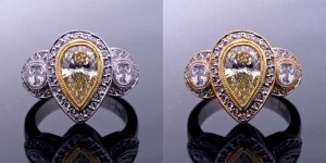
The center stone is a fancy yellow pear (.63ct), and I would purchase a side round to match the round I already have (.30ct). I love the Beaudry styles and the antique looks. This is a quick photoshop job, and I *think* this is my favorite take on a 3stone using this yellow pear. The proportions are close to being correct for the stones. Does it look too blingy, cocktail ringy, busy? I love hearing all comments... thank you!
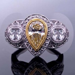
cd_11L-rounds-web.jpg
 
You photoshoped that? You are the master!! Unbelievable. That is what we should be talking about here...you skills are incredible!!!

I love the recycling of the pear...YELLOW goddess pear. Yum. I love the shape of it. It speaks to me!!! I envy you that you have it and I don''t.

Onto your design. I do love the halo around the pear. You were most thoughtful in the design with several layers of detail. That scale to me is right on the money. The white metal and the compliment of yellow gold really makes that pop!

But...sweetie...that is as far as my love goes.
8.gif
Sorry. The round sides are just a tad too overbearing. Can''t put my finger on it...but will you consider pulling back on thickness of their halos? I wish you could whack the one round you have and make it into two half moons. That way your halos would only be semi circle as apposed to full circle. I think that is my issue with them. If there was just the trim work around them...it may work. Do you know of any diamond whackers?

I really hope this didn''t crush you. I think you have missed your calling. The design and photoshop is really impressive.
36.gif


DKS
 
I keep thinking "ET...phone...home." It''s a lovely idea...but I think it wants to be simpler. JMHO.
 
Your photoshopping skills are mad crazy! But yeah, to me it's way over the top, style wise. But then again, I dont care for Beaudry at all, way too busy for me. I do think that you'd need a bit larger sides, and micro pave around it all. To me, all I see are prongs all over the place. Mind you, it's magnified to a huge degree but still, I think a design like that looks best with claw prongs, and if you must do halos, then perhaps a very delicate micro pave will look less obtrusive..? Just my two cents...

ETA: Personally, I think a ring similar to that one should either have micro pave OR fancy grill work/millegrain/engraving on the shank, but not both. I think that's where Beaudry always goes overboard. Too much of everything gives me a toothache!
 
Sorry, but it is a bit busy. Also, have you created images for the side view? The design looks like it may set the diamond a bit high.
 
Date: 11/12/2007 1:58:47 PM
Author: SanDiegoLady
ditto ditto. I think the "busy-ness" is completely a matter of taste. I chose a relatively simple setting for myself, but that doesn''t mean I don''t DROOOOOOOL over poshpepper''s ring every time I see it!
9.gif
 
Thanks for the comments. Door and Surf, if I could work with photoshop all day long and drink black coffee, I think I''d be in heaven!! I don''t do photo restoration at work anymore, though

When I did the original, I looked at it again and the rounds are a little big. Plus they look bigger because they''re not turned for perspective. I''d want these to curve with the ring, not be a flat plate or plane like you see with antique "stop light" rings. So I poured more coffee and did two things: changed the diamonds (smaller, and turned), plus played around with rose gold. So, two more takes on the ET-Phone_Home ring. I hope to do some side view concepts soon for the gallery work, as soon as I figure out the top view (I''m pretty certain that I want it plain, not mico or engraved)

cd_11L-rounds2AND2Rose.jpg
 
Ok...you are coming back for more...so I will still play...as long as you''ve got game....

Please stop here...if you would prefer to have no negative comments....I mean your day was just humming along swell and then you got broad sided by a door knob. I have had those kind of days myself. Please stop reading...HERE. Please...you aren''t listening....stop....

Ok, so you are back for more....I understand now that the rounds will angle out and away from the top. But knowing that still didn''t change my main thought that they (their halos) are just too much. You have a great pear...you''ve got the bling factor in the halo and milgrain. I just want you to cut back on the rounds detail. I didn''t understand the ET phone home...but I do see it now. It has an owl face look now. The pear is the beak. Oh dear.
6.gif
I am sorry.

Would you consider smaller pave on the rounds...or no pave and just milgrain? Ok...and while you are down...I might as well take another swing. Hate the rose gold. But on that thought...what about changing your pave stones to yellow...and the metal they are seated in yellow too. That would make that .63 look like a carat or more! Then take some yellow milligrain down with the rounds. Oh never mind...I think that was what I liked about your design...that you showcased all metal colors and white stones...Hum....I am trying to come up with something to help you see your round halos in another light.

Hey one thing I see now that I didn''t before...did you add a little round at the base of the round? That looks pretty cool. Haven''t seen that done.

Also, someone else asked what your profile will be. You could incorporate more detail on the side and make the top less details.

I guess you nixed my whack idea?

DKS
 
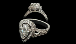
I like beaudry designs but for some reason i just don''t love the rounds next to the pears, with our without the halos. why not do something like this beaudry for your pear and then figure out something else to do with your round...

beaudrypearidea1.png
 
Date: 11/12/2007 12:25:48 PM
Author: surfgirl
Your photoshopping skills are mad crazy! But yeah, to me it''s way over the top, style wise. But then again, I dont care for Beaudry at all, way too busy for me. I do think that you''d need a bit larger sides, and micro pave around it all. To me, all I see are prongs all over the place. Mind you, it''s magnified to a huge degree but still, I think a design like that looks best with claw prongs, and if you must do halos, then perhaps a very delicate micro pave will look less obtrusive..? Just my two cents...

ETA: Personally, I think a ring similar to that one should either have micro pave OR fancy grill work/millegrain/engraving on the shank, but not both. I think that''s where Beaudry always goes overboard. Too much of everything gives me a toothache!
I agree - that would be my "complaint" about the ring. I think if you downsized the side halos and lost the millegrain around them and used micropave instead of the slightly larger diamonds for pave - then it would work.

I like the millegrain and halo around the pear and the two tone. The center looks great. I think just scale down a bit on the sides.

BTW - I love Beaudry. I think their work is stunning and usually not too busy for me. But it''s all a matter of getting the right propotions to make it work.
 
For some reason, it reminds me of a dragonfly.
31.gif
 
Date: 11/12/2007 7:30:41 PM
Author: mrssalvo
I like beaudry designs but for some reason i just don''t love the rounds next to the pears, with our without the halos. why not do something like this beaudry for your pear and then figure out something else to do with your round...
You copuld easily do a ring just like that and insert the rounds into the space between the split shank. I think that would look beautiful.
 
Date: 11/12/2007 8:16:29 PM
Author: LadyAmythyst69
Date: 11/12/2007 7:30:41 PM

Author: mrssalvo

I like beaudry designs but for some reason i just don''t love the rounds next to the pears, with our without the halos. why not do something like this beaudry for your pear and then figure out something else to do with your round...

You copuld easily do a ring just like that and insert the rounds into the space between the split shank. I think that would look beautiful.


true. beaudry has done that on some of his designs and it might work very well too.
 
Date: 11/12/2007 7:12:11 PM
Author: door knob solitaire
Ok...you are coming back for more...so I will still play...as long as you''ve got game....


Ok, so you are back for more....I understand now that the rounds will angle out and away from the top. But knowing that still didn''t change my main thought that they (their halos) are just too much. You have a great pear...you''ve got the bling factor in the halo and milgrain. I just want you to cut back on the rounds detail. I didn''t understand the ET phone home...but I do see it now. It has an owl face look now. The pear is the beak. Oh dear.
6.gif
I am sorry.


DKS
This is in no way meant to be insulting to anyone, but this statement cracked me up!

I actually like it better in the all YG version, but I agree that the round halos look a bit large.
 
Status
Not open for further replies. Please create a new topic or request for this thread to be opened.
GET 3 FREE HCA RESULTS JOIN THE FORUM. ASK FOR HELP
Top