shape
carat
color
clarity

Need help. Got my cushion three stone ring but it's set too low, and I have one other concern.

Ally T

Ideal_Rock
Premium
Joined
Oct 24, 2012
Messages
8,531
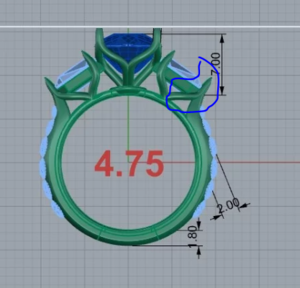
Ok, so i haven't had time to read the other comments, so forgive me if I duplicate. I think the ring is gorgeous, your cushion is stunning & overall, the low setting wouldn't bother me at all. But I really don't like that metal showing under the shields. It looks clumsy & definitely detracts from the unique diamond shape. I hope you can resolve these things with David & be 100% happy, as it's beautiful!
 

mrs-b

Super_Ideal_Rock
Premium
Joined
Aug 18, 2013
Messages
11,646
I do a lot of projects with DKJ (am doing 3 at the moment, for example) and I love their work, but I am NOT a fan of this setting. There's a lack of synergy that doesn't make the most of either the diamonds or the design.

Firstly, the metal showing around the traps looks really lumpy to me, but I have to say, even removing the metal would leave the diamonds too large in my opinion. I think you need to go to baskets, but also cut the size of the traps by at least 1/3 - tho I'd drop them by 1/2. Since diamond size is a 3D measurement rather than 2D, cutting by 50% doesn't make *as* much of a difference as you might think. Either way, as they are, they're swallowing your center stone, which in and of itself will make it look way smaller than it needs to.

Secondly, I'd tilt the side stones more acutely - which would also entail raising the center. Victor Canera and Leon Mege are masters at the side angle, and I'd definitely do that with this design. And yes - agree - raise the center stone, tho I think 6.75 would be too high. I think 6.25mm would be just right.

But lastly, while I love the bridge design of the side melee in profile - face on it looks very heavy and lumpy and not sufficiently refined. There's also no flow from the traps to the melee. Consequently, I'd be switching to pave, as per one of your inspiration shots, and if you *really* want to make your center stone the star of the show, I'd be doing away with the traps altogether. You're constrained by your melee - which is comparatively large - and would probably be unable to lower the size of your traps past a certain point without the melee looking as tho it was overpowering it.

Have you thought about step cuts as per @KKJohnson's glorious marquise ring for the sides? They're a lot more snub and wouldn't look as overpowering, and don't end in a point, so your larger-than-average melee would join them more proportionately. This would give you a much prettier design.

I think this project is a good example of the diamonds not suiting the design. To get the look you want, something will have to give - and I suspect more than one thing.

But don't despair! It's possible to make something gorgeous here, and DKJ will work with you until it's right. I love your cushion, but you might need to give up on the 'all that and the kitchen sink' approach, which is stopping any of the various aspects for anchoring the look and, instead, giving you a distracting combo.

I wish you well on this.
 

allaboutcushions

Rough_Rock
Joined
Apr 10, 2007
Messages
59
I have a new CAD and some of my notes on the 2nd pic. Thoughts? thumbnail_55970-QUAD (1).jpg Ring recast redesign.11.26.19.jpg
 

allaboutcushions

Rough_Rock
Joined
Apr 10, 2007
Messages
59
I suspect some of you will comment or suggest removing the basket, but I'm pretty sure they are necessary in order to anchor something to the center head. The center tulip is constructed like this. s-l500.tulip4.jpg
 

rockysalamander

Ideal_Rock
Premium
Joined
May 20, 2016
Messages
5,105
I like this design. But, it is very different from your previous exuberant design. Are you happy with it?

This prong is not going to be symmetrical with the left one. It can't be due to the narrowing width of the side stone so it has to reach back, so it will always be unsymmetrical. That would drive me bananas. If it was me, I would eliminate both legs on the side stones and just keep the pretty tulip in the middle. I think the Kwait ring below shows my idea. I think the Kwait one really shows off the floral element more than the triple version.

1574810975824.png

1574811436496.png


You really wanted your center to stand out. Here is the side shank view of the above ring with the same heights as yours. Is this enough elevation or should the center be raised? I think you want it higher, right?

1574811964863.png
 

Attachments

  • 1574810976098.png
    1574810976098.png
    183.6 KB · Views: 36

allaboutcushions

Rough_Rock
Joined
Apr 10, 2007
Messages
59
I like this design. But, it is very different from your previous exuberant design. Are you happy with it?

This prong is not going to be symmetrical with the left one. It can't be due to the narrowing width of the side stone so it has to reach back, so it will always be unsymmetrical. That would drive me bananas. If it was me, I would eliminate both legs on the side stones and just keep the pretty tulip in the middle. I think the Kwait ring below shows my idea. I think the Kwait one really shows off the floral element more than the triple version.

1574810975824.png

1574811436496.png


You really wanted your center to stand out. Here is the side shank view of the above ring with the same heights as yours. Is this enough elevation or should the center be raised? I think you want it higher, right?

1574811964863.png

Hi Rockysalamander,
I don't understand what you're talking about the non-symmetry. I was more concerned about how the construction of the center tulip appeared too detached from the sides. Honestly, I'd love to be able to keep the three tulip heads but remove the baskets like this example. The first tulip design David sent me had the construction more in the front of the center stone. Like this.

Ring recast redesign.11.26.19.jpg
 

allaboutcushions

Rough_Rock
Joined
Apr 10, 2007
Messages
59
If I simplified it as much as the Kwiat design, yes, I would want the center raised higher and the shape of the tulip to be different like this.
Ring recast redesign.11.26.19.basketsandonetulip.jpg
 

allaboutcushions

Rough_Rock
Joined
Apr 10, 2007
Messages
59
Ok, after staring at the pic, I finally understand what you are saying about the curve of that prong toward the pointy end of the shield being longer than the length of the two curves used to hold the shields next to the cushion. Couldn't I have that adjusted though so that base of those side tulips were centered?
 

yssie

Super_Ideal_Rock
Premium
Joined
Aug 14, 2009
Messages
27,259
You are still going to see metal under those side traps - this incarnation will swallow the sidestone taper. You can see it in the CADs - the shape that I've outlined with red dots is what you will see face-up. Those concave "wingtips" that I've got arrows pointing to - those won't exist in the finished piece: That's extra metal that's cast for the prongs - the prongs will bend indward to hold the stone.

1574831557867.png


To show off the taper you need a shank design that pinches in toward the endstones.
That means no separate constant-width band element underneath.
 

yssie

Super_Ideal_Rock
Premium
Joined
Aug 14, 2009
Messages
27,259
Ok, after staring at the pic, I finally understand what you are saying about the curve of that prong toward the pointy end of the shield being longer than the length of the two curves used to hold the shields next to the cushion. Couldn't I have that adjusted though so that base of those side tulips were centered?

You don't want to do that.

Photoshopped it for you - it looks unbalanced.

The way it is now, with the longer prongs at the ends... The side view of where the "base" is located (uncentered) matches the the topology of the traps - the stones aren't symmetrically weighted E/W, so making their baskets symmetric E/W just looks mismatched.

1574832705430.png
 

yssie

Super_Ideal_Rock
Premium
Joined
Aug 14, 2009
Messages
27,259
Now this is beautiful. Proportional. Showcases the centerstone, no distractions. All elements work together and flow into each other without interruption. Aesthetically perfect in its simplicity.

1574832983893.png
 

distracts

Ideal_Rock
Premium
Joined
Oct 11, 2011
Messages
6,139
I do agree that this is very, very different than your first ring. Is this by chance your first fully custom ring? I suspect perhaps you aren't ready for the custom rodeo because your ideas seem all over the place and you don't seem to understand what the ramifications of some of them are. Rather than go custom where you're in charge, which is what you get with DK, I might hire a designer to make the ring. Elle of The Gemstone Project works with DK and could probably design something for you using your ideas and has a lot of rings that incorporate elements similar to what you like. I would shoot her an email and see if she could take this on. I worked with her on one of my rings and she was great.
 

allaboutcushions

Rough_Rock
Joined
Apr 10, 2007
Messages
59
Now this is beautiful. Proportional. Showcases the centerstone, no distractions. All elements work together and flow into each other without interruption. Aesthetically perfect in its simplicity.

1574832983893.png

Thanks, Yssie. Some of the CADs/designs you are referencing are the old ones where the elements have changed. Some of the things I'm not changing--the shields. I own those, they weren't provided by David and I like them. The rounds, I asked David to add a few smaller melee at the top so it can taper down to the 5 pt rounds from my original e-ring, which my DH asked me to incorporate and I will keep.

If I went with this design do you think I need to have that straight edge basket crossbar in the center tulip? Would it look weird to have them on the two sides but not the center? Also, I've said it several times and I'll say it again. With the current ring set at 5.5 mm high and my diamond being 4.83 deep, it's too low. I hate it. It's like my diamond is literally sitting on my finger and just flat. I know the vast majority on this forum loves low set, but I've found I simply am not a fan. I'm fine with a total height of between 6.75 and 7 mm high. I would like a small airline under my culet and I think that's possible at that height with a tulip shaped head. I never measured my previous setting but I know it was well above 7 mm (probably 8.5).
 

allaboutcushions

Rough_Rock
Joined
Apr 10, 2007
Messages
59
I do agree that this is very, very different than your first ring. Is this by chance your first fully custom ring? I suspect perhaps you aren't ready for the custom rodeo because your ideas seem all over the place and you don't seem to understand what the ramifications of some of them are. Rather than go custom where you're in charge, which is what you get with DK, I might hire a designer to make the ring. Elle of The Gemstone Project works with DK and could probably design something for you using your ideas and has a lot of rings that incorporate elements similar to what you like. I would shoot her an email and see if she could take this on. I worked with her on one of my rings and she was great.

Hi Distracts, yes, this is my first rodeo. I am realizing I am all over the place as every time I think I've addressed one issue, I run into another inadvertently. I am also discovering why so many rings look alike since certain things simply can't be done due to the laws of physics and also aesthetics. Ultimately, I don't need everything and the kitchen sink.

The one thing I want to say to everyone--not you specifically is that pics can be deceiving. In person, the current ring is quite lovely and delicate looking. If my center stone was set higher and that metal wasn't showing/distorting my shields from the top view, I could have lived happily with my ring. The side leaves not working out really tripped things up and I'm finding that shields/bullets can be difficult to set for a person that doesn't love straight edge baskets or the pointy edge in a V prong. As for the scalloped arches, they also look quite pretty and detailed, but again I acknowledge the fact that they could use some tapering in order to transition from the point of the shield. Also, because they are set high in the shank, it makes the ring look bulkier/chubbier and probably add to making my cushion look smaller. Lastly, again because of the low height of the center, the shields are set right under the girdle of the cushion and it all looks like almost one plane detracting from my center. I like how the Kwiat design had the sidestones set halfway lower than the center.

My cushion also looks large in the hand photos but IRL it looks much smaller than it did in my old high setting.
 

distracts

Ideal_Rock
Premium
Joined
Oct 11, 2011
Messages
6,139
Hi Distracts, yes, this is my first rodeo. I am realizing I am all over the place as every time I think I've addressed one issue, I run into another inadvertently. I am also discovering why so many rings look alike since certain things simply can't be done due to the laws of physics and also aesthetics. Ultimately, I don't need everything and the kitchen sink.

The one thing I want to say to everyone--not you specifically is that pics can be deceiving. In person, the current ring is quite lovely and delicate looking. If my center stone was set higher and that metal wasn't showing/distorting my shields from the top view, I could have lived happily with my ring. The side leaves not working out really tripped things up and I'm finding that shields/bullets can be difficult to set for a person that doesn't love straight edge baskets or the pointy edge in a V prong. As for the scalloped arches, they also look quite pretty and detailed, but again I acknowledge the fact that they could use some tapering in order to transition from the point of the shield. Also, because they are set high in the shank, it makes the ring look bulkier/chubbier and probably add to making my cushion look smaller. Lastly, again because of the low height of the center, the shields are set right under the girdle of the cushion and it all looks like almost one plane detracting from my center. I like how the Kwiat design had the sidestones set halfway lower than the center.

My cushion also looks large in the hand photos but IRL it looks much smaller than it did in my old high setting.

Personally I like the scalloped arches under the side rounds - I see how they don't work with some of your design traditionally, I DO see that, but I like them anyway because it's such an unusual design element. I was wondering if it would make it easier if you did the scalloped arches with the rounds as a wedding band? And then the three-stone without any stones down the shank. I don't know if that would make it simpler or is even a thing you would be interested in doing.

If I were you, I'd think of every iteration you might possibly be interested in and draw them all out. Shitty stick-figure drawings are fine. I'm not exactly a jewelry artist myself. But it really helps me to clarify my ideas and to figure out what is possible. If you try to do it actual size, you will quickly figure out what can and cannot fit.

I'm also a fan of low-set but if you want it high, then go for it. We all have different preferences. There are plenty of people on the forum who like their rings set higher, they just haven't commented on this thread for whatever reason.
 

rockysalamander

Ideal_Rock
Premium
Joined
May 20, 2016
Messages
5,105
If I simplified it as much as the Kwiat design, yes, I would want the center raised higher and the shape of the tulip to be different like this.
Ring recast redesign.11.26.19.basketsandonetulip.jpg

I think this design works well. You may or may not be able to remove the cross-bar on the center. They are structural at certain stone sizes. But, with double prongs, it may allow for enough stability.

Yes. Physics is a harsh mistress.

Rather than viewing the three parts as separate, what if you view the sides as petals for the center. These lean to lotus but still floral. The sides petals replace the straight bars in the side stones. But, they need to be pushed inward and under the sides or they peek out.

1574853839286.png
1574851706079.png

1574851904108.png

Or something like this with more of a floral/tulip center as you have designed. But the swooped side stones are very cool.
1574853540672.png
 

Attachments

  • 1574851552297.png
    1574851552297.png
    1.1 MB · Views: 34
  • 1574851850561.png
    1574851850561.png
    428.3 KB · Views: 36

mrs-b

Super_Ideal_Rock
Premium
Joined
Aug 18, 2013
Messages
11,646
Or something like this with more of a floral/tulip center as you have designed. But the swooped side stones are very cool.
1574853540672.png

This is what I meant re a higher angle on the side stones. It cuts their visual size from above and will make them look more proportional to your center. I understand you own them and want to use them, but they're always going to turn your ring into a three stone, rather than a 'center stone with side detail', and that will *always* descrease the look of your cushion. A harder angle, however, will cut the visual length of them from above, and that would do you a great service in this design. It will also make the side stones follow the curve of your finger more obviously, giving it an organic element it currently doesn't have, and that would soften the look. So it's a win-win for you.

I'd also use the swoop basket style as per the photo above. It's very beautiful, it's in keeping with your design, and it removes a lot of visual distraction, which would be a good thing. I understand the temptation, when doing a custom project - ESPECIALLY a first custom project - to try to include all the elements you love. But as anyone experienced in this path will tell you, most of the old hands here have multiple pieces of jewelry because it is simply not possible to incorporate all ideas in one piece. People are showing you simpler designs because they highlight certain beautiful elements, rather than pitting them against each other. I suspect it would serve you to work out, say, the 2 things most important to you to have in this design, then make your design around those.

So - raise the center stone and keep the leaf design on the basket. Angle the sides much more tightly and simplify their setting. Taper the side melee. I think you'll then be good to go.

But far better still - is there any chance you could remove your melee and make a band to go with your cushion ring? You could wear them together so there would be no loss of sentimentality. You could then use your arched setting idea for the band setting and simplify the heck out of your cushion setting. The 2 worn together would look way more pulled together, because you're always going to struggle with the size of that melee.
 

allaboutcushions

Rough_Rock
Joined
Apr 10, 2007
Messages
59
Wow. Thx everyone for taking the time with all of your suggestions. Rockysalamander, that lotus designed ring you posted was one of my original inspiration pics that prompted my leaf design. The irony.

At this point I’m leaning toward that Kwiat design just with a better looking tulip center since I really do like the tulip shape hugging the center. I think the crossbar won’t really be noticeable since it’s so small. Like my higher setting preference, I’m keeping those round sidestones too. Their size just doesn’t bother me. I think adding the smaller melee to taper and changing to the lower set pave instead of the arches will address the bulk issue for me anyway. I already have a wedding band with those same stones.

The one thing I don’t understand with the Kwiat ring is how the have a claw prongs on the pointy end of the shield. Is it attached/part of the basket? Can someone give me a visual example from a different angle that would explain that? 3CE99301-AFB0-4068-8996-1821B9836B1D.png
 

allaboutcushions

Rough_Rock
Joined
Apr 10, 2007
Messages
59
This side pic the site provided doesn’t show/explain the how. 1709FE98-DAE3-45B8-B52F-E5BABF7B24D7.png
 

allaboutcushions

Rough_Rock
Joined
Apr 10, 2007
Messages
59
I like this design. But, it is very different from your previous exuberant design. Are you happy with it?

This prong is not going to be symmetrical with the left one. It can't be due to the narrowing width of the side stone so it has to reach back, so it will always be unsymmetrical. That would drive me bananas. If it was me, I would eliminate both legs on the side stones and just keep the pretty tulip in the middle. I think the Kwait ring below shows my idea. I think the Kwait one really shows off the floral element more than the triple version.

1574810975824.png

1574811436496.png


You really wanted your center to stand out. Here is the side shank view of the above ring with the same heights as yours. Is this enough elevation or should the center be raised? I think you want it higher, right?

1574811964863.png

Is this side view you posted of a pear sidestone? I posted further down the chain the side view of when they use a bullet, which is closer to the shape of my shield.
 

allaboutcushions

Rough_Rock
Joined
Apr 10, 2007
Messages
59
Here are some close ups of the current ring with the three prongs holding the end of the shield. If you can imagine only a single prong at the end and the metal behind the shield not being there, it would look much sleeker and showcase the shield shape. Not to mention without all that metal bulk, to me the proportions between the cushion and shields would look much better. That said, I think the bench did a beautiful job on the claw prongs.

thumbnail_55970-7 (2).jpg thumbnail_55970-6 (2).jpg
 
L

lydial

Guest
Hello. I am chiming in and apologize if my thoughts are not welcome - I do not mean to be impolite. So here goes: I think the primary problem with your design is the side melee. The center 3 stone, even with the metal showing with your side stones, makes more sense and is at least cohesive. The melee on the shank seems like a separate and conflicting design element. The side melee says (to me) "I am a ring that is trying to have as many diamonds as possible". They are too bold maybe. Especially the way they wrap around your tiny finger then just stop, and the prongs in the pictures look choppy from the top because of the angle of your small diameter finger. As far as the leafy patterns under the diamonds - they are pretty but IMO they are not architecturally consistent (to me) with the diamond shapes - they make more sense with RB's. Your fancy shape side stones would make perfect sense on the simpler Kwiat setting you posted - more airy, and it highlights the stones over the metal. which makes the diamonds look bigger to me. With all of the prongs and leaves etc I think the ring takes on an overly busy aesthetic.
 

Cerulean

Ideal_Rock
Joined
Sep 13, 2019
Messages
5,078
I have nothing terribly educated to add as I lack the depth of knowledge that some of these ladies have with jewelry design, although I know a good deal about fine art! I really like the Kwiat design, and it definitely seems that's what your heart desires at this point after seeing your current setting in person. I also personally relate to liking a lot of different styles and needing to edit...it's the hardest part. There's this quote by Picasso that I think of sometimes when I do artwork - “one does a whole painting for one peach and people think... that the particular peach is but a detail.” Pick a peach and make sure it doesn't fade into the background!

Take this all with a grain of salt as it is really personal preference. To me, the Kwiat allows the stones to take center stage, as I think the original flowy, floral design, while stunning, is a bit in conflict with the unusually shaped, angular shield side stones and the cushion center that you seem to like so much. I think the sharp edges and rounded edges between the cushion/shield diamonds creates an unusual aesthetic interplay that is subtle and as you've seen, can be drowned out with too much metal material.

My only inclination would be to keep the tulip basket in the Kwiat design simple to mirror the rest of the ring. The shield side stones are so cool and I see why you are sticking to your guns with them! If you are debating changing the melee (which I am not sure you are) - you could even do without it or with smaller melee. I think the design being simpler might make enough of a difference, however.
 

Cerulean

Ideal_Rock
Joined
Sep 13, 2019
Messages
5,078
Hello. I am chiming in and apologize if my thoughts are not welcome - I do not mean to be impolite. So here goes: I think the primary problem with your design is the side melee. The center 3 stone, even with the metal showing with your side stones, makes more sense and is at least cohesive. The melee on the shank seems like a separate and conflicting design element. The side melee says (to me) "I am a ring that is trying to have as many diamonds as possible". They are too bold maybe. Especially the way they wrap around your tiny finger then just stop, and the prongs in the pictures look choppy from the top because of the angle of your small diameter finger. As far as the leafy patterns under the diamonds - they are pretty but IMO they are not architecturally consistent (to me) with the diamond shapes - they make more sense with RB's. Your fancy shape side stones would make perfect sense on the simpler Kwiat setting you posted - more airy, and it highlights the stones over the metal. which makes the diamonds look bigger to me. With all of the prongs and leaves etc I think the ring takes on an overly busy aesthetic.

Of course this posted in the middle of me writing mine! Sorry for redundancy
 

msop04

Super_Ideal_Rock
Premium
Joined
Dec 3, 2011
Messages
10,051
Another fan of the Kwiat design here... I also feel the larger stones going down the shank are messing with the aesthetic of the design you have now. They are too large and set really strangely, protruding from the shank then abruptly stopping. The flow could be better with smaller stones set differently. IMO, I think it would look more cohesive if you would lose them altogether, but I understand if you like them.
 

yssie

Super_Ideal_Rock
Premium
Joined
Aug 14, 2009
Messages
27,259
I usually do more custom projects per year than most PSers do in a lifetime.
Most have gone wonderfully.
A few have gone poorly.
The biggest difference between the former and the latter is whether or not I'm working with a designer whose aesthetic matches mine.

My strong advice is to take @distracts' suggestion and contact The Gemstone Project:
Her design sense matches yours - take a look at her porfolio. She has the experience and expertise required to translate your ideas into a cohesive and structurally sound work of art. At the very least - speak with Klass and ask how you can get some of his designer's time.

You don't have to do this all by yourself. In fact, you'll be much happier if you don't do this all by yourself! PS can help, but we aren't designers and we aren't benches - that's why even people like me, for whom custom jewellery is the norm, always recommend working with a designer.

If you're working with a designer, instead of specifying that you want your diamond set 7.95mm high you can just tell him or her that you want the culet to be visible in profile - and your designer will figure out how to make that happen in a fluid fashion. If you're working with a designer, instead of specifying that you want a lead-in of two one-pointers and two two-pointers and three three-pointers that starts 2.5mm from the prongtip - you can just say that you want the shoulders to highlight the taper of your traps, and your designer will figure out how to make that happen in a fluid fashion. You can say that you want a floral basket rather than crossbars on the centerstone gallery and your designer will figure out how to make that happen. You can say that you want arches under your sidestones, and your designer will either make it happen or tell you that it's a bad idea and explain why. David Klass, as you have experienced already, is not a designer and cannot help you in these ways.
 
Last edited:

Cerulean

Ideal_Rock
Joined
Sep 13, 2019
Messages
5,078
I do more custom projects per year than most PSers do in a lifetime.
Some have gone extremely well.
Some have gone poorly.
The main difference between the former and the latter is whether or not I'm working with a designer whose aesthetic matches mine.

My strong advice is to take @distracts' suggestion and contact The Gemstone Project:
Her design sense matches yours, and she has the experience and expertise required to translate your ideas into a cohesive and structurally sound work of art.

You don't have to do this all by yourself. In fact, you'll be much happier if you don't do this all by yourself!

Not to thread hijack - Yssie I may knocking on your door for designer suggestions in the future! I've already got a few dream projects in mind but it'll be years in the making. I've decided one of my savings accounts is now dedicated to jewelry. I'm also def a newbie, know very little about custom designing ANYTHING and it turns out that my training in painting is virtually no help in jewelry design. :lol:
 

yssie

Super_Ideal_Rock
Premium
Joined
Aug 14, 2009
Messages
27,259
Happy to help! ::) I should think your painting background will be very helpful though - art is art... It’s just the implementation that gets squiffy :lol:
 

allaboutcushions

Rough_Rock
Joined
Apr 10, 2007
Messages
59
I have nothing terribly educated to add as I lack the depth of knowledge that some of these ladies have with jewelry design, although I know a good deal about fine art! I really like the Kwiat design, and it definitely seems that's what your heart desires at this point after seeing your current setting in person. I also personally relate to liking a lot of different styles and needing to edit...it's the hardest part. There's this quote by Picasso that I think of sometimes when I do artwork - “one does a whole painting for one peach and people think... that the particular peach is but a detail.” Pick a peach and make sure it doesn't fade into the background!

Take this all with a grain of salt as it is really personal preference. To me, the Kwiat allows the stones to take center stage, as I think the original flowy, floral design, while stunning, is a bit in conflict with the unusually shaped, angular shield side stones and the cushion center that you seem to like so much. I think the sharp edges and rounded edges between the cushion/shield diamonds creates an unusual aesthetic interplay that is subtle and as you've seen, can be drowned out with too much metal material.

My only inclination would be to keep the tulip basket in the Kwiat design simple to mirror the rest of the ring. The shield side stones are so cool and I see why you are sticking to your guns with them! If you are debating changing the melee (which I am not sure you are) - you could even do without it or with smaller melee. I think the design being simpler might make enough of a difference, however.

Hi Annagene,
You actually stated this very nicely and as a newbie myself, based on much of the feedback here, I have come to very similar conclusions as you. Though I'm refusing to budge on ring height and those too big melee that everyone seems to hate so much--that's not how you stated it. It's so funny as I've seen a ton of three stone rings on this site with both large sidestones and melee but not everyone is posting for opinions or help. I get that I asked for it and boy did I get it. I'm trying to take the criticism with a grain of salt and taking the feedback that aligns with my preference and apply it. I will say this, some people state their opinion nicely and some do not--that's just how it is in this world.

Honestly, I'm a longtime lurker since 2007! I've seen the gamut of designs and various diamond sizes on this site--it really leans toward the gigantic considering the average e-ring diamond in the U.S. is half a carat (can't remember if I read that here or elsewhere). To each his/her own ultimately as far as what is beautiful, and right or wrong.

I feel lucky to have a 2 ct beautifully cut cushion--more importantly, it came from my wonderful DH. While some on this site think the e-ring design is solely the recipient's, I want a design that my DH will also like. We both work so it's not a money thing--over the years he's heard the numerous compliments my old ring got from people, even strangers and it always made him proud to have been able to give me something beautiful that I loved. He doesn't like simple three stones, so I'm keeping those melee and they don't bother me or look huge to me--oh well.
 

allaboutcushions

Rough_Rock
Joined
Apr 10, 2007
Messages
59
I usually do more custom projects per year than most PSers do in a lifetime.
Most have gone wonderfully.
A few have gone poorly.
The biggest difference between the former and the latter is whether or not I'm working with a designer whose aesthetic matches mine.

My strong advice is to take @distracts' suggestion and contact The Gemstone Project:
Her design sense matches yours - take a look at her porfolio. She has the experience and expertise required to translate your ideas into a cohesive and structurally sound work of art. At the very least - speak with Klass and ask how you can get some of his designer's time.

You don't have to do this all by yourself. In fact, you'll be much happier if you don't do this all by yourself! PS can help, but we aren't designers and we aren't benches - that's why even people like me, for whom custom jewellery is the norm, always recommend working with a designer.

If you're working with a designer, instead of specifying that you want your diamond set 7.95mm high you can just tell him or her that you want the culet to be visible in profile - and your designer will figure out how to make that happen in a fluid fashion. If you're working with a designer, instead of specifying that you want a lead-in of two one-pointers and two two-pointers and three three-pointers that starts 2.5mm from the prongtip - you can just say that you want the shoulders to highlight the taper of your traps, and your designer will figure out how to make that happen in a fluid fashion. You can say that you want a floral basket rather than crossbars on the centerstone gallery and your designer will figure out how to make that happen. You can say that you want arches under your sidestones, and your designer will either make it happen or tell you that it's a bad idea and explain why. David Klass, as you have experienced already, is not a designer and cannot help you in these ways.

Hi Yssie,
This is all great advice. At this point, I don't want to scrap working with David since I've already paid for the initial ring/design. Since this is now a redo of the ring, I've offered to pay a change fee and related shipping costs but I don't think I can completely switch to The Gemstone Project vendor as I don't want to pay for an entirely new ring. I will ask him about help from a designer he has on staff.

I do like your suggestion about the ring height and just ensuring the airline under the culet instead of a specified height. That ensures my diamond doesn't appear to be sitting on my finger--ugh. I'm not gonna lie, the lower ring height is great when I'm washing my hands or putting on gloves to wash the dishes, but just like high heeled shoes, I'm not giving them up just cause they hurt my feet. Since I don't wear my ring 24/7, I don't mind the inconvenience of a higher setting since to me it will give the cushion a 3D look instead of appearing flat.

Thank you very much!
 
Be a part of the community Get 3 HCA Results
Top