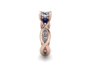
shape
carat
color
clarity

Looking for feedback on first draft render of custom ring

webwing91

Rough_Rock
Joined
Mar 13, 2014
Messages
11
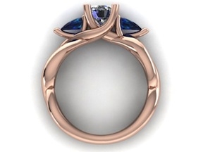
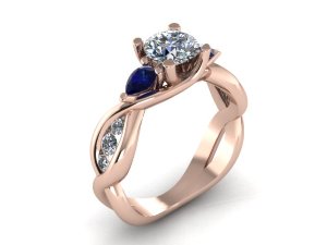
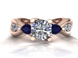
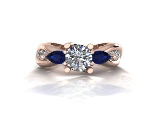
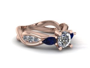
I received the rendered images of the first attempt by the designer (local shop). I have some concerns and would appreciate ideas from the experts here.

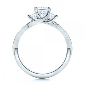
This ring is the concept I started with:
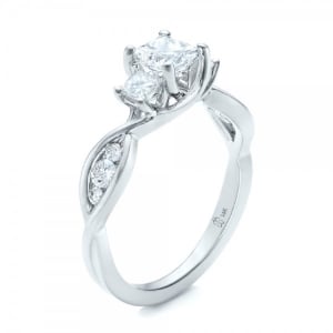
custom-princess-cut-diamond-engagement-ring-3qtr-101223.jpg

Additional views can be found here: https://www.josephjewelry.com/custom-princess-cut-diamond-engagement-ring-101223

I want to take this ring and change the center stone to Round (I already have it) and the side stones to pear shaped sapphires instead of princess cut sapphires.
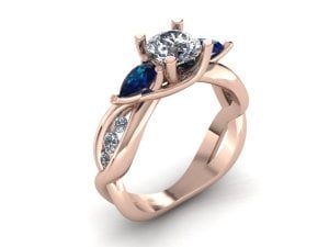
55132_atodaria_1.jpg

55132_atodaria_2.jpg

55132_atodaria_5.jpg

55132_atodaria_6.jpg


What I loved the most about the original concept is the lovely prong design. The prongs look like tree branches that grew around the gems. I feel that this first attempt doesn't match the elegance. There is a lack of flow.

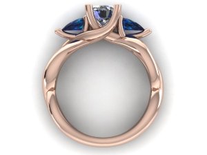
In my opinion, the worst offender is that third prong at the end of the the pear shaped sapphires. It obstructs the single line as it crosses over to the other side. Moreover, it kind of just juts out there and blocks the view of the side diamonds. Does anyone have ideas around this issue? Would smaller sapphires help? Are pear shaped sapphires just a bad fit? Any other comments on the design, especially to improve the flow of the prongs and make it look more like the original?

If I go with rose gold, I am also going to look for brighter sapphires.

Thank you in advance!
 
Re: Looking for feedback on first draft render of custom rin

i think the prongs look a bit more prominent, but that may be because you're going with rose gold, a center diamond, and blue sides. whereas the original was all white everything....center, sides, and setting. kwim?

it seems like the center stone sits down a lot lower in the setting on your customized version.
 
Re: Looking for feedback on first draft render of custom rin

I think you are trying to squeeze too many different elements and their proportions just don't flow together. In the original, it doesn't look as busy because there's only 2 shapes (square and round) and everything is white. In this design, there are 2 shapes (round and pear) and 3 different colours (white, blue and rose). I agree that the pointy pears throw things off a bit. If you want to keep the pears, then the proportions of the trio of rounds on both sides need to be made smaller. As it is, the pears have taken up all the transition space of the original design and the round trio had to be moved further down the shank, coupled with the odd "bump" to accommodate the tight spacing.
 
Re: Looking for feedback on first draft render of custom rin

Yeah, I think the pears take up more space (more elongated) than the rounds and there's not enough room for them, changes the prong work - here's a profile pic of your inspiration ring. I wonder if using smaller pears would work, or maybe switch to round sapphires (unless you have already purchased the pears)- I wonder if raising the height of the center stone, thus raising the pears, might make more room for everything, and the side prongs would go upward instead of to the side. Hope this makes sense, I'm not good at expressing these things!

I agree with chrono about the side diamonds.

custom-princess-cut-diamond-engagement-ring-front-101223.jpg

55132_atodaria_6.jpg
 
Re: Looking for feedback on first draft render of custom rin

I like the CAD better than the original.
 
Re: Looking for feedback on first draft render of custom rin

I like the bottom half of the original better, it flows nicely and doesn't look as chunky. You have a second open loop after the diamonds and they don't. Close the loop and just make a twist?
 
Re: Looking for feedback on first draft render of custom rin

Thanks for all the feedback everyone. It definitely helps me understand the choices I'll have to make. While I was searching for a ring, I kind of fell in love with a few concepts (sapphires, rose gold, and an elegant split shank ring) and I suppose this was my attempt at combining them.

I have not bought the pear shaped sapphires yet just the round diamond (saw a Brian Gavin I really loved). I would first like to see if this design can be improved with the suggested changes, but may have to change the sapphire shape and possibly let go of the rose gold. Do you suggest only round sapphires to reduce the shape diversity, or would anything smaller work?

I thought the bottom half was a little weird with the extra opening, but figured it wasn't critical as that wouldn't be seen so much.
 
Re: Looking for feedback on first draft render of custom rin

I took some of the suggestions and I think the result is pretty great. This is the ring redone with smaller sapphires with greater tilt. I think this is a great balance. We haven't made the side diamonds smaller yet, but I don't know if that is necessary anymore. Thoughts?

55132_atodaria_1_0.jpg

55132_atodaria_1_1.jpg

55132_atodaria_1_2.jpg

Note: Still have not decided if I will go white or rose gold.

I specifically want lighter, bright blue sapphires than the ones shown in these pictures (I believe they are called vivid light blue). I think rose gold especially would benefit from a lighter sapphire. My jeweler 's collection if pretty dark, and she seems hesitant if she can get the color I am looking for anytime soon. Is what I am looking for hard to find (I seem to be able to find single, larger stones online), or should I hold out for the color I want?

Thanks for the assistance again everyone!
 
Re: Looking for feedback on first draft render of custom rin

This newer version flows so much better! Rose gold doesn't seem to compete with the overall look anymore so I don't think it'll be an issue.

I noted three things which I don't know if they are something you like/requested.
1. In JJ's ring, the shank gets thinner as it "pulls" away from the centre stone. In yours, the shank gets thicker towards the bottom.
2. In JJ's ring, the metal around the diamond trio is very thin and of even width. In yours, the metal is rounded and thicker.
3. You are keeping the air gap (last twist) after the diamond trio twist?
 
Re: Looking for feedback on first draft render of custom rin

Interesting observations. I hadn't noticed those details and have not asked for any of them.

As far as the ring getting thicker in the bottom half, this might have to do with her philosophy. When we talked about how the actual product would look more dainty then the render (she says this always looks way 'heavy') she mentioned the one exception was the bottom of the shank. She called it a "high wear" area and says that she usually makes it thick to make sure it will last more than just 10 to 15 years. I'll ask her if this is why the ring seems to get thicker as it goes down. If it is, then I am fine with it. If not, I'll probably ask for a change. Do you feel this is a valid reason? Does it hurt the look of the ring?

I didn't ask for the extra twist at the bottom either, she said she just kept going with the intertwining theme on the bottom half. I've been focused on the top of the ring, so I've been indifferent to the twist. I still don't have much opinion on it, but I'm open to other opinions on if it adds to the effect or not. Follow up question, is there a danger that the twist opening will cause my fiance's skin to be pinched at some point? I would hate to miss a detail like that.
 
GET 3 FREE HCA RESULTS JOIN THE FORUM. ASK FOR HELP
Top