Morgie44
Brilliant_Rock
- Joined
- Dec 13, 2007
- Messages
- 634
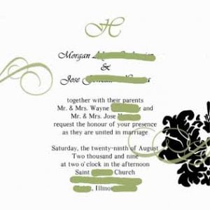
I posted a few weeks ago for proofreading help, but the more I look at them, the less I like the top part. What I originally had can be found here. I feel like the black brackets at the top around the H just don''t "go" with the damask I am using elsewhere, and they just look weird...
Original Thread
I wish I knew how to do a poll, but I don''t.
Here is a mockup of another possibility.
Which do you like better?

Original Thread
I wish I knew how to do a poll, but I don''t.
Here is a mockup of another possibility.
Which do you like better?


300x240.png)