You are using an out of date browser. It may not display this or other websites correctly.
You should upgrade or use an alternative browser.
You should upgrade or use an alternative browser.
Help on these numbers for a stone
- Thread starter yrrp3738
- Start date
- Joined
- Jan 11, 2006
- Messages
- 58,581
- Joined
- Apr 3, 2004
- Messages
- 33,852
slg47
Ideal_Rock
- Joined
- Apr 4, 2010
- Messages
- 9,667
- Joined
- Aug 14, 2009
- Messages
- 27,488
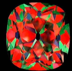
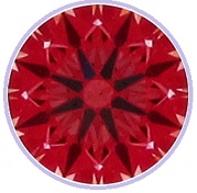
Looks nice - no worries about the contrast/fuzziness, that's just the photos. Our concern is the colours and patterning, and there's nothing to worry about.
I have to make one comment about the colour, you didn't state what it was - a J is a J, a K is a K. A well-cut J or K can look surprisingly white/colourless from the top (surprisingly colourless, not actually colourless), depending on size and "type" of proportions, but a J is still a J and it will at best look like a well-cut J from the top - as in, it won't look like a G or an H. And you rarely do see a stone from precisely face-up - normally the stone is at an angle of some sort, which makes any body colour pretty clear.. so if you know that you are quite colour sensitive and you know that you dislike seeing body colour in the stone, a lower coloured stone may not be a good fit, if you are relying solely on cut masking colour..
I have to make one comment about the colour, you didn't state what it was - a J is a J, a K is a K. A well-cut J or K can look surprisingly white/colourless from the top (surprisingly colourless, not actually colourless), depending on size and "type" of proportions, but a J is still a J and it will at best look like a well-cut J from the top - as in, it won't look like a G or an H. And you rarely do see a stone from precisely face-up - normally the stone is at an angle of some sort, which makes any body colour pretty clear.. so if you know that you are quite colour sensitive and you know that you dislike seeing body colour in the stone, a lower coloured stone may not be a good fit, if you are relying solely on cut masking colour..
- Joined
- Jan 28, 2011
- Messages
- 84
Yssie|1303600344|2903683 said:I have to make one comment about the colour, you didn't state what it was - a J is a J, a K is a K. A well-cut J or K can look surprisingly white/colourless from the top (surprisingly colourless, not actually colourless), depending on size and "type" of proportions, but a J is still a J and it will at best look like a well-cut J from the top - as in, it won't look like a G or an H. And you rarely do see a stone from precisely face-up - normally the stone is at an angle of some sort, which makes any body colour pretty clear.. so if you know that you are quite colour sensitive and you know that you dislike seeing body colour in the stone, a lower coloured stone may not be a good fit, if you are relying solely on cut masking colour..
The point that Yssie makes is extremely valid. We don't know the color, clarity or carat weight of this stone. If color is you main concern, without compromising on cut, you can play around with the clarity and weight of the stone in order to get to a more comforting color parameter, without breaking the budget (depending on how much room there is - we don't know). Relying solely on fluorescence isn't going to help you as much as you may think.
- Joined
- Aug 14, 2009
- Messages
- 27,488
slg47
Ideal_Rock
- Joined
- Apr 4, 2010
- Messages
- 9,667
Share:
The Ultimate Guide to Men’s Wedding Bands: Metals, Fit & Finish The Ultimate Guide to Men’s Wedding Bands: Metals, Fit & Finish - 06/27

Chipped Diamonds: Causes, Risks, and What You Should Do About It
Chipped Diamonds: Causes, Risks, and What You Should Do About It - 06/27


300x240.png)