Pinkmartini87
Brilliant_Rock
- Joined
- Apr 10, 2017
- Messages
- 1,314
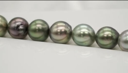
Hi all, would love the experts here (@yssie, etc) to help me pick the more colorful strand of the two below.
I’m really looking for colors that “stick” in different light conditions, so maybe a more colorful body vs simply colorful overtones.
Both are about equal in price btw (around 1k)
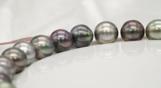
Strand one:

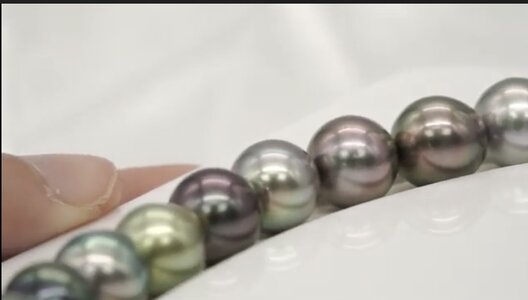
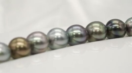
Strand two:

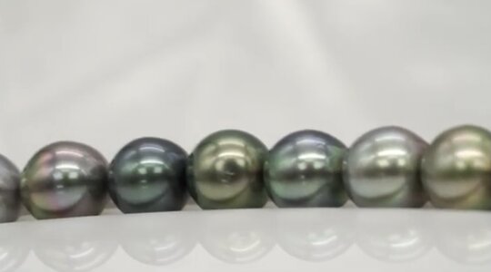
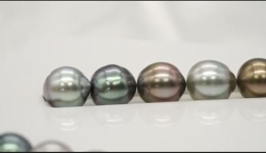
I had bought and returned strand below because I thought it wasn’t colorful enough:

I’m really looking for colors that “stick” in different light conditions, so maybe a more colorful body vs simply colorful overtones.
Both are about equal in price btw (around 1k)
Strand one:
Strand two:
I had bought and returned strand below because I thought it wasn’t colorful enough:


.jpg")


300x240.png)