shape
carat
color
clarity

E-ring CADs are in! Thoughts please?

natsplat

Brilliant_Rock
Joined
May 1, 2011
Messages
509
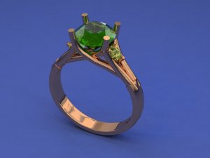
That day has come! - after two months of conversation emails, the first CADs are here! :mrgreen:

Quick run-down on components:

18k rose gold, peachy.
The centre stone is the green Barry tourmaline, 8mm, as in my avatar.
The side stones are champagne diamonds, 2.8mm or so:


And the prongs will be split - so 8 in total - and pointy.

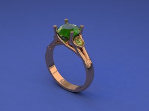
Two variants here. I initially wanted bezel-set side stones, but they also sent prong-set too for comparison.


My initial thoughts:

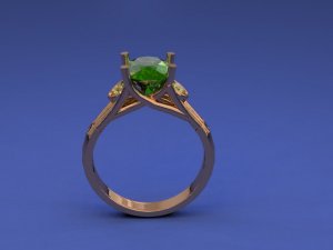
* I'd like the side stones further away from the main stone, a tiny bit. Dan and Caren carefully followed my idea to slightly "tuck" the side stones under the main stone to make them even less prominent, but now I'm thinking it might be crowding the centre stone a bit (and maybe the brown would cloud into the green?)

* I love bezels as a look in general, and rather like having both prong and bezel in one ring: but if there isn't room to set them tucked between the split shank so that they don't sit proud, then I think I prefer the less prominent look of the prong setting.

Cont...
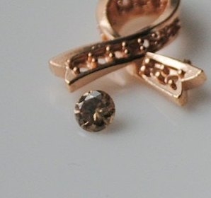
Side stone with 18k rose gold.jpg

CAD 25.06.11 prong.jpg

CAD 25.06.11 bezel.jpg

CAD 25.06.11 bezel side.jpg
 

natsplat

Brilliant_Rock
Joined
May 1, 2011
Messages
509
Cont...

*The area where the split shank meets the trellis/prongs (at the top nearest the centre stone) is a little awkward. As a newbie to CADs, I don't know if that awkwardness will be smoothed out, but I would like all eight strands of the metal to flow into the stone-holding job as if separately, with the metal strands that are flowing from the split shank feeling as if it goes straight up diagonally to become a prong (one of the eight), rather than stopping, joining, and then splitting again. Does that make sense? This also is probably contributing to the ring looking a little more like a 4-prong trellis (which I'm not so keen on).

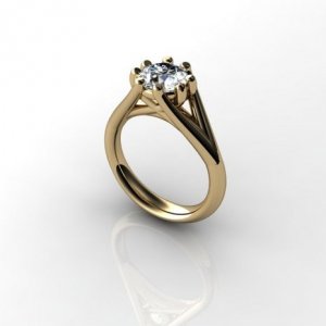
I gave them an 8-prong trellis CAD as inspiration:


but asked that the prongs be spaced into four groups of two, rather than eight even prongs. I think the slightly wider split shank on this inspiration to allow for the diagonal cross right at the top of the stone to provide the 8 prongs might house the side stones (even in bezel) more neatly too. But then I do like how much of the stone can be seen in the side profile, and don't want to crowd it too much.

* I'm also thinking the bottom of the ring might look good a little narrower, again feeling like the band widens, flowing into the split shank.

Please let me know what you think could be tweaked to make the ring flow, and if I'm on the right lines to achieve this. And do you prefer the bezels or the prongs for the side stones? Any comments would be hugely welcome, as these are my first CADs, and (obviously!) want to make it perfect.

Thank you! :read:

Split-shank 8-prong trellis setting inspiration.jpg
 

faegrace

Shiny_Rock
Joined
Feb 24, 2011
Messages
373
Hi, Nat :wavey:

Congrats on getting your CADs!!! It's so good when you can actually see the process.

My limited experience says that yes, those areas of concern will most certainly be smoothed out. I think as great as CADs are, they do have limitations. The finish work cannot be represented, so things tend to look bulky.

My thoughts on bezzel vs prongs for the side stones are that the bezels have a more modern feel whereas the prongs seem much more traditional. I don't know your personal style to say which would suit better. I do think that it would be nice if the accents weren't quite so close to the center stone. It looks a wee bit crowded to my eye. I don't know if it is possible to move them down the shank without jeopardizing the integrity of the design. Definitely ask though.

~ faegrace

Keep us updated, please.
 
T

talamasca

Guest
Firstly, I love the colour combinations and I personally prefer the bezel set, which is something I never thought I'd say as I'm not usually that keen on them!

But, I'm a little confused. Are you not having 8 prongs as the CAD's only seem to show 4? The design you gave them as your inspiration is really nice and I think that because of the way the 8 prongs are it's wider and flows a bit more, but if yours was wider I'm not sure how the bezels would go???

Hopefully, someone with more knowledge will bob on soon :D
 

natsplat

Brilliant_Rock
Joined
May 1, 2011
Messages
509
Faegrace:

I so AM excited! The process is so cool, and I know that - coz I am very happy with the colour combination and stones - that these details won't take long to sort out.

Re the bezels, I forgot to mention that they might be milgrained, so if that happened plus they were more sunk into the split shank, I think they'd look less modern. I'm still so on the fence about them! My tastes are far more towards the old-fashioned, and I'm trying to build something with a more old-fashioned look but with more modern colour palette. I know trellises can look modern, but I'm hoping with the flowing strands plus 8 prongs, this will look more like the 1920s twist rings I've seen and been inspired by. Do you think the prongs of the side stones will be pretty much unnoticable?

I'm also glad you think the finishing work will iron out the slightly clunky areas. I plan to mention my concern about that area to Caren (I'll prolly circle on the CAD so I don't have to describe it and risk miscommunication). I realised that a big part of what I like about the even 8-prong inspiration setting is the cross-over diagonal created by the split prong "halves" crossing the lower trellis to create the prong, which of course I am missing here.

A mad thought I had: would it be astonishing to consider an 8-prong setting where South and North had 4 even prongs, with East and West having the gap created by the split shank? That would create those even crossovers in the side view that I love. But I do like double prongs. Hmm!

Tala:

Hey! Re the 8 prongs, the four prongs shown get split after casting to create eight, because I wanted the look of double prongs but the trelliswork of the inspiration. I do love the flower-like look of the evenly-spaced 8 prong setting, but I was concerned that it might shade the stone too much to have even spacing. I'm trying to have my cake and eat it ;-)

Glad you like the bezels. I think they look more substantial/"noble", but I have to go carefully with them I think, making them narrow-edged and milgrained, coz I do not want them to look like a modern anomaly. And I don't really like them sticking out as much as they do on this CAD.

**Edited to add another thought** would it look too fussy with a simple ridged cuff to tie off the split shank at the bottom?
 

natsplat

Brilliant_Rock
Joined
May 1, 2011
Messages
509
Any other preferences...? :twirl:
 

packrat

Super_Ideal_Rock
Joined
Dec 12, 2008
Messages
10,614
I dig bezels but w/this ring I like the side prongs better than the side bezels.
 

natsplat

Brilliant_Rock
Joined
May 1, 2011
Messages
509
I like the prongs too o_O and the logical side of me says the matching prong setting is sensible. But - BUT! - I have something in me saying "don't discount the bezels yet"...!

I dunno: the bezels moved further down, tucked more into the shank, tiny milgrain with possibly matching thin milgrain cuffs...

It could work, couldn't it?

Thanks packrat :)
 

minousbijoux

Super_Ideal_Rock
Premium
Joined
Aug 5, 2010
Messages
12,804
Natsplat you/they have done a magnificent job with those CADs! I love the color combination between the stones and the metal; I love the simple elegance of using the 8 prong trellis as inspiration. I agree with you that it would be great if the shank could connect more gracefully, bending up to become two of the prongs. My vote - from someone who typically like prongs settings more than bezel - is for bezel setting the side stones. There is something about the bezel set side stones that provide a pop of color without complicating the design, or drawing your eye away from the beautiful center stone.

I can't wait to see more! :appl:
 

minousbijoux

Super_Ideal_Rock
Premium
Joined
Aug 5, 2010
Messages
12,804
In the two CADs the bezel set stones seem larger. If they were comparable in size to the prong set side stones, they might be less pronounced...just a thought. You want to compare things fairly.
 

Michael_E

Brilliant_Rock
Trade
Joined
Nov 19, 2003
Messages
1,290
natsplat|1308990560|2954680 said:
Glad you like the bezels. I think they look more substantial/"noble", but I have to go carefully with them I think, making them narrow-edged and milgrained, coz I do not want them to look like a modern anomaly. And I don't really like them sticking out as much as they do on this CAD.

**Edited to add another thought** would it look too fussy with a simple ridged cuff to tie off the split shank at the bottom?

I think that you're on the right track here. I would suggest that use material rising up from the junction of the prongs on the sides and form a larger triangular "prong" holding the bottom of the side stones. You would then have a similar, smoothly curved semi-bezel holding the top part of the sides stones in place, such that the semi-bezel looked like it "grew" from the main prongs. This design is a modern, smoothly flowing design and anything which protrudes sharply will look like an add-on. The prongs look like they jut out too abruptly to work well, as does the bezel, unless it were set very low in the setting. Using a more "organic" sort of semi-bezel which flows smoothly with the ring would look better IMO.
 

natsplat

Brilliant_Rock
Joined
May 1, 2011
Messages
509
minousbijoux|1309043242|2955042 said:
Natsplat you/they have done a magnificent job with those CADs! I love the color combination between the stones and the metal; I love the simple elegance of using the 8 prong trellis as inspiration. I agree with you that it would be great if the shank could connect more gracefully, bending up to become two of the prongs. My vote - from someone who typically like prongs settings more than bezel - is for bezel setting the side stones. There is something about the bezel set side stones that provide a pop of color without complicating the design, or drawing your eye away from the beautiful center stone.

I can't wait to see more! :appl:

Thanks Minous: I'm really glad you like how it's going :D I know what you mean about the bezel setting; it does "contain" the fact that my side stones are unusually darker than my centre stone, and allows the colour pop without any undue fuss. I think that's why I'm leaning towards it. But only if I am able to get them (almost) flush with the band, tucked into the shank. I'll check the sizes of the side stones in both examples too. I don't mind going down a bit in size in diamond if I have to to get the look I want.
 

natsplat

Brilliant_Rock
Joined
May 1, 2011
Messages
509
Michael_E|1309045395|2955058 said:
I think that you're on the right track here. I would suggest that use material rising up from the junction of the prongs on the sides and form a larger triangular "prong" holding the bottom of the side stones. You would then have a similar, smoothly curved semi-bezel holding the top part of the sides stones in place, such that the semi-bezel looked like it "grew" from the main prongs. This design is a modern, smoothly flowing design and anything which protrudes sharply will look like an add-on. The prongs look like they jut out too abruptly to work well, as does the bezel, unless it were set very low in the setting. Using a more "organic" sort of semi-bezel which flows smoothly with the ring would look better IMO.

This is a great idea Michael. It moves the side stones down nicely too. I'll talk to Caren about it. I agree that it's the abruptness of the side stones at the moment that's jarring for me. The last thing I want is for the design to look "added to". I think I shall ask if I can see a true 8-prong setting that is imitating a double-prong look, coz I think the flow is being interrupted there too.
 

natsplat

Brilliant_Rock
Joined
May 1, 2011
Messages
509
I'd love to hear if anyone think a tiny milgrain cuff would work, and if anyone has any pictures of milgrain on cuffs on rings, even better...! Thanks! *hoping* :shock:
 

ooo~Shiney!

Brilliant_Rock
Joined
Jun 6, 2010
Messages
1,501
I should stay out of this....
I LOVE the Cad
That being said, do you not think
the side stones will look a little dark
or "blendy" once they are set?
Do you have your heart set on Champagne diamonds
for side stones ?
Are you just wanting a little glint of light there?
(keep in mind, i am not the best at design ideas,
and I really do LOVE that design... :sun: )
 

natsplat

Brilliant_Rock
Joined
May 1, 2011
Messages
509
I know what you mean Shiney, and you have worded it well :) I'm glad you like the shape of the CADs :D

Yes, that's exactly what I do want: a very understated glimmer, mainly on the side profile. I guess I should have explained it in the first post. I always knew I definitely didn't want white melee/side stones, as I knew they would sparkle very differently to my centre stone (which is a soft sparkler, and not similar to a diamond's flashiness ;-) ), and my thought has always been that I want the ring to look like a solitaire at first and even second look, but then it rewards a closer observer with extra subtle detail. I played with the thought of using rose-cut side gems or maybe other tourmalines, but I reckon the champagne diamonds, that are flashing peachiness to match up with the rose gold, will give me that extra lustre I'm aiming for.

I hope I explained that sensibly...! :shock:
 

T L

Super_Ideal_Rock
Premium
Joined
Sep 20, 2008
Messages
25,159
I didn't read what everyone else wrote, but I think the bezels enhance the side stones more. Without them, they just fade away and might not be noticed. This is especially true since the side stones are a very similar color. Love the CAD though, and I think the 8 prong trellis is way to busy for my taste. Not a fan of lots of prongs.
 

natsplat

Brilliant_Rock
Joined
May 1, 2011
Messages
509
Hey TL,

I think I'm pretty much decided on the bezelling now; they definitely do help to mark out the side stones. You know the side stones are the champagne diamonds? - for some reason Dan and Caren didn't colour the CAD side stones in a different colour.

I rather like the busy-prong look :oops: I especially have a thing about 8 prong settings. As long as the post-casting makes the prongs light and pointy, and the twists are not bulky, I shall be happy. :mrgreen:
 

LD

Super_Ideal_Rock
Premium
Joined
Jun 29, 2008
Messages
10,261
I haven't read any of the other comments but in general I would say that CADs tend to look very bulky compared to the finished article. In real life everything will be much more delicate - which hopefully will allay some of your fears.

My only concern is the colour combination. You've got rose pink/champagne brown/green. They are all earthy type colours which makes me concerned that they'll merge a bit too much.
 

natsplat

Brilliant_Rock
Joined
May 1, 2011
Messages
509
LovingDiamonds: The fact that they are all earthy colours is why I chose them :) As I said to Shiney, I want the side stones to be very subtle, as I think the pink and green of the metal and main stone is stark contrast enough. I am confident about the colour choices - almost the only thing I am confident about...! But I know they are unusual, so thank you for voicing your concerns. I also wear unusual colour combinations in clothing, so I reckon my eye is a bit more quirky than the average :naughty:

I've written to Dan and Caren now asking for tweaks and clarification about the flow and bezel positioning (I've gone for the bezel-set side stones), and possibly tiny cuffs at the bottom of the split shank. I'll keep you all posted! Thanks for everybody's help :D
 

TristanC

Brilliant_Rock
Joined
Jun 6, 2011
Messages
995
Very nice design. I love the combination of colours, it almost reminds me of a beautiful little organic tree that twirled around your finger and sparkled. So all the prong prongs are fine - they are reminiscent of branches. Sorry... weird imagery for me here.

I was going to chip in that bezels would be very pretty for this ring, even though I personally am not fond of them. The CAD seems to show that bezels would help you achieve the desired muted bling effect.

Just wondering, have you considered longish pear shaped champagne diamonds? It might help elongate the area under the ring head and make it less clustered up top for you due to the pear's natural taper.
 
T

talamasca

Guest
TristanC|1309170421|2956011 said:
Just wondering, have you considered longish pear shaped champagne diamonds? It might help elongate the area under the ring head and make it less clustered up top for you due to the pear's natural taper.


Oooo, that sounds good!
 

chrono

Super_Ideal_Rock
Premium
Joined
Apr 22, 2004
Messages
38,364
Why the shift away from the 8 separate prongs into a 4 prong split into double prongs? I much prefer the 8 separate prongs version and as it is, I'm not into the prong side stones. If the bezel can be set into the split gap (flush instead of above the gap), the flow will be more fluid. But of course, I don't know the size of your side stones, so it might be too big for that.
 

natsplat

Brilliant_Rock
Joined
May 1, 2011
Messages
509
TristanC|1309170421|2956011 said:
Very nice design. I love the combination of colours, it almost reminds me of a beautiful little organic tree that twirled around your finger and sparkled. So all the prong prongs are fine - they are reminiscent of branches. Sorry... weird imagery for me here.

I was going to chip in that bezels would be very pretty for this ring, even though I personally am not fond of them. The CAD seems to show that bezels would help you achieve the desired muted bling effect.

Just wondering, have you considered longish pear shaped champagne diamonds? It might help elongate the area under the ring head and make it less clustered up top for you due to the pear's natural taper.


The pear diamonds sound like a great idea! - I don't know if my vendor has access to them, but I'll bear it in mind if the stones we have now don't fit with the tweaks to the design. Thank you! :)
 

natsplat

Brilliant_Rock
Joined
May 1, 2011
Messages
509
Chrono|1309185821|2956133 said:
Why the shift away from the 8 separate prongs into a 4 prong split into double prongs? I much prefer the 8 separate prongs version and as it is, I'm not into the prong side stones. If the bezel can be set into the split gap (flush instead of above the gap), the flow will be more fluid. But of course, I don't know the size of your side stones, so it might be too big for that.

Hi Chrono :D I should have xplained a bit about my "journey" through this design; I originally wanted a clean non-trellis double pronged four point ring setting, as I love that look with round stones. but then I foun the 8-prong trellis, and asked if that could be modified to look like double-pronging rather than even spacing. There are two way of skinning that cat, and Dan and Caren chose the double-pronging imitating the 8 prongs; we may have to go for the 8 prongs imitating the double pronging in the end, though :lol:

I really need those bezels to be flush with the band, as you suggest. I guess if they don't fit, we could possibly go with smaller stones, or Michael's idea of semi-bezelling (although I would have to forgo the milgrain then, which would be a pity).

I'll keep everyone updated with our progress...! :D
 
Be a part of the community Get 3 HCA Results
Top