Andelain
Ideal_Rock
- Joined
- Mar 10, 2010
- Messages
- 3,524
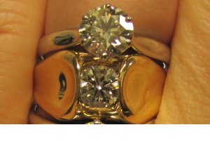
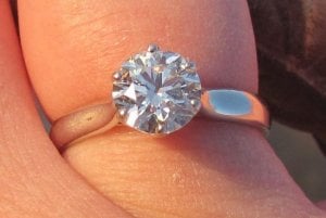
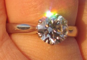
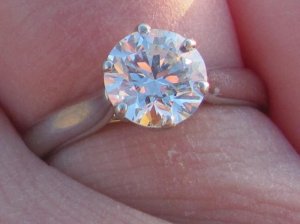
I can see color well myself, but in many lights this I is a perfect match to the D because it''s so excellently cut and all I can see are the flashes of light. I think I''m going to do a separate thread comparing the 3, not only for color, but cut. One is a WF ACA and 2 are Eightstars and the differences are subtle, but they do exist. I''m forming an opinion of which cut I favor, but it''s by a tiny margin. I''ll save all that for a comparison thread.Date: 5/20/2010 1:31:20 PM
Author: dreamer_d
I am very color sensitive (i.e., as in perceptive), the bane of my diamond existenceBut I also may recall you mentioning the color somewhere else... I think your photos are really great for showing the difference between an F and an I in some lighting, though of course in reality the fine nuance of color differences are so much less noticable. I wonder if you can comment on the different appearances of your three diamonds in terms of color? Of course, you I is also larger and I have noticed that once you are over the 1.5ct mark the performance really changes in the diamond and it shows more contrast and scintillation from the larger facets and virtual factes, and that sort of changes the flavour of the color... anyways, would love to hear your comments since you own a D and F and an I!
I know you ended up choosing a J that makes my mouth water. I think your stone''s diameter is about the same as mine and how I wish we could hold our hands side-by-side in some different lights. Not only for color comparison, but to compare a BGD to an Eightstar of the same size.
I actually have lots of diamonds, mostly 1 ct and below, of all different colors, but only the 3 shown here are branded cuts. For that reason I doubt I''ll include any of them in color comparisons because the cut really does change perception. For example I have a GIA graded G that faced up more tinted than this GIA I, and I''m sure it''s because the G really needs a trip to a recutter.
One other thing I''ve notised before and I''m seeing it here is that high clarity makes a difference to my eyes, even if I can''t actually see the inclusions. The D is a VS2, and has nothing at all in the table are. It''s beautiful, but my eyes just get lost in the VVS1. It''s hard to explain, but it''s like I''m looking at the clearest water that just ripples if I even think of moving. Make any sense?
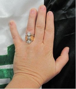
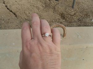
OK, I know this is a bit long, so I''ll shut up for the moment. Here''s a hand shot with all 3. Pardon the swollen finger look, but that''s how my hands do when it''s 100 degrees outside.







300x240.png)