- Joined
- Aug 29, 2003
- Messages
- 15,808
That's certainly understandable to try and avoid looking like the old setting but really it's already going to look nothing like it. And even the Ls contrast a lot in color. I just think if they are going to not match, they should REALLY not match so it seems on purpos Rather than a lack of attention to detail. Imagine wearing a black suit with blue pants.
You were saying you were going to look for two tone examples. It's harder to find light yellow center stones but here's one

I actually did like the Js shape too. The thinner shields seem to make your marquise look fatter and I liked that. I looove your stone loose there and I think whatever you do will be fab. And always take anyone's advice including mine with a grain of salt because we have ideas on how we would rock that stone. This doesn't mean you have to agree.So what I told David was I was ok with anything in the K color and up, just as long as they were not colorless or face up white. For it to match he would have needed to cut a pair, these will definitely have some contrast but not the same as a white pair would have and that is what I was hoping for. I was pretty flexible in the color because warmer stones are harder to find in warm colors.


I actually did like the Js shape too. The thinner shields seem to make your marquise look fatter and I liked that. I looove your stone loose there and I think whatever you do will be fab. And always take anyone's advice including mine with a grain of salt because we have ideas on how we would rock that stone. This doesn't mean you have to agree.
i just think that stone is fab and trying to point out its unique color is the way to go, rather than meld it with somewhat lighter stones.
Here's another two-toned option. But, I'm not sure how L colored sides would look in this setting. It seems something like this might suit the J sides better.This is 18k gold which may be a bit too much color for your stone.
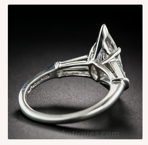
An example of a two tone setting more like what you're after. Here they actually did a cup to accentuate the color. I'd don't die a cup as that can make it difficult to clean but a thicker bridge on the ma can accomplish a similar affect


colorless side stone with the more yellow tinted marquise might be a bit flashy...
I think the shank is so big because the side stones are so big. Smaller white stones would, I imagine, be a similar cost, allow the shank to be bigger, and not look as "flashy" which I understand you're concerned with. I think huge side stones on a huge diamond is the epitome of flashy regardless of color.
 you are going to make me pull out my hair for planting this seed! I now have no idea what to do after seeing this..like F me this looks really good as well!! I will say I would probably want something larger for the side stones or if doing traps going with two sets on both sides.
.
This is something else - WWW
& another WWW
If you match the sides by color, why add contrast back in via metal color ...
It seems natural to have the ring all dine in one metal or half & half, that is to say, all diamond holding parts in one metal & the shank in another.
___
Then,
for what it doesn't matter, I'd vote Pt for diamond-holding & YG rest - so that the gold picks up the colour of the diamonds & no more; it seems too much to firce the O-P into masquerading straight yellow or straight white. I have not seen this done much in modern rings ... only old Pt & Yg settings with similar diamonds ...
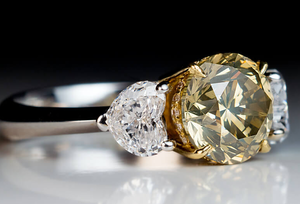
Oh my god I hate to do this to you but I think the colorless stones look amazing. And really the color of the mq pops
And those are just random side stones that were not he shapes you were asking. If it looks this good with randos just think if he could find kites. What did he think of the two tone?
Yes I assumed you'd make him get another shape but those are lovely just as they are if you went that route too.

if doing traps going with two sets on both sides
I do agree with you over the color not being in a low enough range to pass as a fancy. I just posted a photo of the contrasting white side stones...
 ) actually will enhance the shape of the marquise AND not make the stone bigger. The blending colored side stone will be more of a wall of diamonds. If you go with contrast, then you see three-distinct stones...that will be less of a 'giant diamond' that three stones that blend together.

300x240.png)
 Let’s see what happens lol