shape
carat
color
clarity

Dilemma Between the two Asschers

emmy88

Rough_Rock
Joined
Feb 21, 2012
Messages
41
Hi Everyone:
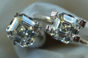
When I first compared the two asschers, both 1.05ct, one is FSI1 and the other HVS1, I thought I definitely like the FSI1 better. It seemed to have more fire and brighter. However, now that I have more time to look at it at different light conditions, I am not so sure anymore. Here are couple of photos for you to look at. The FSI1, while sometimes brighter, seems to have a step missing, if that make sense. While with the HVS1, you can see more steps. My daughter and friends prefer the FSI1 because of it being brighter, but my husband likes the HVS1 because you can see more of the steps. I, on the other hand, cannot decide which one I like better. I like the FSI1 because it is sometimes brighter, but I like the HVS1 better sometimes because I can see the more defined steps in it. Can you see the difference? The FSI1 is in a ring holder.
The FSI1 is on the left below

The FSI1 is on the right below


Does the FSI1 has a "dead step"?

Asscher comparsion 1.jpg

Asschers comparison 2.jpg
 

tyty333

Super_Ideal_Rock
Premium
Joined
Dec 17, 2008
Messages
27,285
I like the one on the right in both pictures however, it could be the stone holders and the lighting that are affecting
my choice.

Did you switch the stone holders between those to shots or are the stones in the same holders?
 

emmy88

Rough_Rock
Joined
Feb 21, 2012
Messages
41
They are in the same holder; so in first picture, the FSI1 is on the left, and in the second picture, the FSI1 is on the right.
 

marymm

Ideal_Rock
Premium
Joined
Apr 21, 2010
Messages
5,533
Seeing them both, H-VS1 wins my vote - I prefer its steps and to me it seems more lively and brighter, maybe because of its steps and/or its higher clarity? And, though I don't know the dimensions, the shape of the H-VS1 seems more square.
 

SweetAsscher

Shiny_Rock
Joined
Sep 11, 2011
Messages
377
I think the H has nicer pattern. The steps look nicer to me.
 

Gypsy

Super_Ideal_Rock
Joined
Aug 8, 2005
Messages
40,225
They are two different cutting styles, I noticed that when I was posting it that it had one less step than the others you were looking at. Which doesn't mean it's bad, but it does give it a different look.

I gotta say, looking at them I don't know which I like better. They both have pluses and minuses.

Can you take them out to a nice jewelry store and see them in different settings (just play and tell the jeweler you have these two stones, are trying to decide between them and thought seeing them sitting in settings would help).

I would recommend just playing with them in all light and see which one catches your heart.

There is no WRONG choice. Just keep that in mind. Either way, you end up with a gorgeous stone.

ALSO, we tend to give our spouse's opinions a LOT of weight. Would you be so torn if your spouse's opinion was neutral, but two of your friends were giving you conflicting thoughts. As in neutral spouse, one friend likes the H the other likes the F? Or would it be easier then?
 

Karl_K

Super_Ideal_Rock
Trade
Joined
Aug 4, 2008
Messages
14,721
It all comes down to personal preference.
In the first pic I like the more contrasty look of the F.
In the second pic I like the H better.
So I am no help lol
View them in as many light conditions as possible and keep the one that speaks to you the most.
 

Karl_K

Super_Ideal_Rock
Trade
Joined
Aug 4, 2008
Messages
14,721
What I said in another thread fits here also:
re: dead zones
A dead zone stays dark even when tilted.
Dark zones that flash with slight tilt are not dead and can provide the contrast that forms the patterns.
When they are to big or don't flash with tilt is when they become an issue.
I don't see any overly big dark zones so if the dark zones flash with tilt they are fine.
There is not enough info here to judge that.
 

Laila619

Super_Ideal_Rock
Premium
Joined
Apr 28, 2008
Messages
11,676
Karl_K|1330822742|3140199 said:
It all comes down to personal preference.
In the first pic I like the more contrasty look of the F.
In the second pic I like the H better.
So I am no help lol
View them in as many light conditions as possible and keep the one that speaks to you the most.

Yeah, in each pic I too have a different preference. In the first picture, I like the H (on the right). In the second picture, I think I like the F. The H looks different in the second pic for some reason.

They are both beautiful, so I really don't think you can go wrong.

Could you maybe post a few more pics?
 

decodelighted

Super_Ideal_Rock
Joined
Jul 27, 2005
Messages
11,534
Same thing happened to me ... in one photo I like one more ... in the other the other! But in BOTH photos I think they BOTH look better than 99% of asschers I've seen soooooooooooooo

I kinda don't think you can *lose*!
 

diamondseeker2006

Super_Ideal_Rock
Premium
Joined
Jan 11, 2006
Messages
58,547
They are both really beautiful, so I'd let the clarity decide it for me. I'd just far rather have VS1 in an asscher. Even if the SI1 is eyeclean from all directions, it would still be more mindclean for me to have the VS1.
 

emmy88

Rough_Rock
Joined
Feb 21, 2012
Messages
41
Hi everyone,

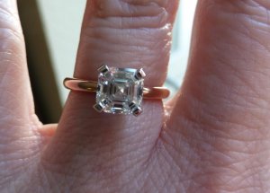
I have finally received my asscher set in BGD Grave setting in rose gold. Again thank you for all who helped me in picking out the diamond. Special thanks go to Karl and Gypsy. By the way, the final decision on the diamond was the H VS1. I will post a couple more pictures in Show Me the Bling


Emmy

asscher in grace.jpg
 

Amys Bling

Super_Ideal_Rock
Joined
Jun 25, 2010
Messages
11,025
Looks great!!!
 

Gypsy

Super_Ideal_Rock
Joined
Aug 8, 2005
Messages
40,225
Looks phenomenal set in rose gold! And the proportions are perfect on your finger.
 

Karl_K

Super_Ideal_Rock
Trade
Joined
Aug 4, 2008
Messages
14,721
congrates!!!!
 
Be a part of the community Get 3 HCA Results
Top