shape
carat
color
clarity

Cushion Taste Test: Need your eyes NOT the specs!

subscribe

Rough_Rock
Joined
Jun 6, 2012
Messages
34
I thought this would be a fun exercise. I'd like to test your eyes, on what they see. Brightness, darkness, each has their own personality. Obviously angles, lighting conditions, etc. all are significant factors - but for this static shot test, what do you think? #1, #2, or #3?

I will reveal the details later! :rodent:
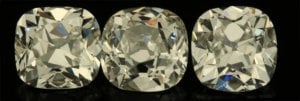
cushion_test.jpg
 
Re: Cushion Test: Need your eyes NOT the specs!

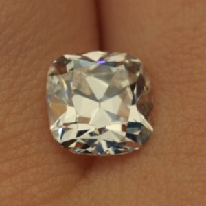
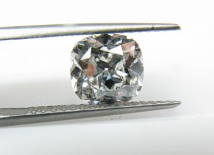
Here is a hand shot of one of the stones.

stone_03.jpg
 
#3 for me...
 
Based on that single static shot, I would prefer 1 or 3. In 1, I can see a culet (I like a culet on a stone that is to appear antique) and it appears to be a squarer cushion. In 3, it appears to have no culet and it a softer, rounded cushion shape. Both 1 & 3 have chunkier facet patterns.

I'm so bad at making decisions... so my decision is ... 1 or 3!!!
 
#3.
 
#3 here as well, based on the more square look to it VS. # 1.
 
2 is out for me - tilt angle is not that steep, and it's visibly less bright at that angle than the other two.
 
I think you are holding #1.

I like 1 or 3. Do not prefer 2.
 
You are correct, it is #1 that is being held.
 
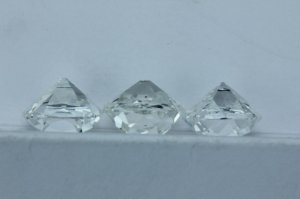
In the same order. Other then color, check out these crown angles!

cushion_test_bottomsup.jpg
 
hmmm.... now I'm going to firm up and go with #3
 
3
 
3
 
Ooh...3!
 
Another for 3.
 
3. No question.
 
3's the one
 
Pillowy outline with the chunky facets...#3!
 
I didn't read ahead - I vote #3.
 
I didn't read ahead before choosing and I picked #3. I see most people did too...
 
#3, please.
 
I never thought it'd be such an overwhelming decision. Amazing. :o
 
Ooooh, #3. If we post a reply are we entered into a drawing?? :lol:
 
jess719 said:
Ooooh, #3. If we post a reply are we entered into a drawing?? :lol:
Ooh yea! And I wanna pick my own prize so cash please!
 
As usual I'm late to the party-but I pick 3 hands down.
 
YayTacori|1349482125|3280234 said:
jess719 said:
Ooooh, #3. If we post a reply are we entered into a drawing?? :lol:
Ooh yea! And I wanna pick my own prize so cash please!

Ha! You guys are silly...
 
Here is #3. In the lineup with all three stones, it looks bright under the table.
Here, not so much. :shock:

img_3809-3.jpg
 
3, then 1, then far behind that pair 2
 
subscribe|1349487949|3280298 said:
Here is #3. In the lineup with all three stones, it looks bright under the table.
Here, not so much. :shock:

Looks perfectly fine. Lots of contrast, but contrast and patterning aren't bad 'darkness' they are good 'darkness' if you will. Did you see number 1 in exactly the same photo set up? Cause unless you did, I wouldn't rule it out based on that image.

Can you have both sent to you and pick one IN PERSON? That's really the best way to chose.
 
Definitely #3. Gorgeous.
 
GET 3 FREE HCA RESULTS JOIN THE FORUM. ASK FOR HELP
Top