davi_el_mejor
Brilliant_Rock
- Joined
- Mar 8, 2010
- Messages
- 1,947
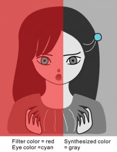
It looks like this Japanese manga girl has one blue eye and one gray eye. In fact, both eyes are exactly the same shade of gray. The girl’s right eye only looks the same as the turquoise hair clip because of the reddish context. Part of the process of seeing color is that three different kinds of photoreceptors in the eye are tuned to three overlapping families of color: red, green and blue (which are activated by visible light of long, medium and short wavelengths). These signals are then instantaneously compared with signals from nearby regions in the same scene. As the signals are passed along to higher and higher processing centers in the brain, they continue to be compared with larger and larger swaths of the surrounding scene. This “opponent process,” as scientists call it, means that color and brightness are always relative.
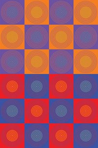
Here is another example of how the brain determines color depending on the context. In the bull’s-eye structures in the top half of the checkerboard, the center rings look either green or blue, but they are all the same color (turquoise). The center rings in the bottom half of the checkerboard are all the same shade of yellow. Unlike the previous images, this type of color illusion is difficult to explain by an opponent process because the apparent color of the rings is more similar than dissimilar to the background.
http://www.scientificamerican.com/article.cfm?id=colors-out-of-space Link to an article and a few more pictures
Something to think about when looking at vendor photos.


300x240.png)