shape
carat
color
clarity

Color change star sapphire ring design

Which is the better arrangement

  • Fewer stones, scattered colors, leave the design as

    Votes: 6 75.0%
  • More stones, ombre arrangement, stones fading out in the middle of the shank

    Votes: 2 25.0%

  • Total voters
    8
  • Poll closed .

Garnet Gimlet

Rough_Rock
Joined
Nov 9, 2014
Messages
75
Ok everybody – help a girl out.

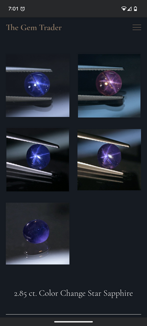
I managed to find my White Whale. A small, but amazing, color change star sapphire. I have been looking for a clear, translucent star within a modest budget for I don't even know how long. I purchased some rings here and there, and they had a nice color and a nice star, but they always fell short. But then I saw this one from Brad at the Gem Trader and my budget went out the window. It's small, 7mm face up, but that's ok – my fingers are small too at a size 5.
1000014502.png

I've been sitting on it for a few months waiting for my bank account to recover and trying to figure out how to set it. I looked at local brick and mortar shops, I thought about going with some of the designers I always see here, but every time I see CADs on the boards, I realize I do not have the mind to design this from the ground up. In the end, I found a lovely designer to work with out in Texas, Everett Walker. I saw his pieces online in a few design competitions and after looking at his work, I really like his aesthetic.

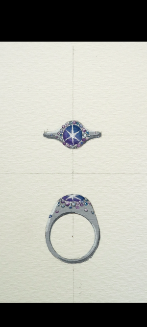
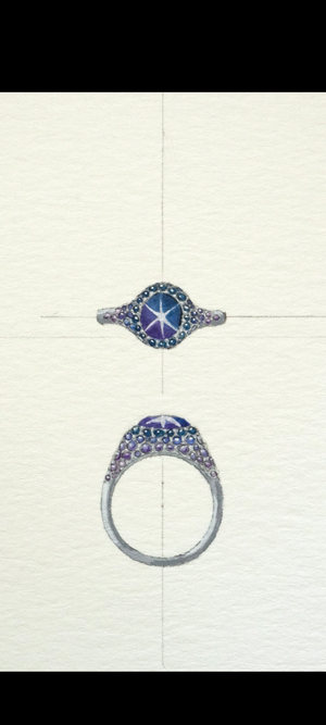
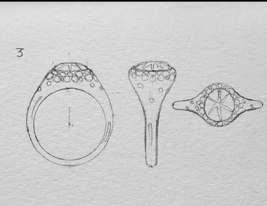
Now on to my current dilemma. I got the basic design of the ring hammered out (see sketch) and know it will be done in a white metal. I do not want to use diamonds throughout. I want to do the smaller stones in sapphires that run the gamut of the color change. The question is now how best to arrange them. Do I keep the design as is and arrange the stones in a mosaic type arrangement (where the colors are scattered across the ring) or add in more stones and create an ombre type effect where they go from saturated to faded to diamond? (You can see an example of this on his insta https://www.instagram.com/everettwalkerjewels?igsh=ZXNjeHJkbTRqbHo0)

1000014503.png

I like the idea of the ombre effect (it's always been something I've loved in clothes and bags and such) but I also like how the current design uses fewer stones as it goes down the shank.

I do want this to be a ring I can use daily. If I am going this far over budget, I want to look at the darn thing day and night! And somehow, there are not a lot of galas on my social calendar that need a cocktail ring.

So ladies and gentlemen – please weigh in. How should I arrange things?
 
Oh man... that's a tough decision! First of all, the stone is fantabulous!! Second, I absolutely lurrrve your design. Third, I am partial to ombre designs. But I do like the idea of a random smattering as well. I honestly don't think you can go wrong, and it sounds like you'd prefer to leave the design as-is. So that's how I'm voting.
 
add in more stones and create an ombre type effect where they go from saturated to faded to diamond?

I do want this to be a ring I can use daily.

These two don’t go together. There is such a thing as too much bling and if the final design looks more like a cocktail ring, you’ll likely find it difficult to fit in a casual outfit. The busier it is, the less it will go with a T-shirt.

This is a spectacular stone. I would give it the stage and not overpower it with a lot of melee.
 
Oh man... that's a tough decision! First of all, the stone is fantabulous!! Second, I absolutely lurrrve your design. Third, I am partial to ombre designs. But I do like the idea of a random smattering as well. I honestly don't think you can go wrong, and it sounds like you'd prefer to leave the design as-is. So that's how I'm voting.

Oh my goodness - I am so torn! I really love the idea of ombre, but I really like his initial design. (It was completely his brain child). I guess it's good to know I can't go wrong no matter which way I go. Thanks for that reassurance ❤️
 
These two don’t go together. There is such a thing as too much bling and if the final design looks more like a cocktail ring, you’ll likely find it difficult to fit in a casual outfit. The busier it is, the less it will go with a T-shirt.

This is a spectacular stone. I would give it the stage and not overpower it with a lot of melee.

This is exactly what I am concerned about. In both cases!

I am definitely a jeans and t shirt kinda girl on the weekend, and on the weekdays it doesn't take a lot to be overdressed in my industry.

But more importantly, this stone is AMAZING and I want something that supports it, not overshadows it. Thanks for your two cents!
 
Last edited:
This is a gorgeous stone. I think the scale of the setting is perfect and it won’t be “tooo much” for daily wear in either case. It will be subtle IMO. I think scattered will work better with this design. There are not enough stones to do a true ombré justice.
 
First, that's a fabulous stone. A star sapphire as transparent as that, with strong colour and a good star, is a rare find. You may like to show it in the star stone thread, either now or when it's set.
https://www.pricescope.com/community/threads/show-your-star-sapphires-and-rubies.231433/

Neither concept will be 'too much' - with a 7mm stone, you are not remotely in cocktail ring territory, more like 'discreet elegance'. In my experience, admittedly as a guy, it's amazing how little attention people pay to even quite spectacular rings...

I voted for scattered. It would look more informal, which is what you seem to want. Ombre, as well as being more formal, would be hard to do well. You would have to find and grade and arrange the stones. Note also that they are likely to shift in colour like the star stone itself. The result may be fascinating, or it may be just weird.
 
This is a gorgeous stone. I think the scale of the setting is perfect and it won’t be “tooo much” for daily wear in either case. It will be subtle IMO. I think scattered will work better with this design. There are not enough stones to do a true ombré justice.

I get what you mean. If it was a higher profile, or I had a bigger ring size, it could work, but as it is, the ombre wouldn't translate well. I wondered the same, even if there were more stones to the middle of the shank. There is only so you can do in one design and I don't want it overcomplicate it
 
First, that's a fabulous stone. A star sapphire as transparent as that, with strong colour and a good star, is a rare find. You may like to show it in the star stone thread, either now or when it's set.
https://www.pricescope.com/community/threads/show-your-star-sapphires-and-rubies.231433/

Neither concept will be 'too much' - with a 7mm stone, you are not remotely in cocktail ring territory, more like 'discreet elegance'. In my experience, admittedly as a guy, it's amazing how little attention people pay to even quite spectacular rings...

I voted for scattered. It would look more informal, which is what you seem to want. Ombre, as well as being more formal, would be hard to do well. You would have to find and grade and arrange the stones. Note also that they are likely to shift in colour like the star stone itself. The result may be fascinating, or it may be just weird.

Fascinating vs Weird -- that is one thin line to walk :lol-2:

But you bring up a good point about the size of the stone. I hadn't thought about it in those terms. There are some less expensive rings with larger stones and halos that I avoid wearing to work, and others that have fine smaller center stones that I am less self conscious about wearing. I never really analyzed it that much, but you articulated it for me. Thanks for that!

I can't wait to see the finished result! Don't you dare forget to come back with the big reveal.

1237397y6kr97ild4.gif
 
I'm team scattered and am excited to see the final ring, as it will be great either way you go! I agree with the above comment about the size of the stone making it very wearable no matter the look you have on. Although I'm quite biased since I've got my rocker tee, Adidas, and 6 carats of diamonds on while writing this, lol.
 
Thanks for your help everyone!

You'll be happy to know that I went with your suggestion. You all were right. When I saw the sketches in color, the fewer stones really allowed the sapphire to shine.

And all the better because I realized my finger size is closer to a 4 1/2. That's a really small space for a whole lot to be going on.

I'm attaching the colored sketches here so you can all appreciate just how right you were. Thank you everyone!

I'll keep you posted!

Screenshot_20250729-153944.pngScreenshot_20250729-153933.png
 
You can’t go wrong with either!!!! Beautiful stone and gorgeous designs! The colours are so harmonious and it totally looks gorgeous and fancy!!!!!!

I’m crazy about the second design myself but that’s probably a sign for you not to go there because I’m ridiculously frufru.
 
You can’t go wrong with either!!!! Beautiful stone and gorgeous designs! The colours are so harmonious and it totally looks gorgeous and fancy!!!!!!

I’m crazy about the second design myself but that’s probably a sign for you not to go there because I’m ridiculously frufru.

But we love your extra-ness!!!!!!!!!
 
Thanks for your help everyone!

You'll be happy to know that I went with your suggestion. You all were right. When I saw the sketches in color, the fewer stones really allowed the sapphire to shine.

And all the better because I realized my finger size is closer to a 4 1/2. That's a really small space for a whole lot to be going on.

I'm attaching the colored sketches here so you can all appreciate just how right you were. Thank you everyone!

I'll keep you posted!

Screenshot_20250729-153944.pngScreenshot_20250729-153933.png

I love this more than words can say... and there's nothing like a well-done sketch. CADs serve a purpose, but to have an original drawing alongside the finished piece is such a luxury, IMO. Anyway, I adore both versions, but sometimes one is just more befitting of a person's lifestyle. I can't wait to see it!
 
You can’t go wrong with either!!!! Beautiful stone and gorgeous designs! The colours are so harmonious and it totally looks gorgeous and fancy!!!!!!

I’m crazy about the second design myself but that’s probably a sign for you not to go there because I’m ridiculously frufru.

No -- I completely got you! It took me a minute to realize I absolutely loved the design, just not for this stone. It killed me because I really love the ombre look!
 
Thanks for your help everyone!

You'll be happy to know that I went with your suggestion. You all were right. When I saw the sketches in color, the fewer stones really allowed the sapphire to shine.

And all the better because I realized my finger size is closer to a 4 1/2. That's a really small space for a whole lot to be going on.

I'm attaching the colored sketches here so you can all appreciate just how right you were. Thank you everyone!

I'll keep you posted!

Screenshot_20250729-153944.pngScreenshot_20250729-153933.png

im not usually into halo type arrangemnets but i love the scattered look
this is going to be an awsome signiture piece
 
im not usually into halo type arrangemnets but i love the scattered look
this is going to be an awsome signiture piece

It's interesting, because I started out with saying I don't want the typical diamond halo. And it's not. This is so fun!
 
I love this more than words can say... and there's nothing like a well-done sketch. CADs serve a purpose, but to have an original drawing alongside the finished piece is such a luxury, IMO. Anyway, I adore both versions, but sometimes one is just more befitting of a person's lifestyle. I can't wait to see it!

Lol -- I needed a sketch. Me and a CAD would not be good. I would be like move this purple one to the left and the blue one up and then the whole thing would come out wonky. There are a few things I can do very well - visual spatial tasks (like CAD design adjustments) are not among my gifts!!!
 
Scattered! The other design is also lively but the ombré is not very obvious and somehow the design seems more formal.
 
GET 3 FREE HCA RESULTS JOIN THE FORUM. ASK FOR HELP

Featured Topics

Top