shape
carat
color
clarity

Chrysoberyl CADs from WF - Comments are Welcomed

chrono

Super_Ideal_Rock
Premium
Joined
Apr 22, 2004
Messages
38,364
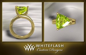
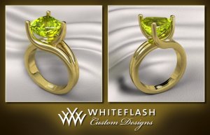
This chrysoberyl setting is long in the making. It took forever to find a design that isn't too outrageous, cheap looking, too masculine or too modern. Although the design looks simple enough, I admit to being a PITA in that the curves have to be just right. As it is, I have issues with the CAD which have been communicated to Whiteflash. I'm open to ideas, comments and suggestions, even if it's the same as the ones I've already noticed, which I will not bias anyone by mentioning as yet.

The stone is 9.4 x 9.4 mm, so it's a challenge to keep the setting fine and delicate. :sick:

Because I have issues with posting pictures on PS at the moment, Ella will be along shortly with the attachments. Thank you, Ella!
 

Laila619

Super_Ideal_Rock
Premium
Joined
Apr 28, 2008
Messages
11,676
Can't wait to see them!
 

Upgradable

Ideal_Rock
Joined
Aug 15, 2004
Messages
5,537
What color gold did you decide to go with? :naughty:
 

LD

Super_Ideal_Rock
Premium
Joined
Jun 29, 2008
Messages
10,261
I love the proportions and the metal colour and ................ oh wait ............... nope, my crystal ball has clouded over again so I'm afraid more thoughts will have to wait until the photos are posted!!! :wink2: :lol:

Chrono, if you want to email them to me, I'll post them for you if you like.
 

Ella

Brilliant_Rock
Staff member
Premium
Joined
Jan 18, 2010
Messages
1,621
Here are the CADs. Sorry for the delay. :))

CAD Chrysoberyl 2ver1.jpg

CAD Chrysoberyl 2ver1 (1).jpg
 

natsplat

Brilliant_Rock
Joined
May 1, 2011
Messages
509
oo very lovely! How will you have the prongs finished? And is that a brushed metal finish too? I love bypass styles: I believe I saw a similar ring with a green stone in DanielM's custom store recently, and that certainly caught my eye. I love the movement in it.

I hesitate to mention a mild taper might be lovely...? :lol: :twirl: and possibly slightly more thinned out where the bypass sweeps under the culet? Other than that: classy and gorgeous :love:
 

Upgradable

Ideal_Rock
Joined
Aug 15, 2004
Messages
5,537
Love the flow!!! I'm always bewildered about how to set a trillion, but you've done a beautiful job!!

I still vote for pink gold though. I think it would allow both the green and yellow to glow!! I think the yellow gold kinda sucks the yellow out of the stone. IMHO
 

ForteKitty

Ideal_Rock
Joined
Oct 7, 2004
Messages
5,239
Chrono, have you seen this? http://www.etsy.com/listing/72767842/reserved-for-lonelynightmare

Sorry, posted before i finished typing. I like how the Daniel M one tapers in under the stone, it looks a lot more delicate. The WF one is too bulky looking, and i dont mean the metal girth. The prongs dont seem to hug the bottom of the stone and there's a weird gap!
 

platinumrock

Ideal_Rock
Joined
Mar 13, 2005
Messages
2,262
While I love the unique design and flow of the ring, agree with ForteKitty that it's a bit bulky for the gorgeous stone. Daniel M's design is eerily similar but looks much more delicate and proportioned. At least compared to the CAD. Maybe the head is lower on Daniel M's? And the shank is more narrow?

But you've definitely shown us a new way to set a trillion! :bigsmile:
 

jstarfireb

Ideal_Rock
Joined
Mar 24, 2007
Messages
6,232
It's going to be very elegant! I agree that Daniel M's finished product looks nicer than the CADS, but that probably has to do with the extra bulkiness that is the nature of the CAD. Other than that, I'd just suggest to have the prongs not come up at almost a right angle, but gently sweep up to the stone and maybe start sweeping "earlier," if that makes any sense.
 

Arkteia

Ideal_Rock
Premium
Joined
Nov 3, 2009
Messages
7,589
I like the inventive way this ring is set!
 

Treenbean

Brilliant_Rock
Joined
Feb 25, 2010
Messages
798
I really like how the stone is the main focus in this design. Very cool intertwined thing going on. I think the chunkiness won't be there in real life, as the CAD's are usually unrefined.
Question: Are you OK with it sitting up that high on your finger? I am klutzy, so I have to ask.
I know you have, but have you considered warmer pink gold? Will this be 18K?

Whiteflash is awesome and I can't wait to see this in real life! You have lovely taste in stones and jewelry.
 

chrono

Super_Ideal_Rock
Premium
Joined
Apr 22, 2004
Messages
38,364
Sorry it took so long; I feel horrible that so many people were checking the thread but seeing nothing. Sort of like the "this thread is unless without pictures". :bigsmile:

Upgradable,
I went with 18K yellow gold. Decided to play it safe, plus just about all jewellers have easy access to it should I need to do any work on the setting in the future. Please don't stone me but rose gold has taken a ding in my head, reputation wise, from seeing poor quality work years ago. Yes, it's totally unreasonable as I've seen many beautiful rose gold setting since then but I can't stop thinking "cheap" when I see a rose gold setting. Sorry! :oops:

Natsplat,
I haven't decided on how the prongs will be finished. I like pointy claw prongs but the pointy tips of the trillions might dictate chevron prongs, so that decision might end up out of my hands, so to speak. As of now, the CADs show a polished finish. I am still toying with the idea of a brushed/satin finish. Ah....I'll explain about the DM setting shortly. Suffice to say, it was my custom project with them. I am unsure if it should be tapered. While I think a bit of tapering is always classy, I'm not sure if it fits the design.
 

bright ice

Ideal_Rock
Premium
Joined
May 14, 2010
Messages
4,328
I love it Chrono. It's a classy design and looks perfect for the trillion. 18kt yellow gold will suit it fine. Can't wait to see the completed ring!
 

chrono

Super_Ideal_Rock
Premium
Joined
Apr 22, 2004
Messages
38,364
ForteKitty,
Yes, the stone and setting in that listing are both mine. I have to come clean on this one, hence it looks very familiar to everybody. I agree that the DM setting is far nicer than the WF setting is that respect. The shank is much thinner and delicate, and the setting of the stone lower, which are two strong issues I have with the current WF setting. The only thing that bothered me about the DM setting is the curvature which unfortunately, could not be curved out further. They look like two straight lines to me. Other than that, Karen and Daniel nailed it perfectly. If only I can have the best of both worlds. :tongue:

Platinumrock,
Yes, it is obvious that the stone is lower and the shank narrower on the DM setting. I've brought this up to WF's attention, plus a link to those pictures.

Jstarfireb,
Thank you. The thickness of the shank is not an illusion in the CADs. I asked WF and it's anywhere from 3.4 mm to 3.8 mm which is terrible! The DM setting width is only 2 mm per band. I am afraid I do not understand your explanation and suggestion about the prong sweep.
 

chrono

Super_Ideal_Rock
Premium
Joined
Apr 22, 2004
Messages
38,364
Crasru and BrightIce,
Thank you. I'm hoping that this will encourage people to buy trillions and have them set as rings, instead of turning away from beautifully coloured trillions just because so many of the settings out there are very masculine or futuristic.

Treenbean,
I'm rather cautious about the bulkiness this time based on the current information from WF. CADs are naturally clunkier but I'm going to thin this design down as much as possible first. There is no way around the height of the setting because the height of the stone is 5.3 mm. However, I believe that the current design is very top heavy and can be further lowered. Yes, 18K yellow gold. I've requested it to be as buttery yellow as possible.
 

Aoife

Brilliant_Rock
Joined
Jun 23, 2010
Messages
1,779
I love rose gold, but I'm actually not a fan of it with this color chrysoberyl, so I think you made the right call on that. I really am loving this design, and once the metal is thinned down I think it will look very graceful and harmonious. However, there is something about the upward curve where the shank becomes the prong in the bottom left photo that is really bothering me. My head understands why it's that way (the way the trillion is cut, symmetry with the other prongs, etc) but it just seems awkward. It isn't hugging the stone enough. It's too linear, and not rounded enough. Is any of this making sense? It's something that popped out at me the first time I saw the CADS, and every time I look back, it bothers me.
 

SB621

Ideal_Rock
Joined
Aug 25, 2009
Messages
7,864
Chrono,

Do you think perhaps you would be interested in lowering the split in the shank? I think that would help make it look less bulky and a bit more feminie. Just my .02 cents though. How will you finish the prongs?
 

stargurl78

Ideal_Rock
Joined
Apr 19, 2010
Messages
3,296
I love your design Chrono and I think the yellow gold suits your stone well! But as some of the others have said, there is something about the way the prongs flow up to the stone that could be improved, like they need to "hug" the stone more if that makes any sense...
 

T L

Super_Ideal_Rock
Premium
Joined
Sep 20, 2008
Messages
25,159
Chrono|1311163824|2972850 said:
Please don't stone me but rose gold has taken a ding in my head, reputation wise, from seeing poor quality work years ago. Yes, it's totally unreasonable as I've seen many beautiful rose gold setting since then but I can't stop thinking "cheap" when I see a rose gold setting. Sorry! :oops:


Actually, I've seen many very expensive designer vintage pieces (mid 20th century) in rose gold, and that's part of the appeal to me. I'm completely hurt and upset that you don't love rose gold as much as I do. *waaaahhhhhH!!* ;( ;( ;(

Just kidding! :tongue:

Great fluid and modern design on the ring Chrono. I'm sure it will be fabulous when it's done.
 

LD

Super_Ideal_Rock
Premium
Joined
Jun 29, 2008
Messages
10,261
Chrono (apart from the fact that I love it), the CADs are concerning me a little in one area. Where the swoop of the prongs come up (side view), because of the shape of the trillion, you see space at one side and gemstone at the other so it looks unbalanced. From the top it's not apparent but the side view would drive me to distraction. I'm not sure whether it's correctable though because it mirrors the stone's shape.

I do want to mention one of the features that I find incredibly pleasing is the way the single prong meets the end of the trillion. The metal work there and design really are well thought out.

I'm curious to know your thoughts?


EDIT: Actually I've just looked at the Etsy version and realised that the difference may be how high the stone is because in the Daniel M design, the space isn't apparent. If Whiteflash drop the stone down a bit will it close the gap?
 

ZestfullyBling

Ideal_Rock
Premium
Joined
May 27, 2010
Messages
2,877
Thats a beautiful setting! It displays your gem very well!!! :love:
 

ForteKitty

Ideal_Rock
Joined
Oct 7, 2004
Messages
5,239
chrono- that's a completely different (smaller) stone, right?
 

pregcurious

Ideal_Rock
Joined
Mar 18, 2009
Messages
6,724
I think what Jstarfireb means is that on the WF setting, the prongs come to a straight vertical too soon. if you look at the prongs on the DM setting, they are overall more angled (hugging the angle of the stone), then straighten out closer to where they have to hold the stone.
 

T L

Super_Ideal_Rock
Premium
Joined
Sep 20, 2008
Messages
25,159
The thing I like about the WF setting more so than the DM setting is that the stone appears to be "floating" in the WF setting. I just think it needs to be slightly more delicate so you'll see the curvature of the shank more. Right now the prongs are so thick that it's hard to show the detail of the curvature.
 

platinumrock

Ideal_Rock
Joined
Mar 13, 2005
Messages
2,262
Chrono, I can't wait see this ring finished. Whatever you do, it will be stunning. You always have a unique eye for modern, fluid design.
 
T

talamasca

Guest
:love: what a great way to set a trillion. Can't wait to see RL pics :D
 

Michael_E

Brilliant_Rock
Trade
Joined
Nov 19, 2003
Messages
1,290
Chrono|1311164788|2972853 said:
I'm rather cautious about the bulkiness this time based on the current information from WF. CADs are naturally clunkier but I'm going to thin this design down as much as possible first. There is no way around the height of the setting because the height of the stone is 5.3 mm. However, I believe that the current design is very top heavy and can be further lowered. Yes, 18K yellow gold. I've requested it to be as buttery yellow as possible.

It's unfortunate that the discussions regarding design rarely take into account the properties of the materials being used, as well as the way that the structure of the ring will contribute or harm the long term durability of a design. In this case, with relativvely soft 18K yellow gold and since the prongs are not banded together with an upper support ring, you will NEED the prongs to be as heavy as possible. The prongs may look better being thin, but will not resist bending well at all if they are not at least as thick as shown in the CAD's. That bending can be caused by something as simple as pressing directly down on the stone, since the steep angles of the pavilion act like a wedge to drive the prongs apart. Thin round prongs with sharp pointed corners set into them also, can cause undue stress on the points of stone and make the possibility of breaking a point during wear greater.

This is one of those designs where you can't hide any structure and so have to consider the trade offs between the beauty of the piece and it's durability and safety of the stone. I would suggest making the prong heavier, maybe as chevrons and even make them triangular in cross section under the stone where the heavier structure will be hidden for the most part. Of course if you just want a "stone holder" and will only be sitting and looking pretty when wearing it, then anything will work. If you're going to be wearing it while loading a dishwasher, getting into file cabinets, or wrestling kids, then you may want to reconsider the "thin is beautiful" mantra that seems to be widely expressed here.
 

jstarfireb

Ideal_Rock
Joined
Mar 24, 2007
Messages
6,232
pregcurious|1311212764|2973481 said:
I think what Jstarfireb means is that on the WF setting, the prongs come to a straight vertical too soon. if you look at the prongs on the DM setting, they are overall more angled (hugging the angle of the stone), then straighten out closer to where they have to hold the stone.

Exactly what I meant! The prongs in your CADs look more vertical than the more gently angled prongs in the Daniel M ring. I would have the split shank start angling up toward the stone a little farther from the stone so they come up at a more sweeping/graceful angle.
 

chrono

Super_Ideal_Rock
Premium
Joined
Apr 22, 2004
Messages
38,364
Aoife,
I went through old design notes and the original setting with the chrysoberyl is 3 mm thick at most at the double band portion while the WF version is almost 4 mm. The difference of 1 mm is significant! I wonder if it’s the illusion of the picture that is causing the trillion to look offset in the profile shot? In any case, I agree that the curve looks too linear and it should be a slower gradual curve upwards.

Sarahbear,
I’m definitely open to lowering the split in the shank although I’m unsure how much room I have. I have skinny fingers and the stone takes up ¾ of finger real estate which doesn’t give the designer much room to work with. As for the prongs, I am still undecided. I suppose my priority right now is to get the other parts of the design adjusted first, before deciding on the prongs and the type of finish.

Stargurl, ZestfullyBling, and PlatinumRock,
Thank you!

LD,
Do you think it’s only an illusion that the trillion looks a little off-set? I’ve brought this up to WF’s attention in dropping the stone down further and they suggested having a notch in the underside where the culet will sit slightly into the shank. I also believe that if the curvature of the upward swoop is reduced (hug the stone, rather than come up almost vertically), this off-set illusion will be further reduced.

ForteKitty,
It’s the same stone.

Pregcurious,
Gotcha. I think I understand what you mean about Jstarfireb’s comment now.

TL,
The two designs are similar yet different. The vertical prong design by WF gives it a floating appearance but the stone sits higher and the profile is very top heavy. The swoopier original prong design allows the stone to sit lower, which is the way I prefer it. The way it is now, looks like the kiddy lollipop ring. :bigsmile:
 
Be a part of the community Get 3 HCA Results
Top