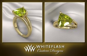
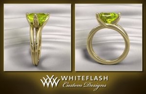
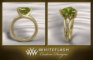
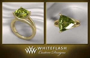
shape
carat
color
clarity

Chrysoberyl CADs from WF - Comments are Welcomed

chrono

Super_Ideal_Rock
Premium
Joined
Apr 22, 2004
Messages
38,364
Michael,
Are you saying that the original setting isn’t safe to be worn? It is also 18K gold, yet 1 mm thinner overall. The thickness of the setting in the CAD is 4 mm thick at its widest. I am fine with the thickness of the prongs as I understand it needs the support. However, does the shank need to be 2 mm thick per band as opposed to the original 1.5 mm thickness per band? This ring, as with all my other rings, are only worn to look pretty aka to work and back home again, doing nothing more strenuous than programming on my laptop. It isn’t even worn at home. Can I then practice the “thin is beautiful” PS mantra? :tongue:

Jstarfireb,
Got it! Will pass that comment along to WF.
 

Aoife

Brilliant_Rock
Joined
Jun 23, 2010
Messages
1,779
Chrono|1311343811|2974527 said:
Aoife,
I went through old design notes and the original setting with the chrysoberyl is 3 mm thick at most at the double band portion while the WF version is almost 4 mm. The difference of 1 mm is significant! I wonder if it’s the illusion of the picture that is causing the trillion to look offset in the profile shot? In any case, I agree that the curve looks too linear and it should be a slower gradual curve upwards.

I've been looking at the photos, as well as the DanielM photos, and I think one of the issues is the fact that the culet/ridge/lowest portion of the chrysolberyl isn't centered on the stone itself, so any design that is centered is going to appear unbalanced from certain angles. I have no idea how to fix this, but I think that's one of the things in the very beautiful design that troubles the eye in these macro photos. I really have no idea if this would actually be an issue in real life. I suspect that lowering the chrysoberyl a bit, as you say you have already discussed with WF, might do quite a bit to de-emphasize that "off" appearance. I'm also wondering if changing the upward curve of the prongs will just introduce other issues. Hmm. I'll be very interested to see what you decide, because this is a really gorgeous design. At least you are in good hands with WF!
 

Michael_E

Brilliant_Rock
Trade
Joined
Nov 19, 2003
Messages
1,290
Chrono|1311344303|2974532 said:
Michael,
Are you saying that the original setting isn’t safe to be worn?

Not at all Chrono. I am saying that the balance between strength and thinness needs to be taken into account for the use that this will be put to. The relationship between prong thinness, length and bending resistance is not linear and so if you make the prongs "just a little thinnner" you may be reducing their strength by more than just a little bit. In addition the "whack resistance" of you stone goes way down when the thin prongs give such little spots to grab the stone with.


It is also 18K gold, yet 1 mm thinner overall. The thickness of the setting in the CAD is 4 mm thick at its widest. I am fine with the thickness of the prongs as I understand it needs the support. However, does the shank need to be 2 mm thick per band as opposed to the original 1.5 mm thickness per band?

The width of the band really doesn't matter much, but the thickness from the finger surface to the outside of the band does. I would make the width whatever looks good to you, but keep the thickness at least 1.5mm or more in all areas of the band section of the ring.

This ring, as with all my other rings, are only worn to look pretty aka to work and back home again, doing nothing more strenuous than programming on my laptop. It isn’t even worn at home. Can I then practice the “thin is beautiful” PS mantra? :tongue:

Sure you can. If it gets too thin though the ring may only be suitable as a stone holder to be placed in a display area and never touched. :D
 

ForteKitty

Ideal_Rock
Joined
Oct 7, 2004
Messages
5,239
Chrono, just curious, but what part of the Daniel M ring didn't you like?
 

chrono

Super_Ideal_Rock
Premium
Joined
Apr 22, 2004
Messages
38,364
Aoife,
I appreciate your taking the time to think about the nitty gritty details. Somehow, I don’t think I’m going to be overly bothered if the culet isn’t exactly dead center of the setting IRL. True as well about how changing a small part of the setting could well affect other parts of the setting I already love. I hope to hear back from WF later today. Their communication has been very prompt, daily, in fact, at this point of the project.

Michael,
If that is the case, then I’m not sure why you brought up the point that the shank (in the CAD) should not be thinned out further. The original setting has each single band at 1.5 mm which I was very pleased with and I wouldn’t go any thinner than that. As a matter of fact, I would not dream of having the prongs thinned out any further than it already is in the CAD, understanding that it needs a certain width for strength.

ForteKitty,
If you look at the top down view (table of the stone), look at the split shank portion of the ring. The bands of the split shank are two straight lines which I do not like. I wanted them to have a slight curvature inward, then gently swoop outwards. Unfortunately, DM said it cannot be done.
 

brandy_z28

Brilliant_Rock
Joined
May 23, 2008
Messages
1,934
Love your chryso Chrono! :love: Hmmm... There's just something about the side view that turns me off. Have you considered adding a surprise stone and bracing underneath the chryso...? Maybe that would allow for the extra swoopiness that you'd like or distract from the lopsided feel on the side view. I think that I'd personally prefer to remove the split look to the band that connects to the single point of the trillion.

Were you going for lack of symmetry with having the stone turned to point left/right instead of toward/away from you? Please excuse me if I missed that explanation. If you turned the stone a little that might help the flow but that would be the most common way to set a trillion.

:sun:
 

chrono

Super_Ideal_Rock
Premium
Joined
Apr 22, 2004
Messages
38,364
Second round of CADs have been released but I'm still having trouble trying to attach pictures. Suffice it to say, it looks almost identical to the original setting. It is a lot lower, much thinner and the prongs hug the stone but seems to have lost the curvature of the split shank. I may have to request help from the moderators to post pictures again.

I really don't want any underbracing as I feel it disrupts the profile view (breaks the flow of metal and hides more of the chrysoberyl pavilion than necessary). Also, I'm partial to this sideways setting versus the usual /_\ setting style.
 

platinumrock

Ideal_Rock
Joined
Mar 13, 2005
Messages
2,262
Can't wait to see it Chrono!
 

bright ice

Ideal_Rock
Premium
Joined
May 14, 2010
Messages
4,332
platinumrock|1312322050|2982594 said:
Can't wait to see it Chrono!

Ditto on this
 

LD

Super_Ideal_Rock
Premium
Joined
Jun 29, 2008
Messages
10,261
Chrono's updated CADs

Chrono 1ver2.jpg

Chrono 2ver2.jpg
 

Kismet

Ideal_Rock
Joined
May 6, 2005
Messages
2,991
Very nice! I love that it's set lower and that the prong on the tip more closely follows the line of the stone underneath.
 

Aoife

Brilliant_Rock
Joined
Jun 23, 2010
Messages
1,779
What a difference! The things that looked "off" in the other CAD's are all fixed, and now the whole design is one seamless flow of metal cradling the chrysoberyl. Beautiful!
 

chrono

Super_Ideal_Rock
Premium
Joined
Apr 22, 2004
Messages
38,364
Maybe I'm too fussy as nobody seems bothered by what I'm seeing in this new redesign. I do like how it's set lower, thinner and isn't as clunky (top heavy) but there still remains two things that aren't what I envisioned.

My utmost thanks to LD for helping me post these second round of CADs. :appl:
 

T L

Super_Ideal_Rock
Premium
Joined
Sep 20, 2008
Messages
25,217
Chrono,
Should you have more protective prongs, like v-tips?
 

Upgradable

Ideal_Rock
Joined
Aug 15, 2004
Messages
5,537
Wow!! I love the top and lateral views. They are gorgeous. I see what you mean about the side view though. The flow of the metal seems to be wonky. Does that make sense? There's almost a kink in the flow. I'm the first person who loves the sexiness of a pavilion view!! Keep working with Whiteflash to make it just as you see it in your head. Your instincts are good, and your esthetic is beyond amazing!!
 

chrono

Super_Ideal_Rock
Premium
Joined
Apr 22, 2004
Messages
38,364
TL,
I have no clue. My personal preference are prongs over chevron prongs and I've asked WF about this. While I wasn't given any answers, I did notice they finished off the CAD with claw prongs. I have also received no response about the pros and cons of a satin finish versus a polished finish.

Upgradable (and others),
Do you all not feel that the "head" is now too squat? Also, this design has lost that split shank curvature which I loved in the first round of CADs. Due to the structural support needed, the single underprong will have to be redesigned somewhat as it is needed to "push" against the split portion of the band.
 

Upgradable

Ideal_Rock
Joined
Aug 15, 2004
Messages
5,537
I'm not distracted by the fact that the two wires are fused on the one side. It still looks balance, and even somewhat logical given the nature of the stone. I do think that maybe the stone has been lowered a bit too low and that what may be affecting the natural curve of the split shank.
 

chrono

Super_Ideal_Rock
Premium
Joined
Apr 22, 2004
Messages
38,364
Upgradable|1312468686|2984001 said:
I'm not distracted by the fact that the two wires are fused on the one side. It still looks balance, and even somewhat logical given the nature of the stone. I do think that maybe the stone has been lowered a bit too low and that what may be affecting the natural curve of the split shank.

From what I understand of WF's email, the fused portion of the prong needs to be opened up (split) under the stone, before re-fusing once again at the prong. This is so that the unfused part will rest directly against each (outer) split shank for additional support. I have no idea how this will look IRL though. I'm only hoping that because it is under the stone, it's not something noticeable IRL. Also, I've asked the stone to be raised a little; sort of a happy medium between version 1 and version 2.
 

deorwine

Shiny_Rock
Joined
May 5, 2005
Messages
348
I don't think it looks too squat at all. (But I'm a big fan of low-set stones, so I guess take that with a grain of salt!) I agree though that the two sides don't look as flowy together with one fused and the other not, if that makes sense, as in the first iteration... but it also makes sense that it's necessary for structural integrity with the stone that low.

That is going to be a gorgeous ring either way. I love the flowy lines and how they merge into the prongs.

And I'm so glad to see more trillions set. Trillions are my favorite cut (I think they're just naturally so sparkly, and I love three-fold symmetry anyway) and it makes me sad that I don't see more of them on PS.
 

platinumrock

Ideal_Rock
Joined
Mar 13, 2005
Messages
2,262
YES!! It's fluid, delicate yet substantial. If that even makes sense. I don't think the head looks too squat either, but if you wanted it to be a little higher, I can why you would see it that way. Make they can just extend it slightly to allow for more curvature? Although I don't know how that would affect the rest of the design though.

I guess the only way to find out is if they modified it so we can compare which version looks best: low or high head.
 

Aoife

Brilliant_Rock
Joined
Jun 23, 2010
Messages
1,779
I actually like the fact that this rendition has the chrysoberyl set low, but I think that's totally a personal preference. I do see the little thing going on with the side view, but I'm getting the feeling that with a stone like this, which is not perfectly symmetrical from every angle, when you fix one thing, another issue arises. I suspect you're at the point where you are the only one (obviously ;)) ) who can decide which trade-off and compromises you can live with. I'm very much looking forward to the finished product on this one, it's going to be a show stopper.
 

LD

Super_Ideal_Rock
Premium
Joined
Jun 29, 2008
Messages
10,261
Chrono I think you're going to have to compromise because the design is either high in the setting and looks odd or lower (looks fabulous) but chunkier than you want. However, I wonder if the CADs are making it look weightier than it will be in real life? We know that CADs put on weight (just like my mirrors do!) so this could be the cause and actually you may be happier with the finished result. I do get where you're coming from because I like high rings. Don't forget this is a large stone and so any higher it'll have the potential to swivel as well.
 

stargurl78

Ideal_Rock
Joined
Apr 19, 2010
Messages
3,296
I love the new version. I normally like high rings and I don't think this looks too low at all.
 

pregcurious

Ideal_Rock
Joined
Mar 18, 2009
Messages
6,724
Wow, this looks so much better. I can't wait to see it in person.
 

LD

Super_Ideal_Rock
Premium
Joined
Jun 29, 2008
Messages
10,261
New CADs from Chrono:

Chrono 1ver3 (1).jpg

Chrono 1ver3.jpg
 

Upgradable

Ideal_Rock
Joined
Aug 15, 2004
Messages
5,537
OH YEAH!!!!! That's gorgeous!! Now, if I could only talk you into rose gold. j/k
 

deorwine

Shiny_Rock
Joined
May 5, 2005
Messages
348
oh my GOSH. YES. That is the best of both worlds -- the nice symmetry of the first version and the low-set graceful curves of the second version. I CANNOT wait to see this ring!!
 

LD

Super_Ideal_Rock
Premium
Joined
Jun 29, 2008
Messages
10,261
Ok - well quite the opposite opinion from me I'm afraid.

I really think that the new split shank detracts from the design. Whereas before the flow was aesthetic and appealing, it now doesn't flow. The profile view (top right hand picture) looks very odd indeed. It's lost all its modern edgieness for me.

If it were me, I'd go back to CADs version 2 but see if they can lift the stone very very slightly.
 

jstarfireb

Ideal_Rock
Joined
Mar 24, 2007
Messages
6,232
I prefer the second version over this one, but I love low-set rings, and I like the little bit of asymmetry in the shanks. But to me, this 3rd round is still better than the first, and now it comes down to personal preference.

Upgradable - I have the same feeling, but with green gold instead of rose!
 

Aoife

Brilliant_Rock
Joined
Jun 23, 2010
Messages
1,779
Oh, dear, I'm not liking this last one at all. Both the top-down view and the top right view look distinctly odd to me.

That said, it's your ring, and it does seem to me that if you are happy with it, no one else's opinion really matters.
 
Be a part of the community Get 3 HCA Results
Top