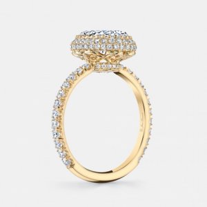
shape
carat
color
clarity

(Cartier inspired) Cuprian Ring

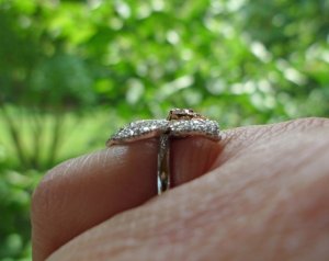
still voting for pink melee on the outside and thinking that the rose gold metal will probably blend in with your rose gold skin. =) As far as the metal edge goes- if the petals are dipping downward will you see the metal edge much? Here is a close up of the petals on my orchid- you really can't see the metal-can he do it like this?
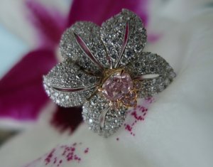
orchid_ring_in_orchid2.jpg

orchid_ring_profile.jpg
 
Niel,
Correct. Shape-wise, I think I can approve the preliminary CADs. There are other details still to be worked out.

Greg,
David has not shared any opinion other than it is going to be quite the ring. :bigsmile: He makes sure I'm aware of how blingy it is with every email correspondence.

Lovedogs,
As the project progresses, pink on the outside is becoming my choice as well.

PinkJewel,
Wow, love your orchid! Thank you for the profile view. I will ask David if he can do the same. :love:
 
Chrono|1447337589|3948731 said:
Lovedogs, Greg, Lady D (my supposed alter ego), PinkJewel, LovingGems, Elle, and others who are reading this thread,
Given the updated CADs, does this change your mind(s) as to pink melees outside or blue melees outside?

Given it's 3 rows of pave and the intensity of your centre stone I think pink will flow better, so I am changing my mind.
 
Chrono|1447337589|3948731 said:
Lovedogs, Greg, Lady D (my supposed alter ego), PinkJewel, LovingGems, Elle, and others who are reading this thread,
Given the updated CADs, does this change your mind(s) as to pink melees outside or blue melees outside?

I did post earlier today but since you may have missed it...my comment below:

"In a previous post I put my vote on the outer blue. Now, I'm thinking outer pink will look better (seriously, this ring keeps making me flip back and forth...what a difficult choice). " :naughty:

I am so in love with this piece already!
 
I'm the evil side, Chrono. I still prefer the pink on the outside.

Pinkjewel, what a stunning ring!
 
I just read through this thread - oh my word what a ring!!! I agree you can't go wrong with either color combo but having the blue melee concentrated at the tips and the pink outer edge definitely gets my vote. It's perfection to my eye!
 
I like pink on the inside because it will help define the shape of your stone, and bring out the color more. If on the inside, they could compete with the color of your gem? Are you sure they're the same color as the trillion in regards to saturation?
 
TL|1447416079|3949175 said:
I like pink on the inside because it will help define the shape of your stone, and bring out the color more. If on the inside, they could compete with the color of your gem? Are you sure they're the same color as the trillion in regards to saturation?

TL,
I read your comment several times but am still not clear about what you mean. What on the inside will compete with the colour of the center stone? The cuprian melees aren't an exact match to the trilliants in that they are about the same colouration but not as glowy. I am quite surprised how such tiny stones hold their colour so well.
 
Chrono could you please show us a photo of the melee with your centre stone again?

Just another wacky idea, how about all pink melees with each petal going dark to light pink, light to dark to light, edge to edge not centre to tip, sort of like an ombré effect? :oops:
 
I knew I should have taken a picture of all the stones together before I shipped them to David. :doh:

LG,
With only 3 rows of melee, there's no room to get light to dark to light because it will be light -dark -light with no graduation in-between unless I'm not getting what you meant.
 
Do you know how many rows of melees from edge of one petal to other? So not from the centre to the outer edge but perpendicular to it. Hope this makes sense.
 
Chrono- I've given this some thought and I may be changing my mind :rolleyes: to blue on the outside
Since the pariaba melee are so small- what if you did the outer row in blue and then another row of the pariabas on the edge where the metal is now. So basically the rows would curve around the edges of the petals? Since this is a blingy ring- totally bling it out!! And rather than any diamonds use the pale pink and light pink on the inside petals.

I do think this will make the center stone stand out more and with the blue against your skin the whole ring will really pop.
 
Lovinggems|1447421338|3949214 said:
Do you know how many rows of melees from edge of one petal to other? So not from the centre to the outer edge but perpendicular to it. Hope this makes sense.

Each petal has 11 or 12 melees from (outer) edge to edge.
 
pinkjewel|1447421423|3949215 said:
Chrono- I've given this some thought and I may be changing my mind :rolleyes: to blue on the outside
Since the pariaba melee are so small- what if you did the outer row in blue and then another row of the pariabas on the edge where the metal is now. So basically the rows would curve around the edges of the petals? Since this is a blingy ring- totally bling it out!! And rather than any diamonds use the pale pink and light pink on the inside petals.

I do think this will make the center stone stand out more and with the blue against your skin the whole ring will really pop.

I am sorry but I don't fully understand what you are envisioning. 2 rows of blue at the outside?
 
Chrono|1447422000|3949219 said:
Lovinggems|1447421338|3949214 said:
Do you know how many rows of melees from edge of one petal to other? So not from the centre to the outer edge but perpendicular to it. Hope this makes sense.

Each petal has 11 or 12 melees from (outer) edge to edge.

Thanks Chrono, my thinking was just do all pink melees similar to ombré effect on each petal from (outer) edge to edge. I like pinkjewels' pale and light pink idea. I might change my vote to all pink melees...
 
Chrono|1447422176|3949220 said:
pinkjewel|1447421423|3949215 said:
Chrono- I've given this some thought and I may be changing my mind :rolleyes: to blue on the outside
Since the pariaba melee are so small- what if you did the outer row in blue and then another row of the pariabas on the edge where the metal is now. So basically the rows would curve around the edges of the petals? Since this is a blingy ring- totally bling it out!! And rather than any diamonds use the pale pink and light pink on the inside petals.

I do think this will make the center stone stand out more and with the blue against your skin the whole ring will really pop.

I am sorry but I don't fully understand what you are envisioning. 2 rows of blue at the outside?

Yes- one seen from the top and one seen from the side-sort of a puffy effect-something like this

custom-eva-oval-cut-diamond-engagement-ring-yellow-gold-jean-dousset-profile-grey.jpg
 
Chrono|1447418737|3949190 said:
TL|1447416079|3949175 said:
I like pink on the inside because it will help define the shape of your stone, and bring out the color more. If on the inside, they could compete with the color of your gem? Are you sure they're the same color as the trillion in regards to saturation?

TL,
I read your comment several times but am still not clear about what you mean. What on the inside will compete with the colour of the center stone? The cuprian melees aren't an exact match to the trilliants in that they are about the same colouration but not as glowy. I am quite surprised how such tiny stones hold their colour so well.

What I mean is that if the melee are more saturated than the trillion, they will compete with it. If they're less saturated, than they won't. I'm not sure because I don't think I've seen a picture of the stones next to your trillion.

If they're the same saturation, the will just make the trillion look bigger, but not as defined. The pink right next to both the trillion and the melee, in the middle, will make both the trillion and the melee pop even more.
 
My vote still goes to inner row in pink and outer row in blue for more definition of your beautiful center stone.
 
TL|1447467497|3949456 said:
What I mean is that if the melee are more saturated than the trillion, they will compete with it. If they're less saturated, than they won't. I'm not sure because I don't think I've seen a picture of the stones next to your trillion.

If they're the same saturation, the will just make the trillion look bigger, but not as defined. The pink right next to both the trillion and the melee, in the middle, will make both the trillion and the melee pop even more.

I think TL is exactly right about this.

Since I love the 'organic' flow of the ring I think I'd choose to put blue next to the trillion at the points as Niel showed, to make the trillion shape less pronounced and make it into a more flowery, organic looking shape. A trompe-l'oiel of sorts.
 
I am so torn. One minute I thought I knew what I wanted, and the next minute I change my mind. :loopy: Oh well, I guess I'll wait to hear back from David first.

PinkJewel,
I'm concerned with the fold-over or fold-under, it is risking the cuprian melees to damage. It'll look gorgeous though. :love:
 
Chrono|1447700511|3950386 said:
I am so torn. One minute I thought I knew what I wanted, and the next minute I change my mind. :loopy: Oh well, I guess I'll wait to hear back from David first.

PinkJewel,
I'm concerned with the fold-over or fold-under, it is risking the cuprian melees to damage. It'll look gorgeous though. :love:

In regards to the color scheme or something else?
 
I am afraid that having the pink nearest to the cuprian will end up giving a striped effect instead of a graduated one.
 
Niel|1447700622|3950387 said:
In regards to the color scheme or something else?
Yes, with regards to the colour scheme.
 
Lady_Disdain|1447700795|3950389 said:
I am afraid that having the pink nearest to the cuprian will end up giving a striped effect instead of a graduated one.

I know, I know...that is why I am torn. ;( All sorts of thoughts are running through my head. Will the stone blend in or will it pop? Will it end up looking stark and stripey or will it pop?
 
Since the stones are already with DK, could you ask him to send you a photo of each layout with the actual stones? It wouldn't have to be über precise, just a rough layout to check the colour scheme.
 
Lady_Disdain|1447701626|3950399 said:
Since the stones are already with DK, could you ask him to send you a photo of each layout with the actual stones? It wouldn't have to be über precise, just a rough layout to check the colour scheme.
Right, just lay a circle of each color upside down around the trillion?
 
I've tried to be patient and I don't want to be a bother, but....

Any updates yet?
 
How is the ring going any news for us avid watchers :mrgreen:
 
Just received this yesterday.

_35409.jpg
 
took me a while to see the difference...

the petals are more curved but more importantly the metal of the petal is a lot less than before.

i like it.
 
GET 3 FREE HCA RESULTS JOIN THE FORUM. ASK FOR HELP

Featured Topics

Top