shape
carat
color
clarity

Caleb Meyer for my oec?

Status
Not open for further replies. Please create a new topic or request for this thread to be opened.

Upgradable

Ideal_Rock
Joined
Aug 15, 2004
Messages
5,537
I''m still on a quest for the perfect home for my warm oec. It measures 6.0x6.2mm, so just a nice medium size. I want to maximize the color and the beautiful sparkles that come from the cut.

Thanks to Coati and ButterBean, I''ve been gawking over all of the James Meyer and Ann McKay setting. I just found the Caleb Meyer site and my heart went thumpa-thump
30.gif
! I have pulled out three designs that I think would be lovely. I would love to hear your opinions.
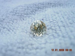
1.07 M SI1 oec uppy.JPG
 
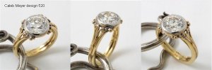
This is design 520. I love the organic nature and the curly vines.

Caleb Meyer 520.JPG
 
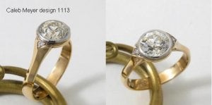
Here is 1113. This would mimic a vintage mounting. I love the style!

Caleb Meyer 1113.JPG
 
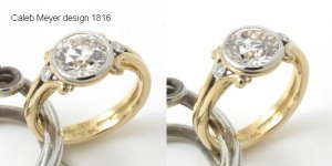
And here is 1816. It looks like a little heavier version of Coati''s design. I''m a 47 year old woman, and the ring would be size 7.5, so maybe beefier is better?

Caleb Meyer 1816.JPG
 
They''re all beautiful settings. But I LOVE the 3rd one and would probably do white gold or platinum and make the bezel yellow.

I know you were looking at the Sholdt too, but I think your OEC would look better in the Caleb (especially the 3rd) So I guess my question is do you want a more modern look or a more romantic look?
 
all three of those are gorgeous designs upgradeable.... i think i love #3 the most, then #2 as it still puts the emphasis on the diamond. i love #1 but i think i see that more for a colored stone where the side swirls really play off the color. in the picture my eyes can't decide what to look at - the swirls or the diamond - because both are just so exciting! of course, in person the diamond would command more attention with its light performance, so that may be a moot point.

i can't wait to see what you decided, and the finished project. your OEC is a beauty!
 
I like the first and third.
 
I am torn between 2 and 3, I think 3 is my favorite. Wow I can''t wait to see your ring when it''s finished
36.gif
36.gif
 
Date: 2/25/2009 10:43:05 AM
Author: elle_chris
They''re all beautiful settings. But I LOVE the 3rd one and would probably do white gold or platinum and make the bezel yellow.

I know you were looking at the Sholdt too, but I think your OEC would look better in the Caleb (especially the 3rd) So I guess my question is do you want a more modern look or a more romantic look?
As much as I love the Sholdt, I just haven''t been able to pull the trigger on it. I could absolutely love it, or it could be so wrong. It just doesn''t feel perfect.

I love vintage, but not "fluffy" vintage. Does that word make sense? The lines (or curves) still have to be clean and meaningful in the design. It also has to be age appropriate.
 
I know what you mean by "not fluffly vintage" and I wouldn''t call his settings that just because I''m not a fan vintagef but LOVE his work. To me they''re more modern with a romantic twist.

As far as the Sholdt, In all honesty I can''t picture your stone in that setting. I guess because it''s an OEC and you''re right, it can go either way. But that 3rd Caleb setting is just delicious I can totally see it with your stone.
 
Beautiful choices, Uppy! My favorite is the 1st because I adore that squiggly part in the center of the shank. Like a gnarled branch. Just sooooo unique and earthy. And while each component of the ring is delicate, as a whole it looks substantial - does that make sense?
 
The first one the first one the first one! I can''t remember the last time I got so excited about a design at first sight.
 
#3 +1
 
Date: 2/25/2009 1:05:07 PM
Author: Circe
The first one the first one the first one! I can''t remember the last time I got so excited about a design at first sight.
Exactly what I thought too. The first one is the huge frontrunner to me.
 
Date: 2/25/2009 1:17:13 PM
Author: Allison D.

Date: 2/25/2009 1:05:07 PM
Author: Circe
The first one the first one the first one! I can''t remember the last time I got so excited about a design at first sight.
Exactly what I thought too. The first one is the huge frontrunner to me.
Oh me too! The first one, the first one!
 
I LOVE 1 and 3! Thump-a-thump is right!
30.gif
I agree that platinum with a yellow gold bezel would look really great with a warmer stone!
 
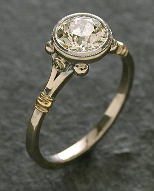
Here is the James Meyer I was considering. I got a very reasonable quote for a yellow gold bezel and wraps with a white gold ring.

James Meyer 1345.JPG
 
Oh I'm so jealous! I've been haunting his site for a week now and I just can't get enough! I think I like #3 best..I hemmed and hawed scrolling back and forth between the 3 and I like #3 best, and then #2..I can't put my finger on it exactly, but it's simple but then when you look at it again, you see it's not "plain jane"..that doesn't make sense, but I don't know how to put it. It's elegant, and complementary of an oec.
 
That James Meyer one is one of all time favorite bezels. Not sure which one I like more , 3 or this one.. hmm
 
In the Caleb Meyer pictures ring #1 is holding a 1.85 stone and #3 has a 1.49. Would that make any difference considering my stone is only 1 carat?
 
Date: 2/25/2009 10:36:07 AM
Author: Upgradable
This is design 520. I love the organic nature and the curly vines.
This one is my favorite. I think that the organic design really suits a warmer stone
1.gif
 
Do you think it would overwhelm a smaller stone? Would they scale it back so the proportions are still similar? The ring is hand fabricated as opposed to cast, so I can''t think why they couldn''t/wouldn''t.
 
I''ve tried on the first and third Caleb Meyer settings at one of his stores in Philly. They are both gorgeous in person but personally I prefer the first. Are you in the Philly area to try them on in person?
 
Not even close! Tell me, what did you think of them on the hand?
 
Wow, those are beautiful! Thank you for introducing me to a new designer. I love #s 1 and 3 with the 3rd being my favorite. I think it will be beautiful with a 1 ct stone and love the idea of a platinum shank with a YG bezel. What fun.
30.gif
 
I love #2 (1113)--and the last one you posted--cause I have that one haha!

I really love #2, though, and I have considered that for a future stone. It reminds me of Sholdt, but Meyer style. I adore their work. Very exciting Up!
 
Jim just got my stone today and he is making me model 1345
6.gif
I love that style! I decided on all platinum because of nickel allergy with most WG alloy. I could have gone with WG and palladium alloy in order to avoid the allergy, but decided on all platinum. You can't go wrong with whatever you decide
2.gif
 
I really like #3 the best of the CM designs, and I like the JM design as well. I do like the milgrain bezel of the JM best and would add it to the CM ring. I really love the yg band and white bezel....I''m not sure about reversing that.
 

DS, here is a pic from the JM thread of WG with I think GG accents - imho reversed with YG would work in this style, but not sure about the others..


Up, I like 2 and 3 the best. 1 is a tiny bit too much imho.
Of course I love the JM one (I''m also having one made), but nobody else has the other designs
2.gif


JM2tonebezel.jpg
 
Its weird.. at first I liked 1 & 3, but after looking at them a bit longer and taking your stone size into consideration,
I REALLY love #2!!!!!!!!
(a lot!)
and it just keeps growing on me!
 
Status
Not open for further replies. Please create a new topic or request for this thread to be opened.
GET 3 FREE HCA RESULTS JOIN THE FORUM. ASK FOR HELP
Top